Unique product packaging helps brands attract customers and make a lasting impression. If you’re looking for some inspiration, you’re in the right place.
I explored both new and past designs and concepts that perfectly capture the important elements of product packaging.
I’ll discuss the main highlight of these packaging designs and give you some tips on how you can incorporate them.
For even more examples, check out the work done by our team.
Let’s begin.
Smart and Unique Product Packaging Tips + Ideas
Create a User-Oriented Design.
If you’re in a bit of a creative slowdown, try thinking of a way to create a package that can be useful for the consumer.
The Tide eco-box is a perfect example of designing for the user, incorporating a tap into the packaging itself.
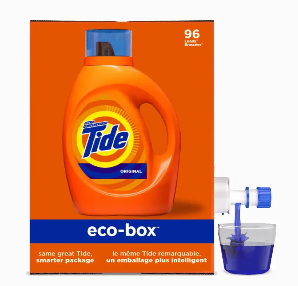
I personally like this design as I don’t even have to tip the bottle over as I did with the usual detergent bottles.
A plus is that the packaging helps protect our environment by using 60% less plastic and 30% less water during production.
Combine Function and Form.
Design a packaging that can help keep your product safe while creatively adding another function.
For example, who would’ve thought a hanger could be a suitable packaging design?
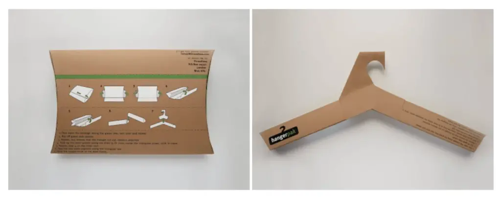
The concept for the packaging design is relatively simple. Steve Haslip, a graphic designer, bought shirts online and noticed that the products would arrive wrinkled.
He then designed a sustainable and reusable way to send t-shirts.
Defy Expectations.
Embrace the element of surprise by incorporating unexpected and delightful elements into your packaging design.
Whether it’s a hidden message, a pop-up feature, or an unconventional use of materials, adding unexpected touches can captivate consumers and leave a lasting impression, making your product stand out in a memorable way.
Here’s something that stood out to me:
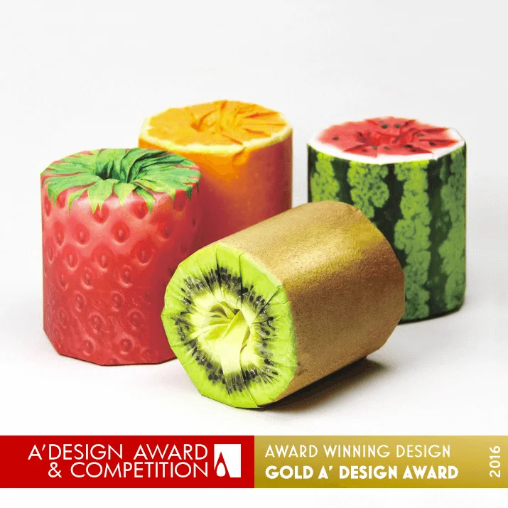
Source: A Design Award
You wouldn’t normally associate toilet paper with fruits, but here we are.
Japanese designer Kazuaki Kawahara playfully added different kinds of vibrantly printed paper to rolls of toilet paper. The product packaging of the toilet paper had 3D images of cross-sections of fruits like watermelon, orange, kiwi, and strawberry.
The designer came up with the fruity toilet paper design because it’s common to give rolls to customers as a sign of appreciation. So, why not make the packaging design more interesting, right?
Design for the Store Shelves.
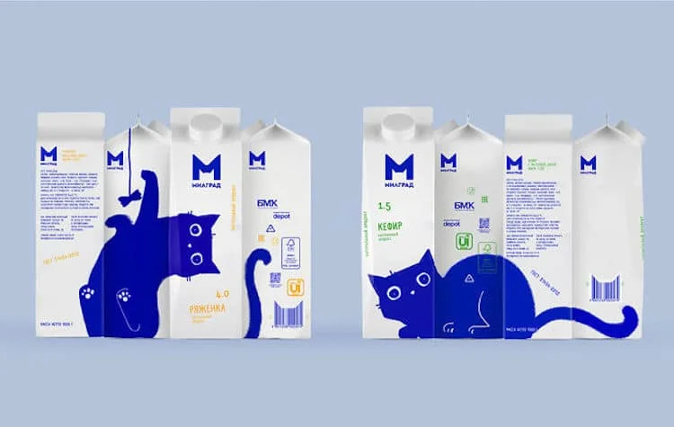
Source: Vera Zvereva via Depot
When designing your product, consider how it will look on the shelves alongside your competitors. How will your product catch the attention of shoppers?
The brand Milgrad answered this question with a creative cat design on the milk boxes.
The stark blue against the white background is eye-catching enough, but the design makes a whole image of an adorable cat when placed side-by-side in varying angles.
It’s unique and fresh – a statement in line with Milgrad’s branding.
Create an Inclusive Product Packaging Design.
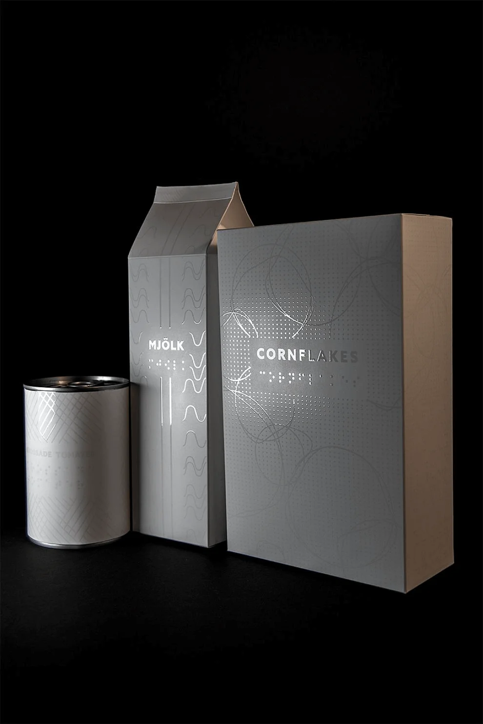
Source: Alexandra Burling
Designing for people with vision impairments is something that brands don’t often do. However, it has become increasingly important today as this audience is more than capable of buying their own groceries.
Alexandra Burling took this great idea in mind and created a stunning design that matches their special needs while being appealing to the general audience.
She created an innovative and dynamic packaging design to assist visually impaired people and give them all the information they need by using Braille as a style and way to communicate.
Highlight Your Product’s Main Feature.
Think of a way to visualize your product’s highlight. You can offer a sneak peek or display it in its full glory.
For Festina, they chose to do the latter. In one of the most creative packaging ideas I’ve seen, the company packed their watch in water-filled containers.
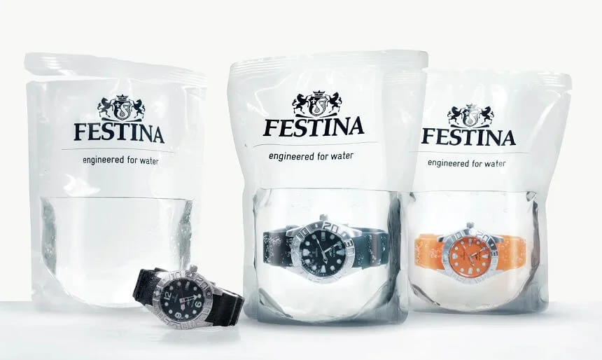
This specific watch is the Profundo, which promises a water-tight accessory you can take with you swimming, snorkeling, and diving.
The packaging immediately demonstrates the watch’s capabilities even if you weren’t familiar with the product or brand. It’s a convincing way to showcase the quality and features without the need for words.
Create Related Imagery.
Sometimes, you don’t need to go too far in designing your product packaging.
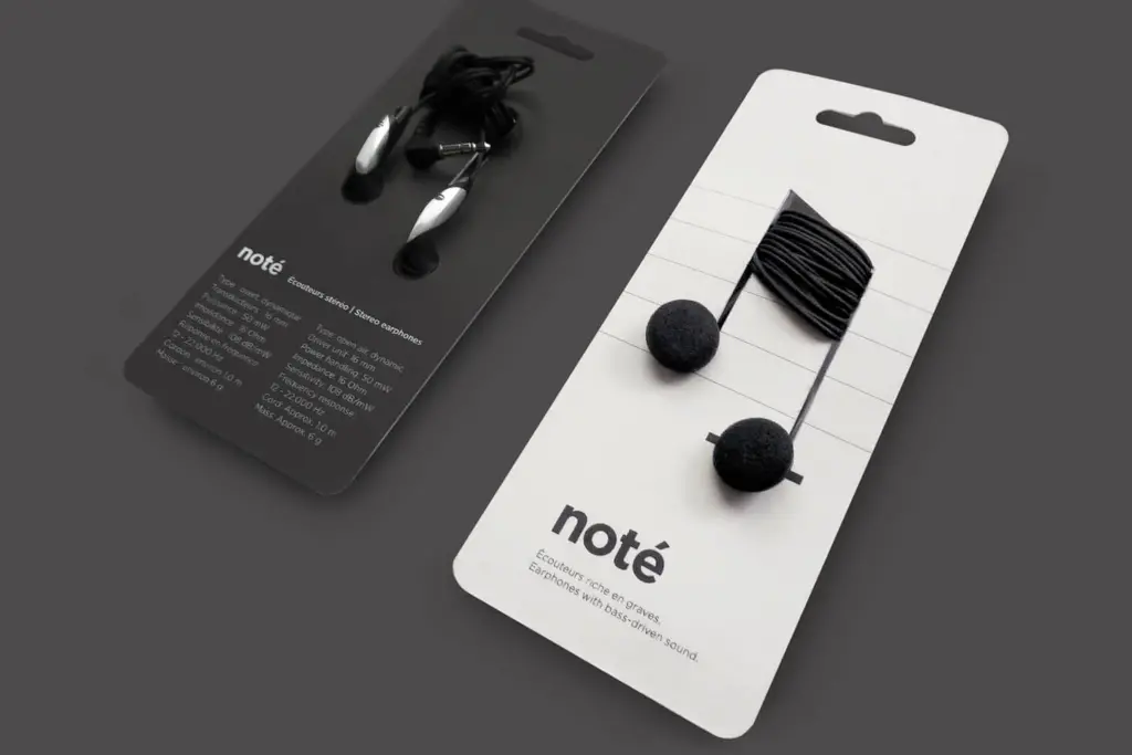
Take this pair of Note headphones, for example.
Source: Corinne Pant
The company wanted to arrange the earphones in a way resembling a musical note, which is undoubtedly related to the product.
Apart from that, there’s nothing else special about the packaging, as it’s simply a piece of cardboard with some holes.
However, it’s enough to catch the attention of consumers and stand out from other earbuds on the shelf. The packaging is clever and minimal, which goes to say you don’t need much to create a connection with your audience.
Think Outside the Box.
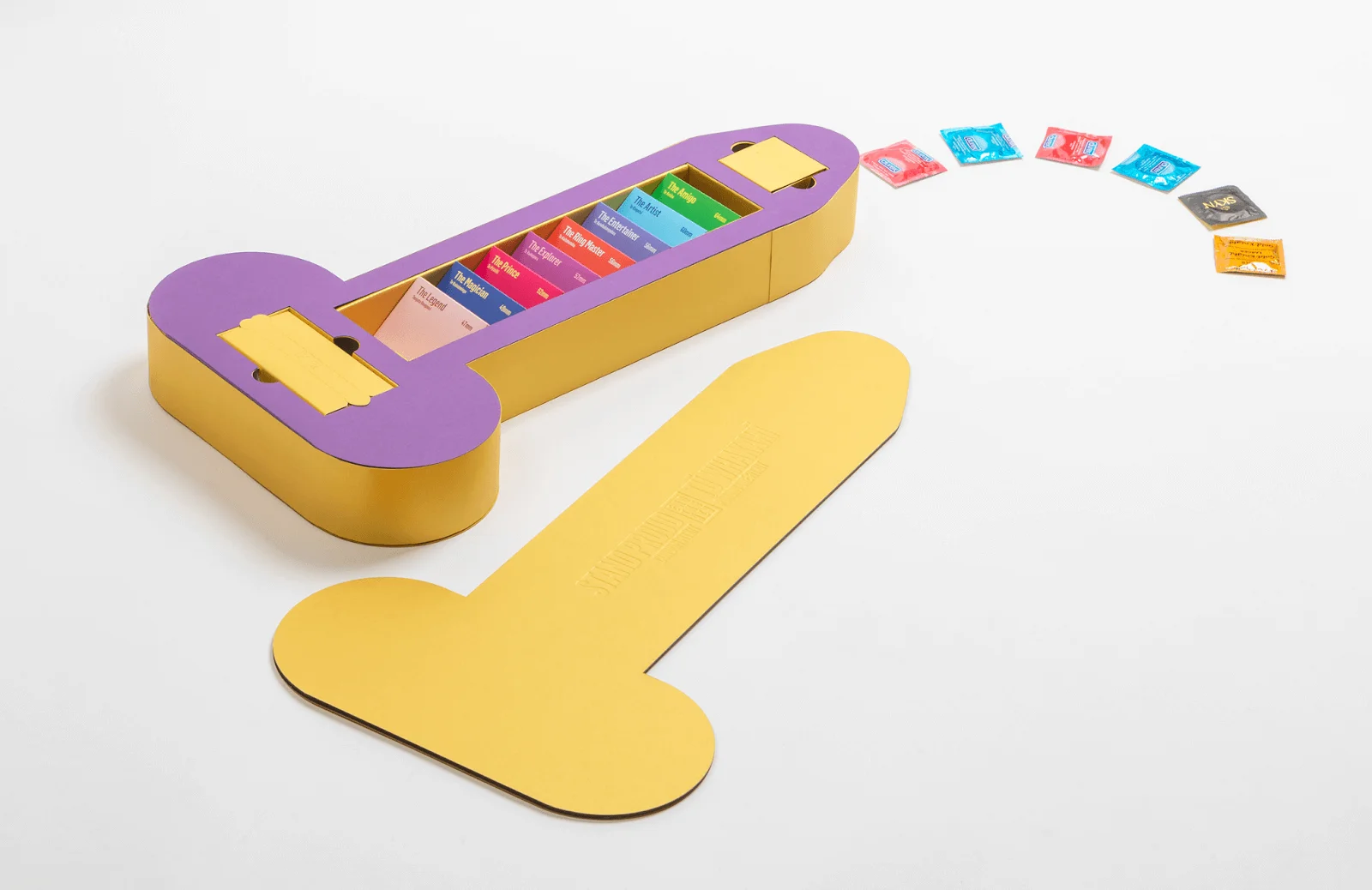
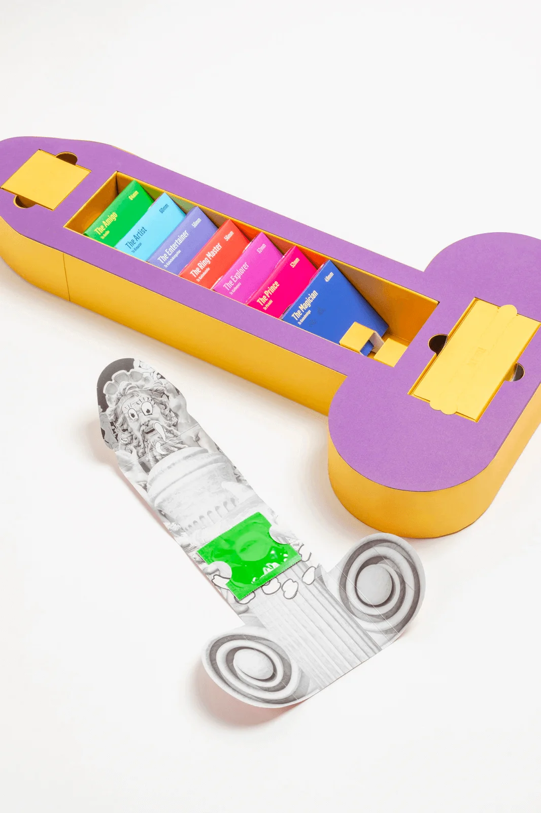
Packaging doesn’t have to conform to a certain mold. In the case of The Condom FitKit, the box is a direct representation of the product.
Source: Think Packaging
A bit of a background: the product is an influencer kit for a campaign by the New Zealand Aids Foundation. It aims to help the audience get the perfect fit, inspired by 25% of people who can’t find properly sized condom.
The designer, Think Packaging, went all out with this packaging, breaking the stigma of hiding anything related to this topic.
The attention to detail is nothing short of impressive, from the box containing the pamphlet to the actual containers of the condom.
Think Inside the Box.
Consider the experience of opening the box.
The internal presentation also affects the overall consumer experience, which can lead to better brand recognition and repeat business.
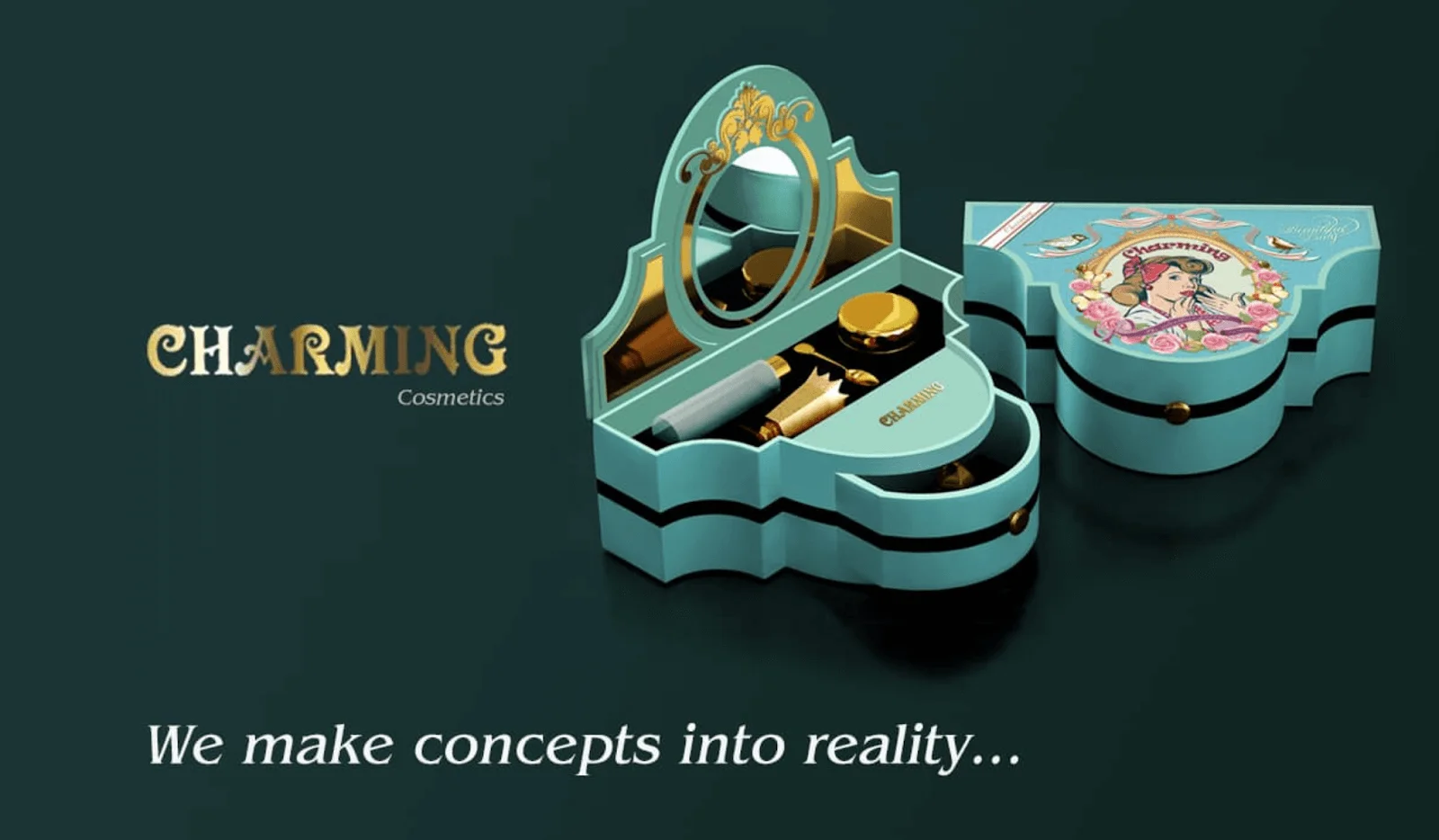
Source: BXL Creative Design
I particularly liked this concept by BXL Creative Design.
The experience of opening a jewelry box is something most women enjoy, so the creative direction here makes sense.
The sight of the package itself is exciting, but what I noticed is the presentation of the product inside it. The ornate mirror elements tie the whole design together.
Showcase Your Brand Identity.
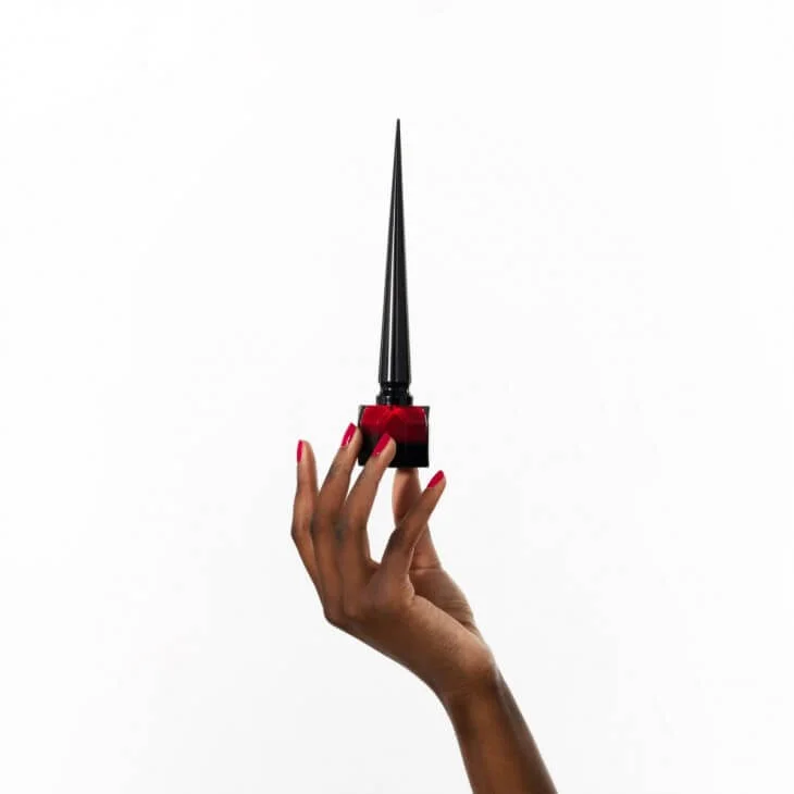
Christian Louboutin is all about luxury, which is why it never fails to showcase this fact in its product packaging designs.
The nail polish bottles are sleek, elegant, and sturdy. Moreover, it replicates the look of pointy heels – the brand’s signature product.
There’s a lesson here, which is to always keep in mind your brand identity when designing the packaging.
Food and Drinks Creative Packaging Design Examples
Break the Mold.
If you want to stand out with a common product, try going beyond the conventional. Here’s an example:
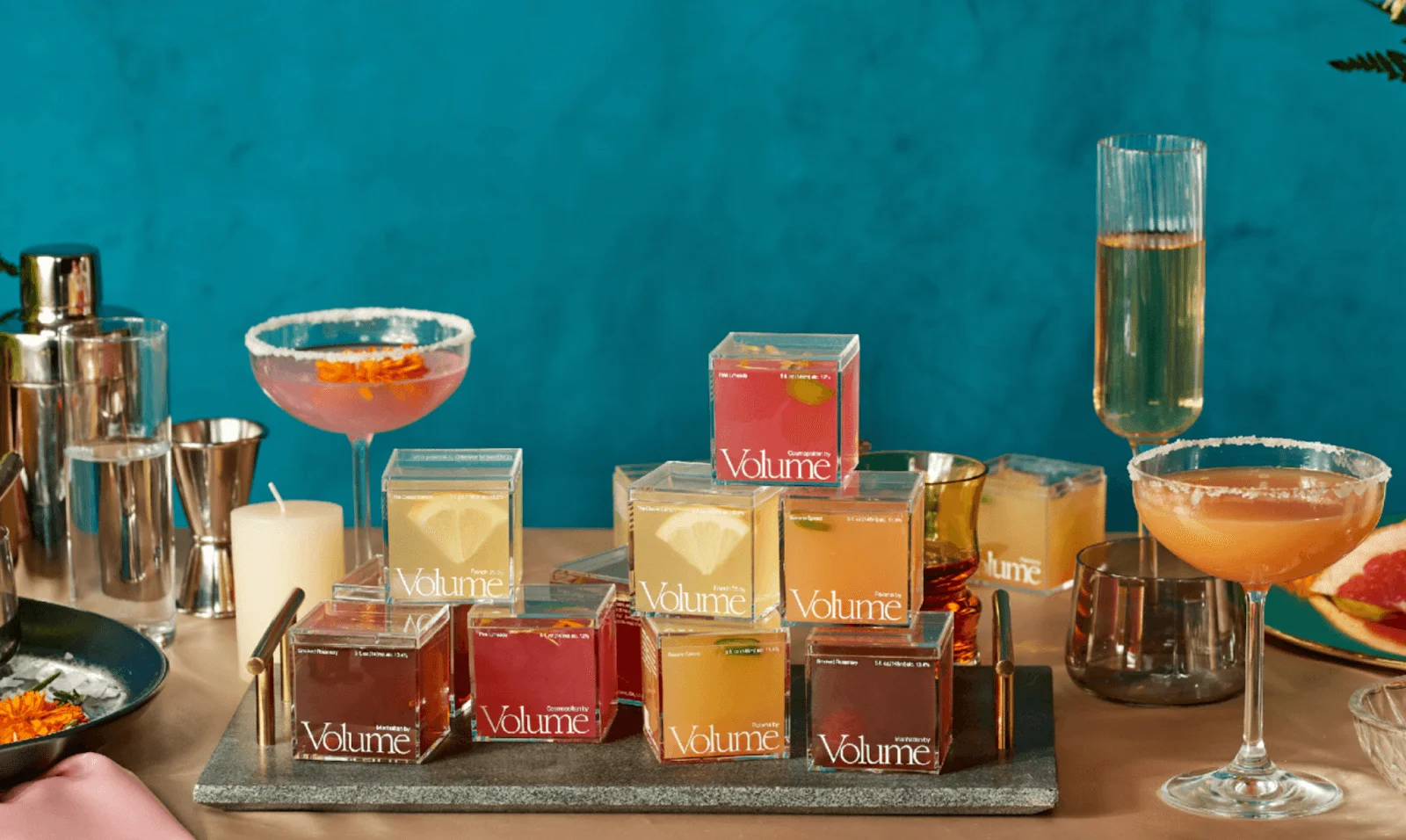
Source: Ching Fa Lung
Volume is a jelly cocktail presented in a cubic form, which is a totally different direction from the usual alcohol bottle designs.
The packaging designers Ching Fa Lung and Yura Park decided on this shape to highlight the product itself. They also strategically placed the serif photography to showcase the vibrant colors.
Be Weird Yet Interesting.
Be as creative as you want. If you think an idea sounds weird, try it anyway. It might just work, like this example.
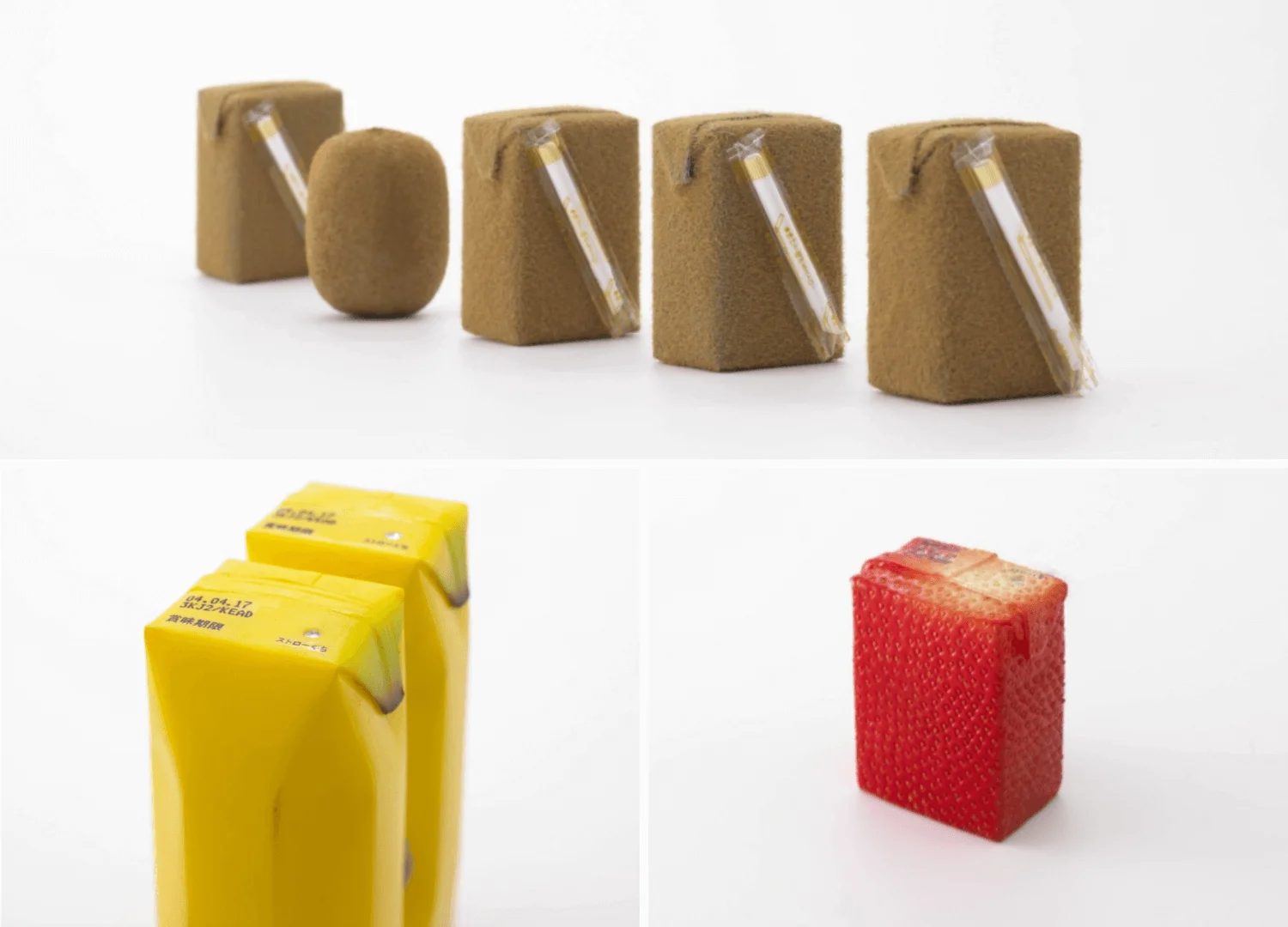
Source: Naoto Fukusawa
If you think juice boxes can’t be interesting enough, this design by Naoto Fujisawa begs to differ.
They’re strange to look at and not something you would expect in a juice box.
However, they communicate two important things: the flavor with just the first glance and the impression you’re drinking straight out of the fruit.
Think Sustainable.
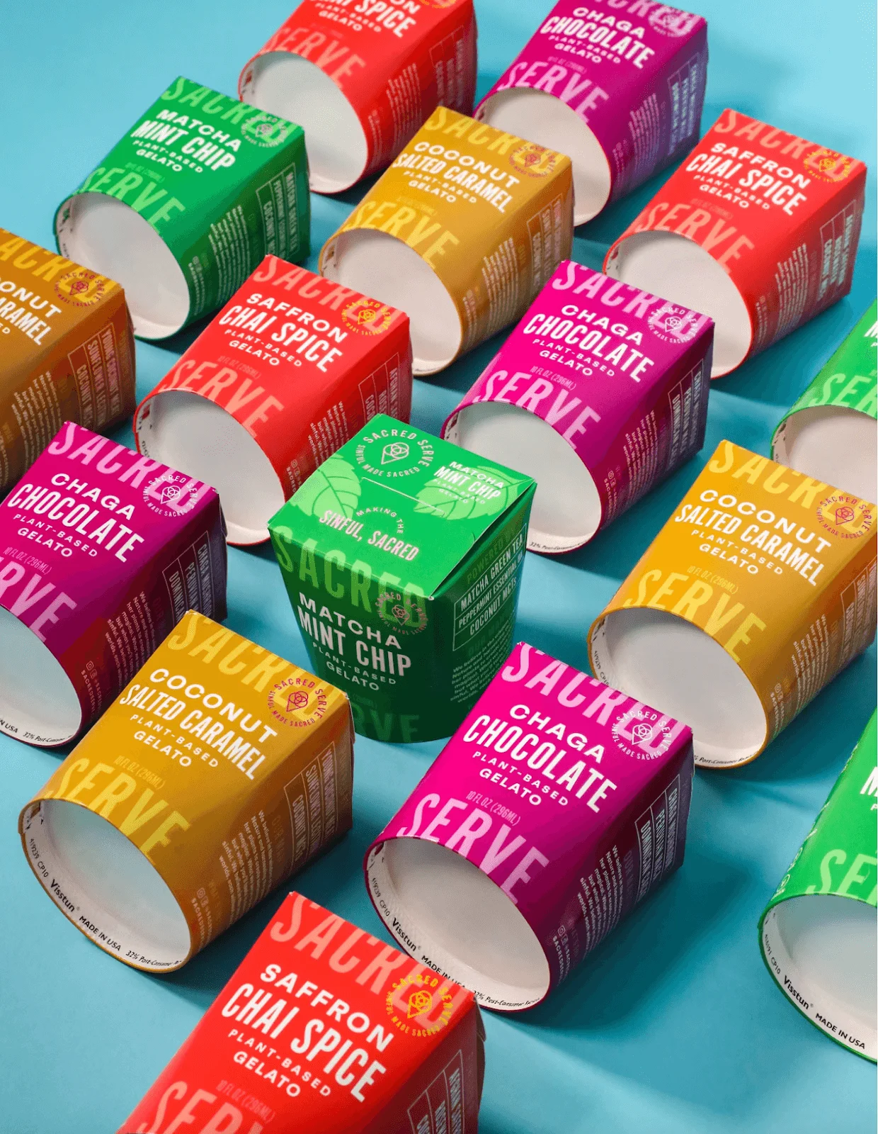
Source: Packaging World
The general public is proactively choosing to support companies with environmentally friendly practices and products with sustainable materials. Around 78% of consumers agree that this cause is important, with 55% willing to pay more for eco-friendly brands.
That said, it’s worth pursuing a packaging design that aligns with consumer interest.
Sacred Serve ice cream is one brand that takes this stance to the heart of their product and packaging. It’s the first and only plant-based pint that 100% compostable, biodegradable, and recyclable.
The brand has since changed its packaging design, but its ice cream still comes in environmentally friendly pints.
Add a Textural Element.
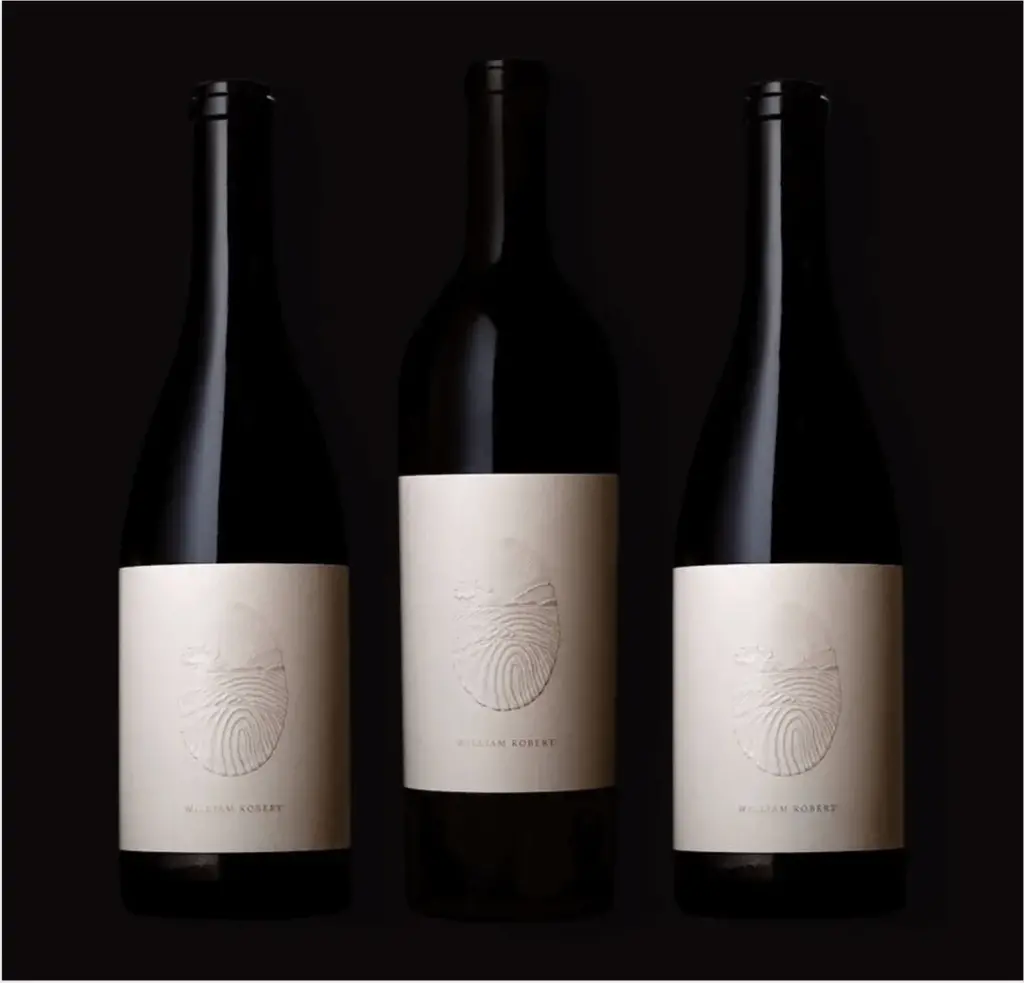
Source: Packaging of the World
William Robert’s design for a wine bottle is simplistic, but that doesn’t mean it’s not striking.
The design only consists of an imagery of a vineyard and the brand name. What sets it apart, however, is the embossed details highlighted by the pearlescent foils.
The texture adds another layer of visual and tactile interest, putting the product in a different league than other wine bottles.
Play With Your Product.
Consider incorporating your product into the design.
The below example is another example of unconventional packaging as it attempts to make a play with something as mundane as spaghetti.
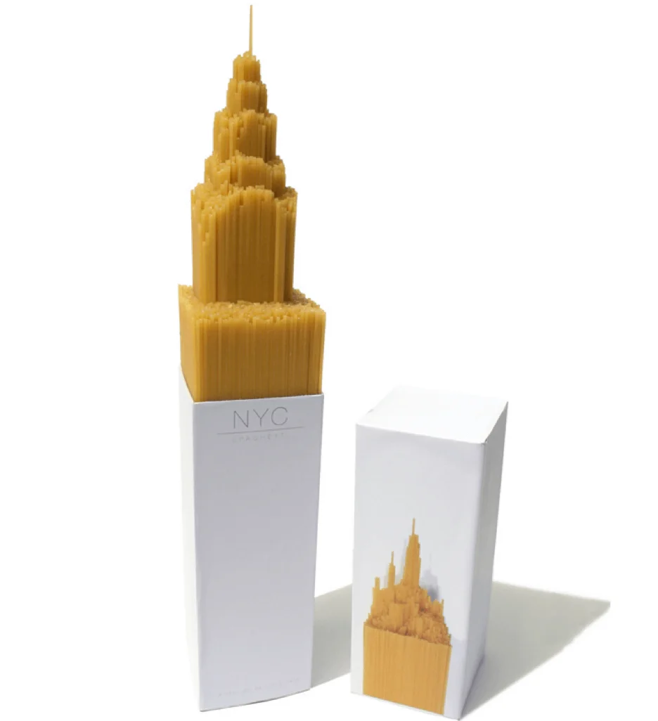
Source: Packaging of the World
Alex Creamer created this design as a university project, aiming to focus on the product rather than making a facade around it.
Shaped like a skyscraper, the NYC spaghetti concept creates a playful impression among consumers. The actual product itself is perfectly capable of catching your attention even if the packaging isn’t out of the ordinary.
Embrace Art.
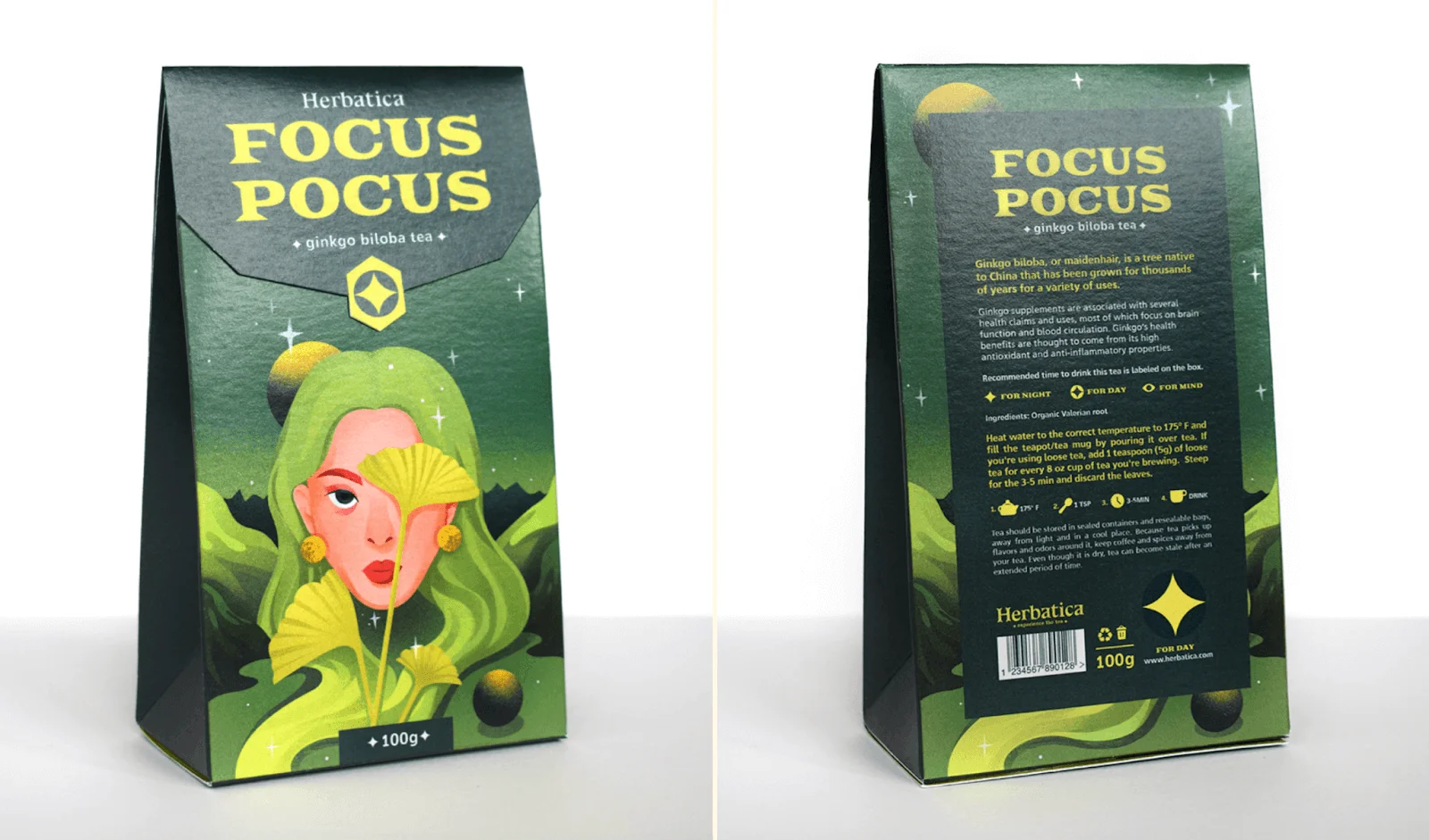
Source: Slaykei
You can also treat your packaging as a canvas for artistic expression. Showcase your brand through striking art that resonates with your target audience.
The designer Slaykei embraced this concept by creating intricate compositions for brands.
As long as you do it right, you can leave a lasting impression on consumers.
Interact with Your Customer.
Foster engagement by incorporating interactive elements into your packaging. This can encourage consumers to actively connect with your product and brand.
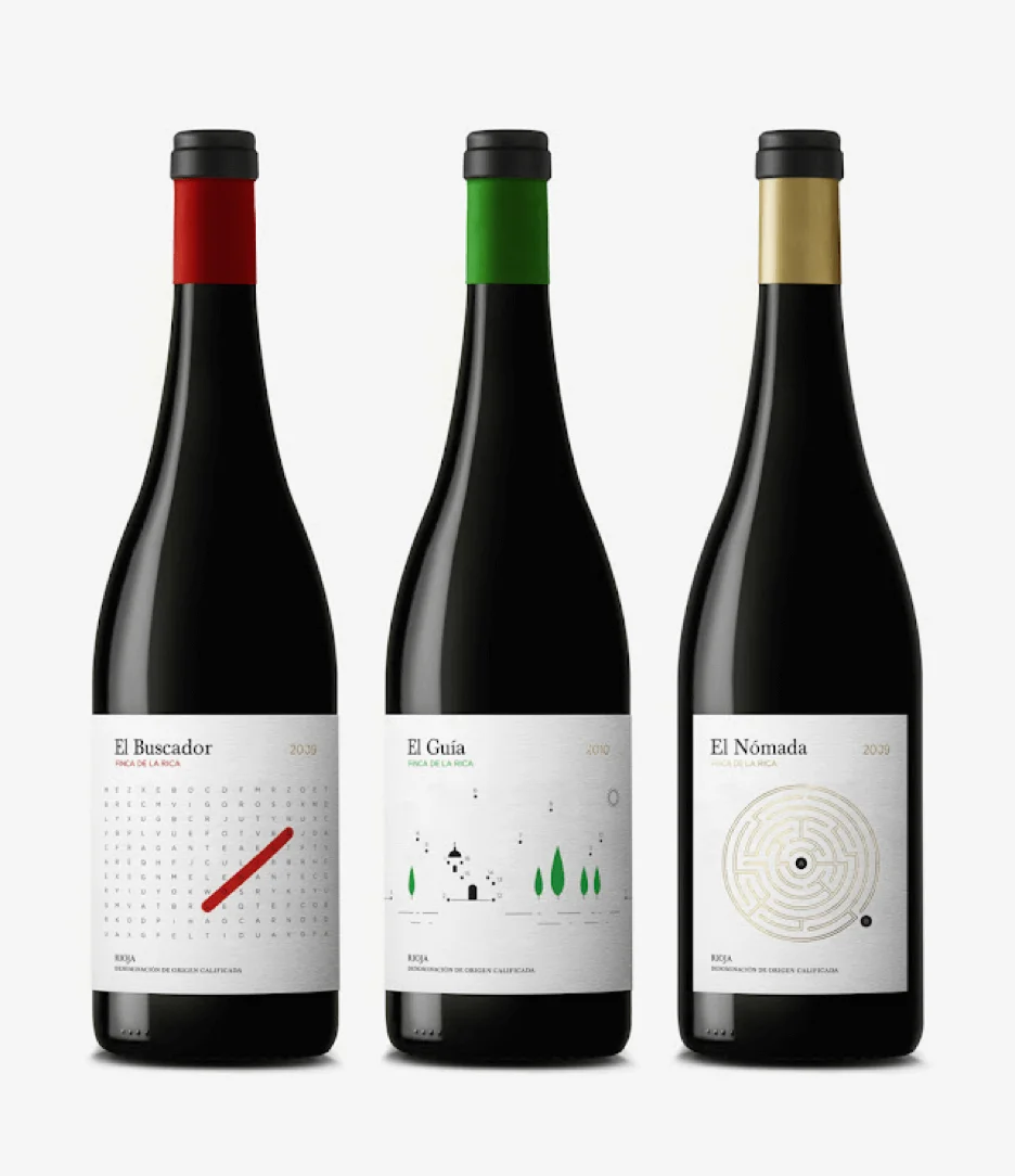
Take this wine bottle that initially looks as simple as a wine bottle can get.
Source: Packaging of the World
However, the label actually allows you to interact with the bottle outside of its intended purpose.
The bottle invites consumers to solve the puzzles while relaxing with a good glass of wine.
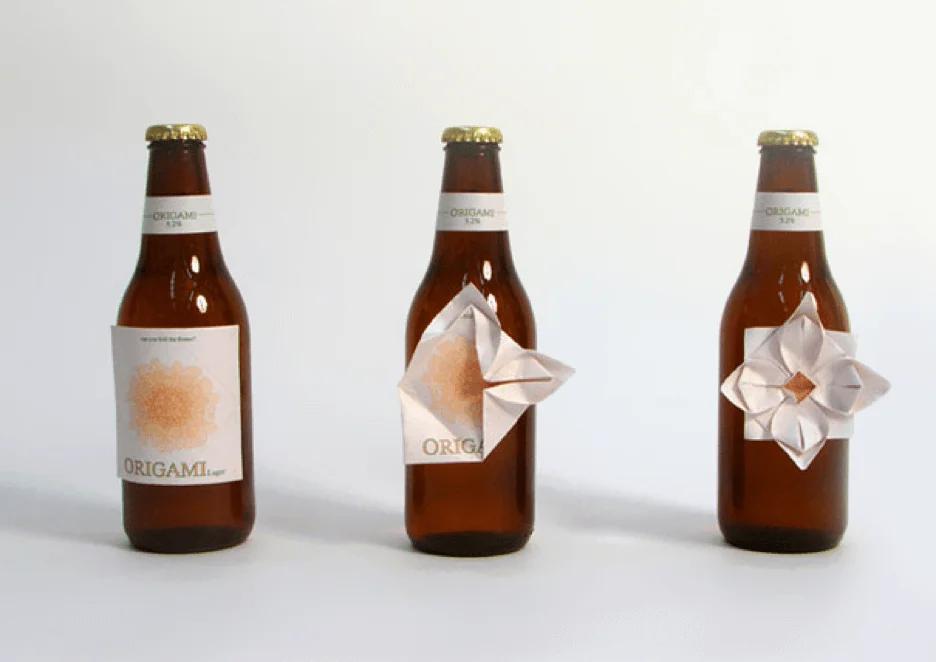
Another example is this Origami beer.
Source: Clara Lindsten
Designed by Clara Lindsten, the label is a piece of paper you can fold into an interesting shape. You can easily remove it, so you can do any design you want.
Create a Different Experience.
Take something common and create an entirely new experience by adding a fun twist.
A brand that does this beautifully is Charm Villa, a creative agency in Taipei. Check out their tea bag design below.
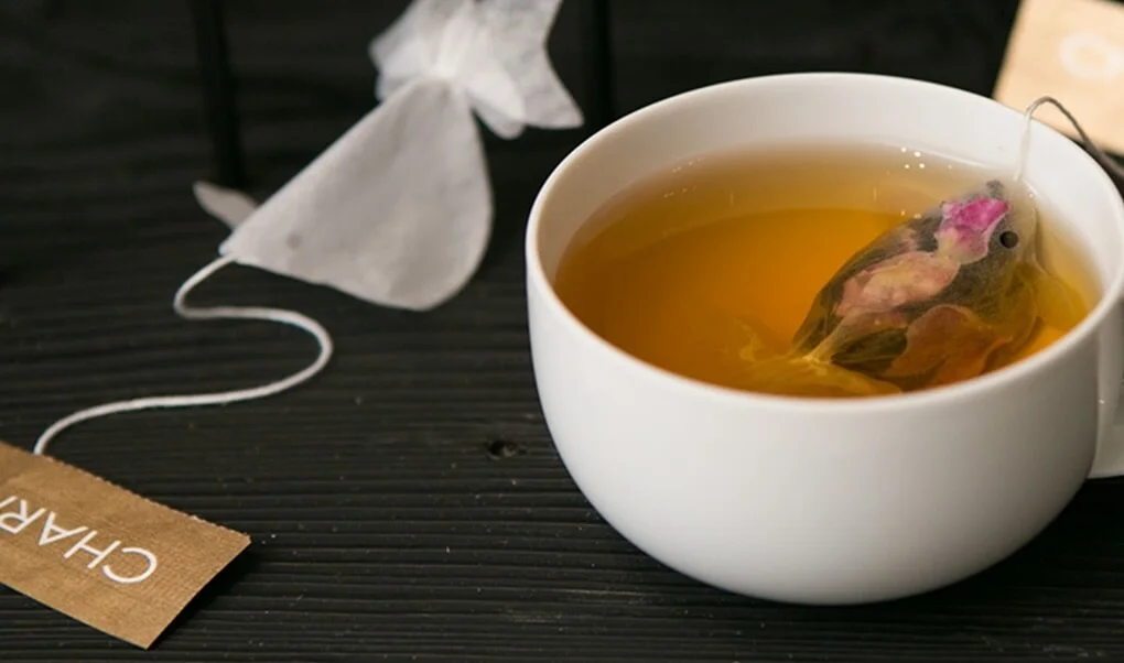
As the tea bag swells up, it turns into a goldfish hanging out in your cup. You can also pull the string to make it look like it’s swimming.
Charm Villa launched the limited edition tea bags in 2015, which saw immediate popularity and a high demand. This goes to show that consumers are willing to pay a higher price for a unique concept (plus high quality product, of course).
Make It Pretty To Look At.
Sometimes, an effective packaging is simply visually appealing.
Terence Kitching, the designer behind this lovely jar of honey, simply incorporated bees into the packaging.
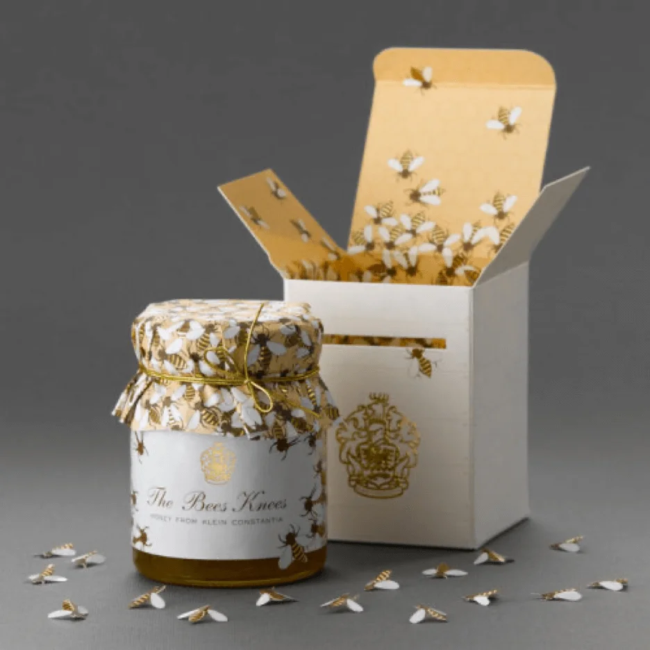
However, the details are what makes it pretty and interesting.
The famous Klein Constantia farm crest is gold-foiled on the front of the box, just below a die-cut slit with a bee entering the box, which is an invitation to open the box.
Once you do, you’ll see a pattern of bees on a honeycomb, and inside each box are small die-cut bees. The package design also has a gold foil to add a touch of detail.
Fun and Cool Packaging Ideas
Don’t Shy Away From Colors.
Using bright and bold colors seems like a cheat code for catching your customer’s attention. On the contrary, this route is a lot more complicated.
Take the G’YA brand of beauty products for example.
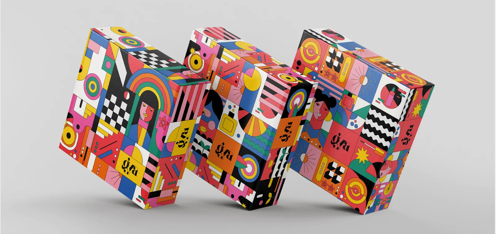
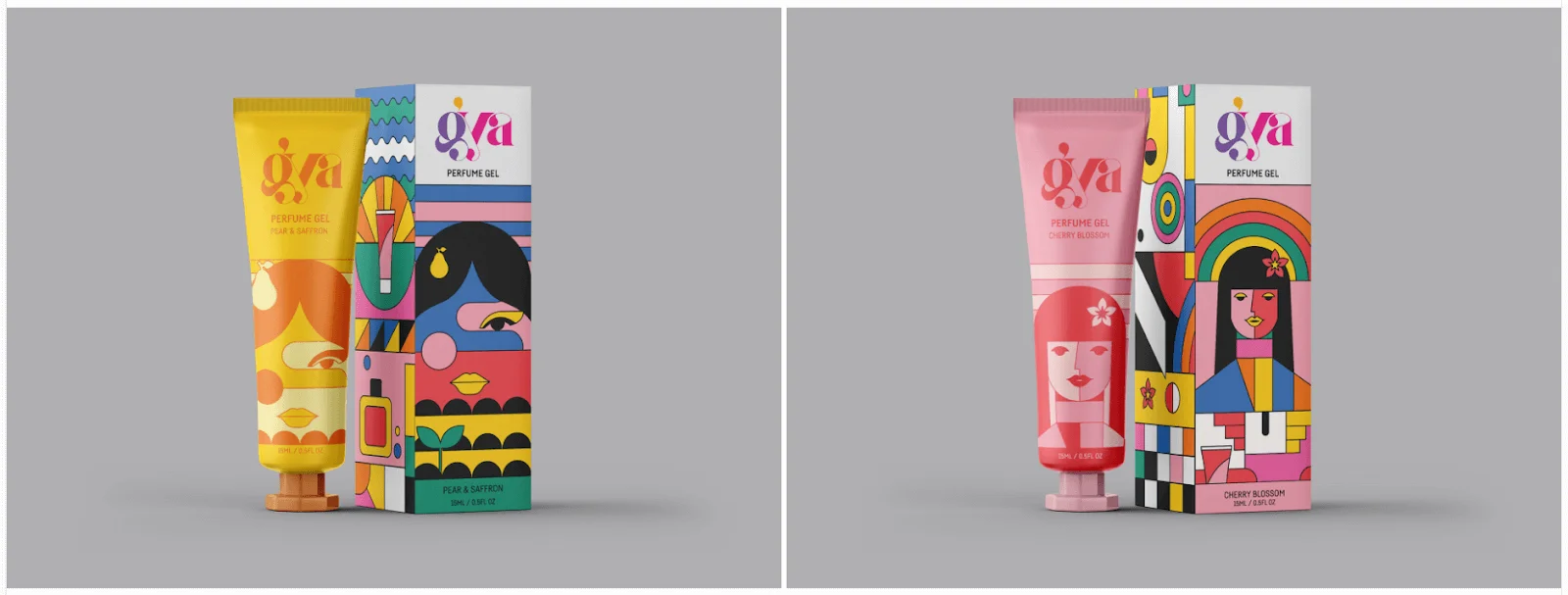
The colorful designs are effective because they appeal to the brand’s target market, which is teenage girls. The varying colors correlate together, ensuring that it’s not only eye-catching but communicates the message across beautifully.
Incorporate Your Product Into the Design.
How about making your product a part of your design?
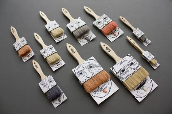
That’s exactly what the designer Simon Laliberté did with his paintbrush packaging concept.
Source: Poilu
He wittingly used the brush, which is usually made of (animal) hair, as the facial hair for the bearded men in the packaging. If you look closely, they even have a small patch of hair under the lower lip.
The attentiveness to detail, simplicity of the packaging, and the humorous look all contribute to this eye-catching design.
Add Some Humor.
Incorporate elements of humor and lightheartedness into your design. Doing so can help create an emotional connection through an enjoyable experience.
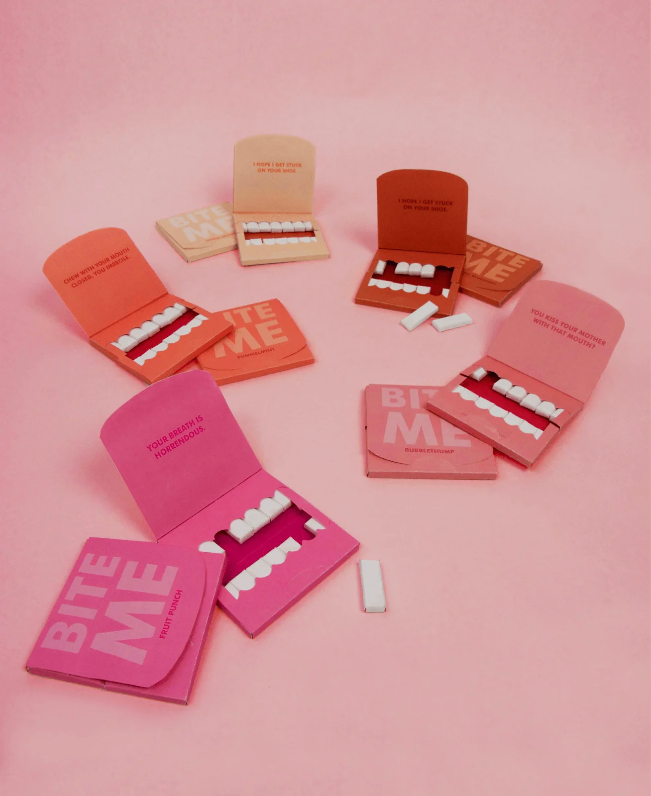
A great example is this pack of gum that pokes fun at the consumer.
Source: Zoe Schneider
Every element of the packaging works together, from each gum forming a set of teeth to the humorous jabs that differ per flavor.
The designer Zoe Schneider successfully created this concept to be shareable, as well. The customers will likely happily share the product that can lead to increased referrals.
Make It Bright.
Utilize vibrant and bold colors to make your packaging visually appealing, standing out on the shelves and attracting consumer attention.
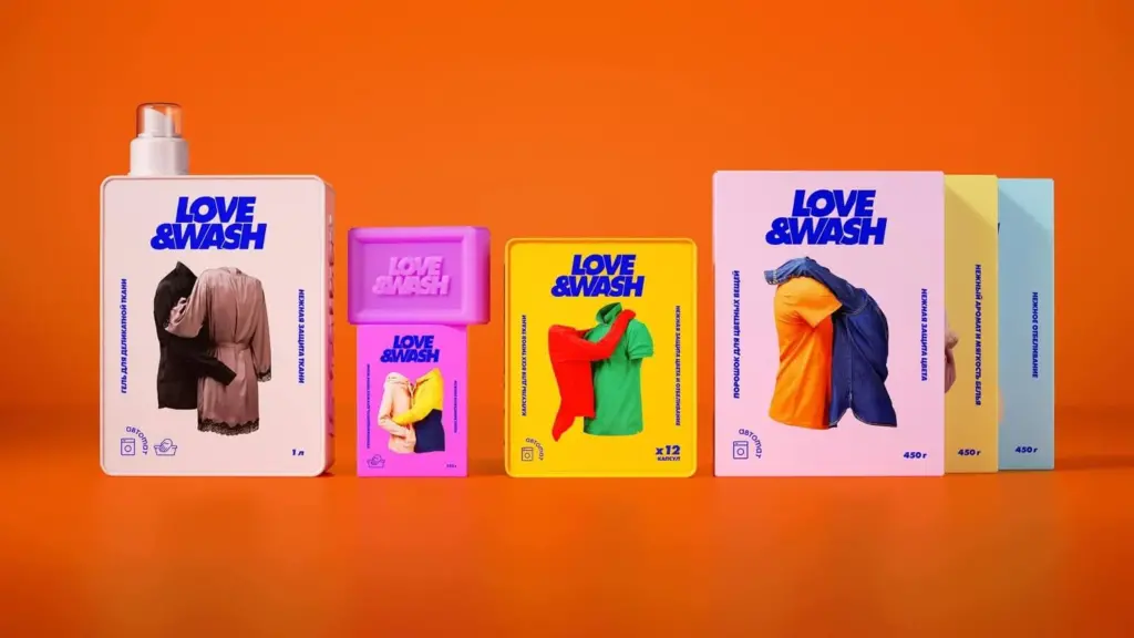
This Love & Wash package concept uses bright colors while keeping it simple.
Source: Packaging of the World
The typography, clothes (the main subject), and the background all use cheery colors. They’re effective in capturing your attention, but they don’t overwhelm to the point you want to grab another product instead.
When you think about it, a bright color palette is perfect for a laundry brand. It communicates the product’s capability of making the clothes’ colors shine.
Pay Attention to Typography.
Sometimes, the typography IS the design.
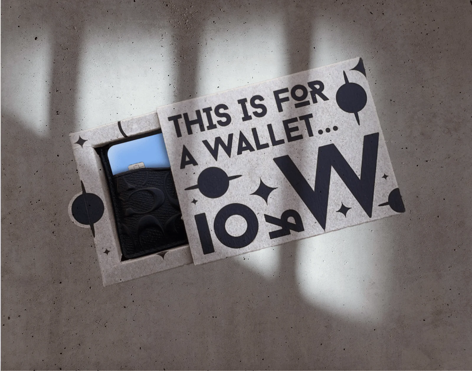
The wallet box concept below by Maria Gutierrez is a good packaging design example, which focuses on the typography rather than intricate graphics.
Source: Maria Gutierrez
However, what also makes this packaging eye-catching is the overall theme.
The idea behind the abstract space-themed wallet came from 90’s retro-futuristic graphics. The designer liked the idea of rich black ink on kraft paper and made it black on cardboard.
Keep with the Current Trends.
Depending on your target audience, you must stay current with design trends and consumer preferences.
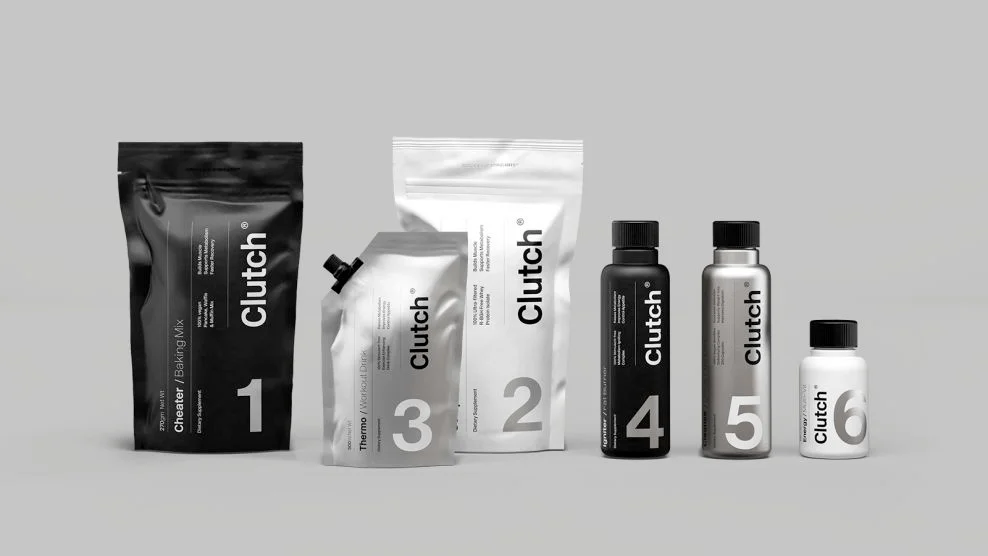
The goal is to remain relevant, and this is what a fitness brand achieved with the minimal design, restricted colors, and large typography.
Most brands of health and fitness supplements have colorful packaging designs—not Clutch Bodyshop.
The packaging takes a modern approach by keeping a monochromatic look with clean lines. It also reflects the science and quality behind manufacturing the supplements, making Clutch an integral part of sports nutrition and fitness.
The huge numbers on the labels aren’t just there for design. They also convey all the necessary information immediately.
Be Whimsy and Fun.
By infusing a sense of playfulness into your packaging, you can create a positive and enjoyable experience for the consumer.
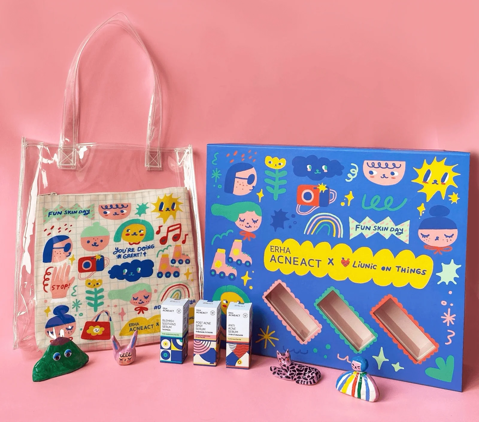
The positive impression can lead your audience into exploring your product and brand further, which Erha Acneact successfully captures with their product below.
Source: Martcellia Liunic
The vivid colors, whimsical animals and girls, and doodle-like style are signatures of the artist Martcellia Liunic.
The style perfectly encapsulates the brand’s message and target audience, making this collaboration a huge success.
Why Is Packaging Design Important?
Packaging design is one of the most critical aspects of product marketing.
It serves as the initial point of contact between a product and the consumer, attempting to make a strong first impression through visual appeal.
However, unique packaging goes beyond aesthetics. It’s also an important factor in the following elements:
- Brand identity
- Product information
- Protection during transit and storage
Moreover, packaging with a great design fosters an emotional connection between the consumer and your product.
For example, user-friendly packaging leads to a positive consumer experience, while environmentally friendly designs align with the growing preferences for sustainability.
In essence, packaging is a tool that influences the customer’s perceptions and decisions, contributing to your product’s overall success.
The Bottom Line
As I explored in this article, a good design thrives on creativity and innovation.
Don’t hesitate to push the boundaries of your imagination, as it’s often the unique and creative packaging solutions that leave a long-lasting impression on consumers. You can draw inspiration from my examples above, and learn more about small business packaging ideas.
However, ensure you don’t lose sight of the practical aspects, namely: product protection, function, user-friendliness, and regulatory compliance.
As I always tell my clients, feel free to explore and adapt to set yourselves apart from competition while creating an emotional connection with your target audience.

