Is your product in need of a solid sales boost?
Or maybe you are looking for ways to give your top-selling product an edge over the competition?
Adding Enhanced Brand Content (also called A+ Content) can be the key to boosting your product’s visibility, conversation rates, and sales numbers!
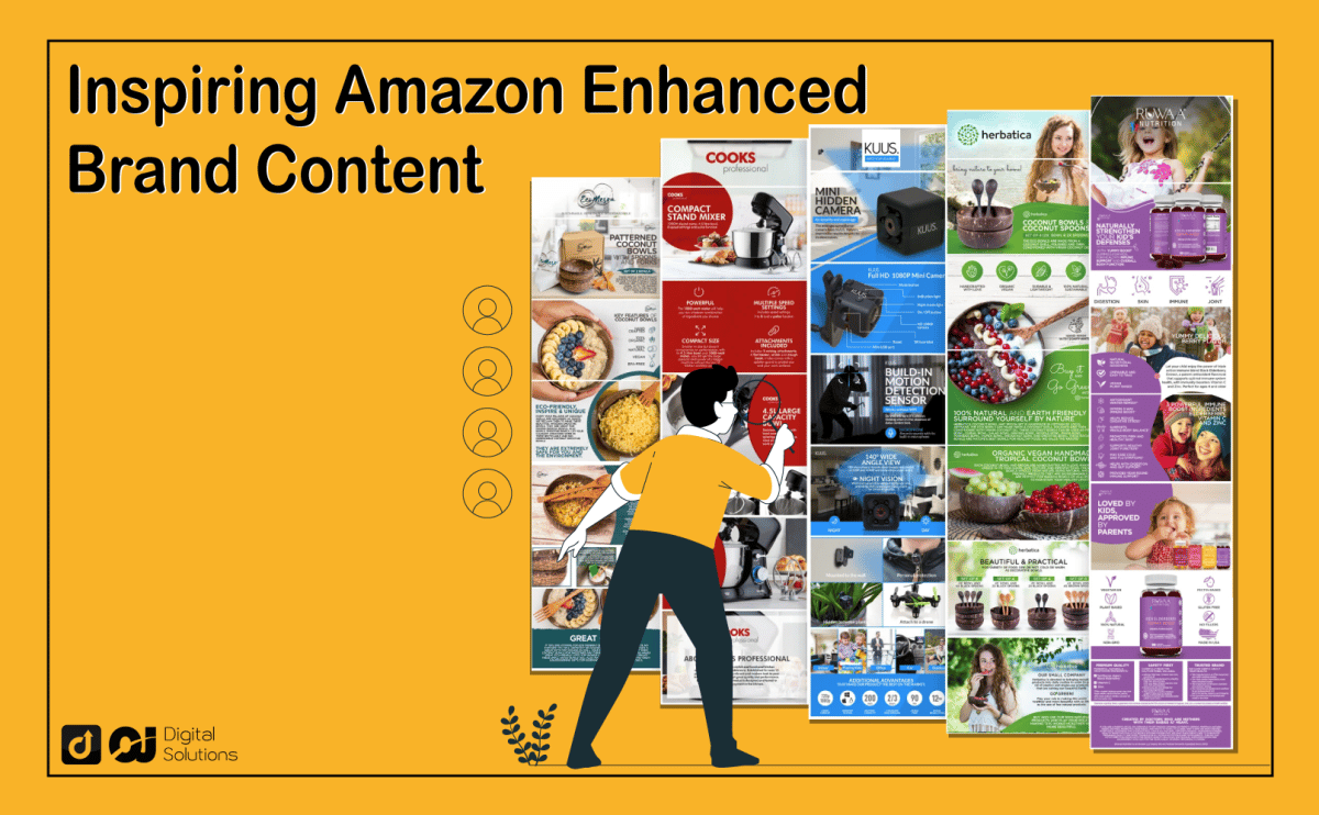
We have scoured through countless Amazon product listings with Enhanced Brand Content and picked out 107 that instantly caught our eye – giving you a variety of online shopping pages to get some creative inspiration.
In this article, you will see various Amazon Enhanced Brand Content examples that use eye-catching design layouts, color schemes, comparison charts, and infographic image designs.
Browse through our list to stir up your creativity and gain inspiration for creating your own Amazon Enhanced Brand Content in no time!
How Can Amazon Enhanced Brand Content Give You an Edge Over Competitors?
As soon as potential customers open your product listings, you only have a few seconds to catch their attention.
What you want is to make them stay on your page to eventually make them purchase your product.
Simply featuring large blocks of text or plain-looking photos in your product listings will shoo away your customers instead of keeping them fascinated.
This is where Amazon Enhanced Brand Content comes in.
As one of the perks of Amazon Brand Registry, creating Amazon Enhanced Brand Content is completely free of charge (but more on that later on).
Amazon Enhanced Brand Content (EBC) makes it easier for you to keep your audience engaged through the use of bullet points, enhanced images, eye-catching banners, and even videos.
Enhanced Brand Content is also an excellent opportunity to build brand awareness, feature product storytelling, and connect with your clients emotionally all at the same time.
After getting approved on Amazon’s Brand Registry, you may now start to create Enhanced Brand Content on your Seller Central account for your amazon product listing.
Seller Central features a few modules and custom templates for you to use for your Enhanced Brand Content page.
But these may not be enough if you want to create a unique and engaging e-commerce store.
List Of Amazon A+ Page Examples By Product Category
To make it easier for you to have some good ideas, I’ve grouped different examples of A+ content by category.
Let’s get started:
Fitness & Outdoors
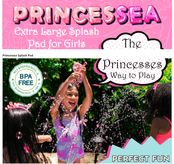
Princessea Emma Outdoor Splash Pad for Kids
A fun product calls for a fun Enhanced Brand Content layout!
Match the playfulness of your product with a dynamic assortment of lively photographs that showcase just how much joy your product brings to your target audience!
Think vibrant colors, hip graphic icons, and lots of smiles!
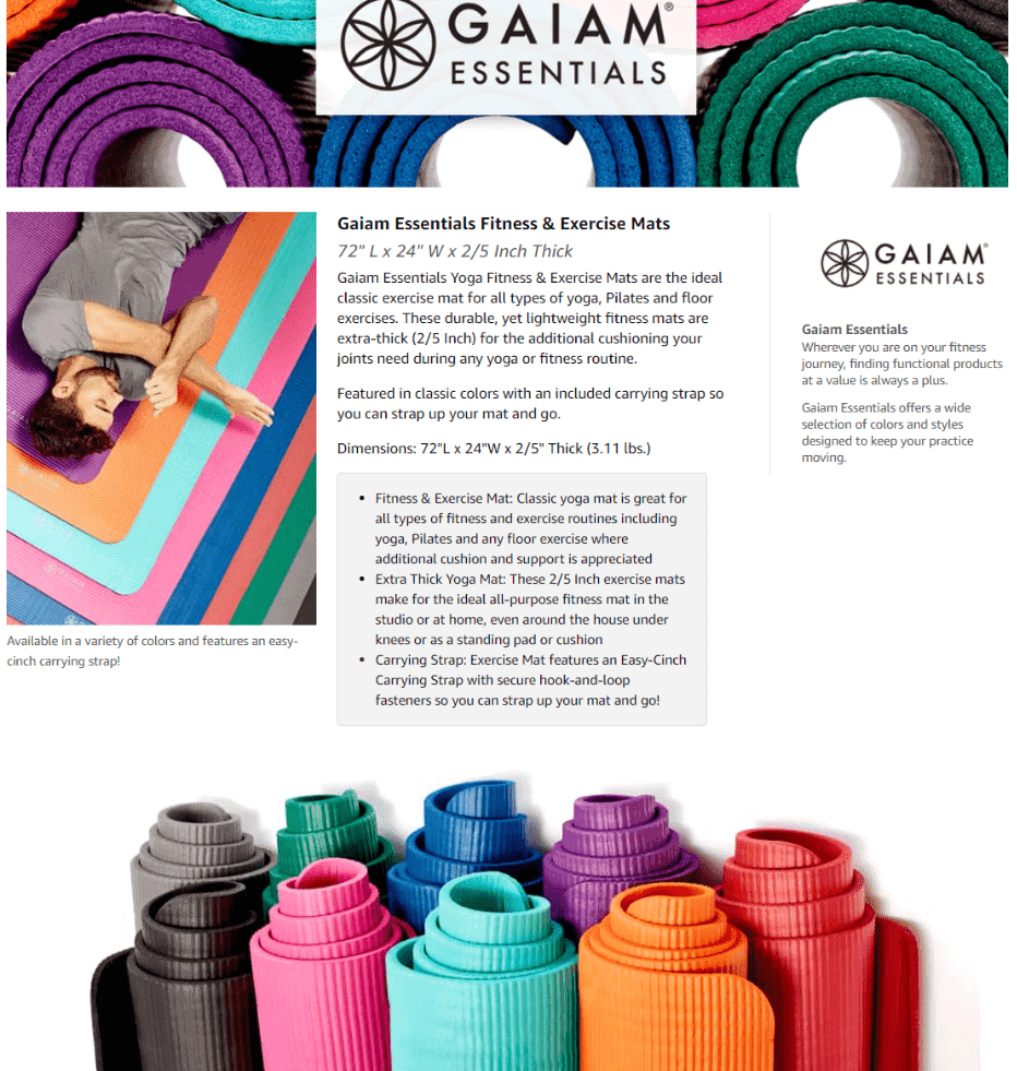
Gaiam Essentials Thick Yoga Mat Fitness & Exercise
Got a product that promotes relaxation?
A clean, professional-looking layout would work best for your Enhanced Brand Content. Think neutral or muted backgrounds and color palettes that will let the colors of your product shine through.
Giotto Motivational Water Bottle
Know what doesn’t need a dull layout?
A hip and cool water bottle! Make sure that the color palette you use for your product doesn’t clash with the actual product itself.
The combination of pink and purple here is perfect for highlighting the way the product comes in an attractive gradient shade.

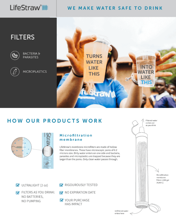
LifeStraw Personal Water Filter
When a product makes an impact, that impact must be represented in your Enhanced Brand Content through photos.
It’s hard for customers to get a good grasp of how a certain product helps a community. This is where a good selection of photos will help!
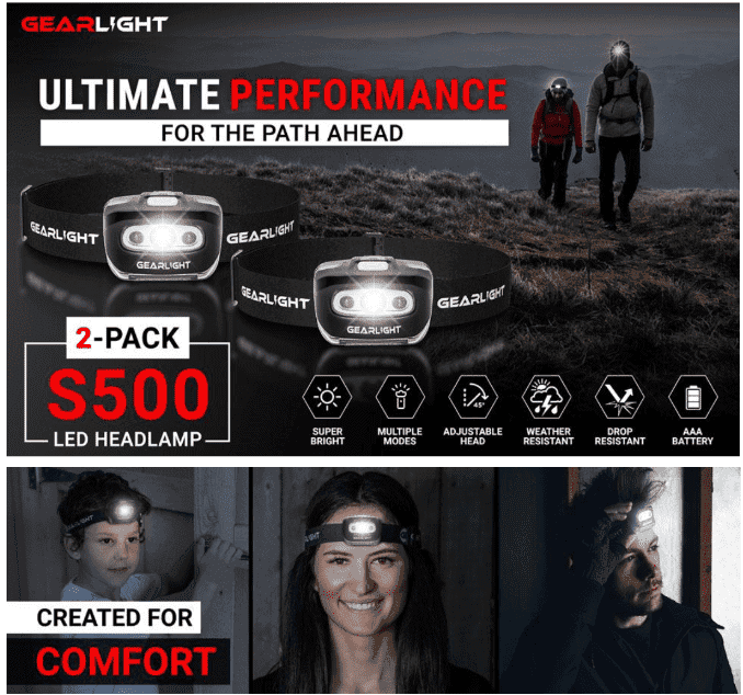
GearLight LED Head Lamp Flashlight
It’s never enough to give a customer a boring list of product specs.
Because you can select photos that will go in your Amazon Enhanced Brand Content, you’re free to demonstrate the features and benefits of your product and clearly show how and where your product can be used!
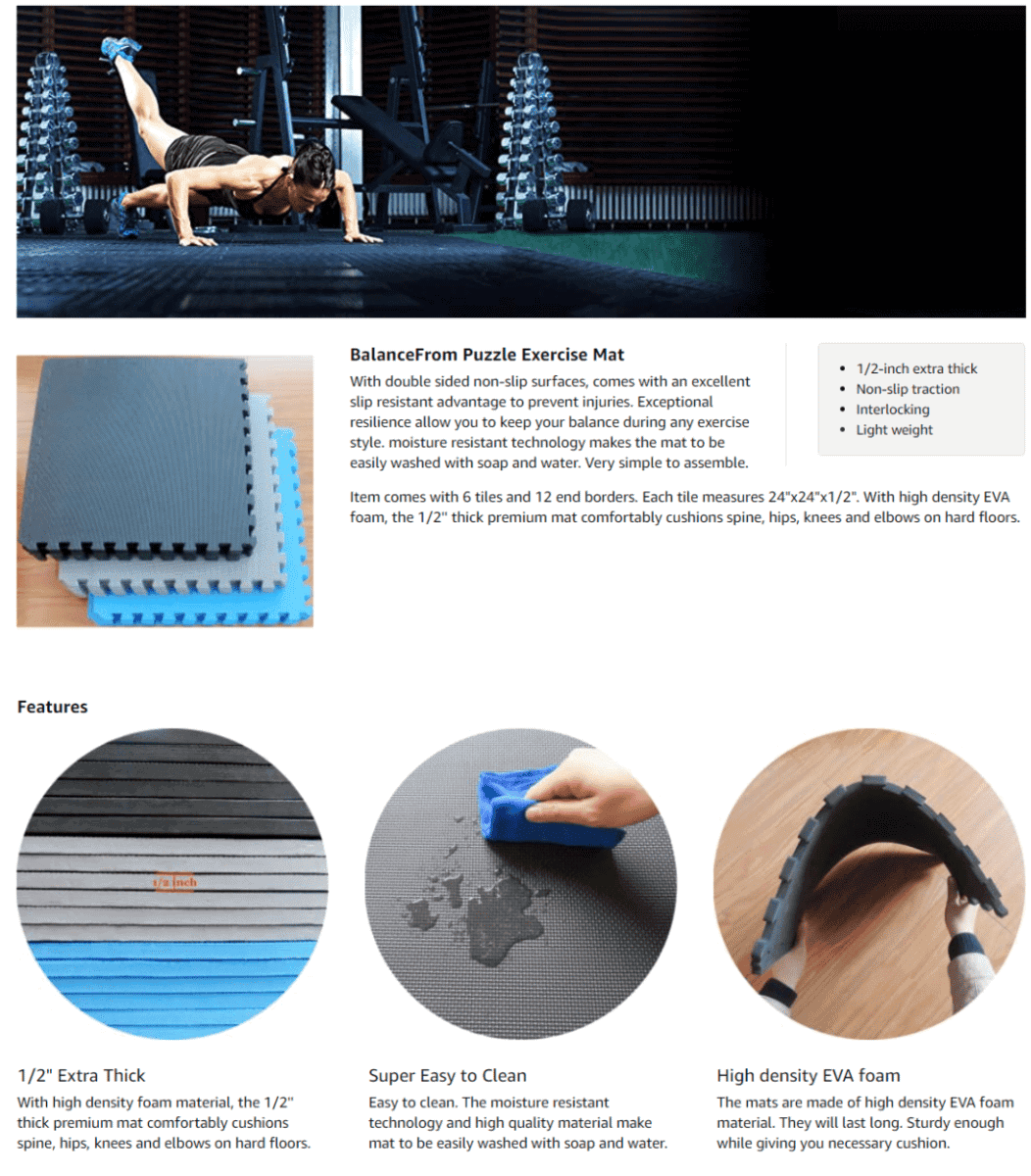
BalanceFrom Puzzle Exercise Mat
Let’s say you want to highlight the durability of the material used in your product.
This is more interesting to a customer than you might think! So feel free to add close up diagrams or informative photos that give people a very close look at what your product is made of.
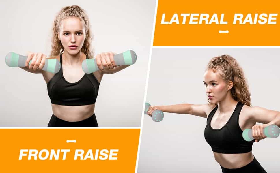
Gruper Adjustable Dumbbells
Customers should be able to visualize themselves using your product.
What better way than to produce photos of your item being used by actual people?
This way, customers will be better able to put themselves in the shoes of someone enjoying your product.
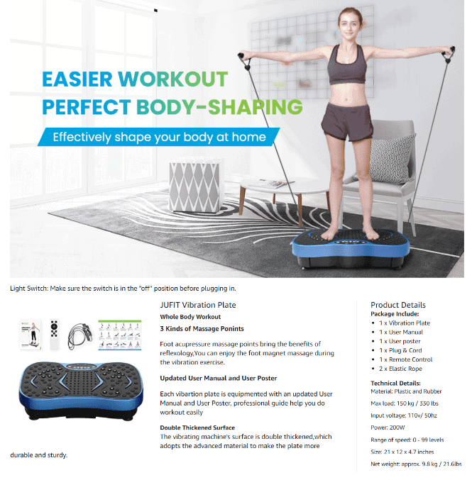
JUFIT Fitness Vibration Plate Exercise
It’s all about balance. Your Amazon Enhanced Brand Content should be as informative as it is descriptive!
Make sure all the necessary information is there, presented in an easily digestible manner.
Think tables or infographics. But don’t leave out photos of your product while in use.
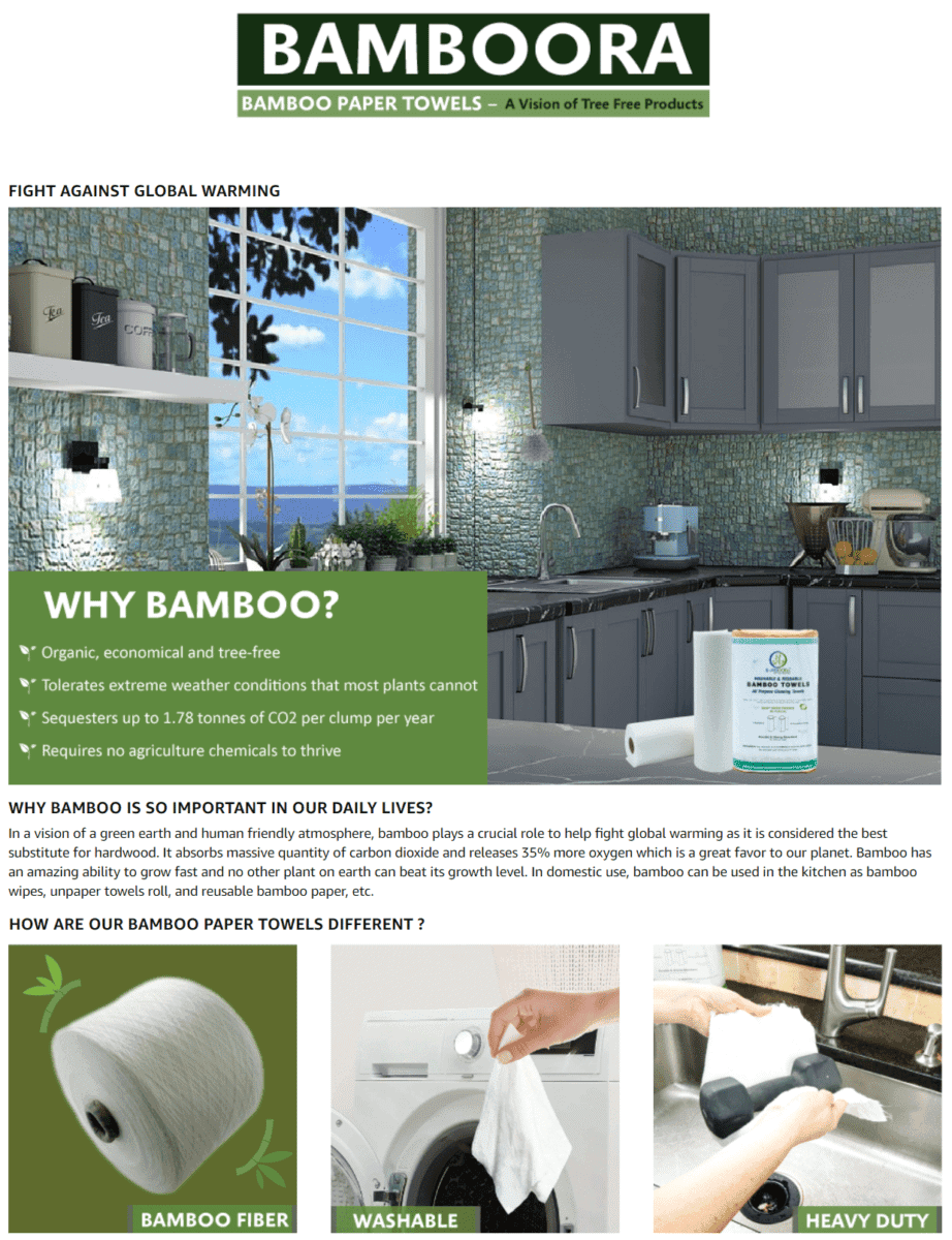
Bamboora Reusable Bamboo Paper Towels
Everybody loves products that care for the environment.
Make sure to highlight how your products promote sustainability, and how they serve as eco-friendly alternatives.
Using green as the primary color theme in your A+ layout also helps!
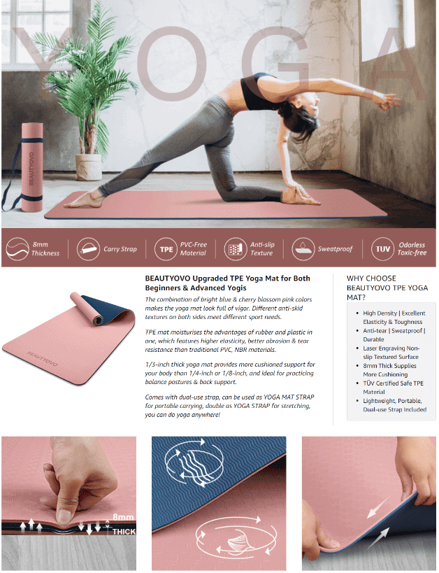
Beautyovo Yoga Mat with Strap
We love how this brand’s Enhanced Brand Content starts off with a large lifestyle image of their yoga mat being used by a woman in a relaxing setting.
Smaller tile images further highlight the durability, size, texture, and cushioning effects of their product.
Also, notice how their color scheme mostly features cherry pink shades and navy blue hues to match their mat’s tones.
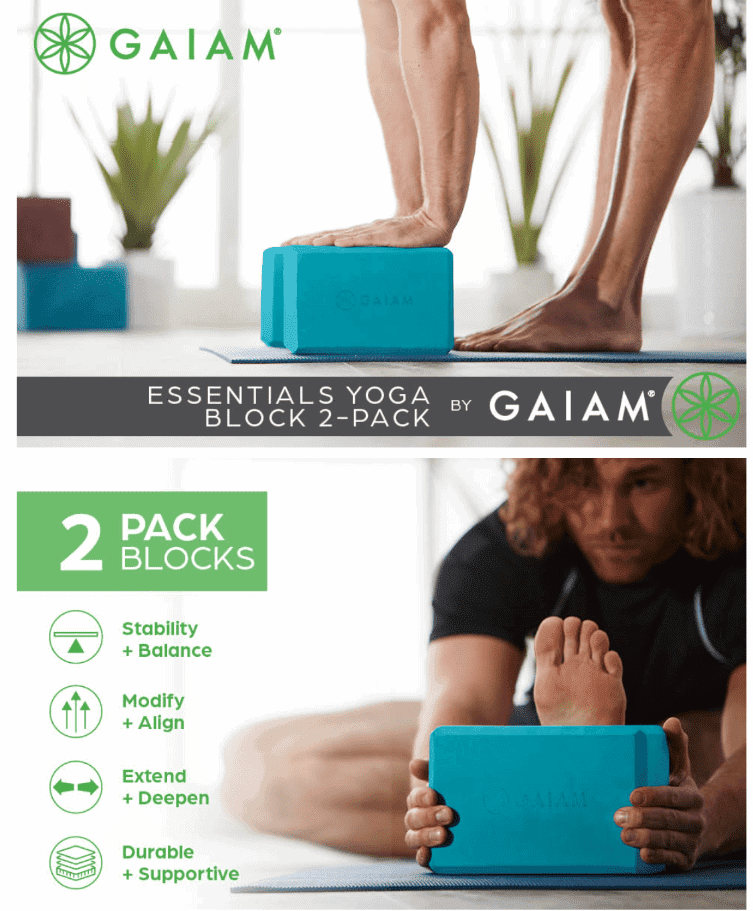
Gaiam Essentials Yoga Block
Use images that show people using your product, while making sure that your product stays on the foreground most of the time.
Don’t forget to pair your images with informative text to highlight your product features, benefits, and freebies, too!
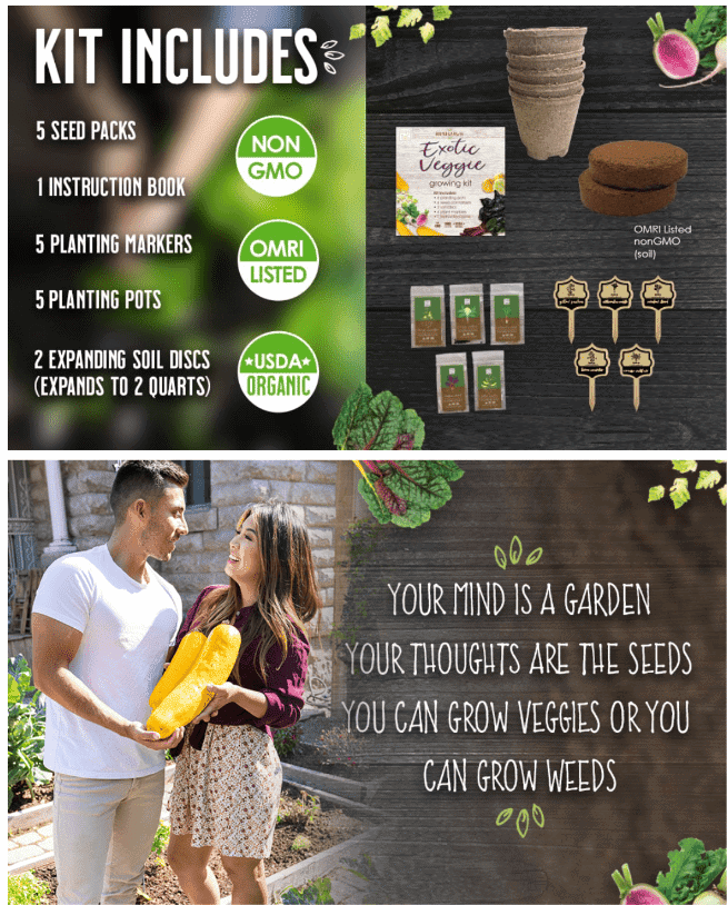
Hapinest Exotic Vegetable Indoor Garden Seed Starter Growing Kit
Clearly enumerate everything that your customers get when they purchase your product.
Adding an inspirational quote also adds a casual and warm tone to your Enhanced Brand Content page.
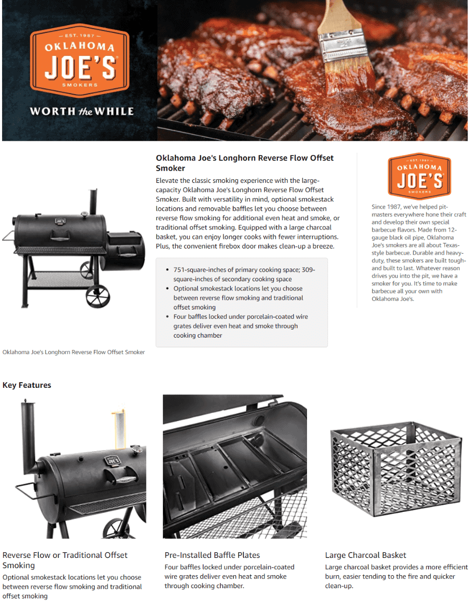
Oklahoma Joe’s Longhorn Reverse Flow Smoker
Sometimes, it’s easy to go overboard on adding color and product details to your Enhanced Brand Content section – something that this brand definitely avoided.
They decided to go with black and white tile images of their product for a classic effect. Each image is also paired with short product descriptions composed of 1-2 sentences for easy reading.
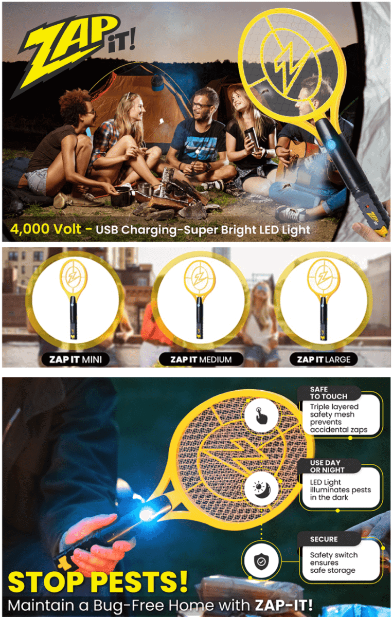
Zap It! Rechargeable Fly Zapper Racket
It’s important to highlight how your product keeps the fun times going.
Notice how they integrated their bug zapper into an image of a group of people having a great time outdoors.
They also added images of their product’s variants, along with a quick run-down of features.
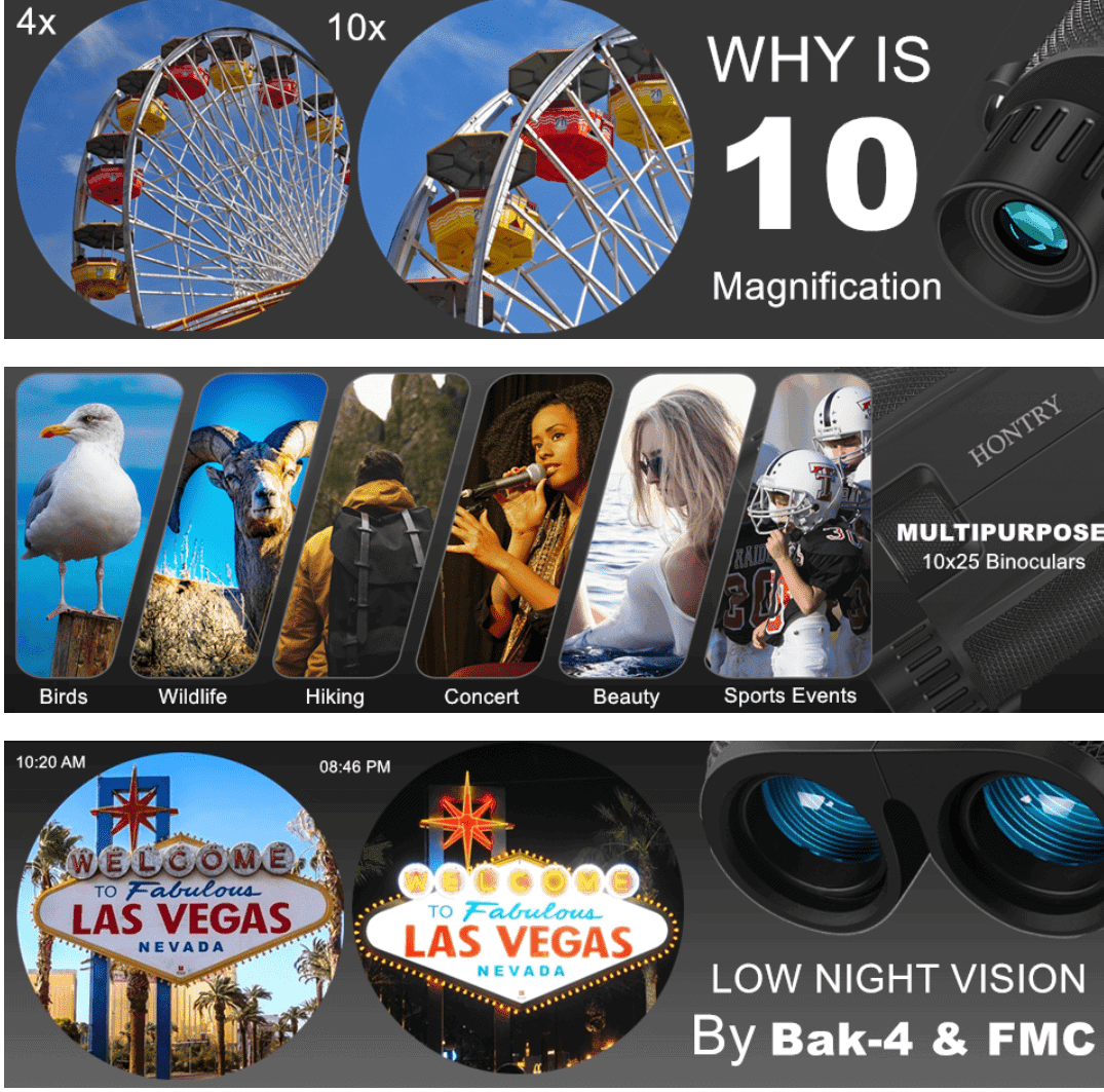
Hontry Binoculars for Adults and Kids
What sets your product apart from others?
Here, we see how the brand shows an image comparison letting you know how their pair of binoculars performs compared to ordinary ones.
They also use closeup images of outdoor scenes as seen through their binoculars.
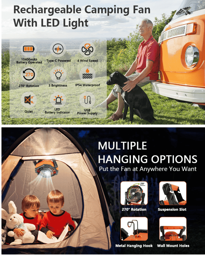
KMENY Rechargeable Tent Fan with Lantern
Is your product designed specifically for outdoor use?
By all means, make use of lifestyle images that show how your product is useful for outdoor trips and adventures.
This brand also highlights the many features of their camping fan through trendy icons.
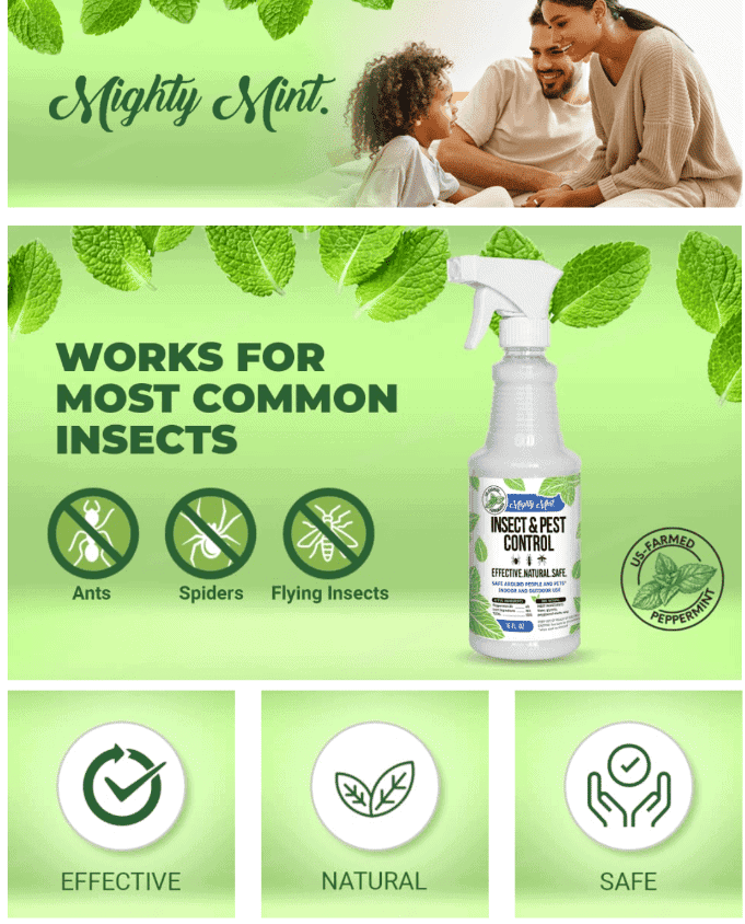
Mighty Mint – Insect and Pest Control
As soon as you visit this product’s Enhanced Brand Content section, you immediately get a sense that it is formulated using natural ingredients – thanks to its mint green-themed layout.
If you are offering pest control products, make sure to highlight what type of pests your formula is effective against.
Pets
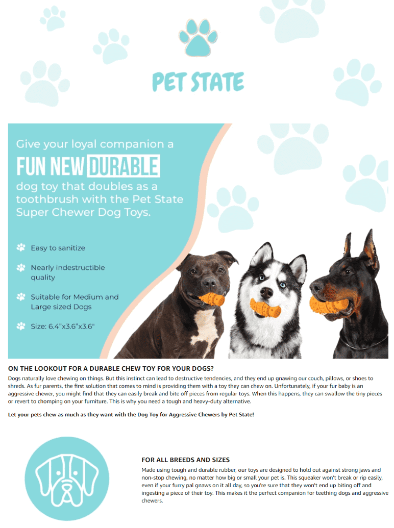
Pet State Dog Toy for Aggressive Chewers
What better way to market your product than by showing images of it being used by adorable doggies?
Paw prints, light colors, and benefit-driven product descriptions give the A+ section a light-hearted and fun vibe.
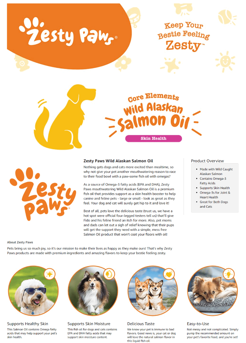
Zesty Paws Pure Wild Alaskan Salmon Oil for Dogs & Cats
Help your customers know about your brand story by featuring an “Our Story” section.
With an abundance of images showing cute dogs, you just feel like their products truly make your furry friends happy and healthy.
Don’t forget to share the benefits of your product through a few select words.
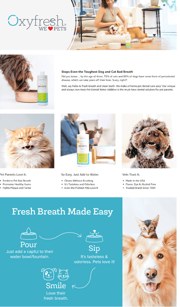
Oxyfresh Premium Pet Dental Care Solution
Looking for a natural solution for freshening the breath of your furry friend?
On this brand’s A+ content section, you are greeted by images of pets happily smiling back at you. They also feature an illustrated image showing how easy it is to use their product.
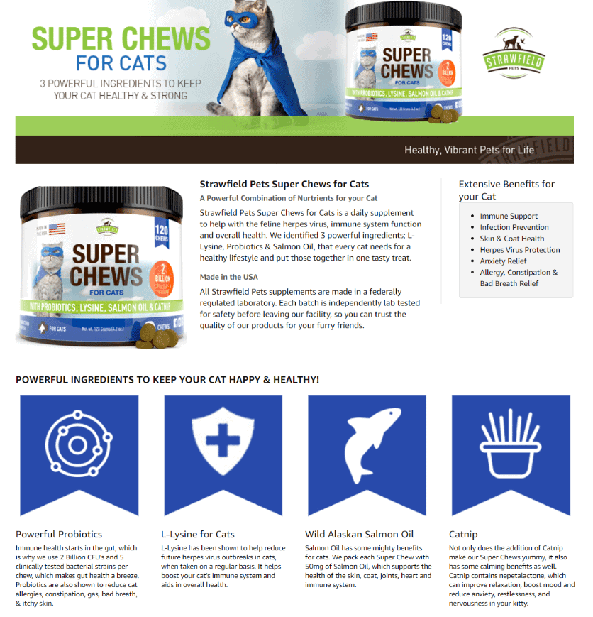
Strawfield Pets Cat Probiotics
Who says your Enhanced Brand Content section needs to look and sound serious at all times?
Featuring an adorable cat wearing a mask and a cape, you can’t help but smile as you read through this brand’s detail page headings.
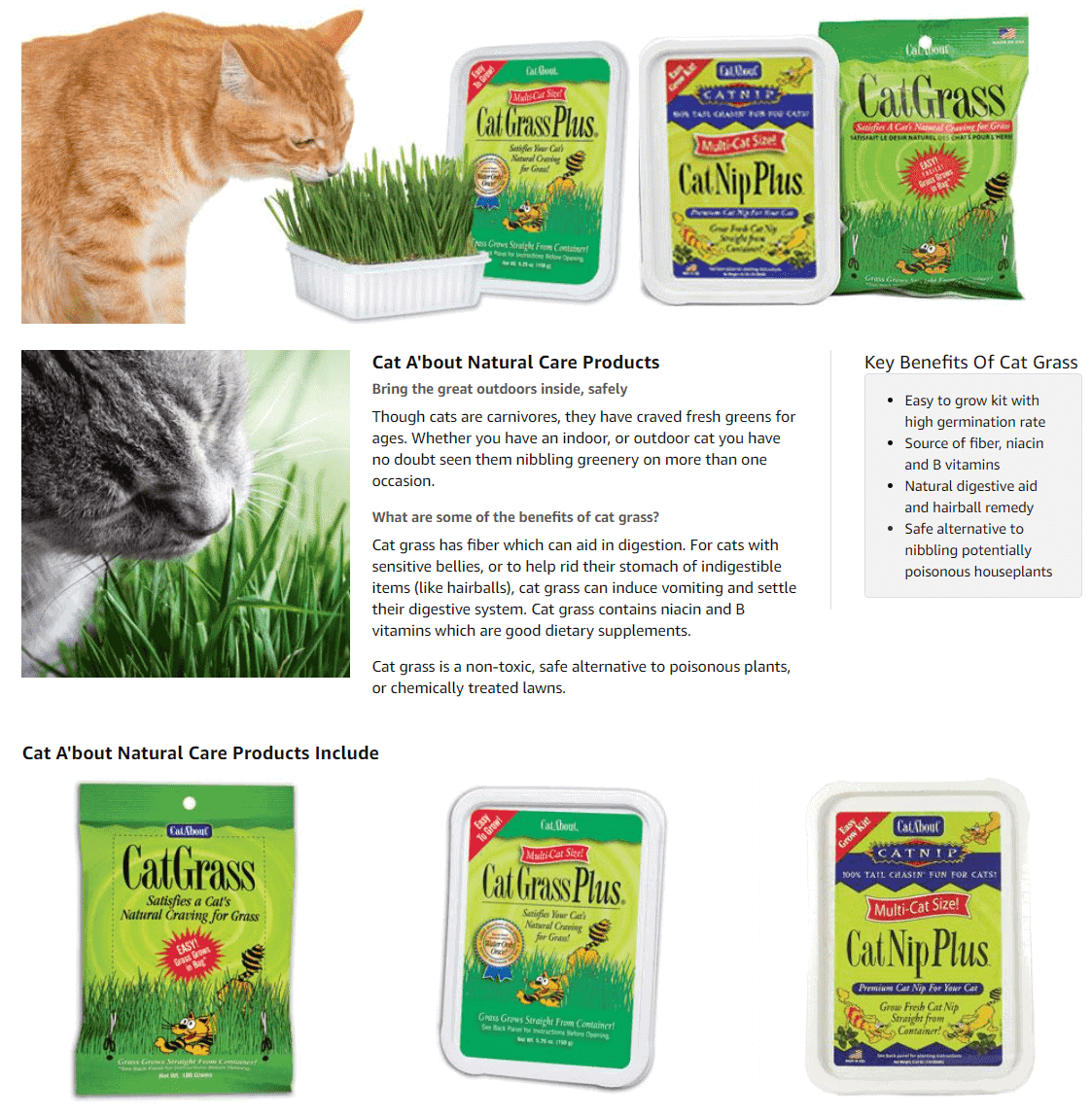
Miracle Care Cat-A’bout Multi-Cat CatGrass Plus Tub
It’s always a good idea to feature large images of your products, paired with pictures showing pets using or consuming them.
You may also want to consider adding photos sent in by your customers on your detail page, showing their furry friends enjoying your products.
Furaland Grass Burn Spot Chews for Dogs
Bright colors, large readable font, and adorable images of dogs – all these look great on any Amazon EBC detail page for pet products.
Don’t forget to highlight how your product only uses natural ingredients that are safe for daily consumption.

Beauty
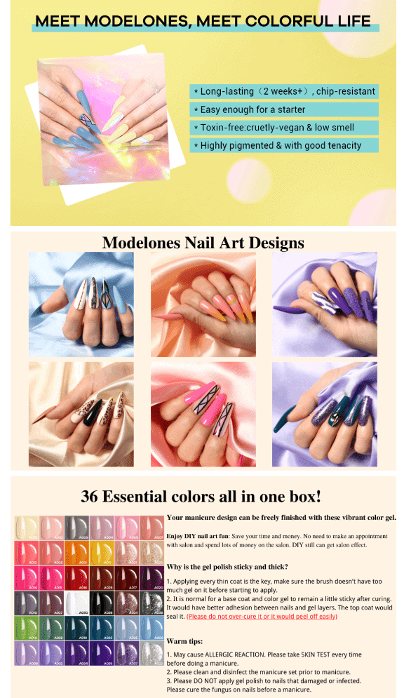
Modelones Gel Nail Polish Set
Color is everything if you offer beauty or cosmetic products.
Notice how this brand’s Amazon EBC section showcases all the different colors of their nail art.
They also add a section on their detail page that features short tips and commonly asked questions.
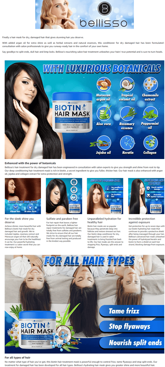
Bellisso Biotin Hair Conditioner Mask
Got a product that promotes the growth of healthy and strong hair?
Make sure to include glamour shots of women flaunting their lustrous locks.
Light colors and bright text work great in making this Amazon EBC section look appealing to the eyes.
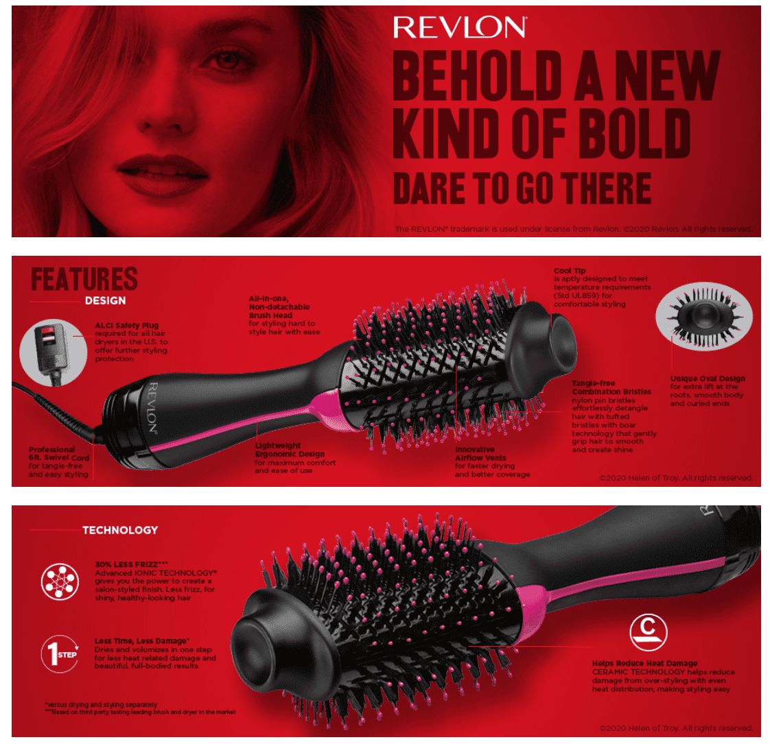
REVLON One-Step Hair Dryer And Volumizer Hot Air Brush
Want your customers to get an up-close look of your product?
Include large, close-up images of your product, and feature its most important components.
Use bold colors and large text to make you’re your a+A+ section stand out even more.
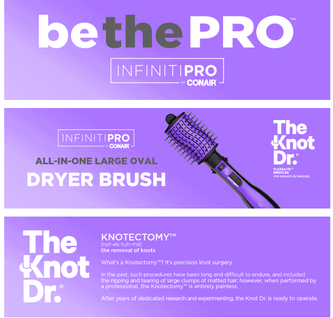
InfinitiPro By Conair All-in-One Dryer Brush, Wet/Dry Styler, Hair Dryer and Volumizer
Having a tough time choosing the color theme to use for your EBC section?
Why not pick one that closely complements the color of your product?
Using matching colors for your design layout gives your A+ section a professional look.
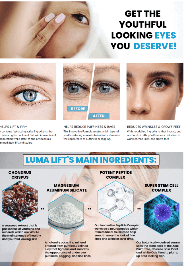
Luma Lift – Instant Eye Cream for Dark Circles and Puffiness
A picture paints a thousand words – which is why choosing high quality, close-up images is a must if you are offering beauty products.
This brand’s A+ section smartly uses before and after pictures, paired with up-close photos of eye areas. It’s also a good idea to list down your product’s ingredients with their individual benefits.
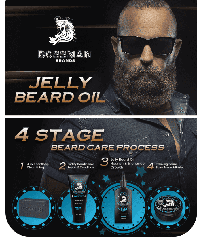
Bossman Beard Oil Jelly Moisturizer Lotion Gel with Natural Ingredients
Just one look at the cool-looking bearded guy on this brand’s EBC section will make you want to grow a magnificent full beard right now.
A full image featuring their beard care products lets you know that their brand has you covered when it comes to growing and caring for your beard.
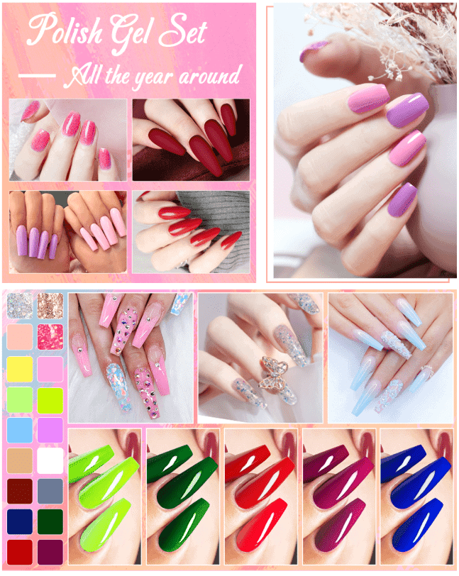
Aibrit 24 Pcs Gel Nail Polish Kit
Using a plain-looking, monotonous design for your EBC section is a big no-no, especially if what you offer are colorful cosmetic products.
This brand does a great job of showcasing their fab nail art products. Notice how their vivid nail art images do most of the talking!
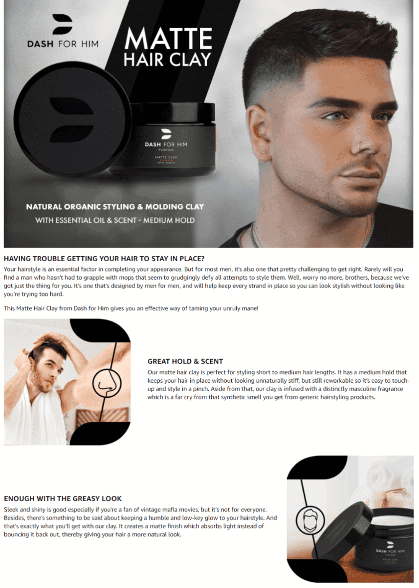
Dash For Him Hair Clay Natural Organic Styling & Molding for Men
Are you offering haircare products for men?
We love how this brand made use of a close-up image of a man with sleek-looking hair, while its product is placed right alongside.
The smaller tile images are paired with engaging text descriptions.
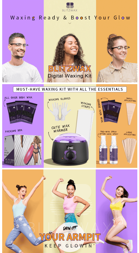
Blitzwax Waxing Kit
We can’t help but applaud how this brand designed their EBC section.
Notice the color scheme they used on all their images – each one giving off a light, fun, and exciting vibe.
Everything is topped off with pictures of people having fun and casual-looking text designs.
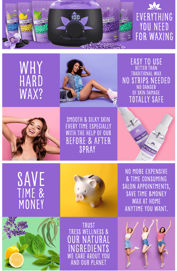
Tress Wellness Waxing Kit
We love the colorful tiled layout used by this brand for their A+ section.
They did a great job bringing together an attractive collection of lifestyle images, product photos, and short text descriptions highlighting their products benefits.
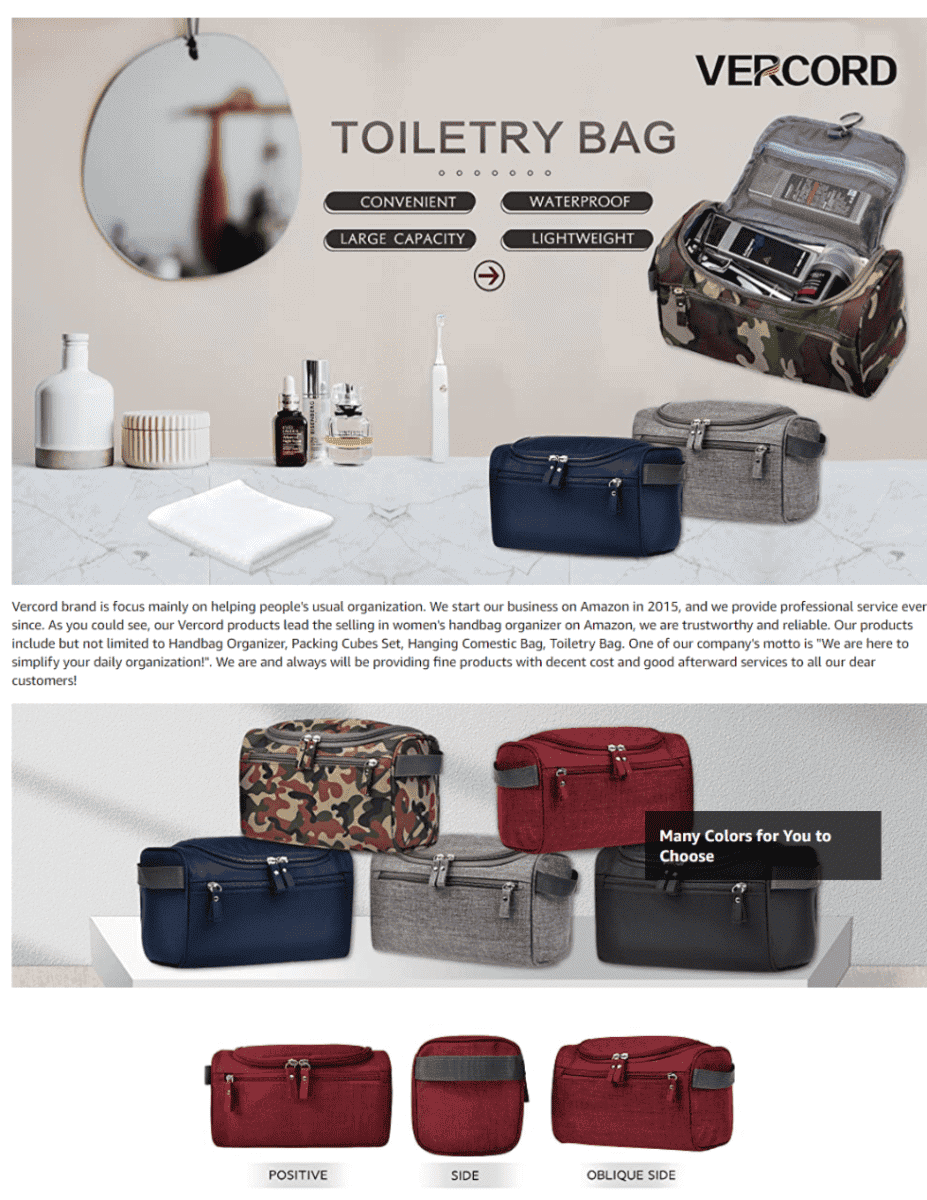
Vercord Mens Toiletry Bag
Need a spacious and stylish bag for organizing all your toiletries?
This brand has what you need, and they make it a point to convey that message loud and clear.
Detailed images of their toiletry bag are partnered with short blurbs that highlight their features.
Kids and Babies
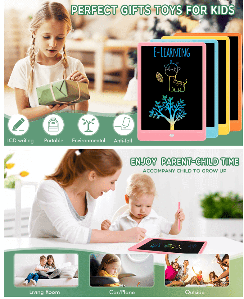
Tefkun Lcd Writing Tablet Doodle Board
If your brand features toys or kid’s accessories, it’s a wise idea to feature children having a blast while using your product.
Highlight all your product’s features through short text descriptions and colorful photos.
You may also want to make it clear that your product will make an excellent gift choice for any special day.
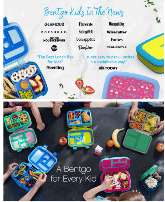
Bentgo® Kids Children’s Lunch Box
For anything that is related to kids, you can’t go wrong by featuring colorful images and fun-looking designs.
If your product has won any awards or has been featured in the news, it won’t hurt to show these achievements off in your EBC section.
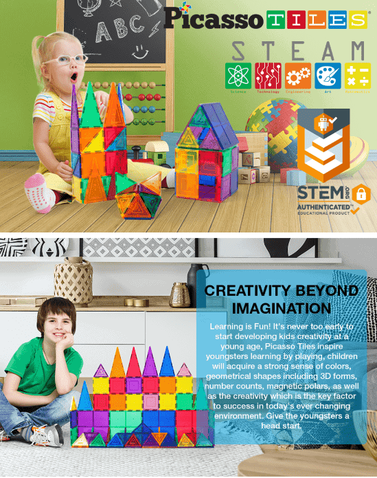
PicassoTiles Magnet Building Tiles
Looking for kids toys that work great for STEM or STEAM activities?
This brand makes it a point to market their educational toys in a fun and light-hearted way.
They also use images that highlight how their toys work great for stimulating your child’s creativity and imagination.
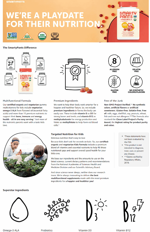
SmartyPants Organic Kids Multivitamin, Daily Gummy Vitamins
Combining colorful images with amusing doodles, this brands A+ section shows off a fun and youthful vibe.
If you offer organic supplements for kids, it is important to emphasize how your products are made using ingredients that are safe for daily consumption.
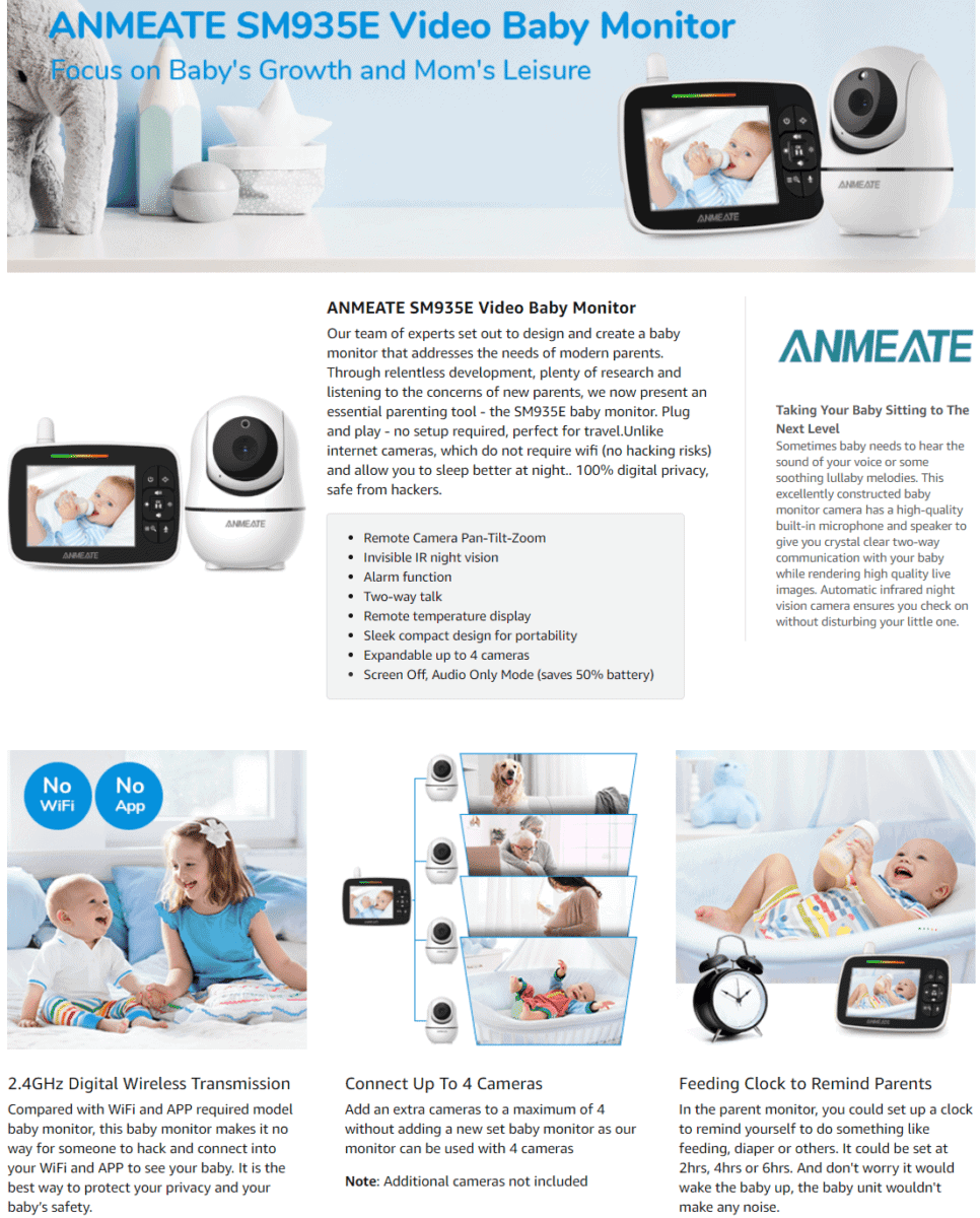
Baby Monitor with Remote Pan-Tilt-Zoom Camera
Using cute images of babies and a light-colored theme, browsing this brand’s EBC section is a real pleasure.
Each tile image features a quick description that tells you something new about the product.
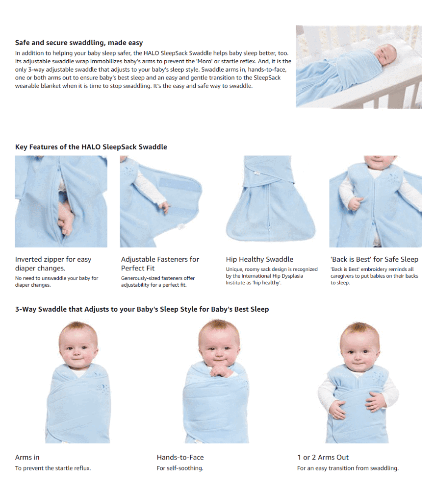
Halo 100% Cotton Sleepsack Swaddle
If your products are geared towards newborn infants, choosing light colors for your A+ section’s layout is a good move.
Light colors give off a clean, fresh, and wholesome vibe – make sure to throw in cute images of babies using your product, too!
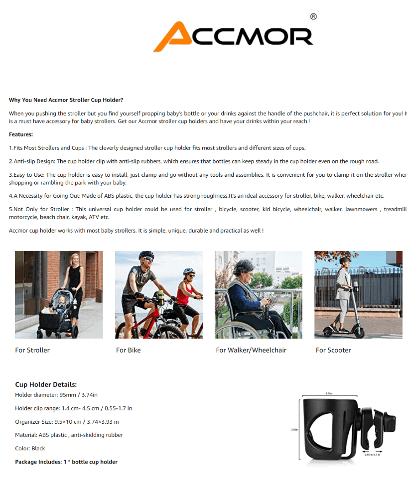
Accmor Universal Cup Holder
Given their product’s compact size, this brand decides to feature close-up images to reveal their cup holder’s smaller details.
They also did great in featuring easy-to-read informative text with tile images, each one showing where their product may be used.
Home
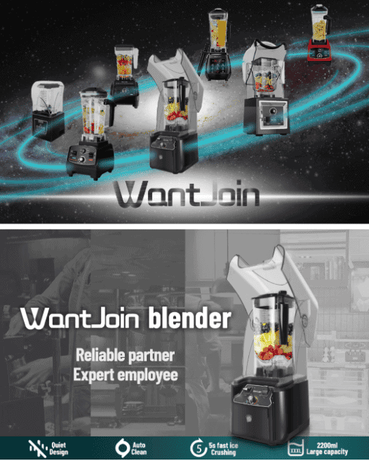
WantJoin Professional Commercial Blender With Shield Quiet Sound
If you have multiple products in your collection, why not feature all of them together in one epic image?
This brand uses a modern layout for their product’s images, and goes with benefit-driven text to label each photo.
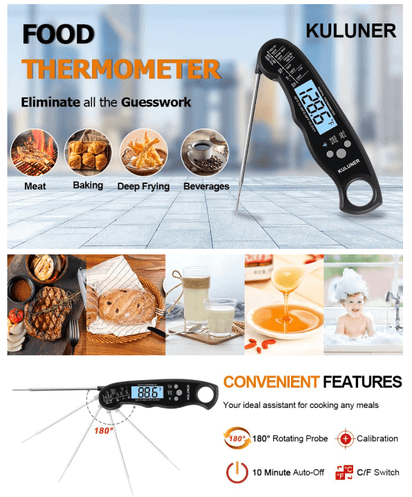
Kuluner TP-01 Waterproof Digital Instant Read Meat Thermometer
Need help serving perfectly cooked food? This brand’s tagline – Eliminate All The Guesswork – caught our attention right away.
Their main image features an up-close photo of their food thermometer, with smaller images of cooked meats featured right beside.
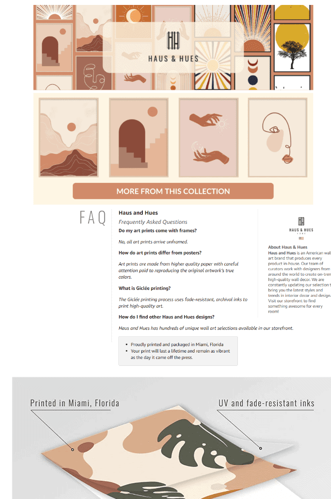
Haus and Hues Boho Prints Neutral Wall Art
Featuring an FAQ section and an About Us section upfront, you get to know more about its brand story and its products right away.
They also use images showing how their decorative art prints may be displayed or mounted on your wall.
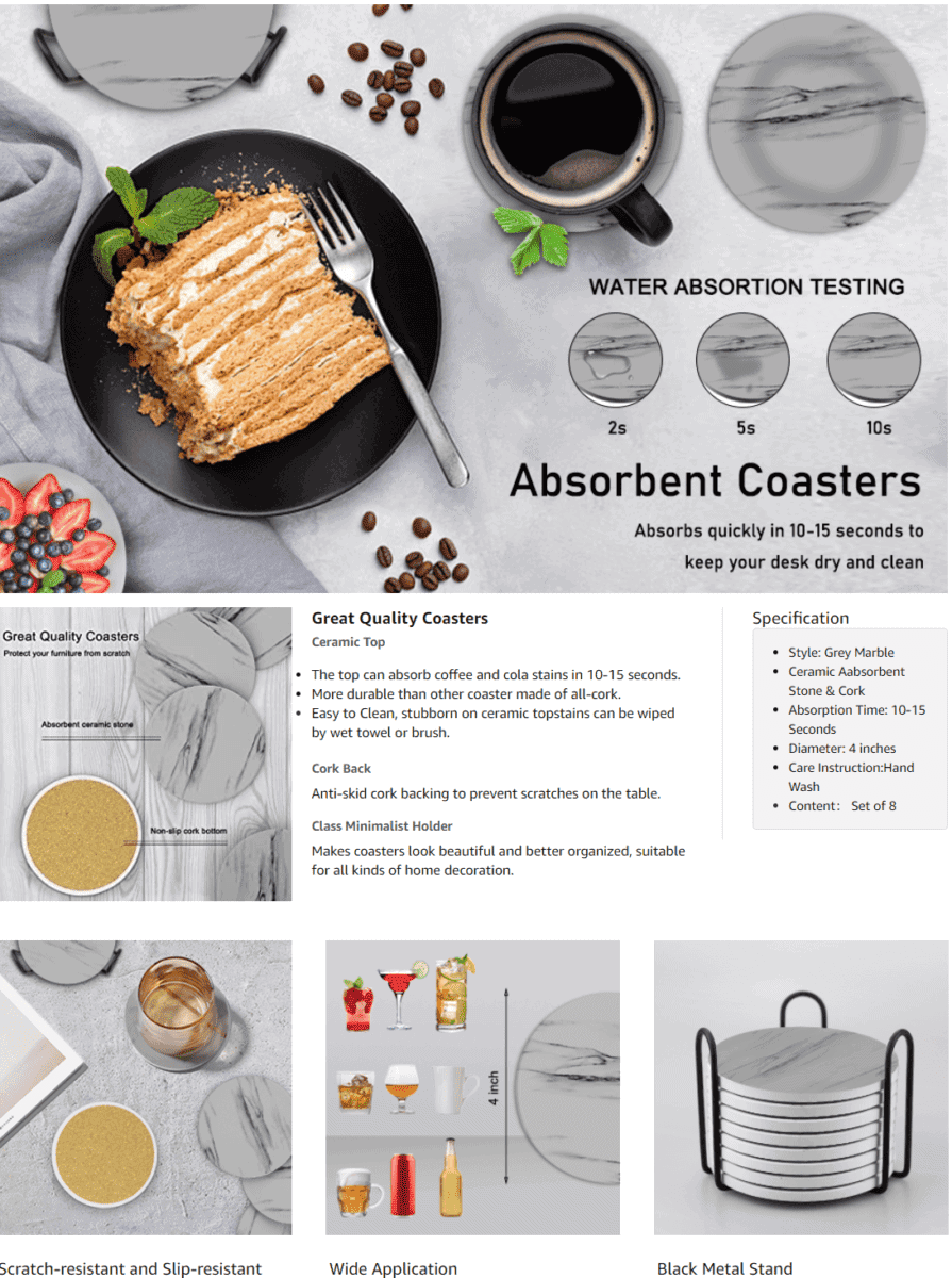
Eagmak Set of 8 Coasters for Drinks
Tired of seeing wet spots or water marks on your table surfaces?
Through their EBC section’s photos, this brand demonstrates the efficiency of their coasters when it comes to absorbing moisture.
They also highlight what their coasters are made of to emphasize their durability.
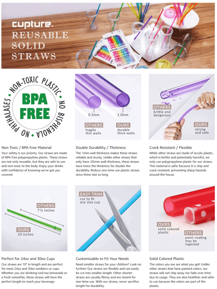
Cupture Reusable & Unbreakable Color Straws
Let your customers know why they should choose your products over the competition.
This brand uses multiple images that compare the quality and design of their straws with others. By doing so, you have an easier time deciding which one to purchase.
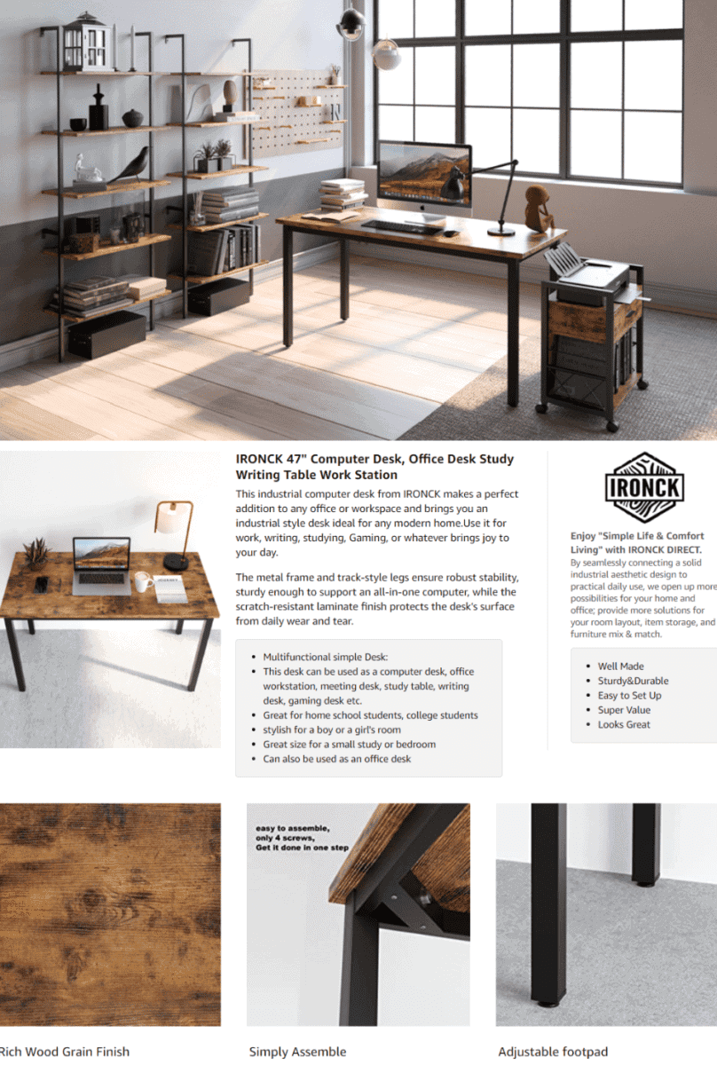
Ironck Computer Desk, 47″ Home Office Writing Study Desk
We love the clean and organized design of this brand’s EBC section.
A large photo of their desk placed in a neat-looking study makes you want to get one for yourself.
You also see a couple of close-up images showing the relevant product details of their desk.
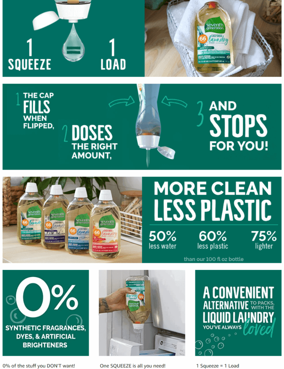
Seventh Generation Laundry Detergent
Take care of your laundry while caring for the environment at the same time.
That’s the message you get as soon as you visit this brand’s EBC section.
We love how they also highlighted how their laundry solution contributes to reduced plastic pollution.
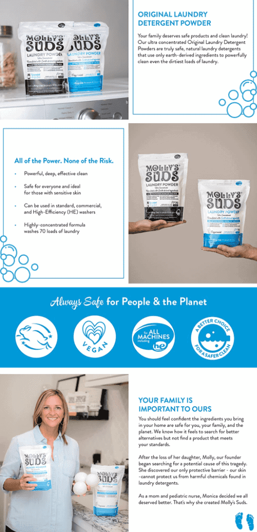
Molly’s Suds Laundry Detergent Powder
Add a personal touch to your EBC section by sharing your own life experiences and what inspired you to create your product.
Aside from using quick and short text, as well as clear images if their product, this brand also emphasizes how their laundry detergent cares for the planet.
Topping off their A+ layout is a short story about how their founder started the brand.
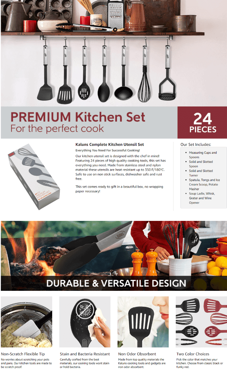
Kaluns Kitchen Cooking Utensils Set
If your products are made for preparing meals, you can’t go wrong by featuring images of your products and freshly cooked food together.
This brand also does a good job of listing all the cooking tools and utensils included in their kitchen set.
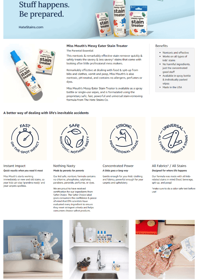
Hate Stains Co. Stain Remover for Clothes
Since their product is a stain remover, it makes perfect sense that their EBC sections shows off a clean and clutter-free look.
The photos they used also feature their products being placed on modern-looking and well-organized home surfaces.
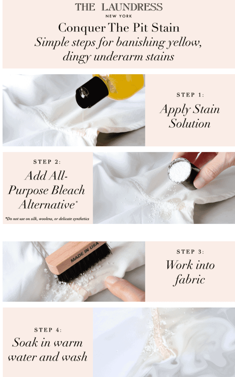
The Laundress – Stain Brush, Removes Stains on All Fabrics
Your A+ section is the perfect place to show your customers how easy it is to use your product.
Through large images and easy-to-read text, this brand focuses on enumerating the steps on how to remove tough stains using their liquid solution.
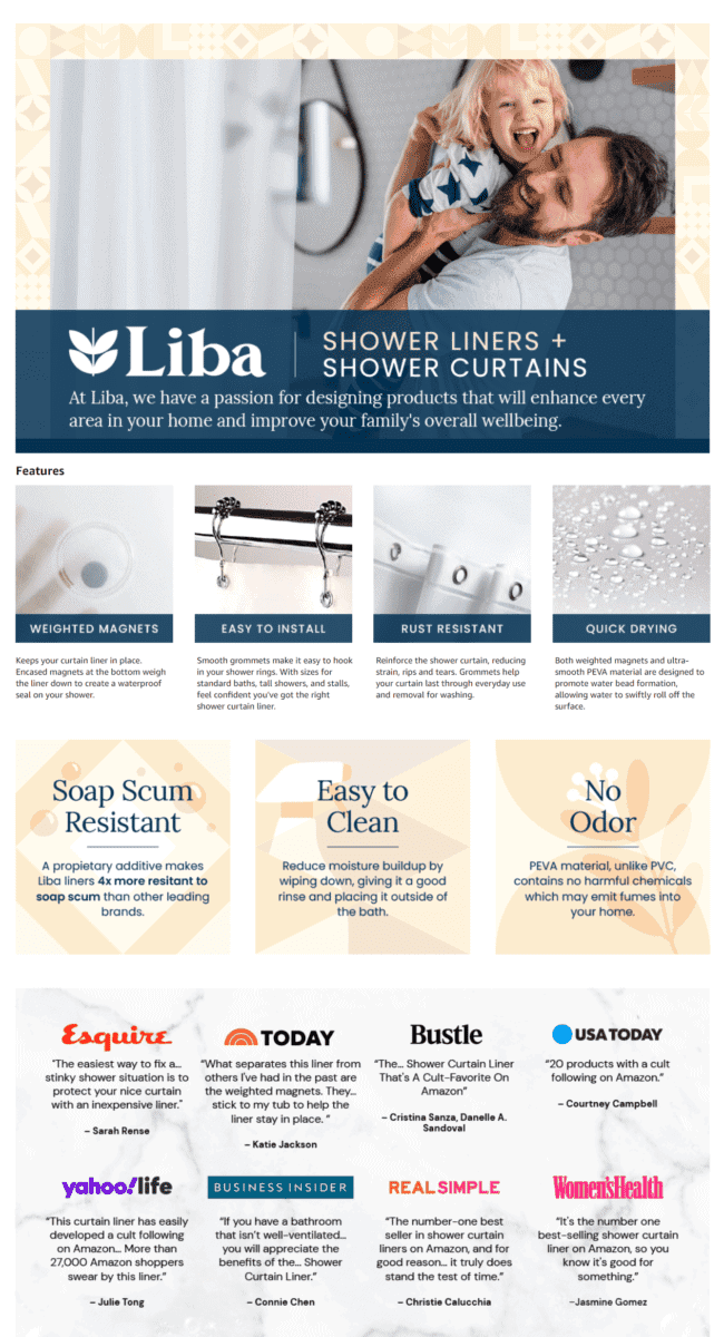
LiBa PEVA 8G Bathroom Shower Curtain Liner
Thinking of upgrading your shower curtains?
This brand’s EBC section makes use of a large lifestyle photo, which features an up-close image of their shower liner with a dad and his child having fun.
They also have a section that features a variety of reviews and quotes from different publications.
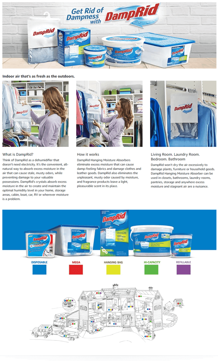
DampRid Hanging Bag, Moisture Absorber
Having trouble dealing with damp air in your home?
This brand shows off their moisture-absorbing products all lined up just like a group of superheroes.
Through bright-colored images, a clean layout, and casual-sounding text descriptions, this EBC section easily caught our attention.
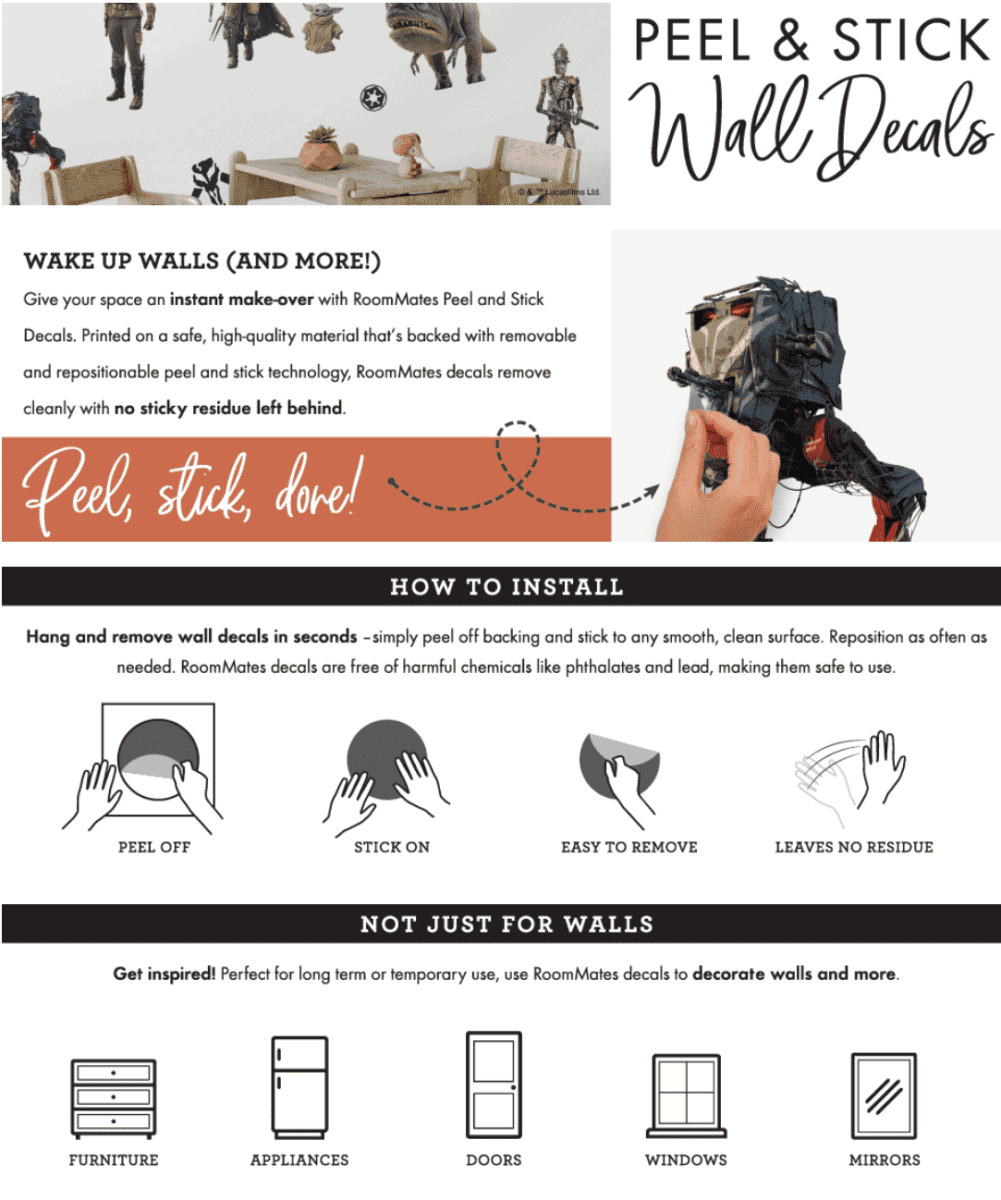
RoomMates Star Wars The Mandalorian Peel and Stick Wall Decals
Most of the time, using a simple EBC layout works to your advantage.
In this page, the brand decides to use minimal color on their images, allowing their wall decals to stand out even more.
Simple illustrations also show how fun and easy it is to apply their wall decals.
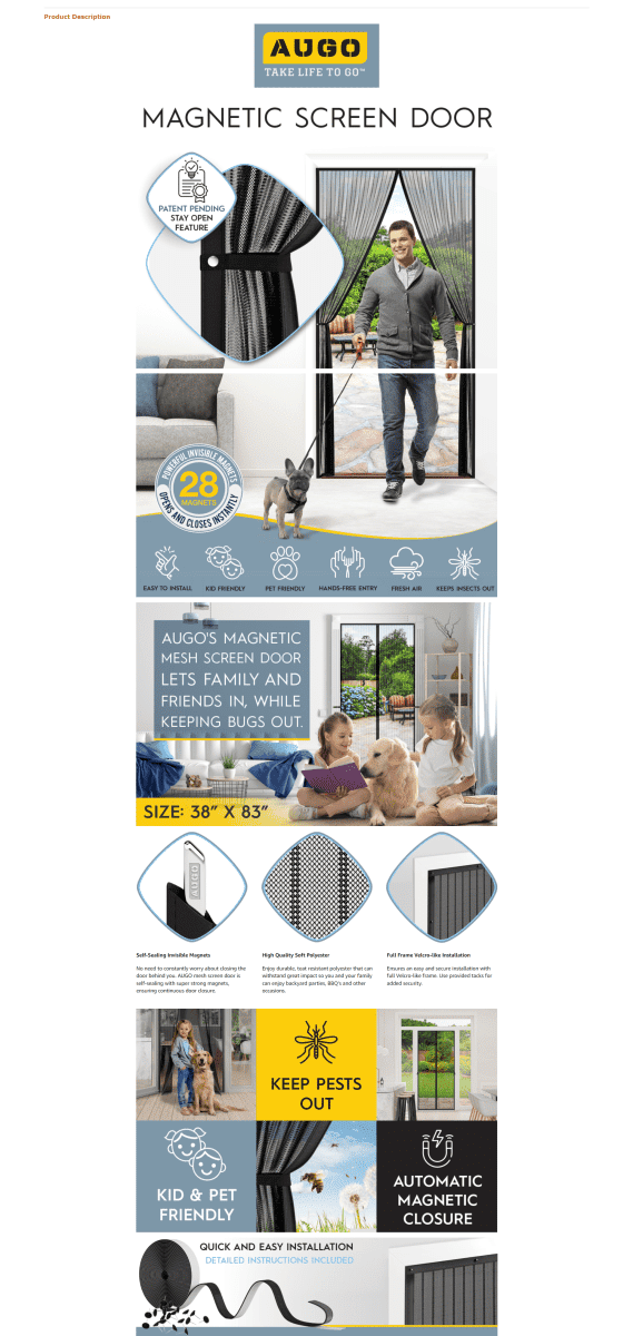
AUGO Magnetic Screen Door
Fighting an endless battle against bugs and winged pests that keep invading your home?
Using large tile images, this brand shows how effective their magnetic screen door is when it comes to keeping insects out.
They also highlight that their screen door is safe for kids and pets.
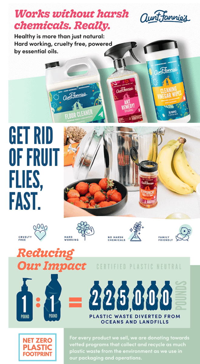
Aunt Fannie’s FlyPunch, for Indoor Fruit Fly Use
Are you using environment-friendly formulas for your cleaning solutions?
Make that point known through your products A+ section. Feature your product with images of natural botanicals, and show how your brand does its part in reducing plastic waste.
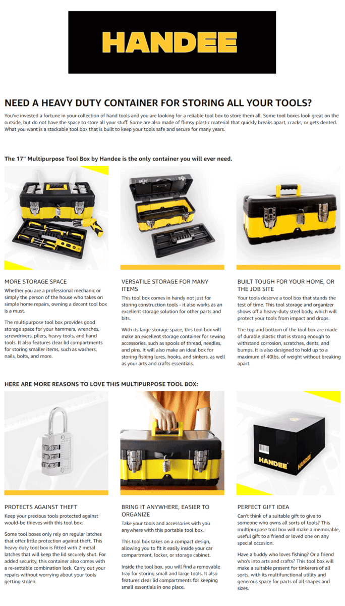
Handee 17-Inch Multipurpose Tool Box Organizer and Storage
What will make your customer buy your product?
Establish a pain point early in the EBC section, something that your customers can relate to.
This brand’s product images are paired with short descriptions that let you know how their tool box is the only storage container you will need.
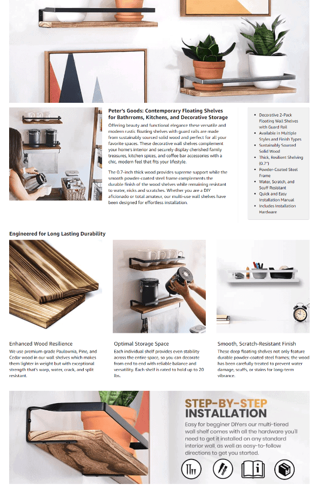
Peter’s Goods Rustic Floating Wall Shelves with Rails
Choose photos that will make your product stand out right away.
This EBC section has a light and casual feel to it, thanks to its bright lifestyle images.
And It’s also a good idea to feature a step-by-step installation guide to let your customers know easy it is to mount your product.
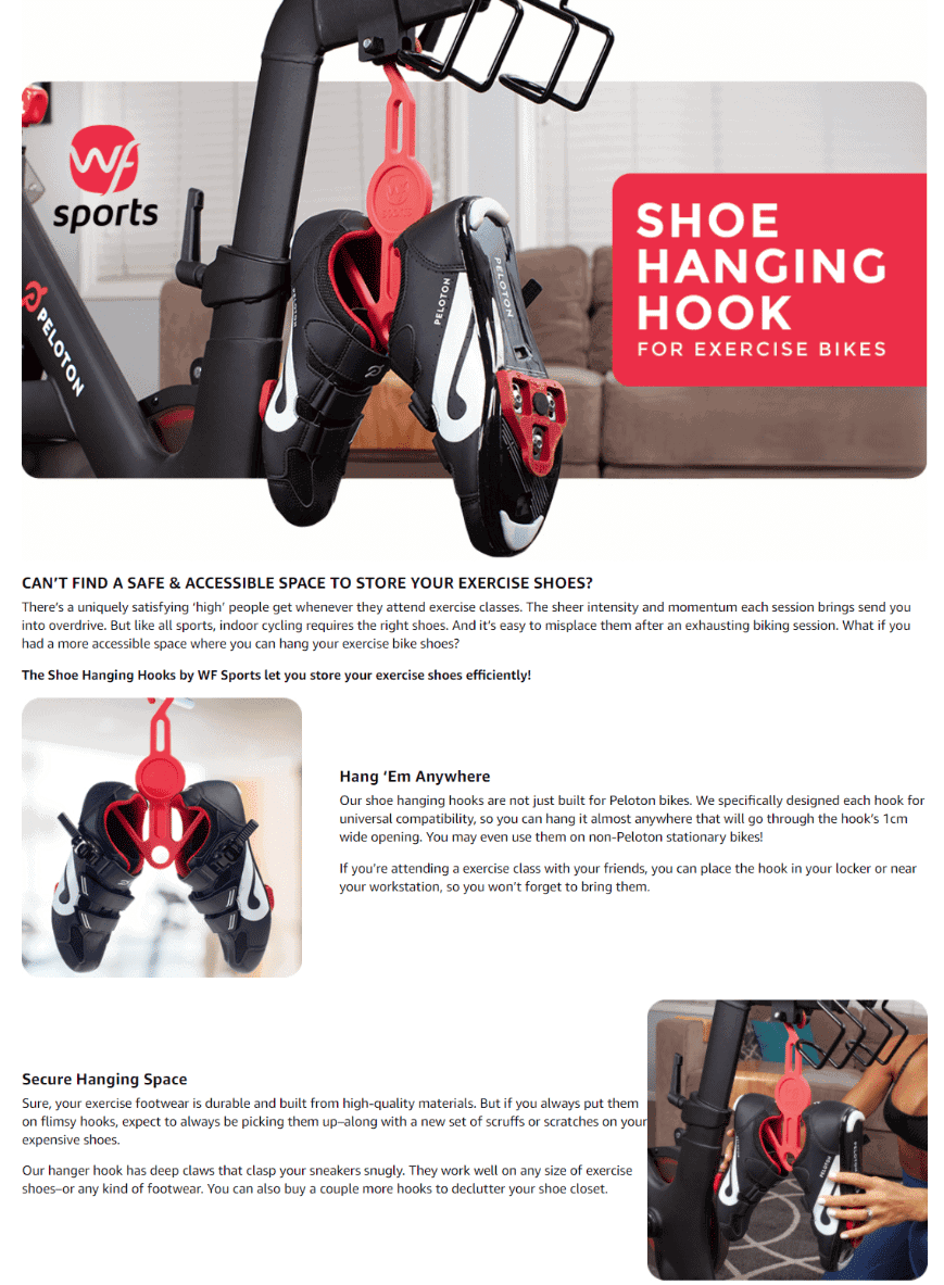
Willa Flare Shoe Hanging Hooks – Space-Saving Hanging Storage
If you are not impressed by the color coordination used in this A+ section, we don’t know what will.
This brand focuses on red, gray, black, and white shades to liven up their layout – reflecting all the colors you see on their logo.
This results in an EBC page that looks clean and well-designed.
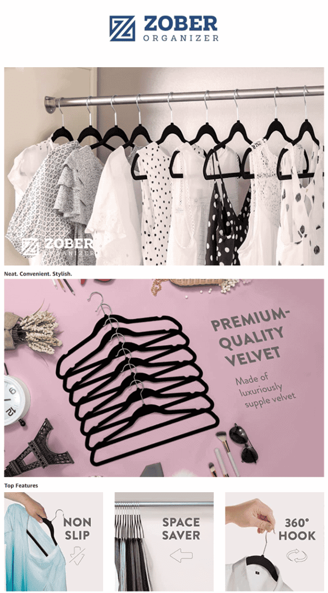
Zober Premium Velvet Hangers
Nobody wants a messy and cluttery wardrobe.
Checking out this brand’s EBC section, you are greeted by images showing cabinets looking well-organized – all thanks to their clothes hangers.
Through bold text, this brand also makes it clear that their hangers are made of premium velvet.
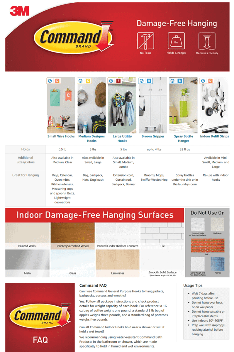
Command Large Utility Hooks
Using a comparison chart for your products makes it easy for your customers to select which one is perfect for their needs.
This brand also shows what types of surfaces you may or may not use their hanging hooks on – they even feature a nifty FAQ section at the bottom.
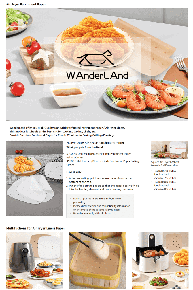
Wanderland Air Fryer Parchment Paper
Offering cooking accessories or kitchen supplies?
Don’t forget to use images of various food items to catch your customer’s eye.
It’s also important to mention how to properly use your products to avoid unwanted kitchen mishaps.
Food
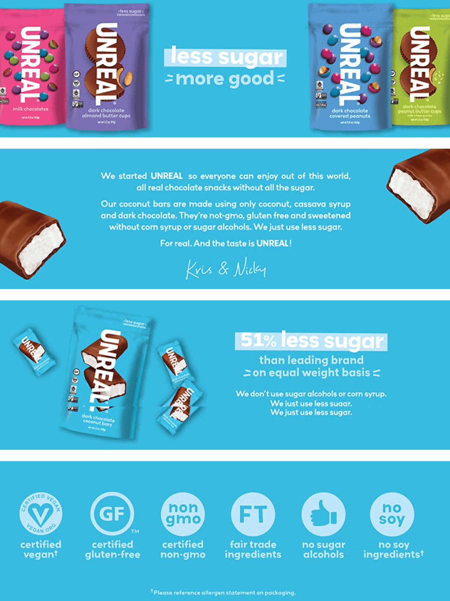
UNREAL Dark Chocolate Coconut Bars
Promoting delicious and nutritious snacking?
Create short, yet compelling, descriptions to highlight the luscious taste of your snacks.
It also pays to include images of all the flavor variants of your products on your A+ section
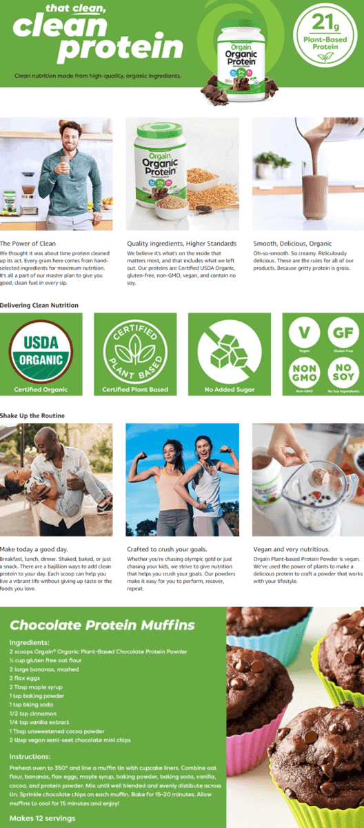
Orgain Organic Plant Based Protein Powder
As mentioned earlier, if your product uses natural and organic ingredients, going green with your theme works to your benefit.
This brand even features a fun recipe for you to try out using their chocolate protein powder… looks yummy!
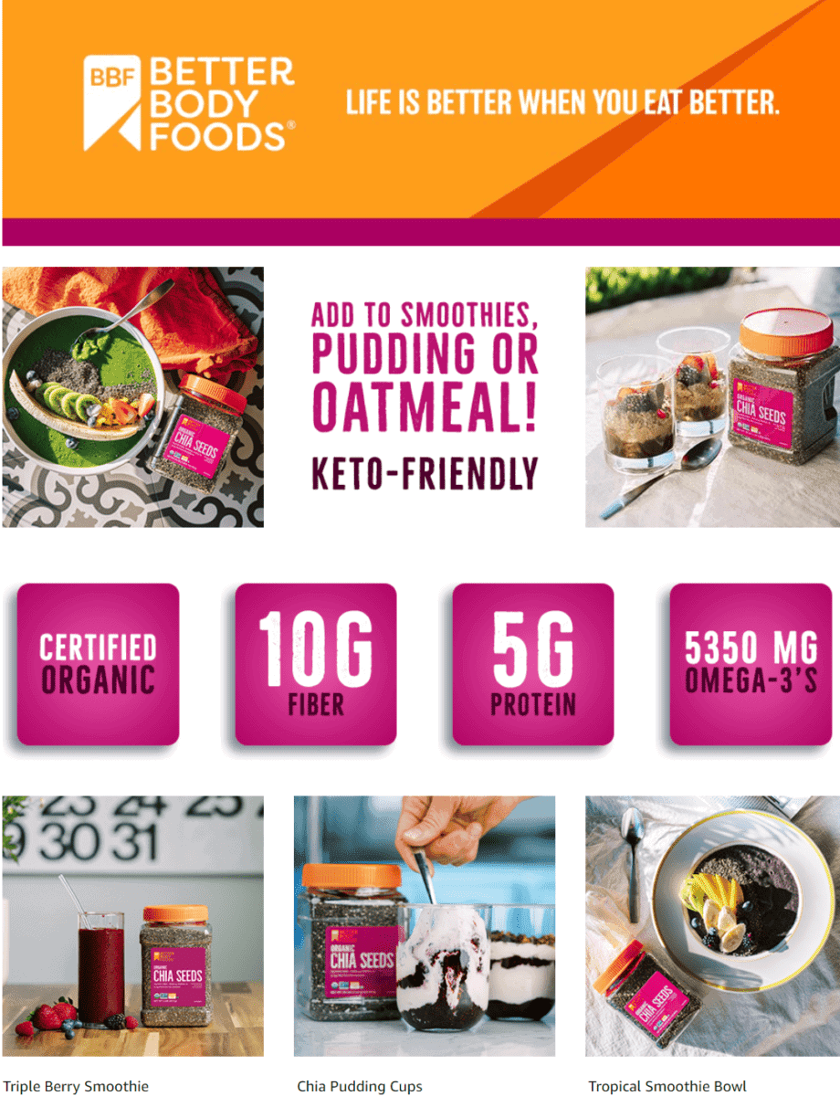
BetterBody Foods Organic Chia Seeds with Omega-3
Make sure to highlight the nutritional value of your product on your A+ section.
Just one look at this brand’s EBC section already lets you know that their product is suitable for people who are on the Keto diet.
They also add scrumptious recipe ideas for you to try!
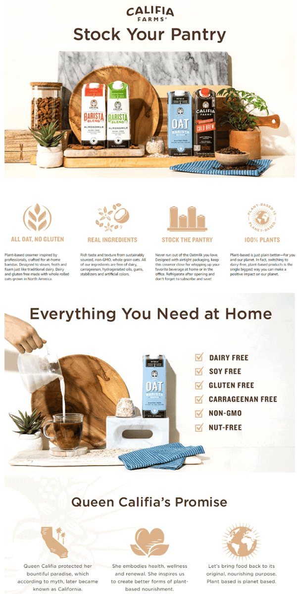
Califia Farms – Oat Milk, Unsweetened Barista Blend
We love the simple layout and the earthy tones used by this brand’s A+ section.
Through their images and text, you know right away that they use natural ingredients for their oat milk products.
They even share a myth about Queen Califia and how she inspired the brand to create nature-based food products.
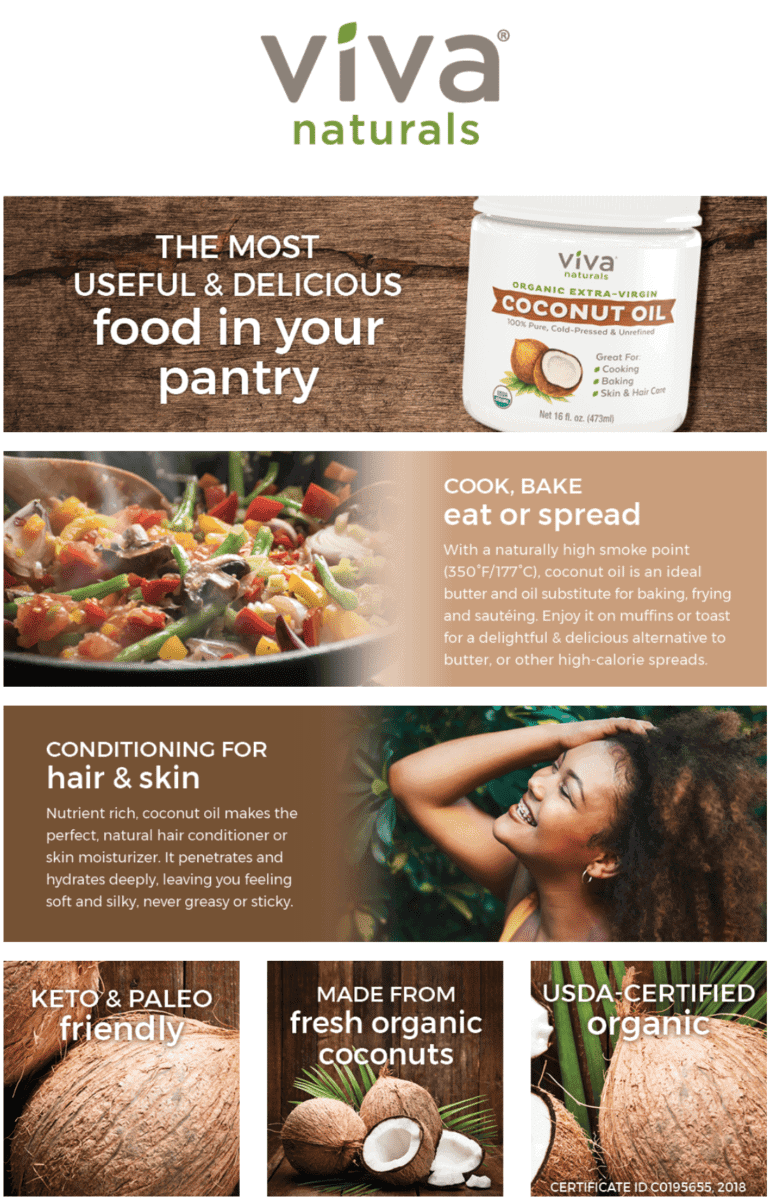
Viva Naturals Organic Coconut Oil, Cold-Pressed
Since their coconut oil is made using 100% natural ingredients, this brand did a good job of featuring images of fresh coconuts on their EBC section.
Make your customers know how your product can be used – just like how this brand highlighted that their coconut oil may be used topically or as a cooking ingredient.
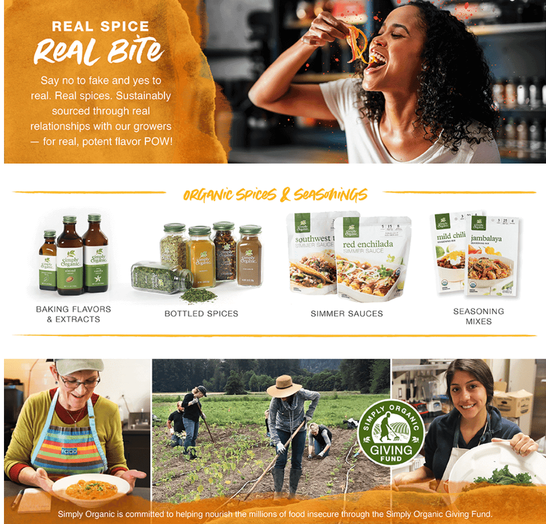
Simply Organic Smoked Paprika
The best way to let everyone know how good your product tastes?
Throw in a large image of a person having the time of their life! This brand also shares how they contribute to ending hunger through their charitable fund.
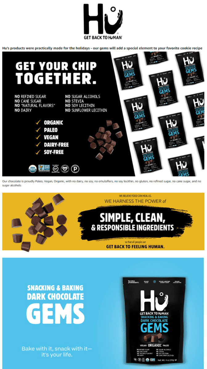
Hu Gems Chocolate Vegan Snacks
A catchy tagline never fails to draw customers in.
This brand lists down all the unwanted ingredients that you won’t find in their chocolate chips.
We also give a thumbs up to the attractive color scheme they chose for their EBC section.
Toiletries And Hygiene
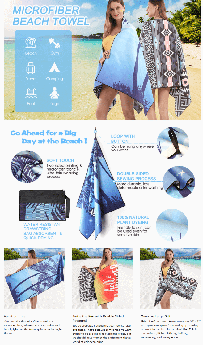
Decomen Beach Towel, Microfiber Beach Towels
It’s all in the details!
This brand spared no expense in using a variety of lifestyle images, each one showing a woman using their stylish towel on the beach.
They also highlighted the superior absorbent properties of their towel as a key selling point.
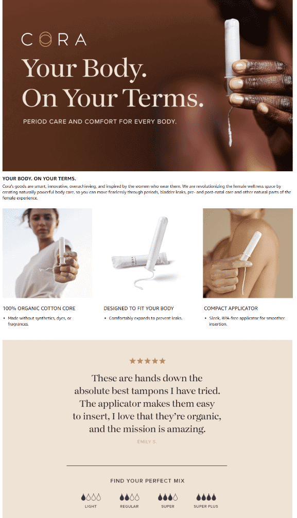
Cora Organic Applicator Tampons
Let customers know how your products can make life easier for them – without using long lines of text or complicated images.
This brand also includes a large image featuring a 5-star customer review, which is perfect for building your customer’s trust.
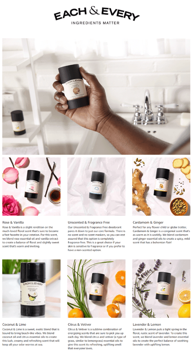
Each & Every Natural Aluminum-Free Deodorant
Are your products made of natural herbs and botanicals?
Don’t forget to include images of your products with their natural ingredients right alongside.
Give your images short and unique text descriptions that highlight their benefits.
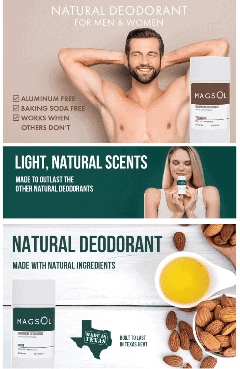
MAGSOL Natural Deodorant for Men
Offering a deodorant made of natural ingredients, again you notice how a brand goes with a green-themed layout design.
They also use lifestyle images of a man and a woman – both looking fresh, clean, and happy.
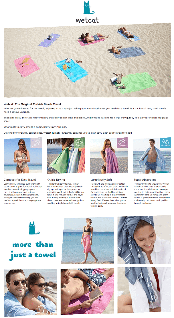
Wetcat Turkish Beach Towel
This brand decides to go somewhat heavy on text, but their EBC section is still fun to read – thanks to the casual writing style they used.
Tile images show how versatile their beach towel is. They also included a section that talks about what makes their product special.
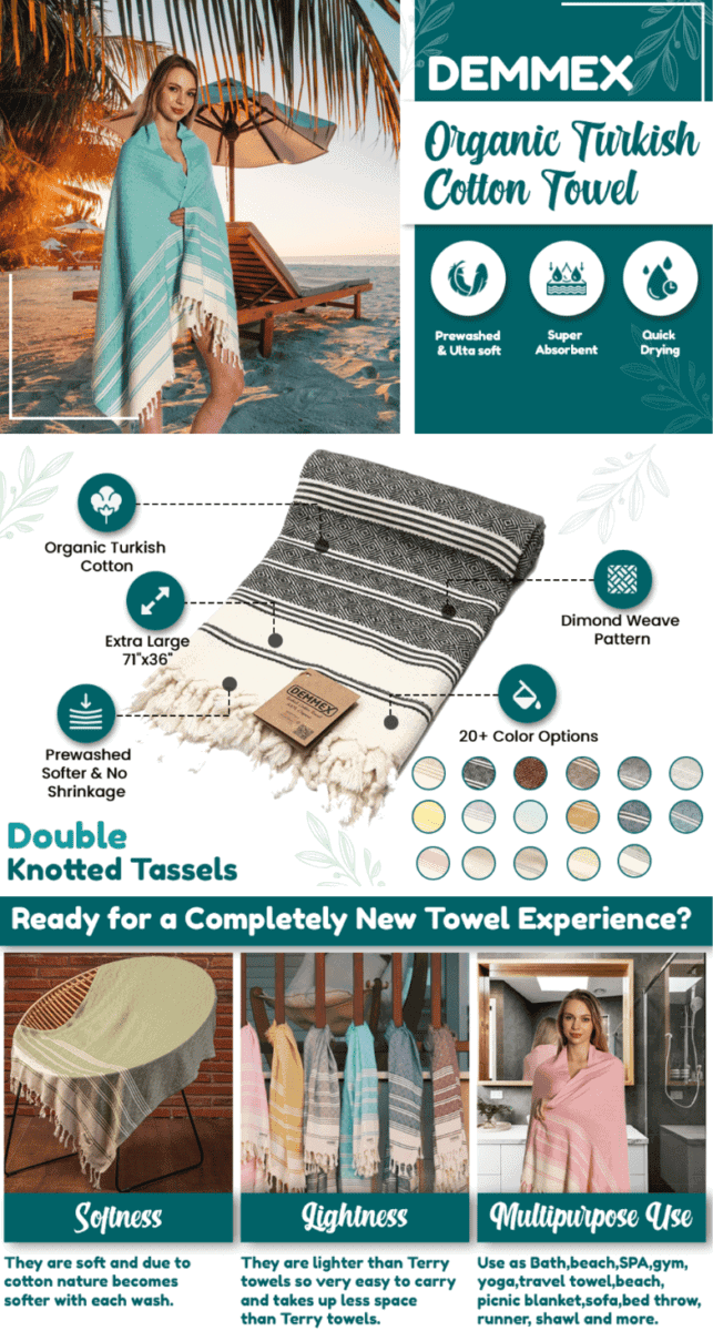
DEMMEX Turkish Cotton Towel
Taking your first look at this brand’s EBC section already makes you want to pack up and just head to the beach.
We love how they used a variety of tile images to show how their beach towel may be used for yoga, picnics, or home use.
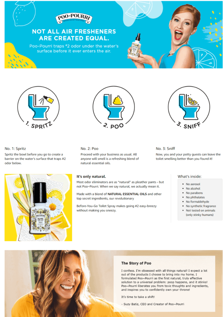
Poo-Pourri Before-You- go Toilet Spray
Refreshing colors and fun-looking illustrations give this brand’s A+ section a lighthearted vibe.
They also feature an image of their CEO with her funny message sharing why she decided to formulate their toilet spray.
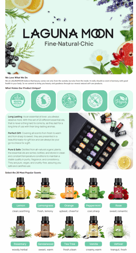
Lagunamoon Essential Oils 20pc Set in Gift Box
If you offer multiple variants, scents, or flavors of your product, make the most out of your A+ section by including all their images in your layout.
Notice how they also featured images of natural herbs, botanicals, and berries to emphasize how their products are made of natural ingredients.
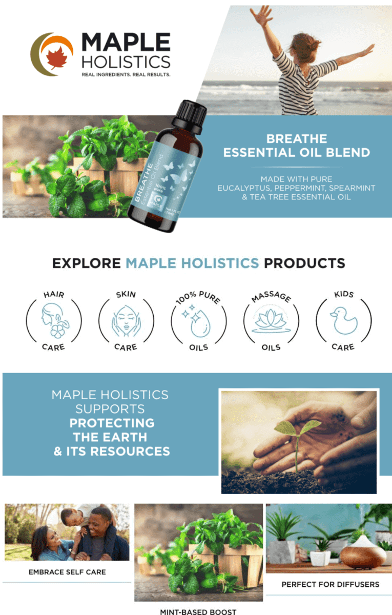
Maple Holistics Breathe Blend Essential Oil for Diffuser
Going through this A+ section is a delight.
We just can’t help but admire the large images, the short and simple text, and the cool color scheme used for this brand’s design layout.
Car
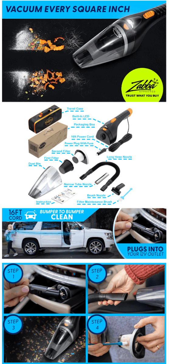
ThisWorx Car Vacuum Cleaner
Your customers should get a clear view of what they are getting once they purchase your product.
This brand lays out all the parts and accessories that come with their vacuum cleaner. They also feature a step-by-step guide showing how easy it is to use their product.
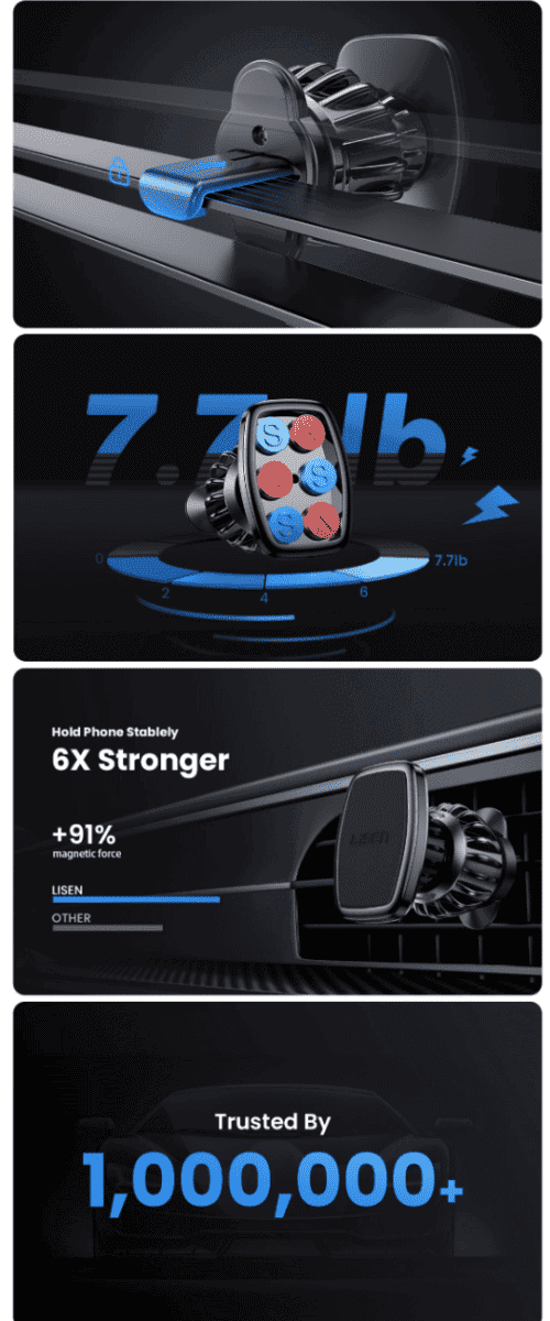
Lisen Magnetic Phone Holder for Car
Giving your customers an up-close look at your product is always a smart idea.
This brand goes with a modern design theme and provides large image of their smartphone holder. They even mention how their product is trusted by millions of customers.
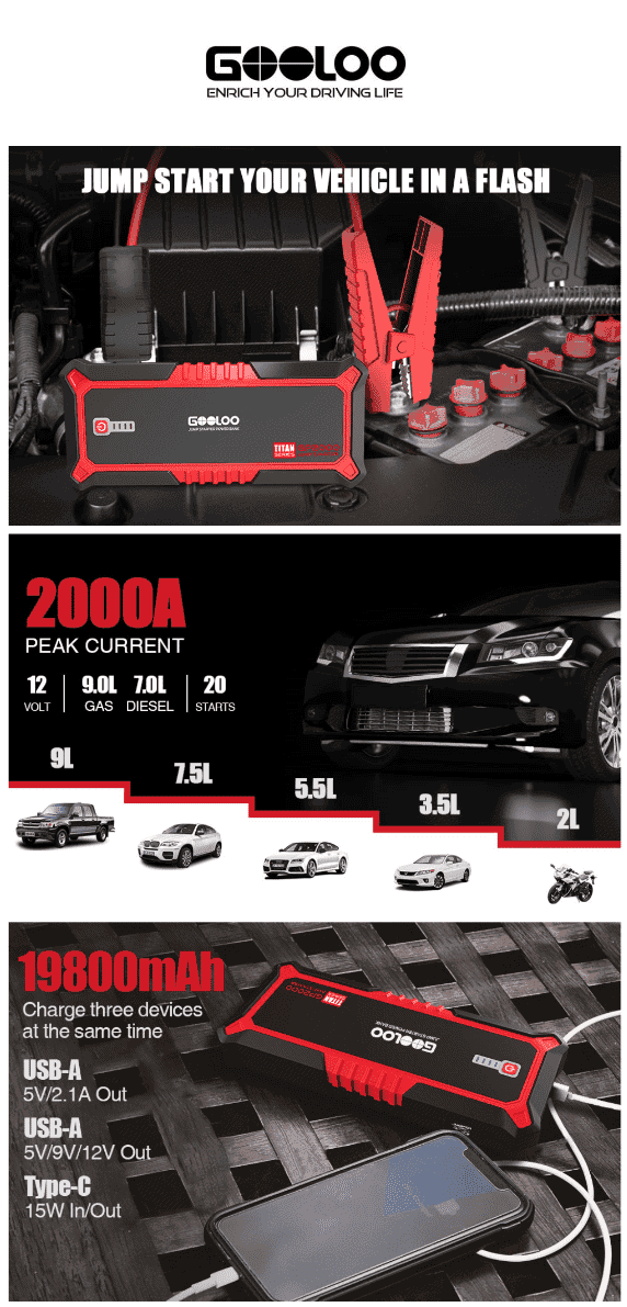
GOOLOO GP2000 Jump Starter
Starting off with a strong statement on their main image, you know that this brand means business.
It’s great that they inserted images of the different vehicles that are compatible with their jump-starting kit.
They also clearly highlight the specs of their product, leaving no room for second-guessing.
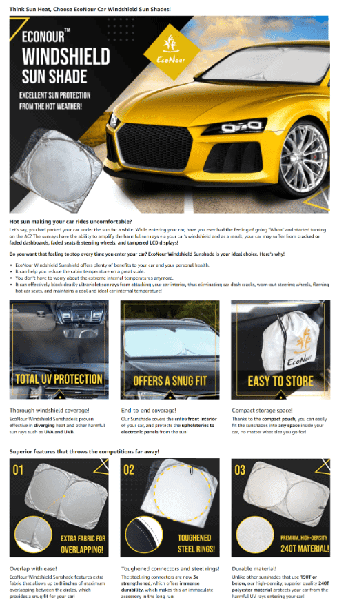
EcoNour Car Windshield Sun Shade with Storage Pouch
Looking for a solution to keeping your car’s interior cool even when parked under direct sunlight all day?
This brand did a good job of presenting various images of their product being used on a car.
Through the tile images, you get different viewpoints showing how their sunshade blocks out the sun.
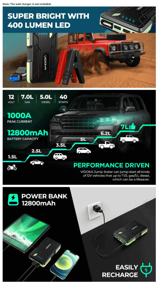
Vidoka Portable Car Jump Starter
Featuring a 4×4 jeep traversing sandy terrain, you get the message that this product is designed to keep up with heavy duty use.
All their product’s specs are highlighted using bold text – they also feature an image showing how their jump-starter may be used as a light source for outdoor adventures.
Office
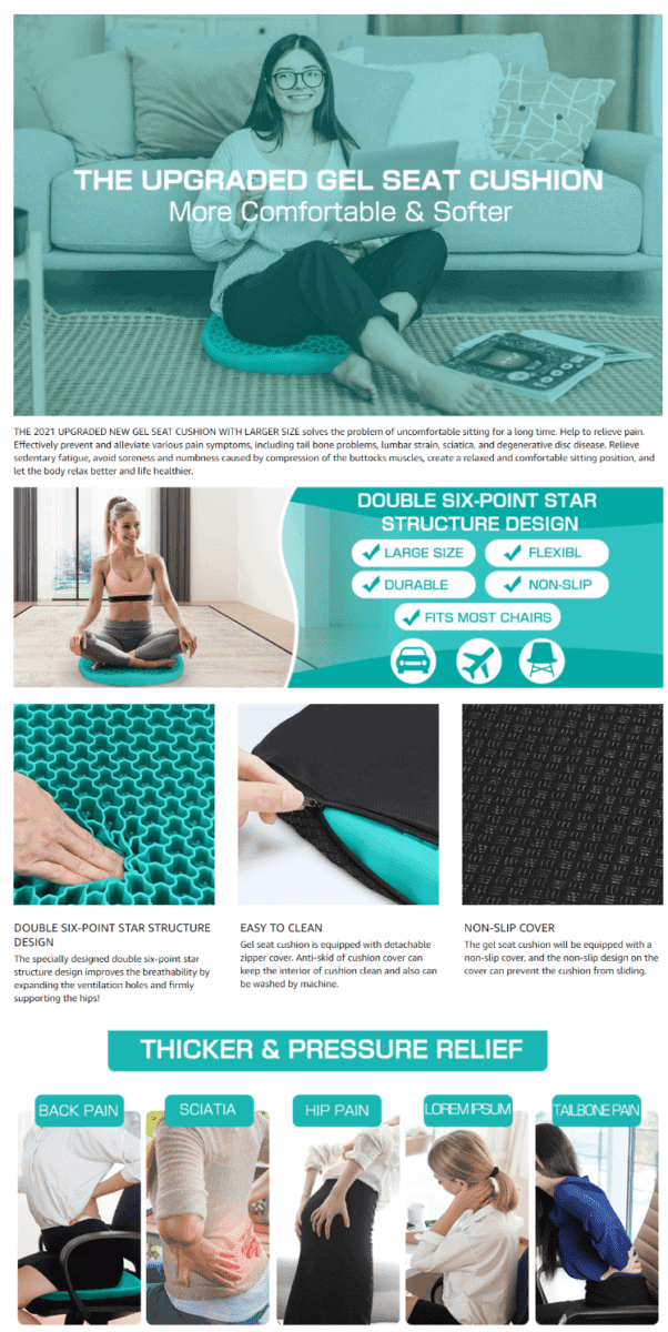
Parkyeon Gel Seat Cushion
The happy smile of the woman on their image tells it all – sitting on this brand’s gel seat cushion is truly a relaxing experience.
They also feature close-up tile images of their cushion, giving you a closer peek at their relevant product details.
Also notice how they included pictures of people experiencing all sorts of body aches and pains – making it clear that their cushion gel seat can be a source of relief.
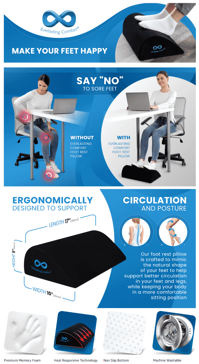
Everlasting Comfort Office Foot Rest for Under Desk
This brand decides to go big in using images to market their product.
We give this EBC section a thumbs up because of the brand’s use of quick and short phrases, large photos, and clean colors.
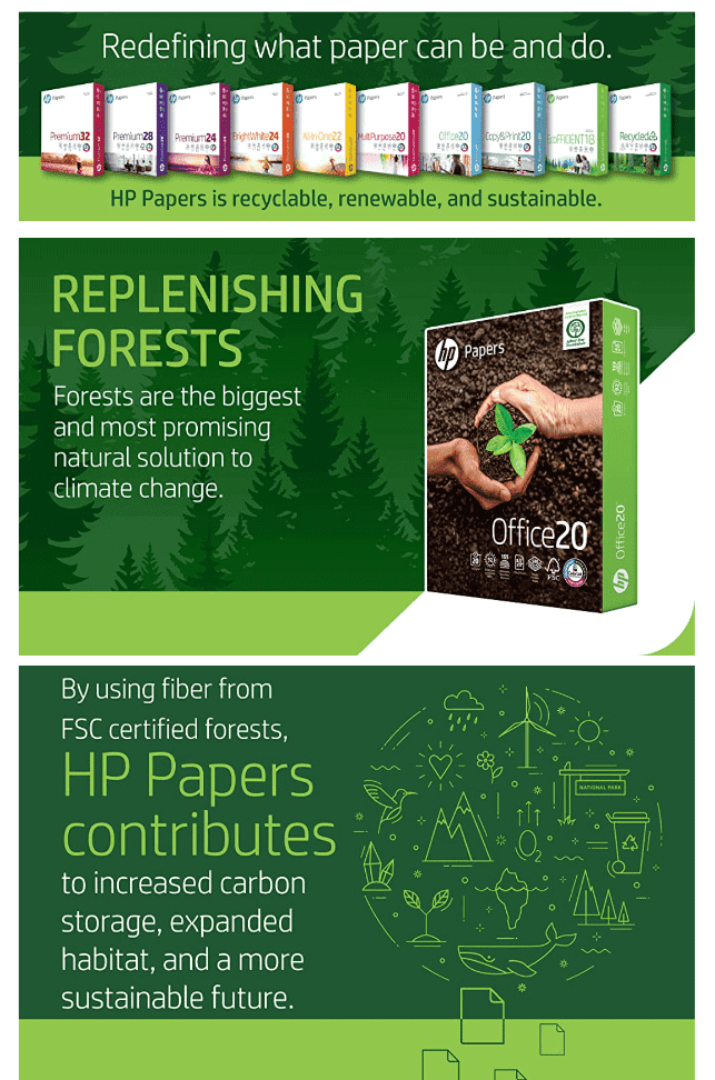
HP Printer Paper
Do your products care for Mother Nature? Get that message across on your A+ section. This brand shares how their paper supports reforestation projects worldwide.
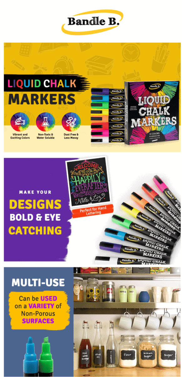
Bandle B. Liquid Chalk Markers
Awaken your creative side as soon as you check out this brand’s EBC section.
It uses vibrant colors for its layout, and emphasizes how their markers work great for home or business use.
Health and Wellness
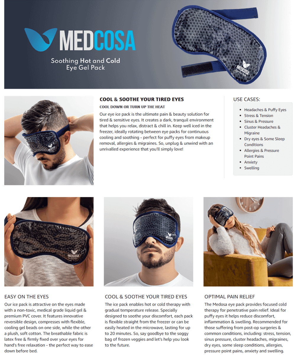
Medcosa Eye Ice Pack
For a product that delivers cooling relief, this brand did well in choosing cool colors for their design.
Just looking at their page’s images makes you want to wear their ice pack and just chill out.
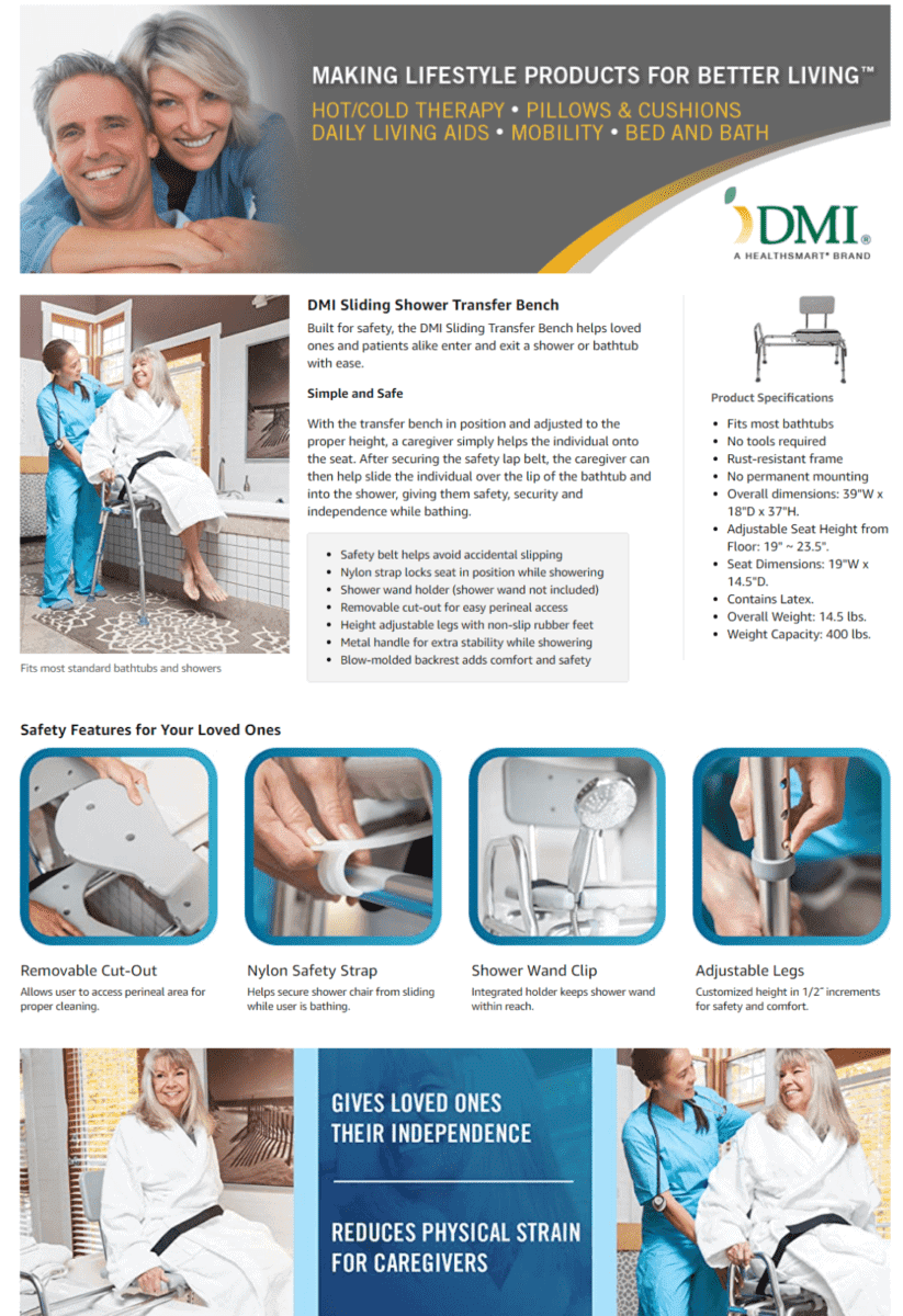
DMI Tub Transfer Bench and Shower Chair with Non Slip Aluminum Body
Packed with information about the product’s features, this brand’s Amazon EBC section does a great job of showcasing their shower transfer bench to potential customers.
They use smaller tile images to give a closer look at their product’s uses and attachments.
Curated by Nature Nutritional Apple Cider Vinegar Gummies
Images of people enjoying life, light color themes, and casual descriptions make this an interesting Amazon Enhanced Brand Content example.
Their supplement’s health benefits are enumerated, and they also show how their product uses a pure and potent formula.

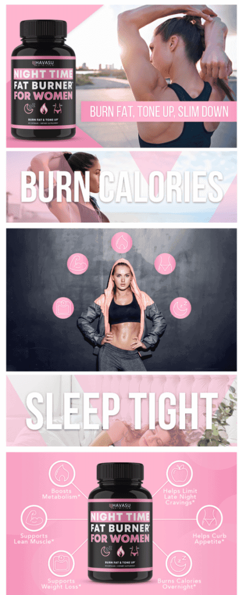
Havasu Nutrition Night Time Fat Burner Weight Loss Pills for Women
Having trouble achieving that sexy and curvy physique?
This brand uses images of fit and active women having a great time.
We love how they use large, bold text to highlight their supplement’s benefits.
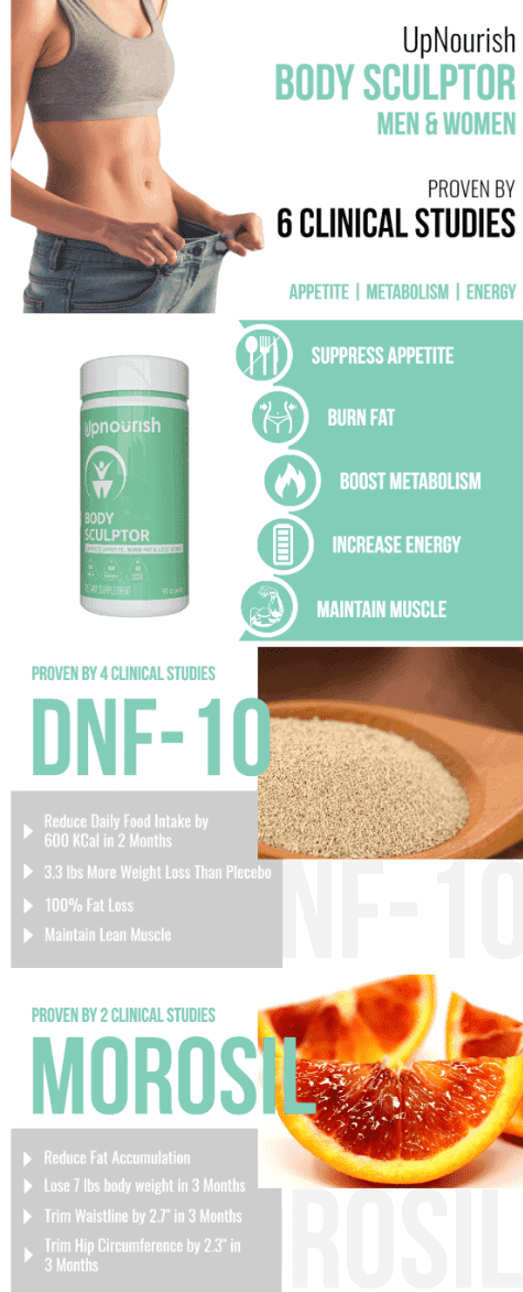
UpNourish Weight Loss Supplement For Women & Men
Are your product’s ingredients backed by research or clinical studies?
Don’t forget to highlight those on your Amazon EBC section.
This brand also mentions infographics that show how their product can deliver significant weight loss results in just 3 months.
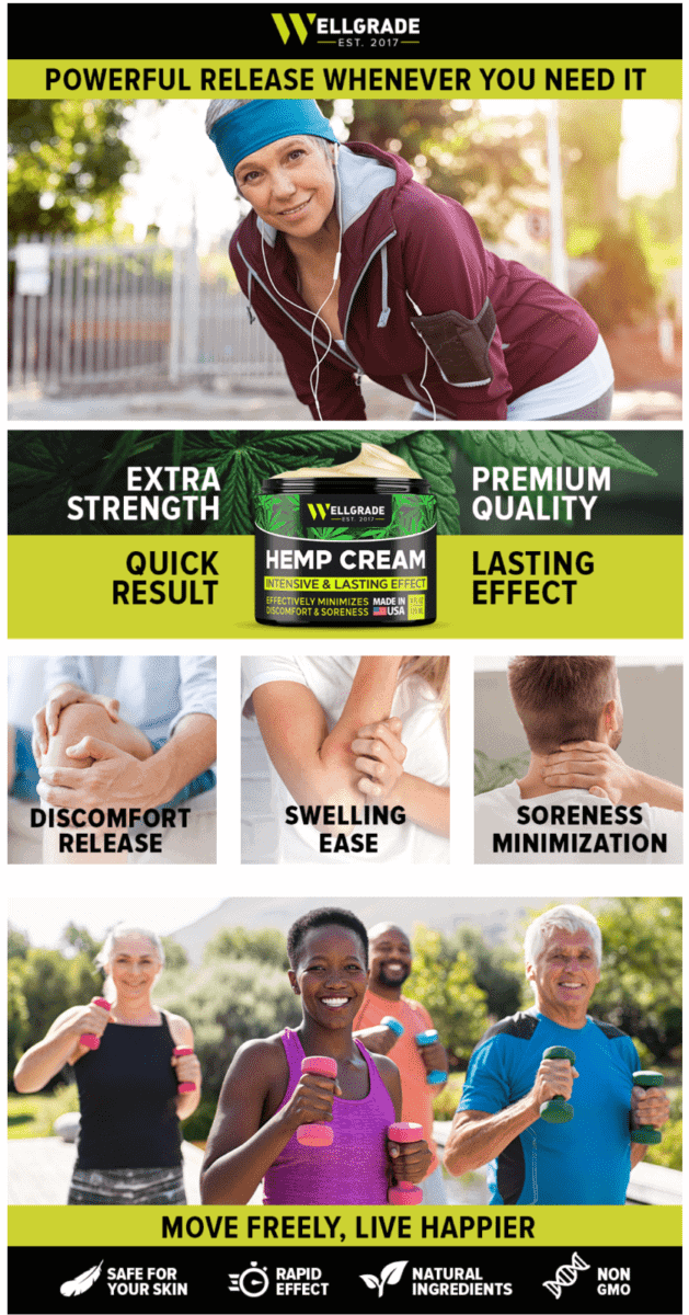
ELLGRADE Natural Hemp Extract Cream
Dealing with body aches and pains every day?
This brand uses large images of middle-aged people living an active lifestyle.
They also use short phrases to show how their cream can provide relief from most types of muscle soreness and joint pains.
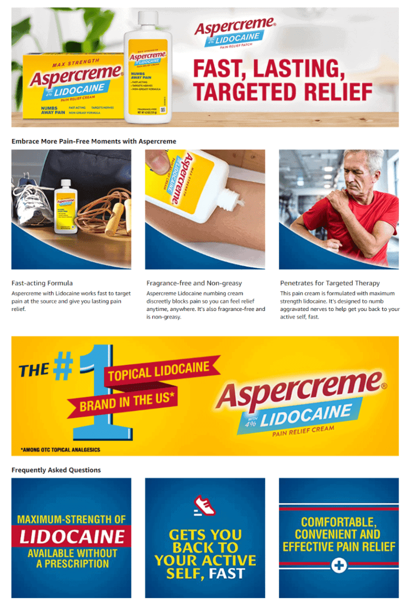
Aspercreme with Lidocaine Maximum Strength Pain Relief Cream
If you have it, flaunt it! This brand made it a point to wave around the statement saying that they are the #1 lidocaine brand among other OTC pain relief products.
The clean and streamlined look of this Amazon EBC section is made possible by using coordinated colors and a smooth-flowing layout.
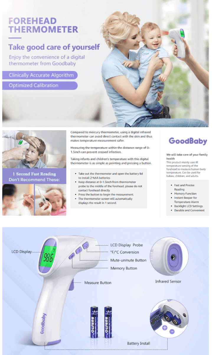
Good Baby Forehead Thermometer
Great things come from small packages.
By featuring light colors and images showing their thermometer’s different applications, you can’t help but get drawn into this brand’s Amazon EBC section.
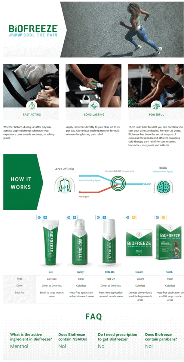
Biofreeze Pain Relief Cream
If your products offer relief from pain and soreness, it’s a good idea to feature images of athletes or people who are always on the move.
This brand also adds a comparison chart that features all the varying benefits of their pain relief solutions
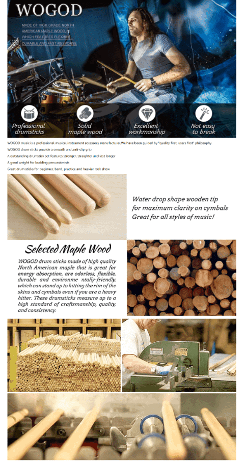
WOGOD 5A Drum Sticks Maple Drumsticks
If your products consist of musical instruments, it makes perfect sense to feature images of musicians rocking out while using your gear.
This brand also uses the EBC section to show in detail how their drumsticks are made, and how their sticks compare to other products.
Electronics
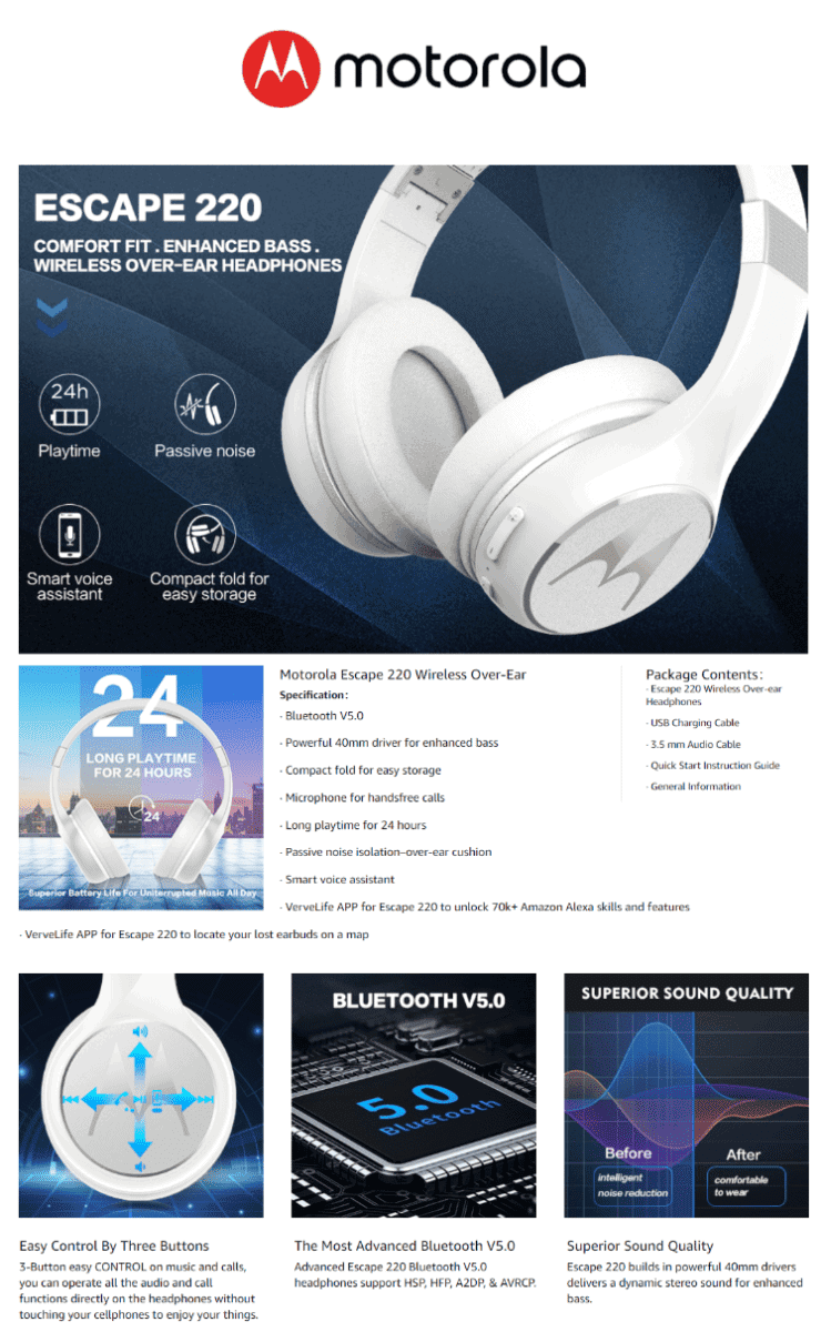
Motorola Escape 220 Over-The-Ear Bluetooth Wireless Headphones
Use high quality images of your product to liven up your EBC section.
This brand covers all the important features and key specs of their headphones.
Each tile image is accompanied by a short blurb that highlights the superior quality and performance of their headphones.
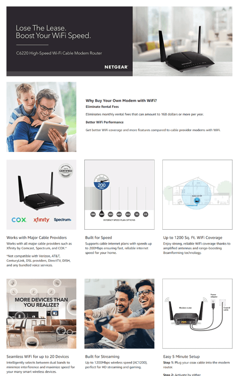
NETGEAR Cable Modem WiFi Router Combo C6220
The last thing you want is an EBC section that confuses you or leaves you with more questions than answers.
This brand’s A+ section uses easy-to-understand descriptions to market their router. They also emphasize how easy it is to set their modem up in your home.
Garden
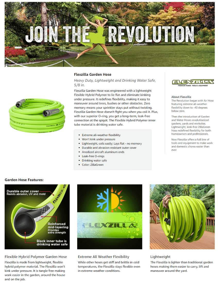
Flexzilla Garden Lead-In Hose
Underscore quality and durability by featuring a cross-section image of your product.
This brand maintains a neon green theme for their layout, and uses tile images to show all the features of their garden hose.
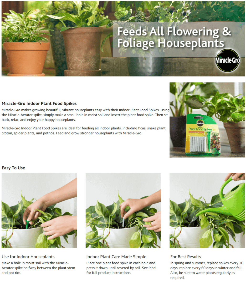
Miracle-Gro Indoor Plant Food Spikes
Keep it clean and keep it green – especially if your products are used for caring or growing plants.
Don’t forget to add a section that talks about how easy it is to use your product.
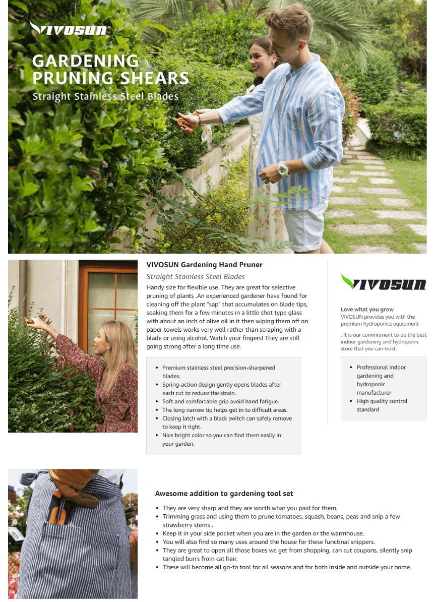
Vivosun Gardening Hand Pruner
Adding images of greenery to your EBC section is a must if your products are used for tending plants.
Tile images of well-manicured lawns and beautiful flower groves suggest that this brand’s pruner is a must-have for your lawn maintenance needs.
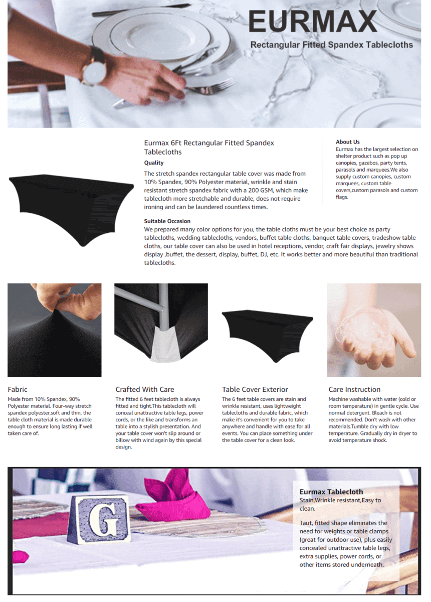
Eurmax Rectangular Fitted Spandex Tablecovers
Looking for a stylish solution for covering your party tables?
This brand highlights how their spandex tablecloth is ready for daily use and special occasions.
They also feature a section that shows how to properly care for their tablecloth.
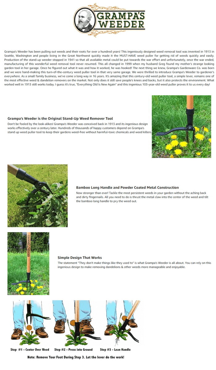
Grampa’s Weeder The Original Stand Up Weed Puller Tool
Sharing your brand story works great for connecting with your customers.
This brand’s Enhanced Brand Content section starts off by sharing how everything started out.
They also use illustrated images that give you instructions on how to properly use their weeder.
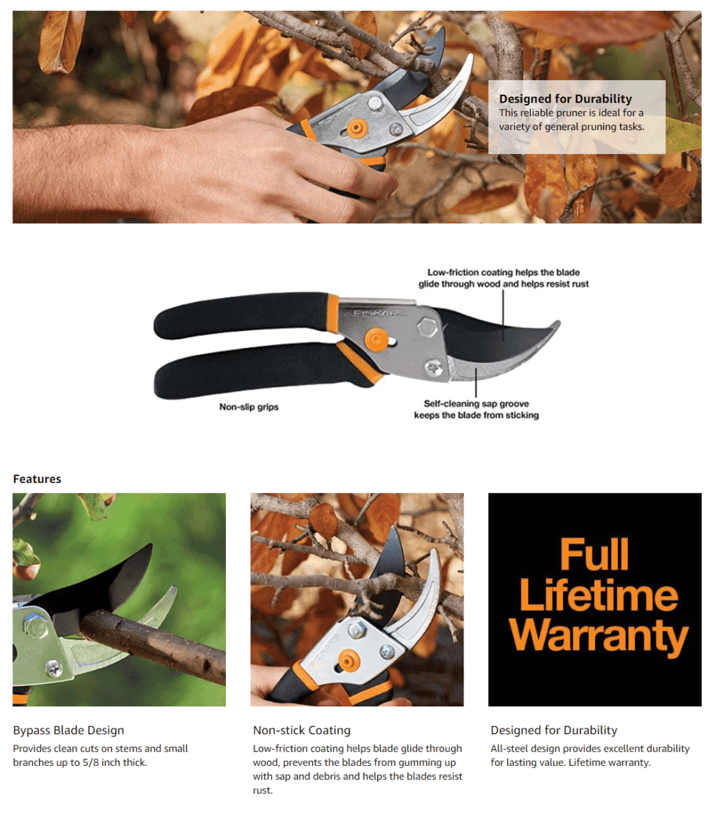
Fiskars Gardening Tools: Bypass Pruning Shears
By using a large, close-up image of their pruning shear, it’s easier for you to check out the details of their product.
Tile images are also paired with short descriptions, which show how durable and sharp their product is.
Images of their pruning shears cutting through branches is just satisfying!
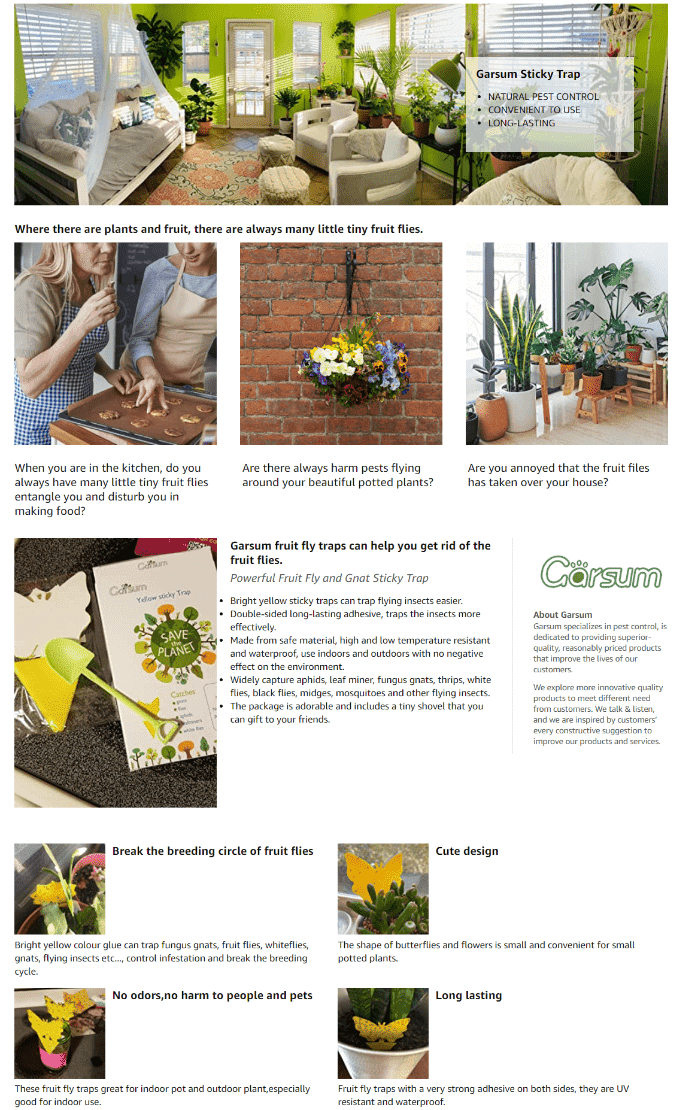
Garsum Fruit Fly Sticky Trap for Indoor and Outdoor
Got a problem with pesky fruit flies?
This brand enumerates all the winged insects that their sticky trap can capture.
Images of plants and flowers give their Enhanced Brand Content section a fresh appearance.
Amazon’s Enhanced Brand Content Guidelines
First off, you need to be a registered brand owner. To do this, you need to be approved through Amazon Brand Registry – after that, you may now add EBC content to any product listings you have in your approved brand catalog.
All brand registered sellers will have access to Amazon Enhanced Brand Content pages in Seller Central.
For brand owners who sell products in media, video, books, or digital, however, your products are not qualified for Amazon Brand Registry.
Also, if you have previously registered your brand with Amazon Brand Registry 1.0, you will still have to redo the process for Amazon Brand Registry 2.0.
After having your trademark registered on Amazon Brand Registry, make sure to check out a few Amazon Enhanced Brand Content guidelines for brand owners to follow:
- Avoid using blurry or low-quality images, images with watermarks, or small text that is unreadable on mobile devices.
- Enhanced Brand Content only supports jpg, bmp, and png image file types. Individual files must remain under 2MB with a resolution of at least 72dpi. Animated images are not allowed.
- Images and text must be unique to your Amazon EBC content. Make sure not to use the same images that are already featured in the image gallery of your page.
- Environmental and satisfaction claims are not allowed, either in text or in images.
- Warranty information is strictly forbidden in Amazon EBC Content.
- Include only one brand logo and icons that help customers navigate through the text.
- Do not include shipping details, as well as language directing customers to purchase, such as “buy now” or “shop with us”. Posting shipping timelines on your EBC page is strictly prohibited
- Do not include web links or language attempting to redirect to other sites inside or outside Amazon.
- Bold and italic formatting are only intended to be used to highlight detail page headings or a few select words.
- Images or text that attempt to mimic Amazon logos are not allowed.
- Using image keywords that do not describe the image and are not useful for shoppers using a screen reader application can lead to your content being rejected.
- Avoid referencing your company as a seller or distributor, or mentioning seller authorization, such as “product only sold by authorized resellers”.
- Grammatical errors, abusing font features, and punctuation errors can lead to content rejection.
- Making false or misleading safety claims.
- References to off Amazon customer service or company contact information are prohibited.
- Energy saving claims need to be backed by reliable scientific evidence.
So what do you think?
Do you have an attractive Amazon Enhanced Brand Content example you would like to share with us?
Leave a comment below and we’ll add it to the list right away!
Want us to help you design a killer A+ content section that drives conversions? Get in touch with us and get a reply in less than 24 hours (Even on Sundays :))




One Response
Great Articel!