If you are reading this article, you are most likely on the hunt for modern Amazon Storefront designs to use as creative inspirations for your Amazon store.
We have picked out 102 of the most eye-catching and engaging Amazon Storefronts examples for you to check out, covering 10 different categories.
In this article, you get to see how different brands showcase their products through attractive photos, personalized logos, and appealing layouts – creating a brand-specific shopping experience for new shoppers and potential customers.
Jump in and check out our list of 102 Epic Amazon Storefront Design Examples right here!
What Is Amazon Storefront?
Doing your research on A9 facts, working on your Amazon listing optimization, and finishing up on your copywriting are all great ways to make your product rank high on Amazon search results.
Just like most brand owners with a professional seller account, you probably encounter difficulties establishing your brand identity.
But with your product featured in an ordinary listing, everything just looks rather identical, and your brand name is barely visible on the Amazon marketplace search engines.
Creating an Amazon Storefront is the perfect way to add flare to your listings, expand your brand story, and leave competitor’s products behind.
It lets you create your very own miniature e-commerce website within the Amazon platform, making way for a unique shopping experience to shoppers.
This way, shoppers have an easier time finding you online and they get to see you as a genuine brand, rather than a typical reseller selling products.
Why Choosing A Best Amazon Storefront Is Important?
By creating your own Amazon Storefront, you get to develop your brand story and market that story to your shoppers.
Through your store, you are able to create a unique and brand-specific online shopping experience for all your visitors – which can ultimately lead in increased sales.
With the right Amazon Storefront design, you have an easier time featuring all of your products and marketing material in just one location.
You also get to significantly enhance your brand image, which leads to a stronger emotional connection with your customers.
In the list below, we bring together 102 of the best Amazon store templates we have seen so far!
Modern Amazon Storefront Examples By Product Category
Fitness & Outdoors
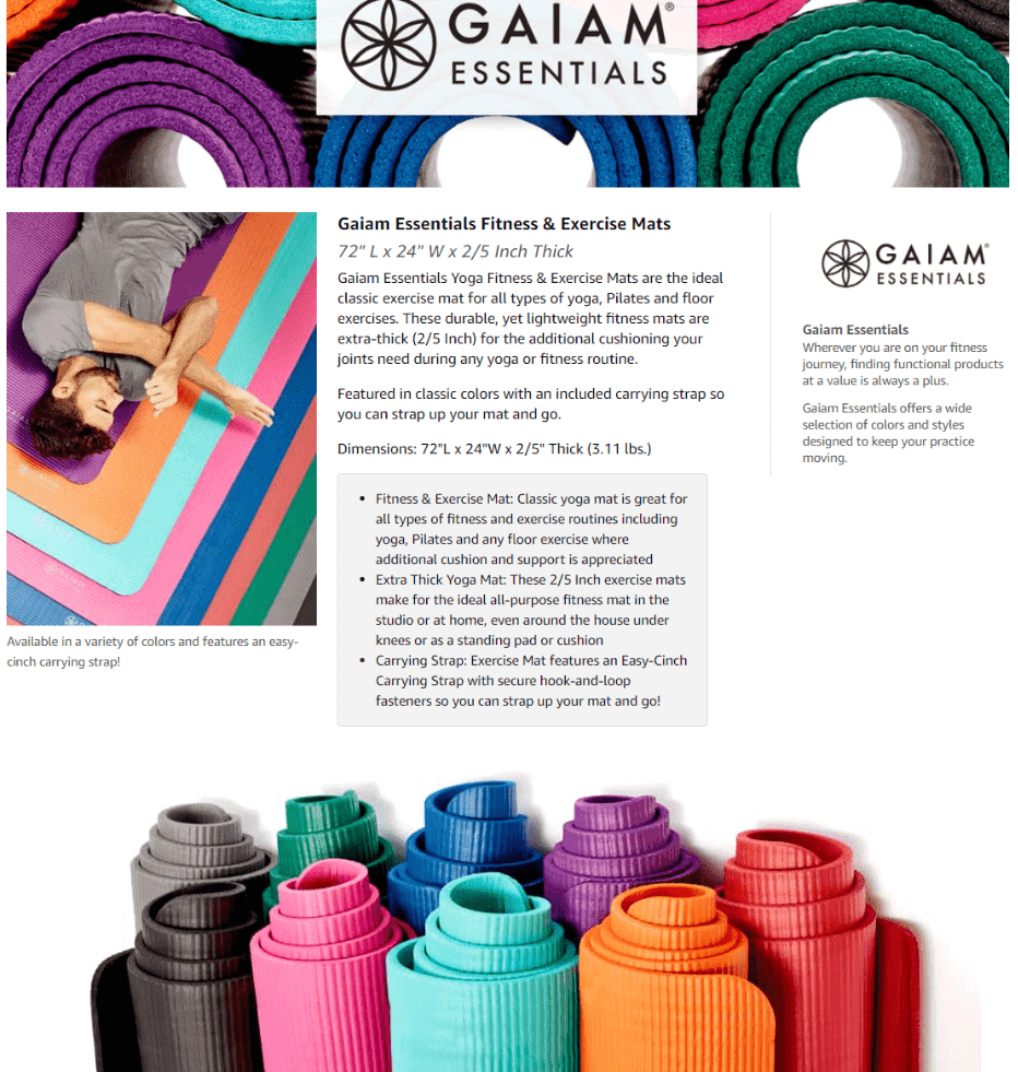
Gaiam
Here you are greeted by a woman practicing her yoga pose, while being surrounded by a variety of Gaiam fitness gear with shoppable image modules.
They also add a call to action by saying “Join us in adding balance to your life”.
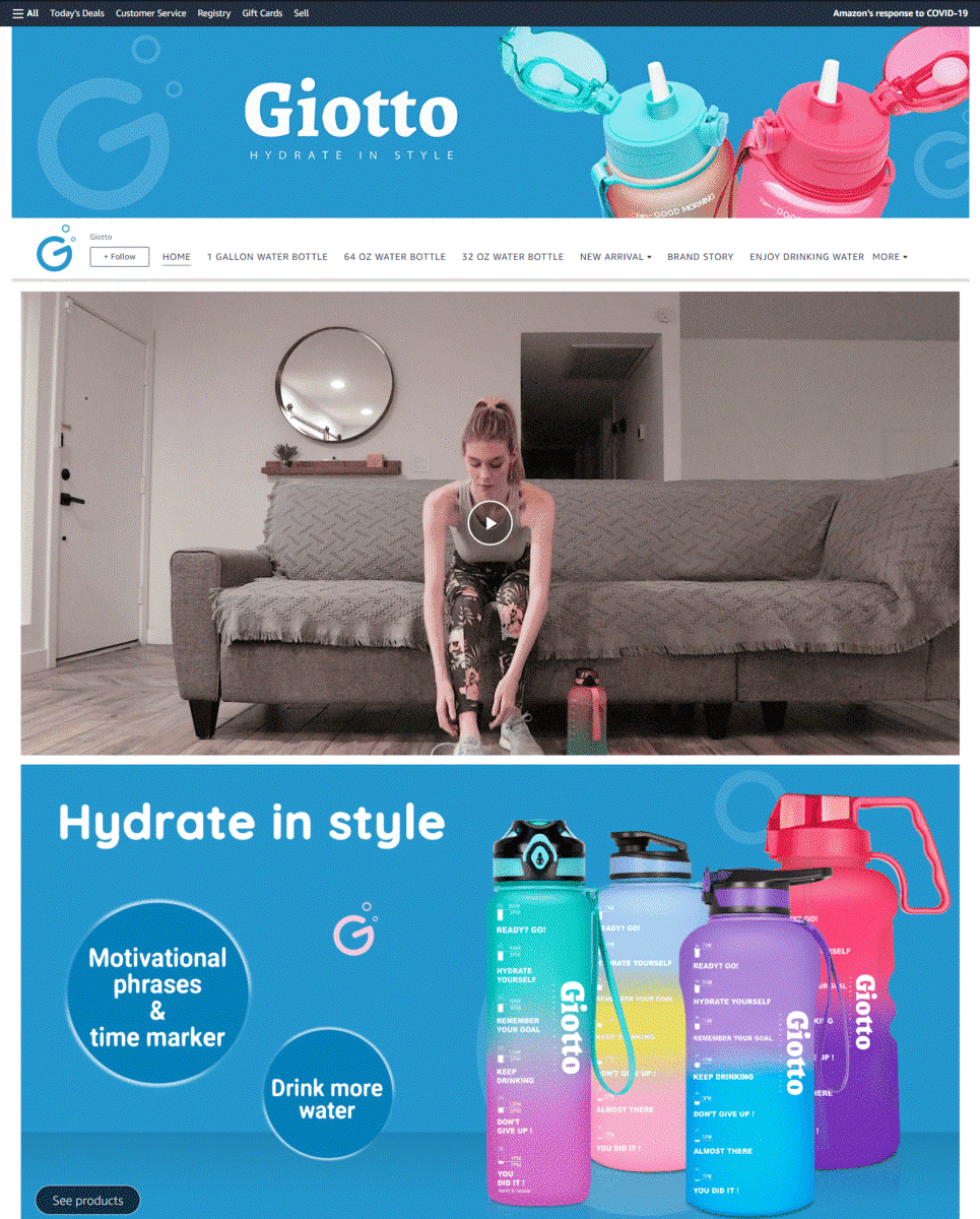
Giotto
Pairing images of their water bottle with blue background colors, you immediately think of quenching your thirst and staying hydrated.
Their landing page video plays upbeat music as it focuses on the water bottle’s time marker key features – highlighting how the bottle is perfect for those who lead an active lifestyle.
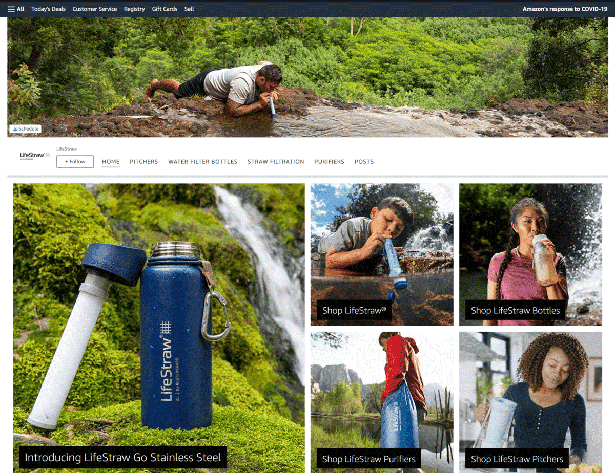
LifeStraw
Featuring large image tiles of their products with purchase links, you immediately get to see how each LifeStraw is used for different outdoor (and indoor) scenarios.
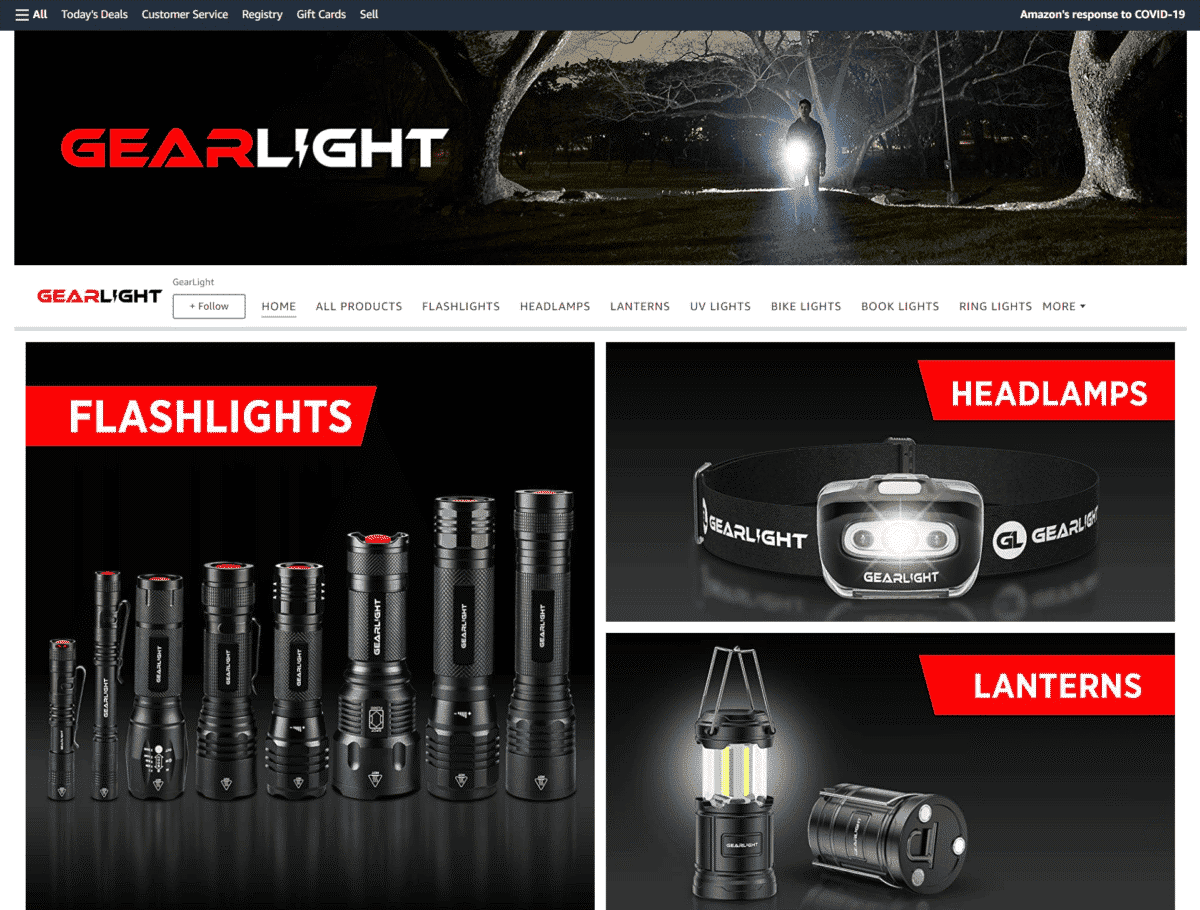
GearLight
As an Amazon Storefront that sells LED flashlights, headlamps, and lanterns, you notice how the page is given a black-themed design to highlight how their products are best suited for use in dark conditions.
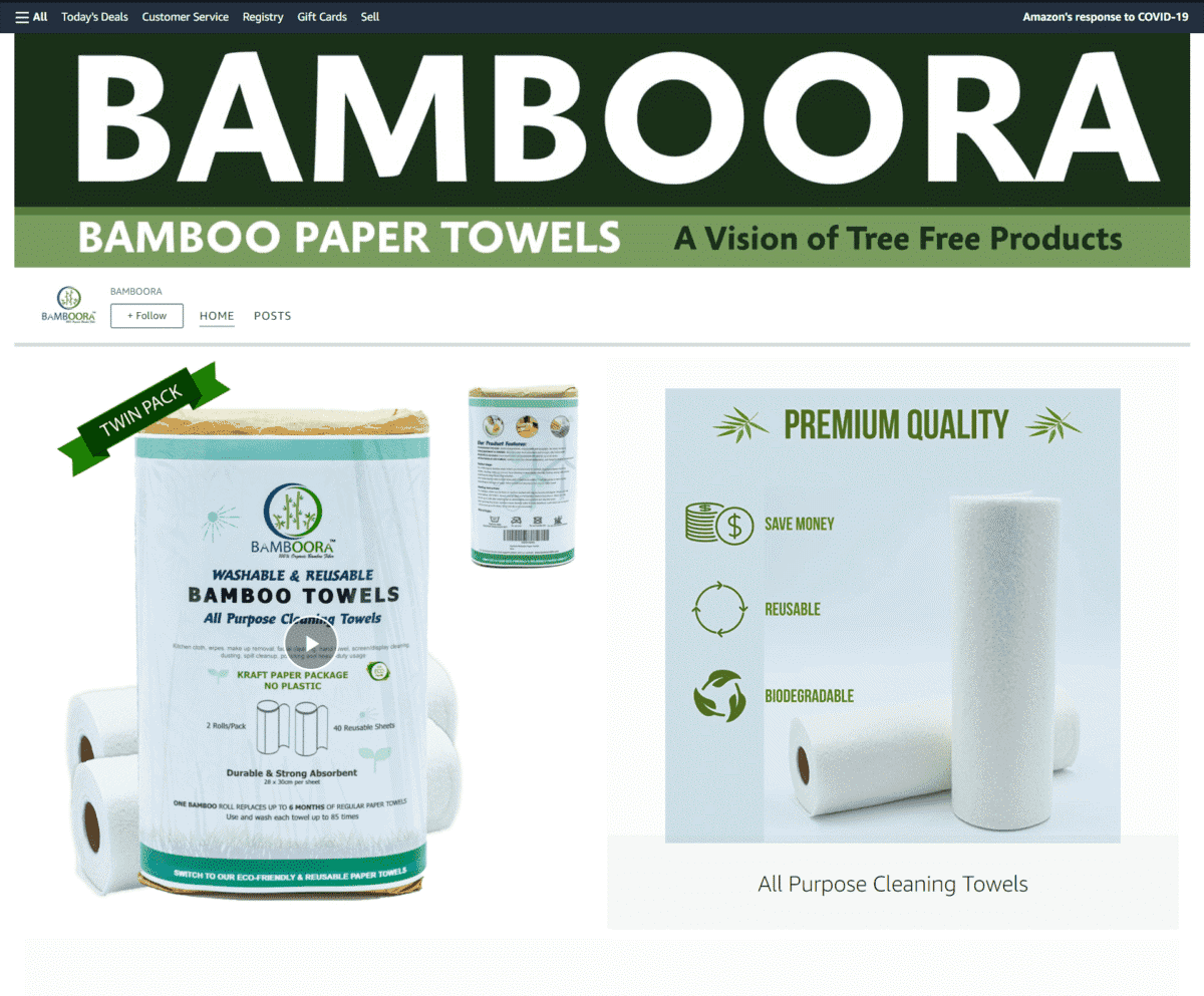
Bamboora
This is one of those Amazon storefronts that know how to keep things clean and simple. Their informative video immediately shows you why you need these eco-friendly bamboo paper towels in your life.
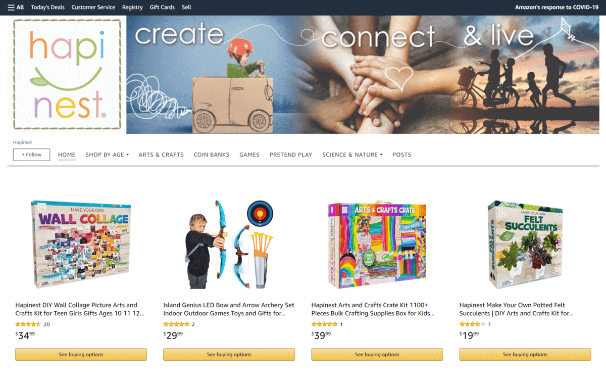
Hapinest
Their brand logo shows of playful pastel colors, while its banner features images of kids playing and having fun.
Just one look at these designs lets customers know that they are in the right place for kid’s toys, arts and crafts supplies, or activity kits.
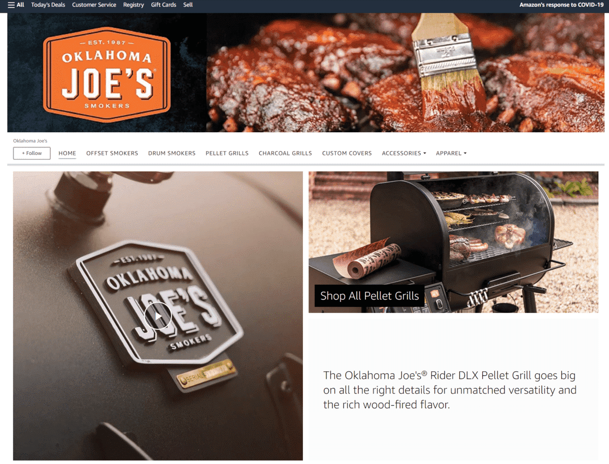
Oklahoma Joe’s
This one right here is one of our most favorite Amazon Storefront examples. Just a few seconds into the video found in this Amazon brand store homepage, your mouth will start to water as you are greeted by thick cuts of juicy meat being cooked on their premium grillers and smokers.
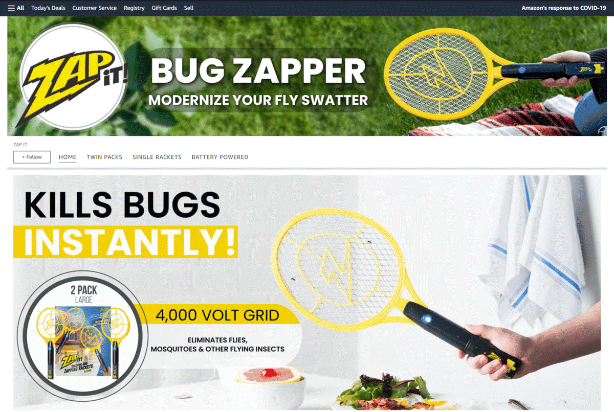
ZAP-IT
Got a problem with pesky flying insects? This Amazon brand store trumpets their call to action to “Modernize Your Fly Swatter” and lets you know that their bug zapper KILLS BUGS INSTANTLY in big, bold letters.
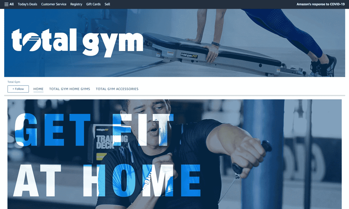
Total Gym
Featuring large photos of people working out with their home gyms, this Amazon Storefront page also has an “Our Favorites” section with images of their home gym machines and accessories.
Gruper
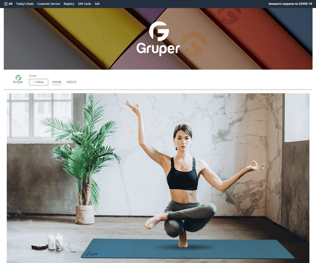
A picture says a thousand words, and this is one of the best Amazon Storefronts examples that prove that. Customers instantly notice the brand’s feel and their attention is immediately grabbed by the full image of a woman looking relaxed while doing a toe stand on their yoga mat.
Hoorboor
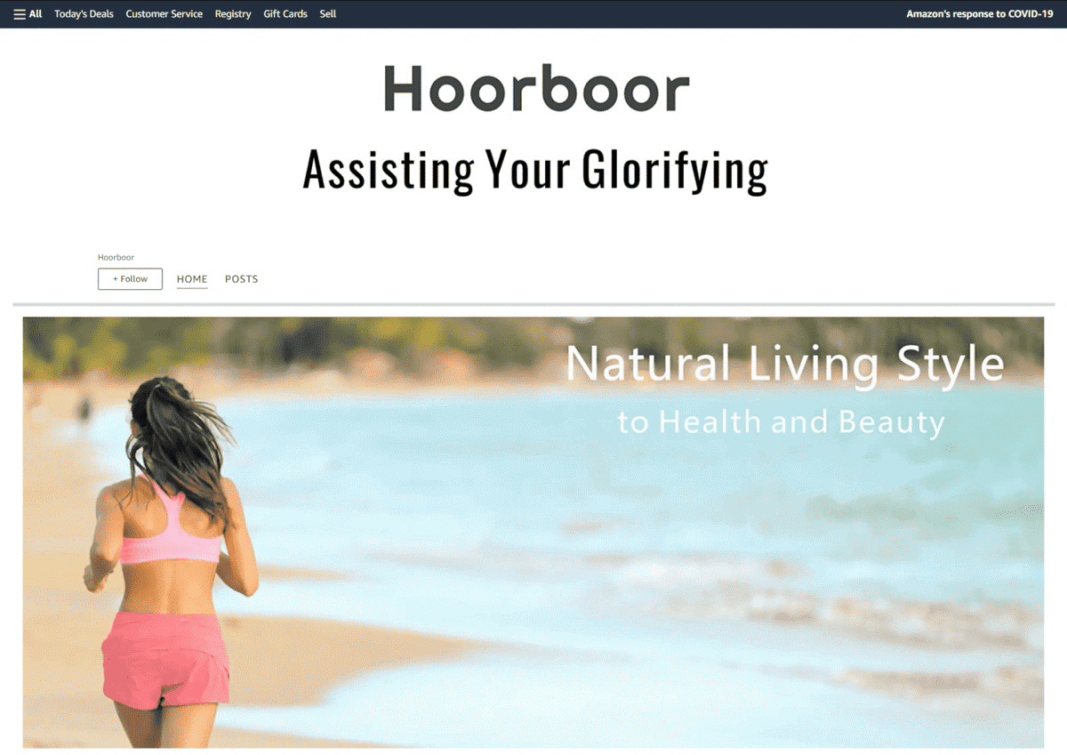
Checking out the images they used on their Amazon Store, you see modern women enjoying life to the fullest, connecting with nature, and pursuing a fitness-oriented lifestyle.
Pets
Zesty Paws
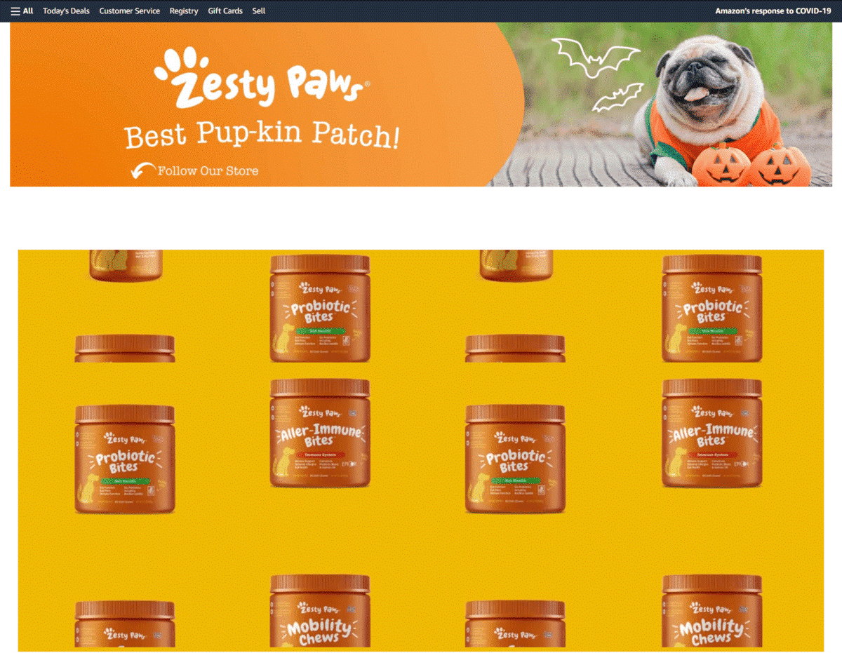
With their tagline that says, “Keep Your Bestie Feeling Zesty!”, this is one of those Amazon brand store examples that attempt to attract customers and boost sales by featuring quirky and cute images of dogs and cats.
Right off the bat, you know that their store caters to pet lovers and fur parents.
Oxyfresh
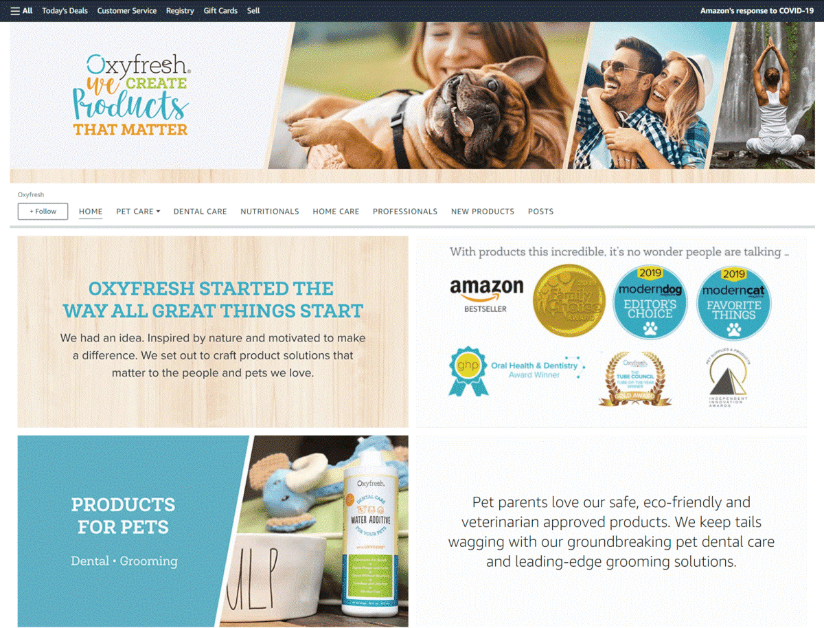
This Amazon store aims to drive traffic their way by proudly showing off the numerous awards it has won through the years – great for telling customers that they are one of the pet care stores trusted by many.
Strawfield Pets
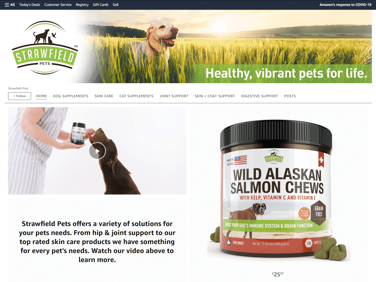
After watching their landing page’s videos, this Amazon Storefront makes it clear that their pet supplements are made in regulated facilities in the USA – you even see an image of a dog happily running with an American flag held in its mouth.
Miracle Care
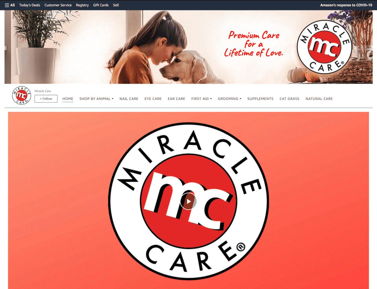
This Amazon brand Storefront highlights how they have been around for more than 4 decades now, providing wellness solutions for different types of pets.
Showing off excellent product placement, they also have dedicated image tiles, allowing shoppers to easily purchase products for their dog, cat, small animal, or bird.
Beauty
Modelones
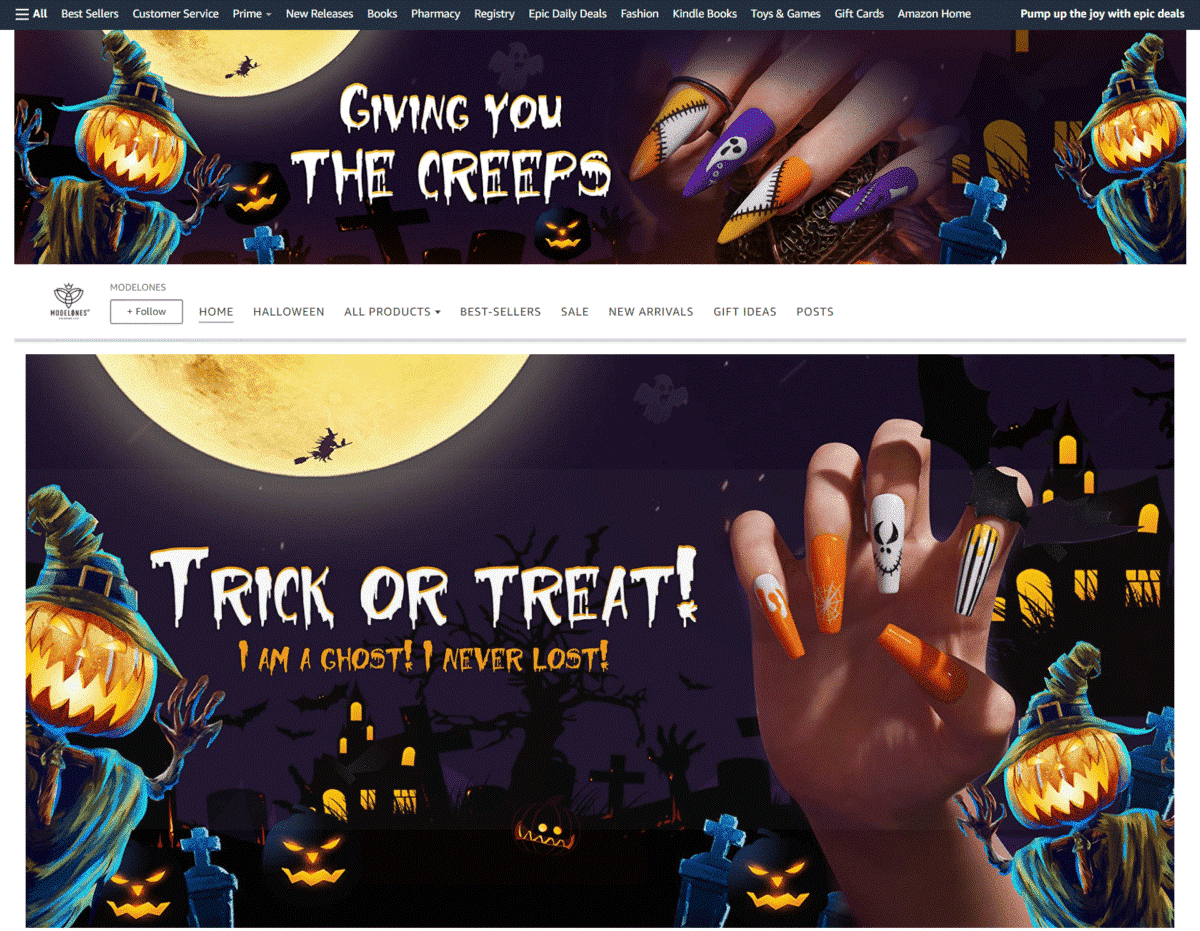
Featuring a Halloween-themed banner on its page, this brand’s modern storefront design lets any customer know that they can find the nailcare accessories needed for any upcoming holidays or special events.
Revlon
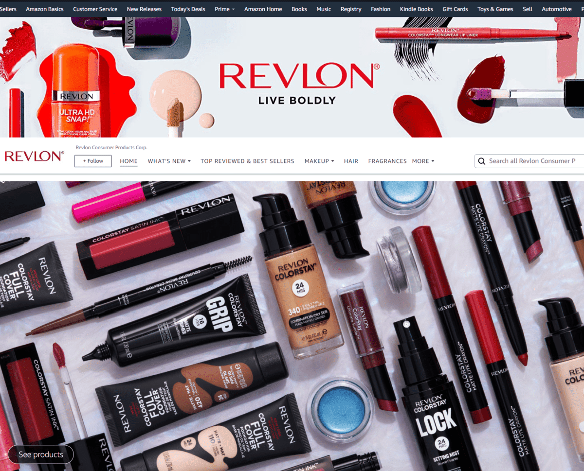
This cosmetics company brandishes its renowned brand’s logo and tagline through an animated banner. They also feature “What’s New” and “Top Reviewed Products” sections for easy navigation of buying options.
Conair
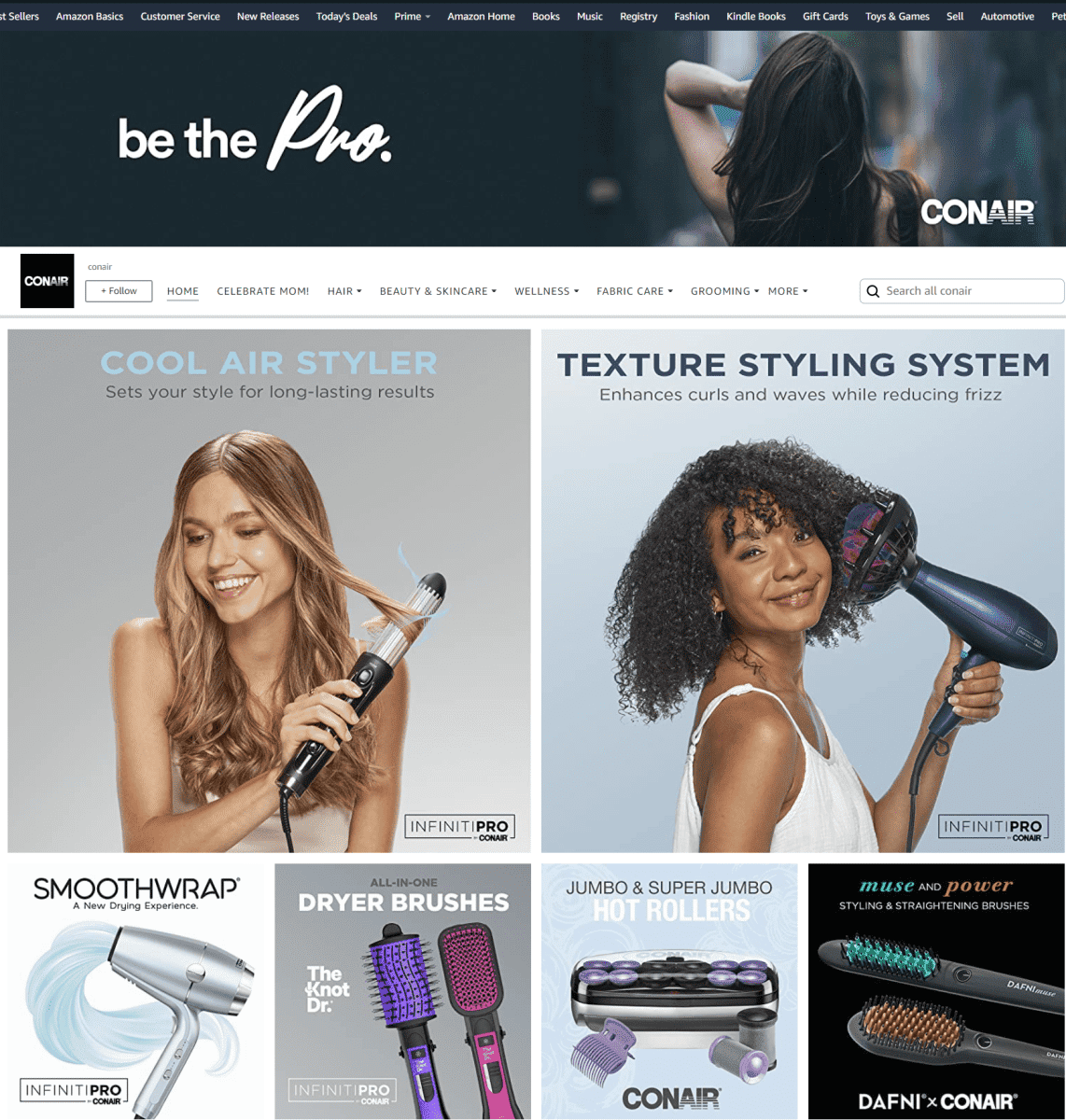
Keeping most of their image text short and simple, this Storefront’s design relies heavily on large photos of their grooming products.
LUMA by Laura
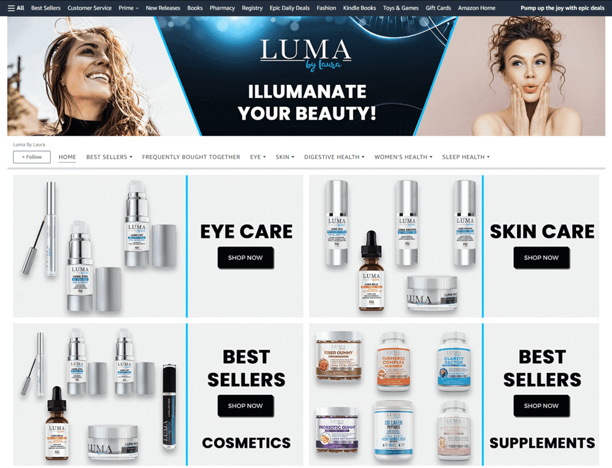
Here you see how this skincare brand incorporated their name into their tagline: “ILLUMANATE YOUR BEAUTY!”. Witty! They also have a Frequently Bought Together section for combo deals.
Bossman Brands
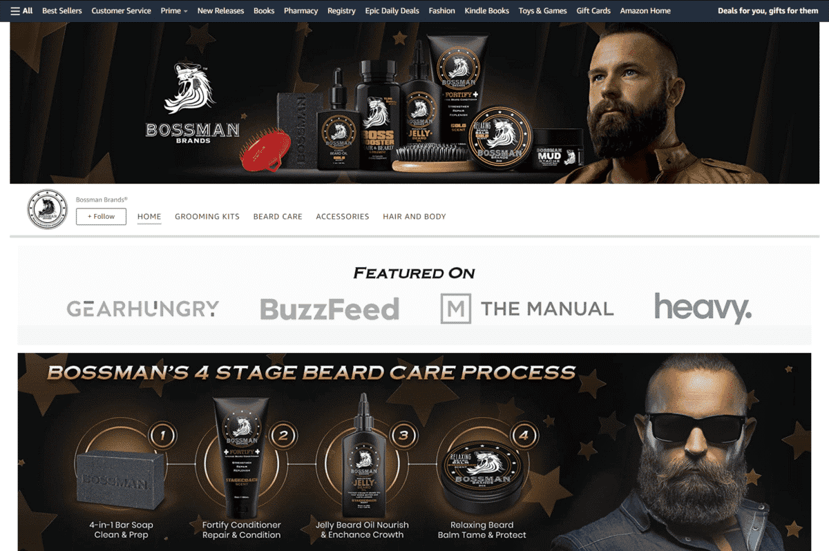
Aside from their masculine-themed image designs, this beard care company aims to send traffic their way by showing that their products have been featured on popular publications and websites.
Blitzwax
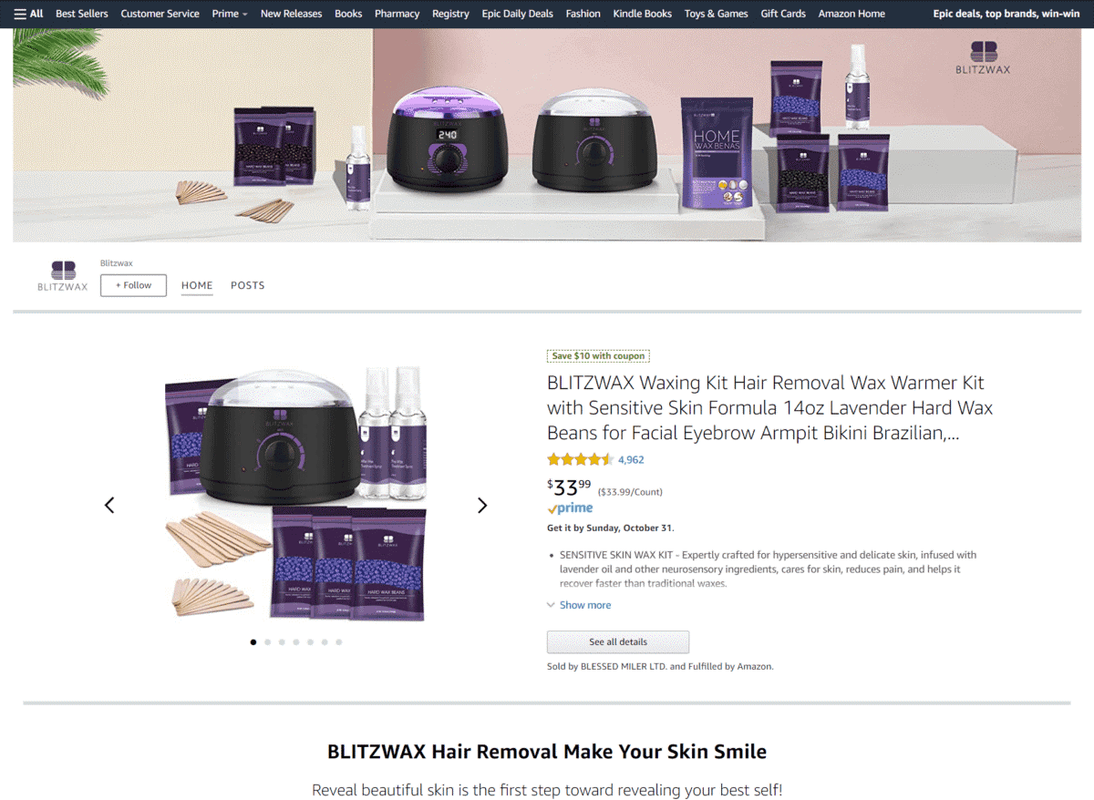
On this page, the brand features a banner with their waxing products lined up nicely. The product description comes right below, giving you more-detailed info for their kit.
Tress Wellness
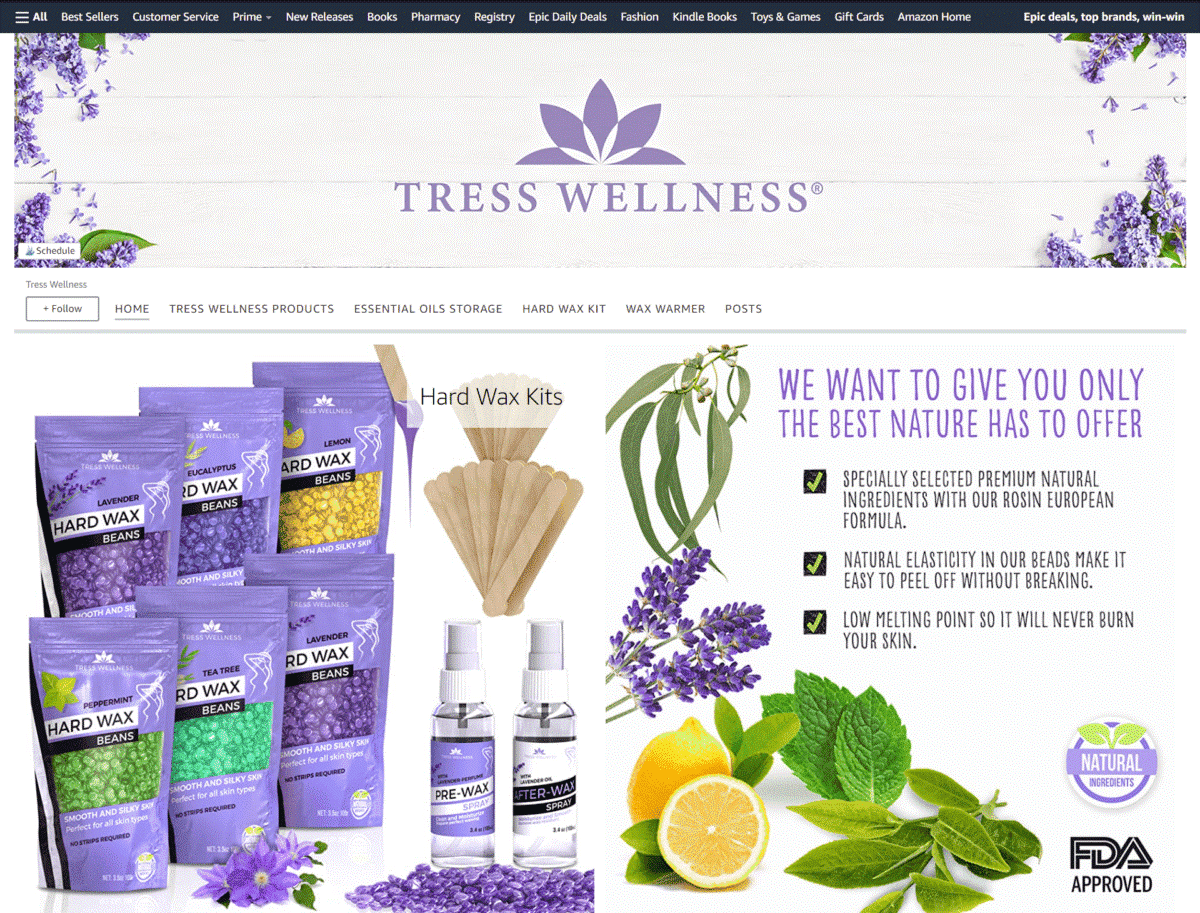
Since this brand offers natural skincare products, they made sure to incorporate images of fruits, flowers, and botanicals to their design layout.
Vercord
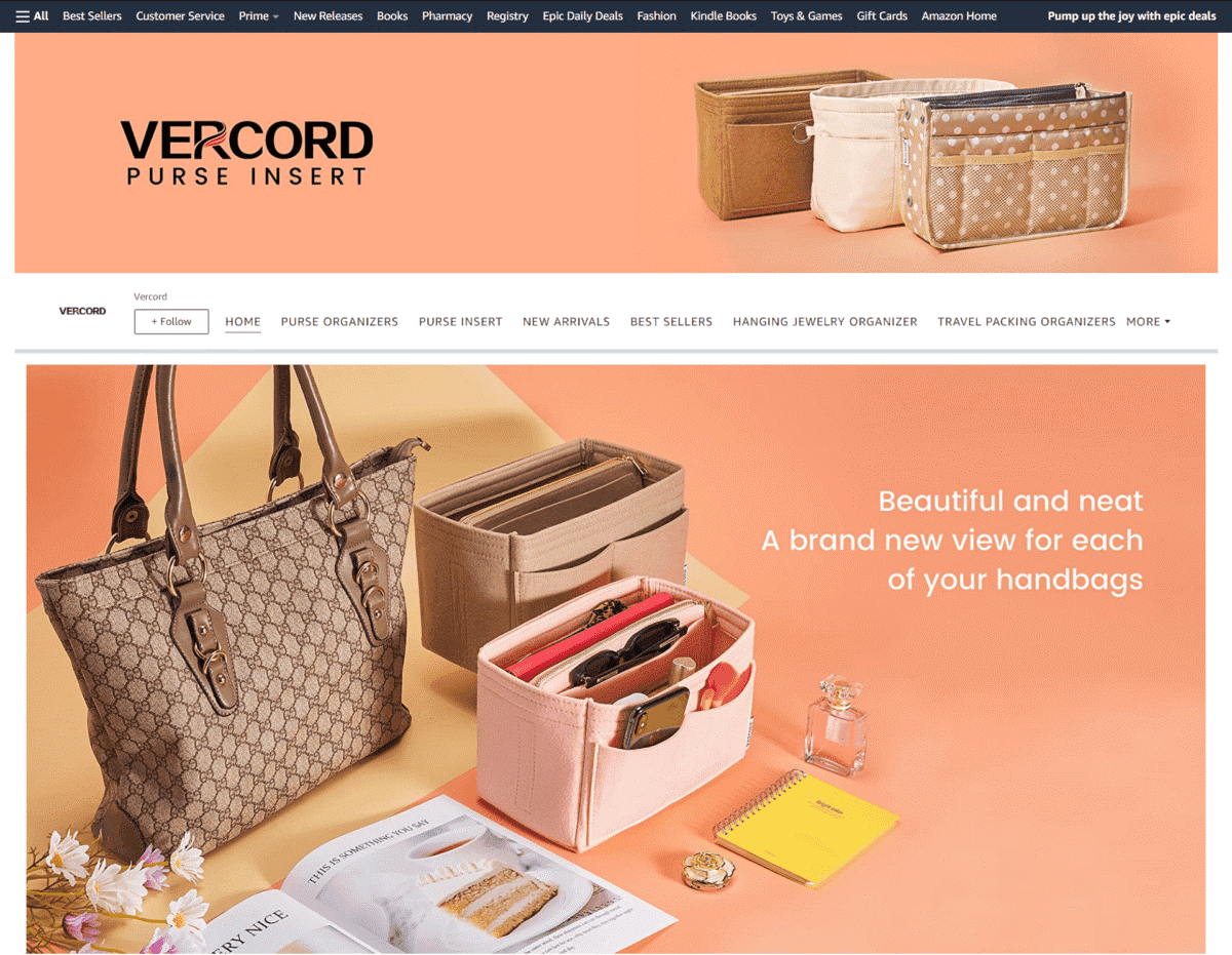
Aside from the large lifestyle images of their bag organizers, this brand’s page also features a short video showing a woman placing multiple items in her bag one by one.
Body & Earth
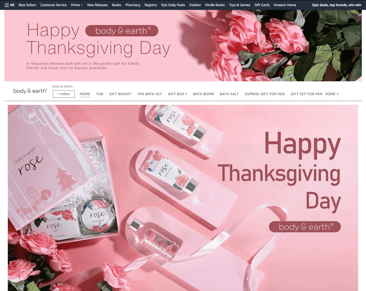
Many people shop online to buy gifts for friends or loved ones. This brand markets their bath sets as the perfect present for every woman.
Bliss
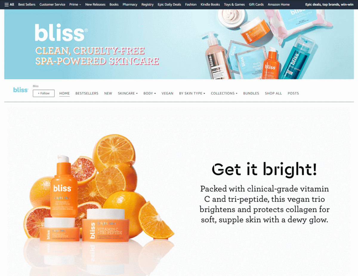
Taking a photo of all their products together for your banner also works in grabbing customer’s attention – as you can see on this online store.
Kids And Babies
Bentgo
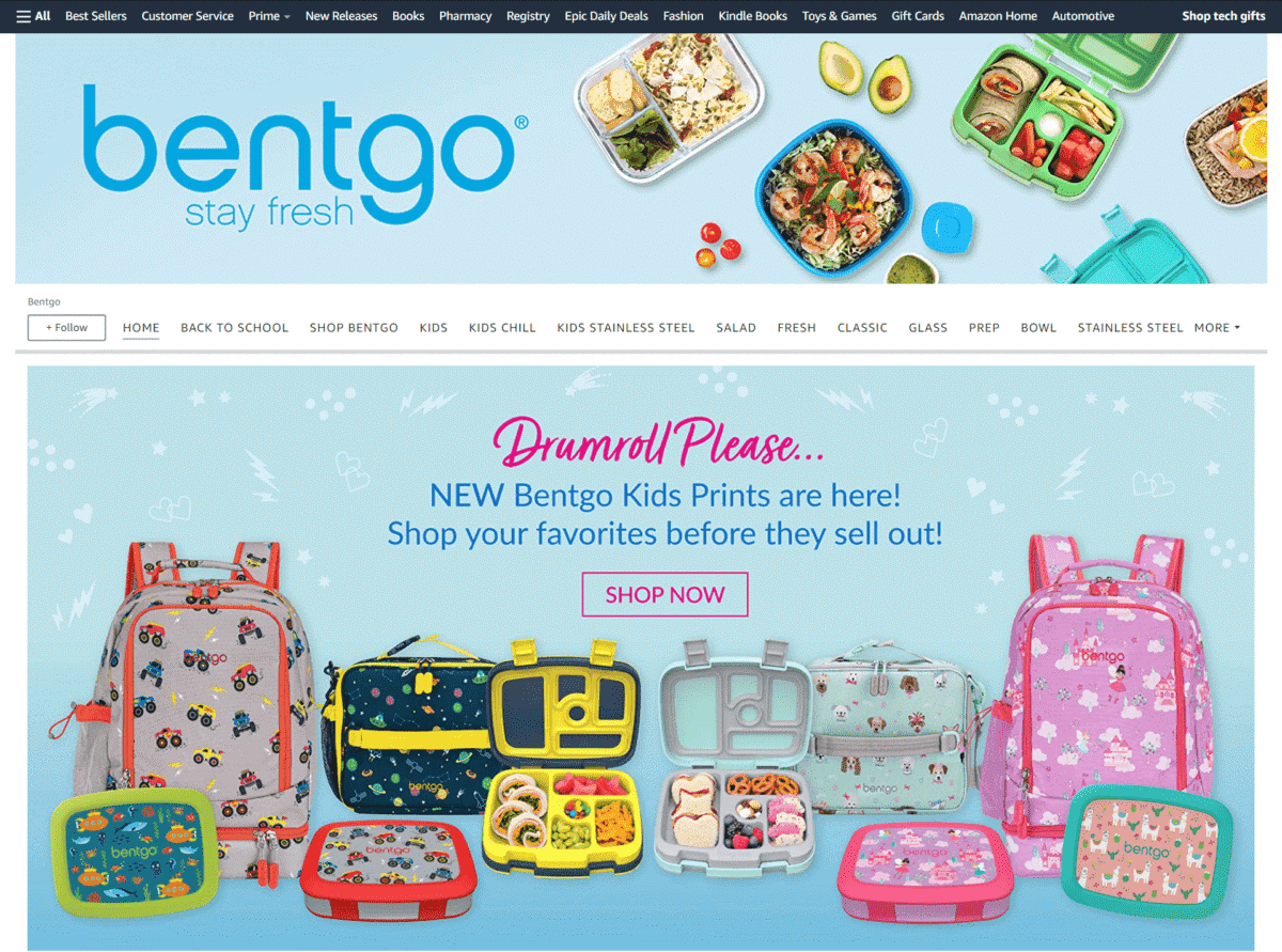
This brand triggers a sense of urgency by encouraging you to purchase their new food packs before they sell out. Their page also features their bento box bags filled with fruit slices, snacks, and treats that kids will love.
Picasso Tiles
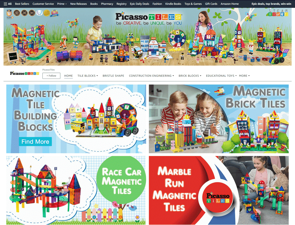
This online store highlights how their colorful building sets and tile block kits are perfect for kid’s STEAM and STEM activities. Their banner also shows the awards they have won through the years.
SmartyPants Vitamins
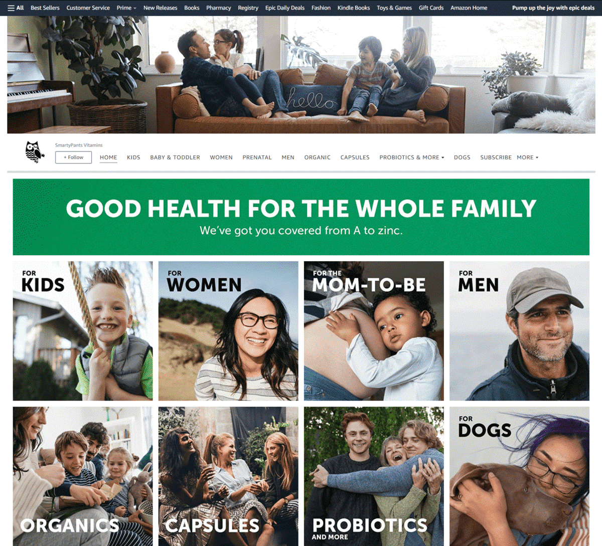
Introducing themselves as a brand that supports good health for the whole family, their online store features tile images of kids, teens, adults, and even pet dogs. They also mention that a portion of each sale gets contributed to charitable causes.
HALO
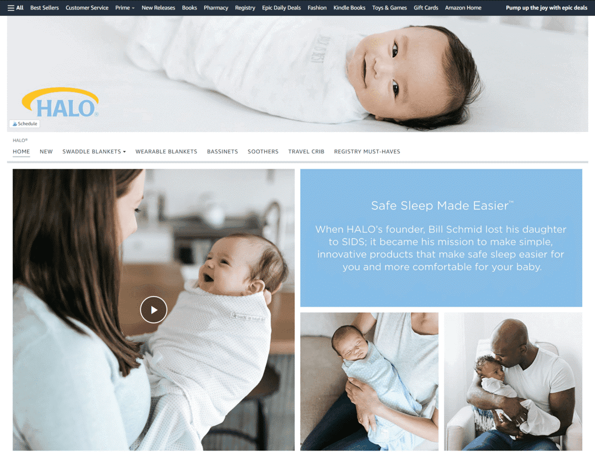
Get ready for cuteness overload as soon as you visit this online store’s page. Their banner features an image of a smiling baby wearing their swaddle blanket. Short text also says why their founder decided to create wearable blankets for babies.
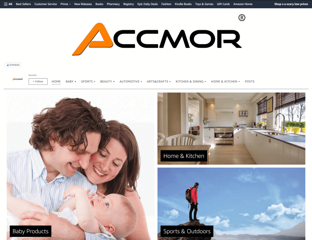
Accmor
Using a simple layout of images, you won’t have any difficulty navigating this brand’s Storefront. It features large image tiles with modern images and minimal text.
Home
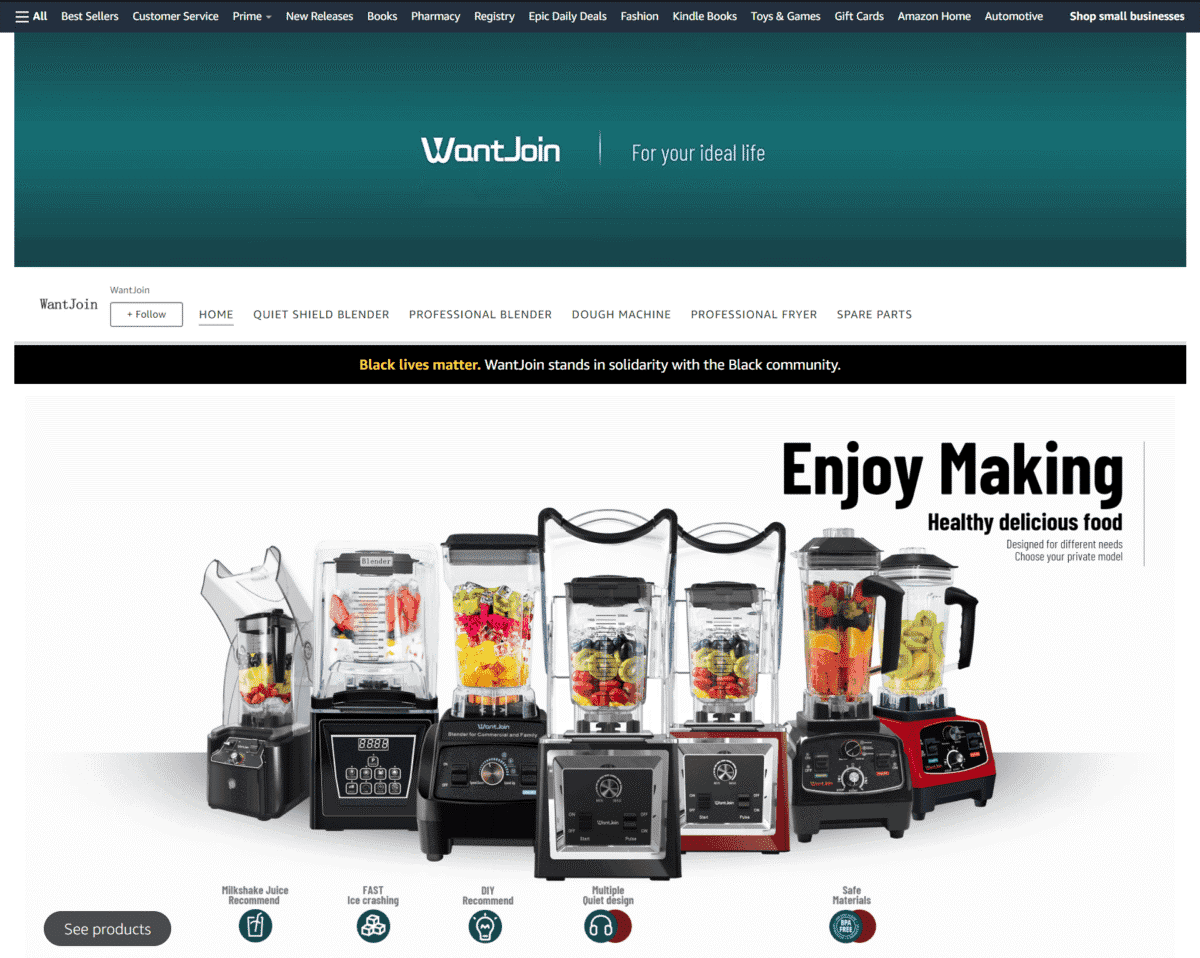
WantJoin
The image of their blenders lined up side-by-side feature shoppable modules for easy shopping. The brand also expresses support for the Black community with the “Black Lives Matter” statement on their page.
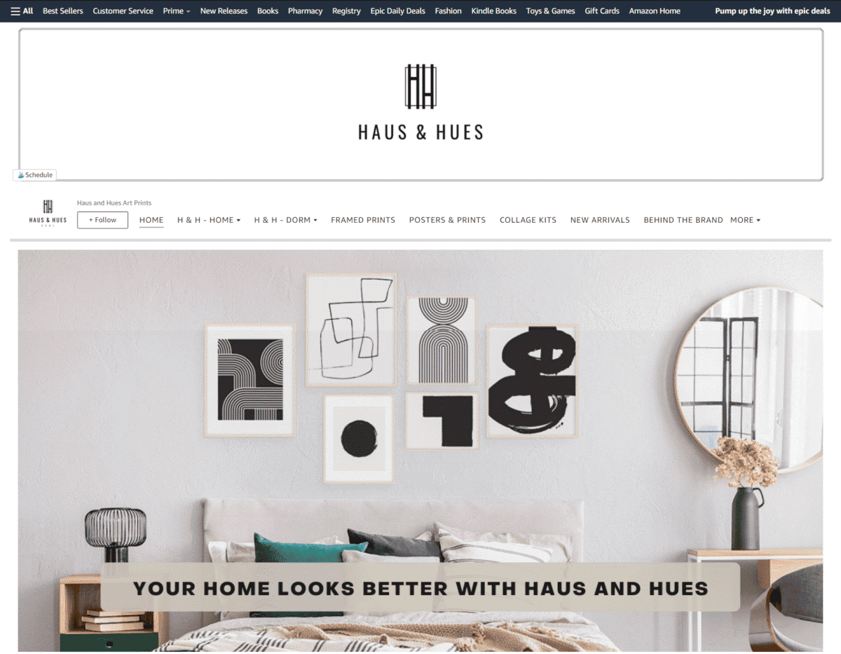
Haus & Hues
Combining a minimalistic design with earth colors, this brand shows multiple images of their art prints being used as wall décor. They also feature an “Our Story” section for you to get to know the brand better.
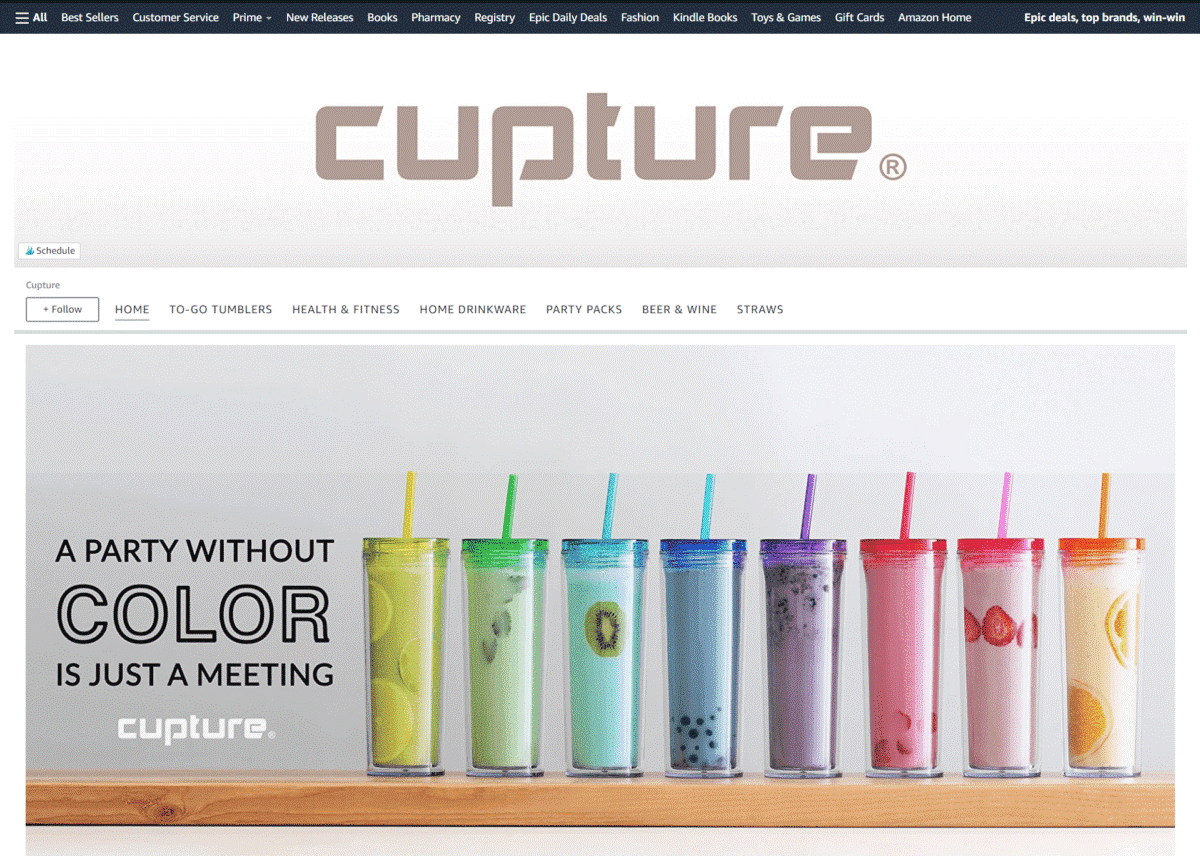
Cupture
Giving off a fun-loving vibe with their colorful tumblers, this brand looks like it is ready to party at all times.
Ironck
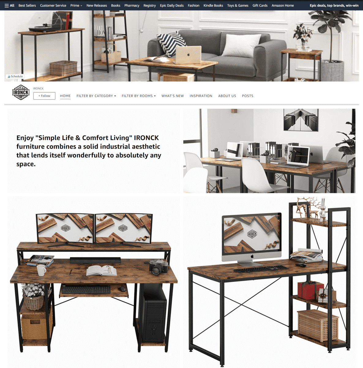
Using a clean white background for their catalog images, this brand’s Storefront exhibits a fresh and appealing look.
Seventh Generation
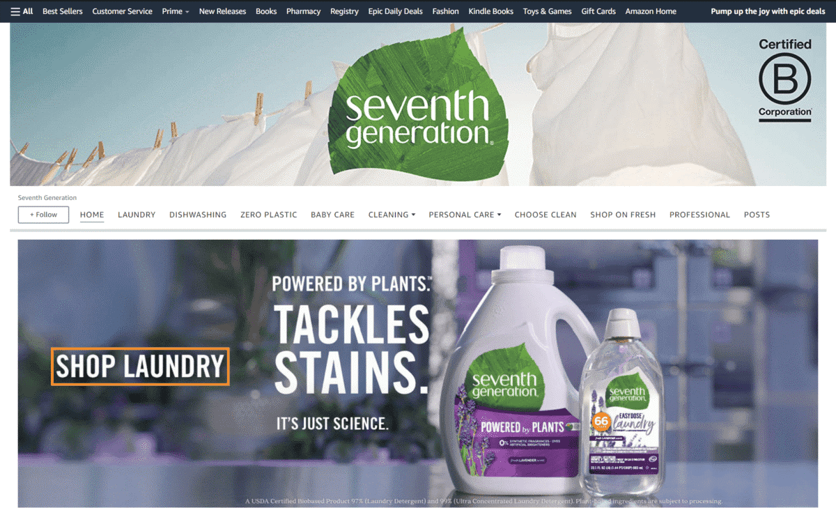
With a tagline that says “Powered By Plants”, this brand highlights how their plant based cleaning solutions are made to be a friend to Mother Nature.
Molly’s Suds
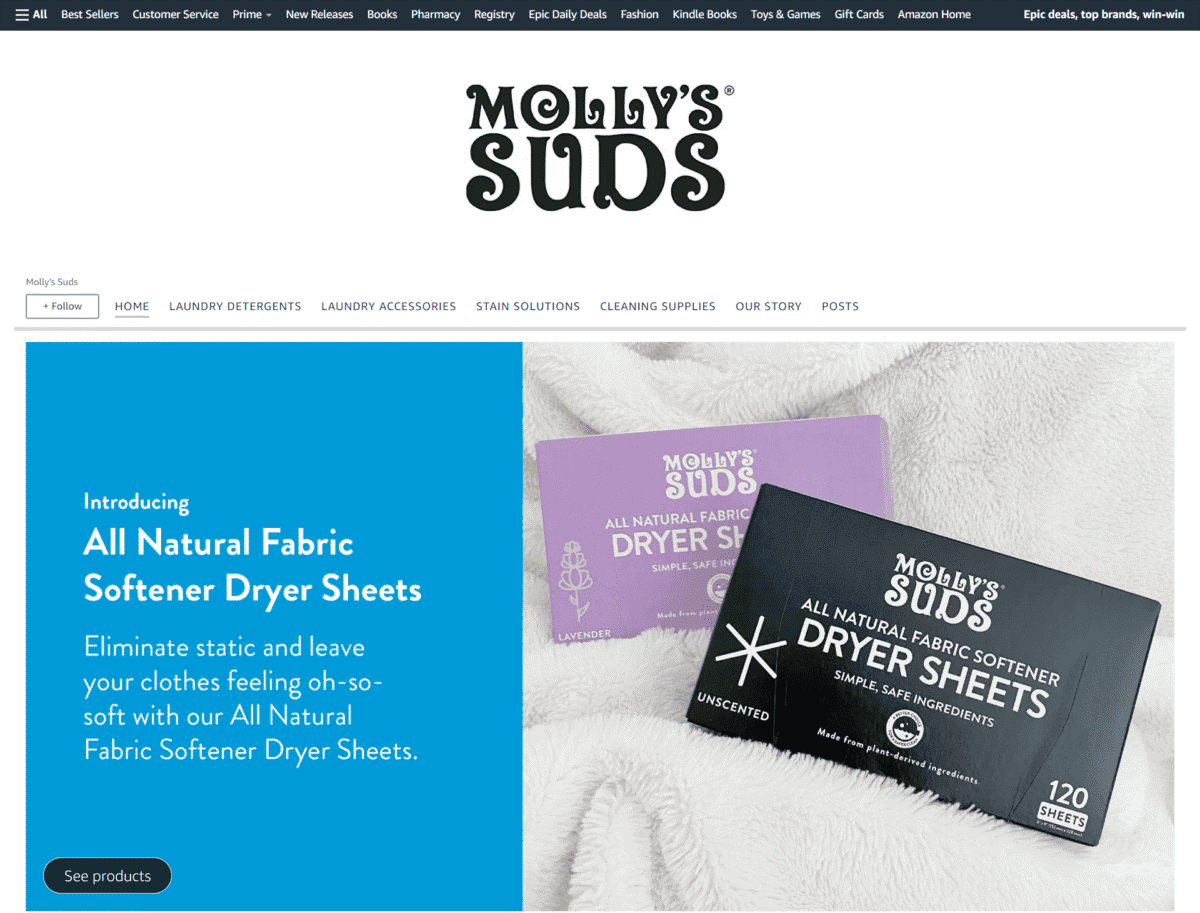
Bringing together large lifestyle images, cool color profiles, and short text descriptions, browsing through this brand’s Storefront is always a pleasing experience.
The Hate Stain Co.
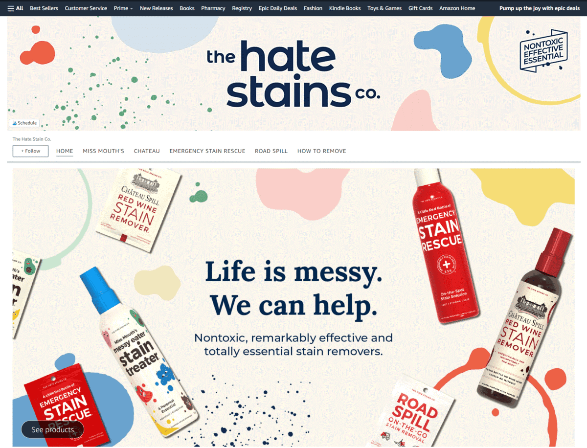
Their tagline says it all: “Life is messy. We can help.” This Storefront takes on a casual and colorful approach to showcasing their cleaning solutions.
The Laundress New York
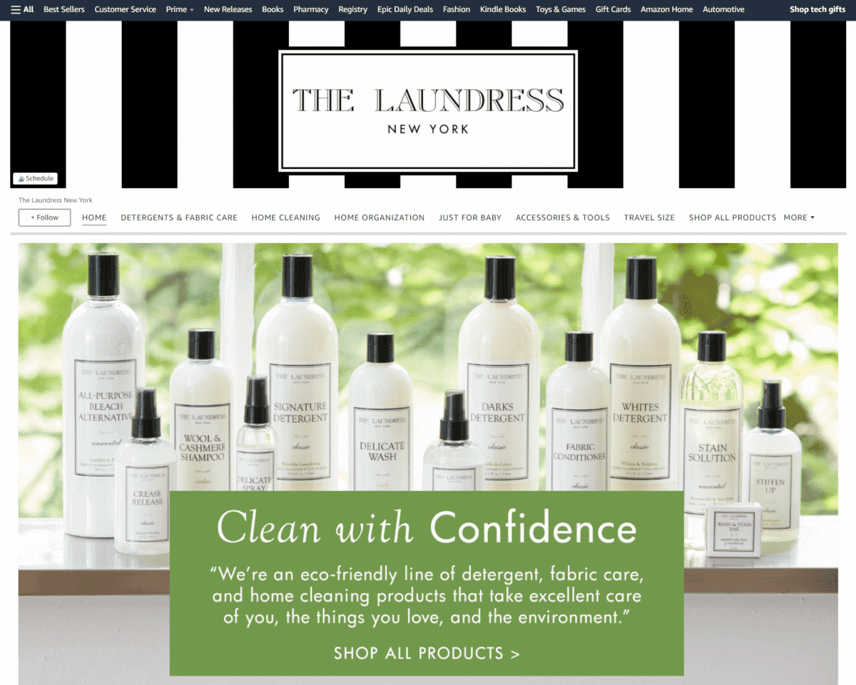
We love how the sleek black and white stripes of their banner matches the classic look of their home cleaning products.
DampRid
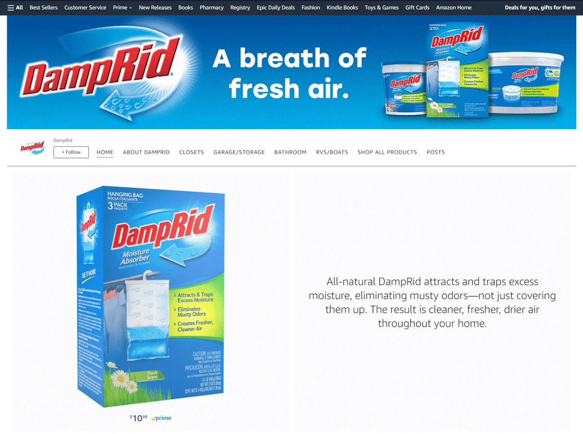
The clean design of this brand’s page is – as their tagline says – a breath of fresh air. Clicking on any of their images will take you to the specific product page.
RoomMates
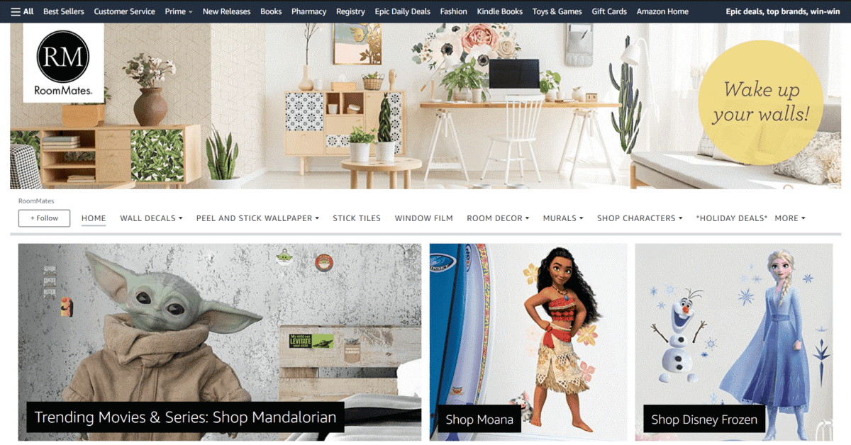
Tired of seeing your plain-looking wall every day? This sellers Storefront features large tile images of their wall decals and wallpaper – each one designed to wake up your walls!
Aunt Fannie’s
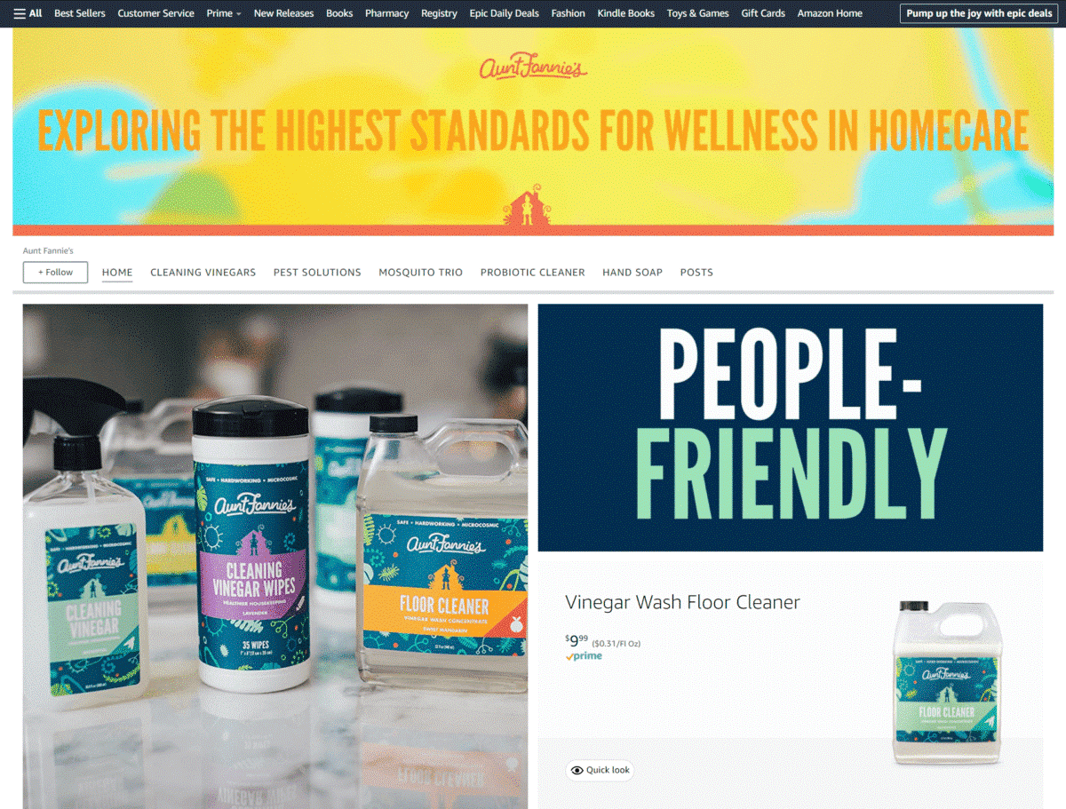
Their Storefront features an image of their founder, along with a message that highlights why they create cleaning solutions that are safe for the whole household and the environment.
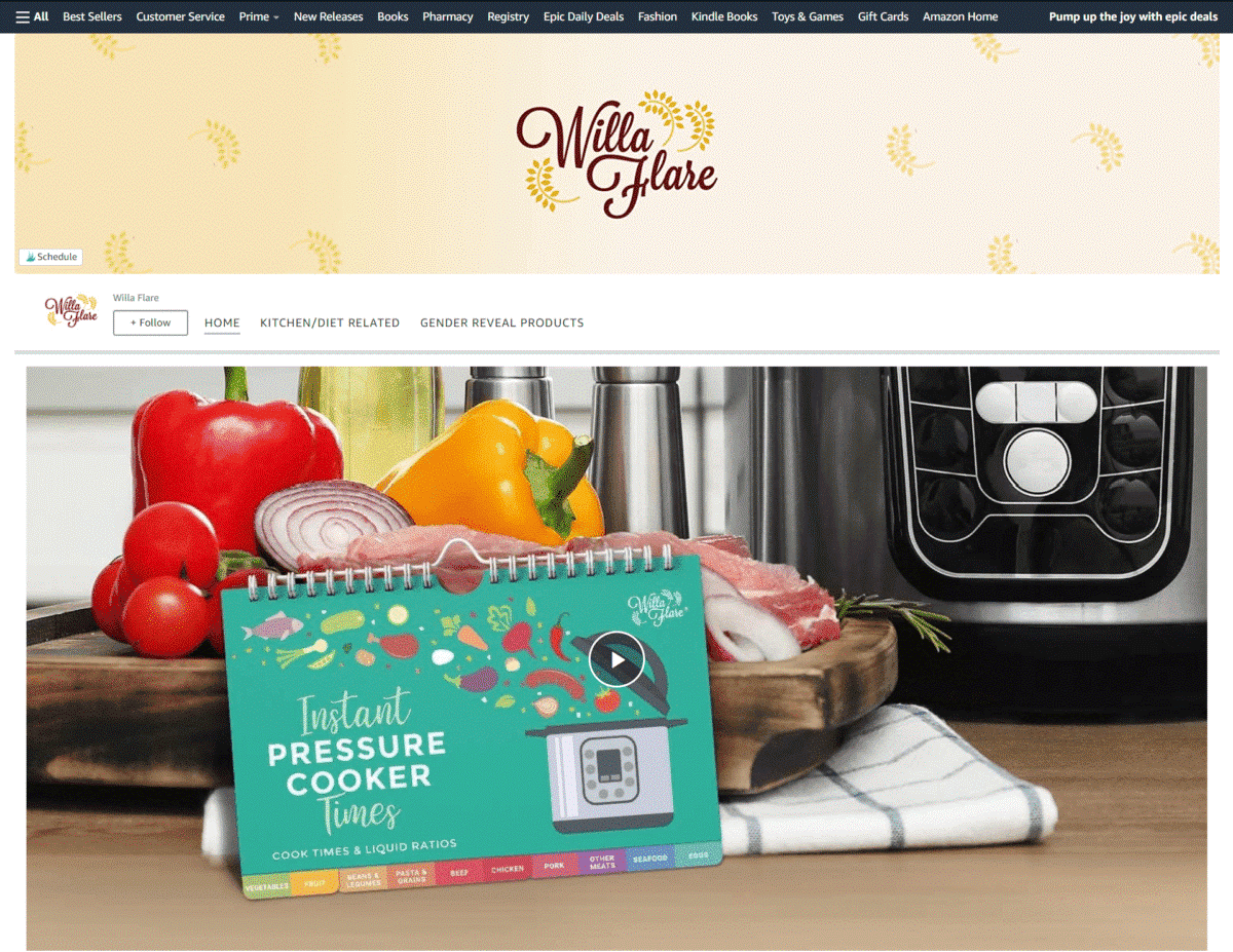
Willa Flare
Upbeat music, easy-to-read text, and light colors make their informative video fun and interesting to watch – their images also have shoppable modules for quick purchasing.
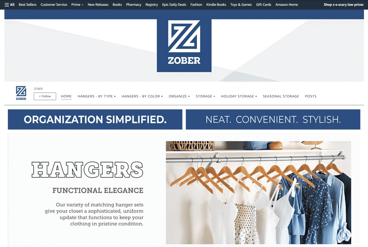
Zober
Images of a clean wardrobe and well-organized shoes, paired with their tagline – Organization Simplified – just makes you want to start decluttering your home right away, right?
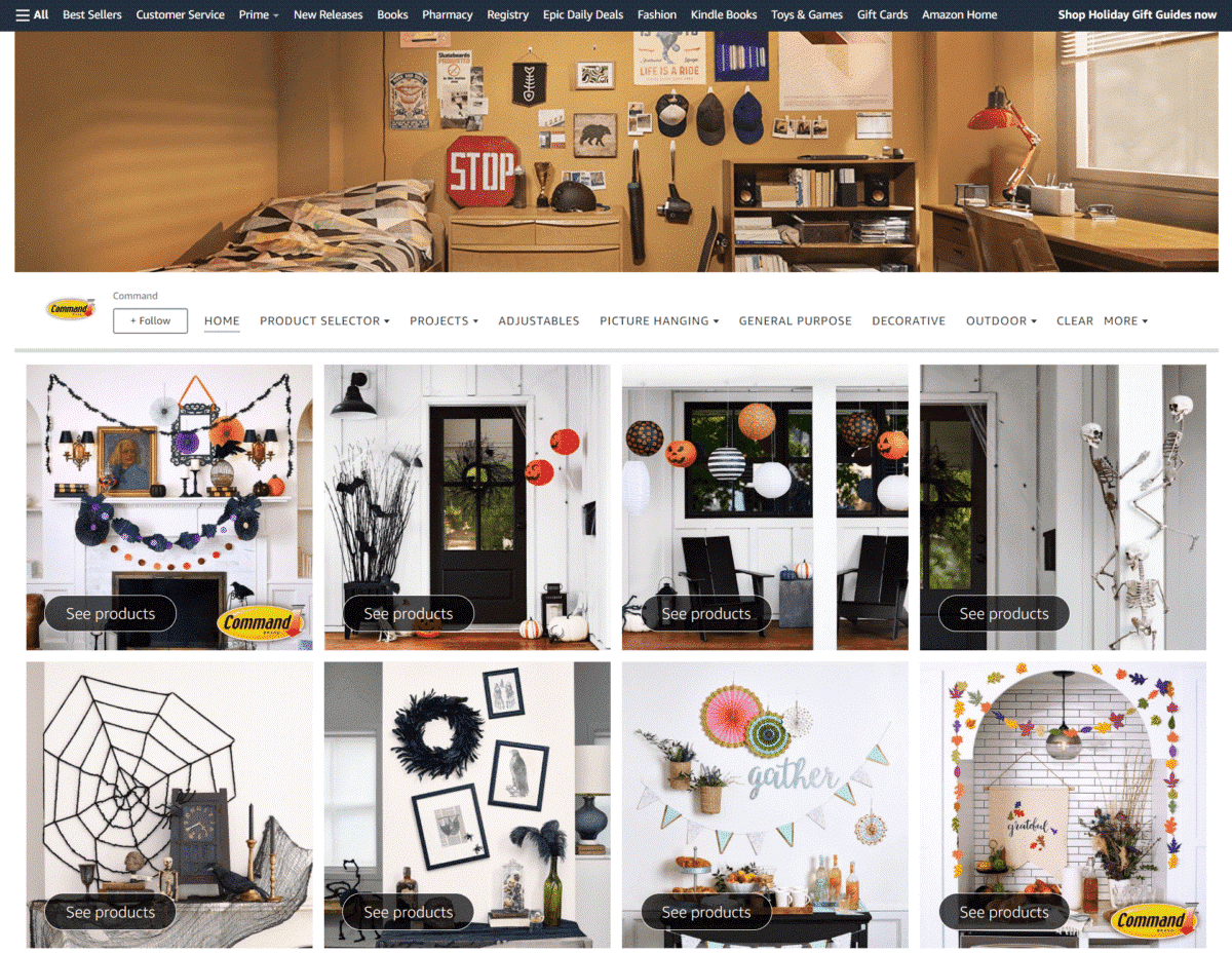
Command
This brand’s Storefront features a “What product should I use?” section, letting you chose the best wall hangers to use for your DIY projects.
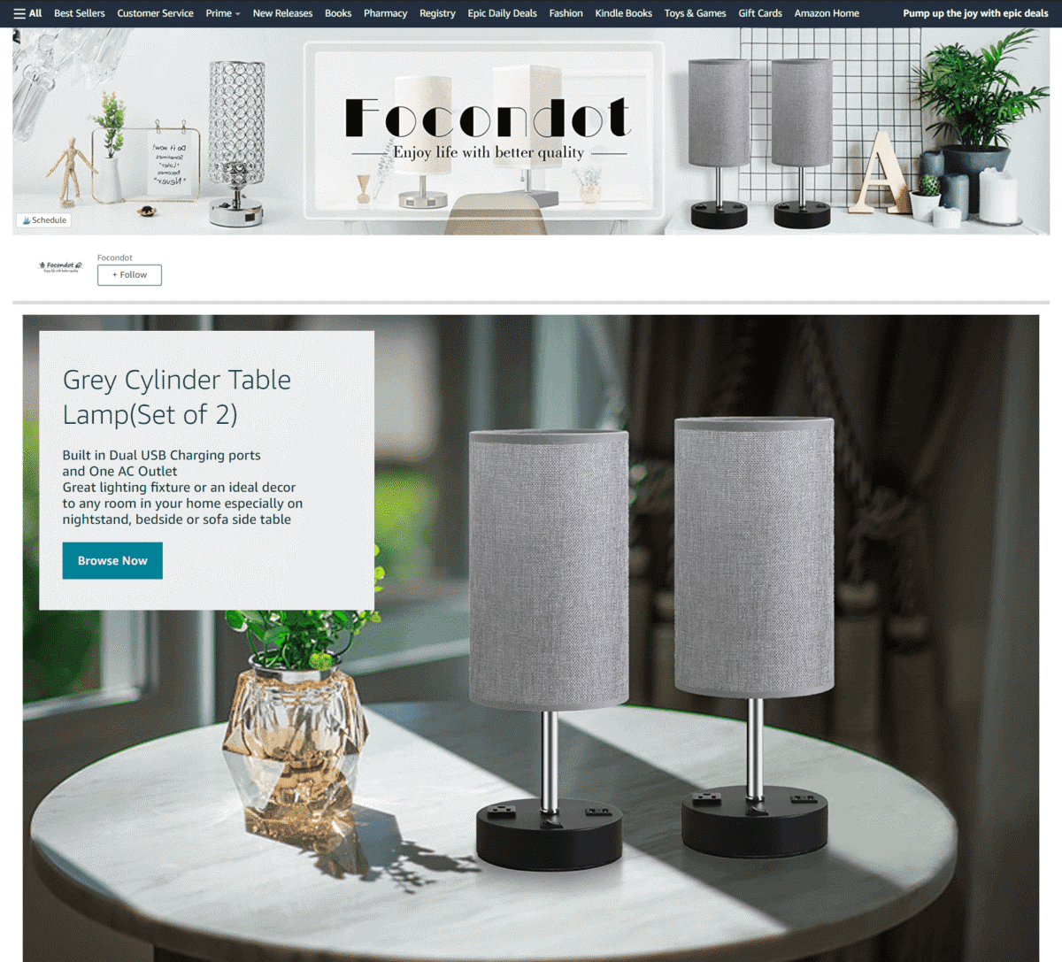
Focondot
Large, close-up images highlight the intricate details of their modern lighting fixtures. Short text also gives a brief description of each lamp.
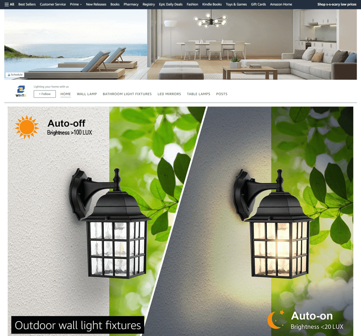
Lighting your home with us
This brand’s Storefront features a full image of their outdoor lamp, with text highlighting its Auto-On and Auto-off features, as well as their brightness levels.
Food
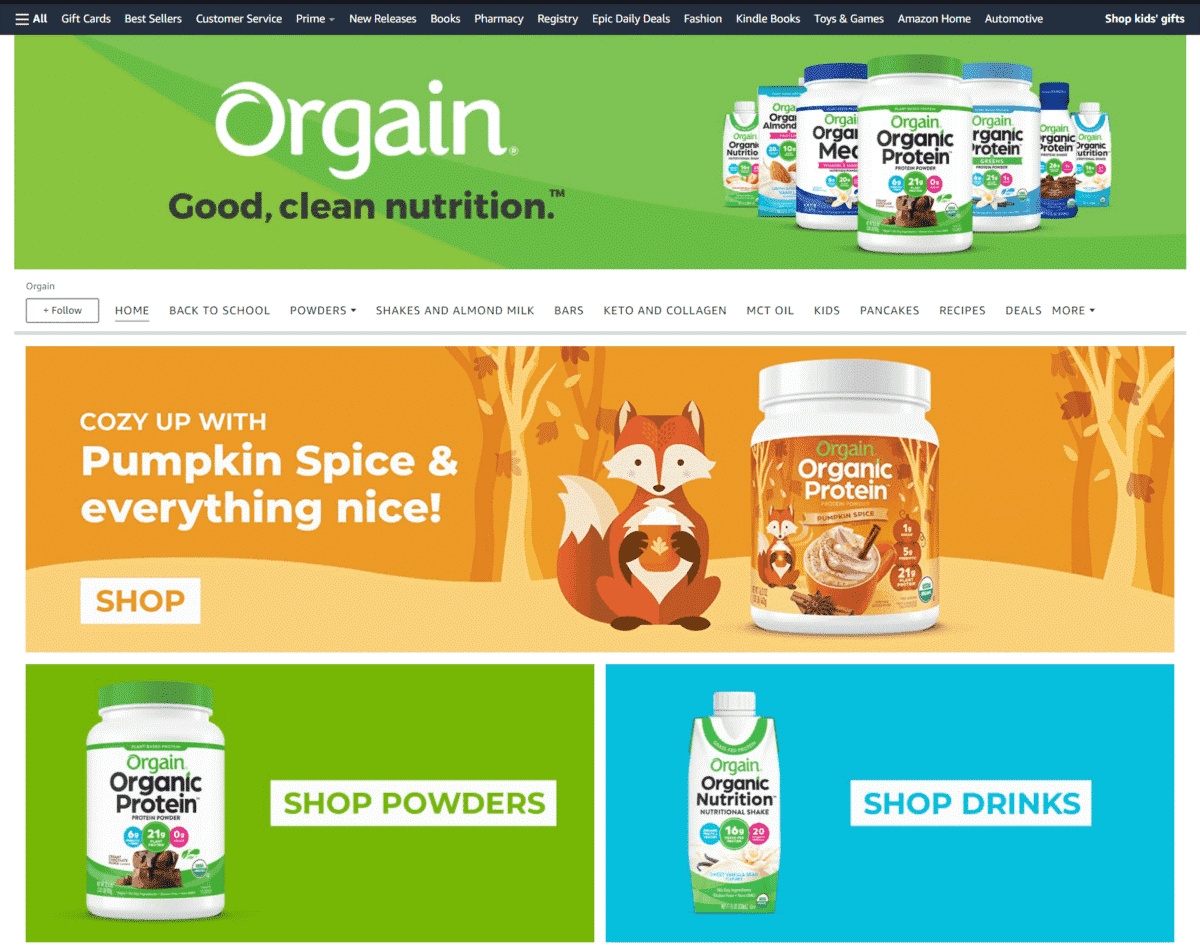
Orgain
Less is more as you can see on this brand’s short tagline – Good, Clean Nutrition. Their supplements are featured in large tile images, each one with bright and exciting colors.
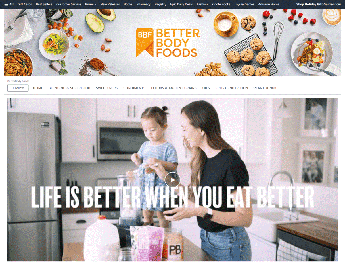
BetterBody Foods
Instead of just throwing in multiple photos of their products, this brand focuses more on sharing their story and their goal of creating nutritious and delicious food choices.
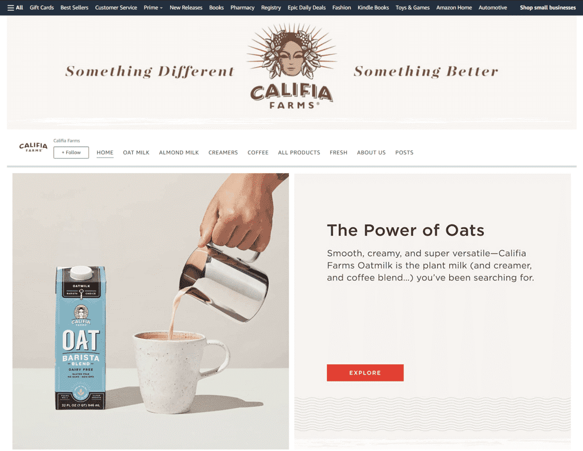
Califia Farms
We love how the images of their creamers, coffee, and milk are partnered with short descriptions, delivered in a casual and friendly way.
Simply Organic
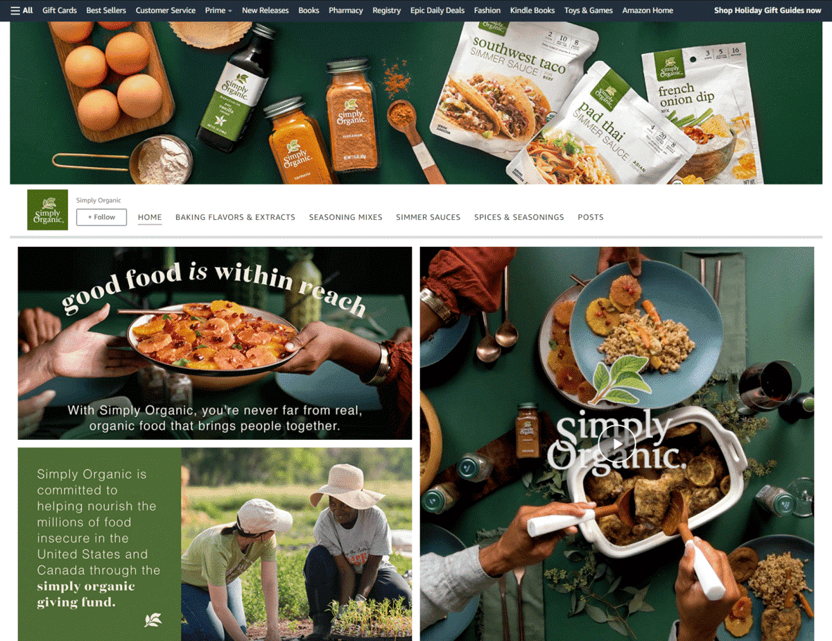
Through their tagline and informative video, this brand makes it clear that you can create delicious and nutritious meals with their organic seasonings. They also feature a Best Sellers section to complete the look of their page.
Hu
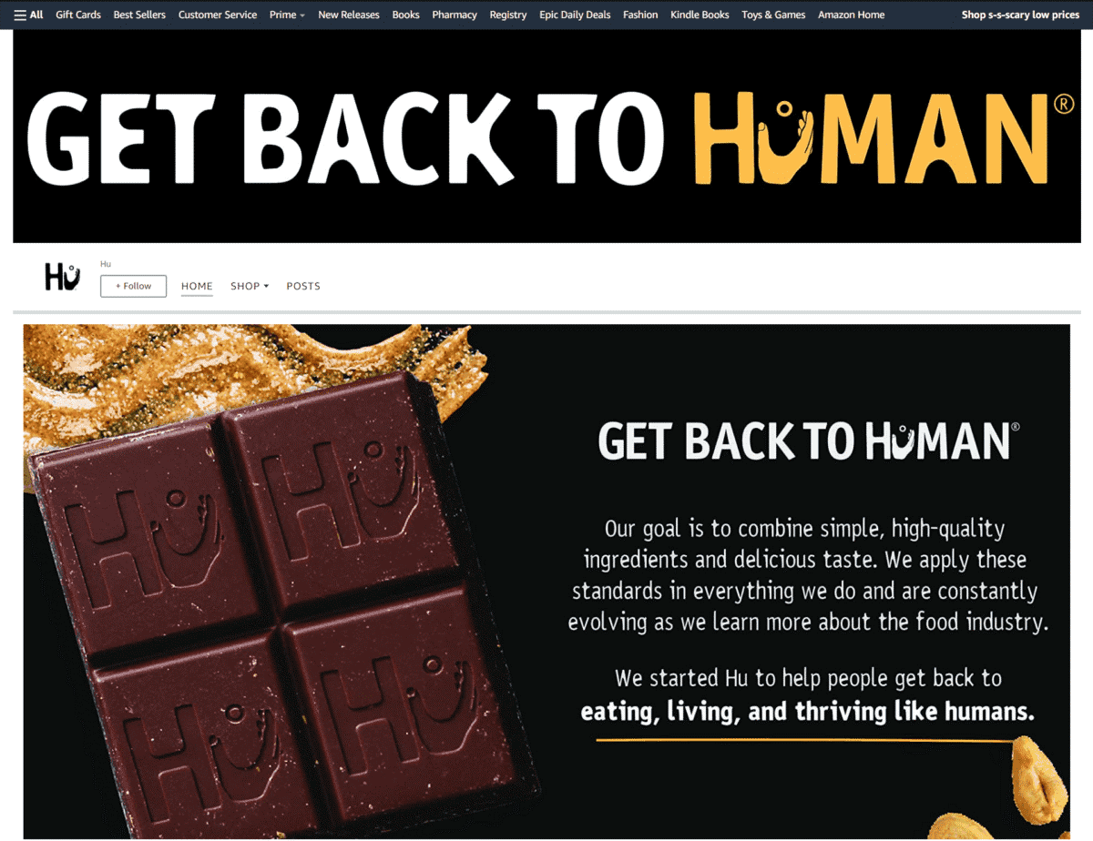
If you are watching your diet, this brand’s Storefront looks like a good place to shop for snacks. They highlight how their products are suitable for vegans and are ideal for those on the paleo diet.
Premier Protein
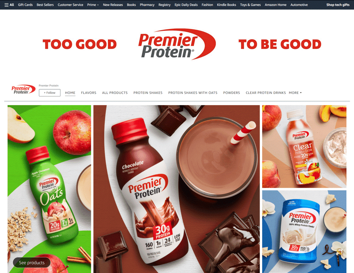
Get to know what kind of nutrition you get from their drinks at first glance. This brand lists the nutritional content of their protein shake in big, bold letters.
Toiletries And Hygiene
Decomen
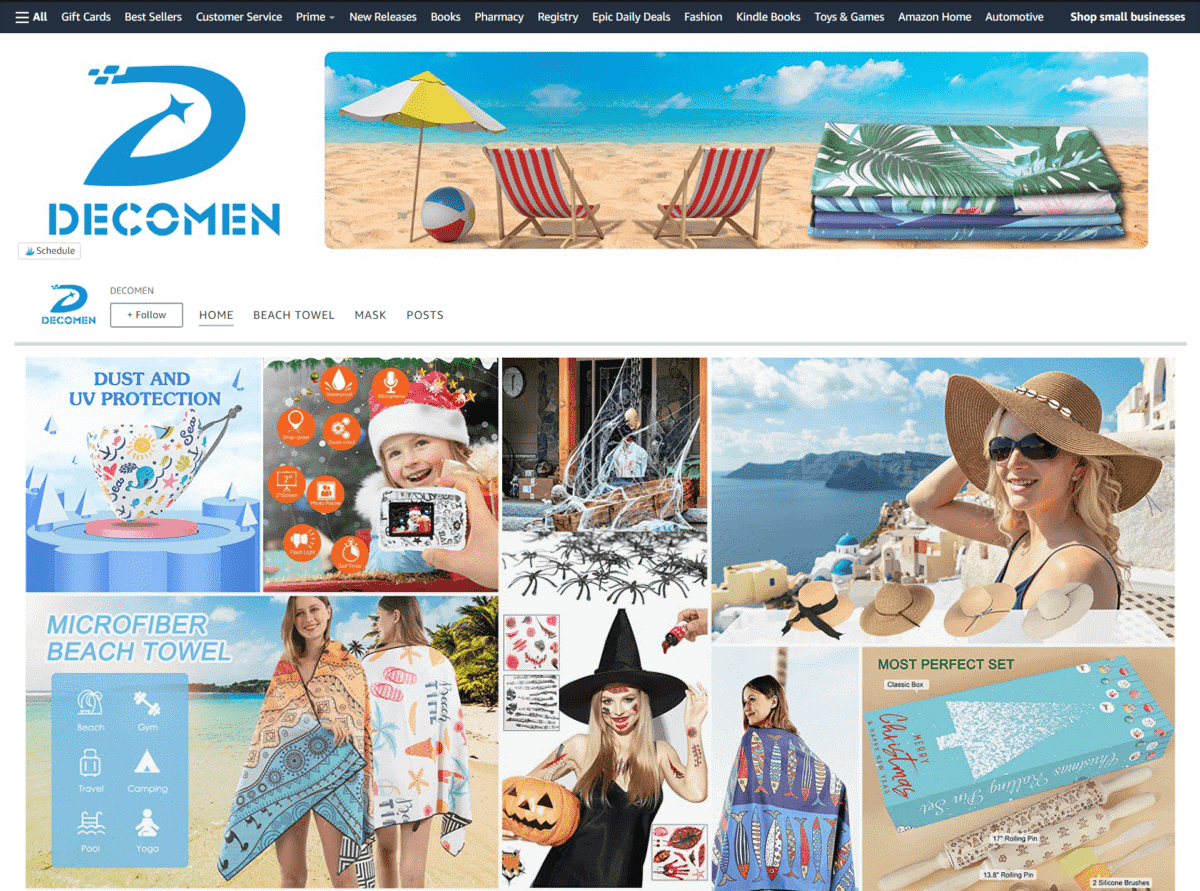
Here you are greeted by an array of colorful lifestyle photos of people having fun outdoors while wearing their products.
Cora
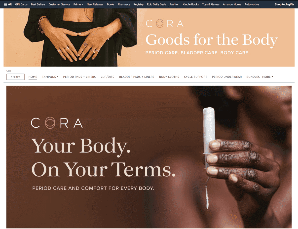
Close up images of women holding their products, paired with quotes from renowned publications add integrity to this feminine wellness brand.
Each & Every
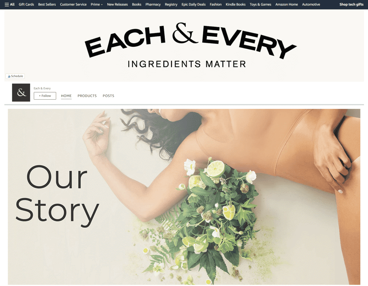
This is one of those Amazon brand page examples that feature images of the natural ingredients used in their products, along with a short description of their individual benefits.
Magsol
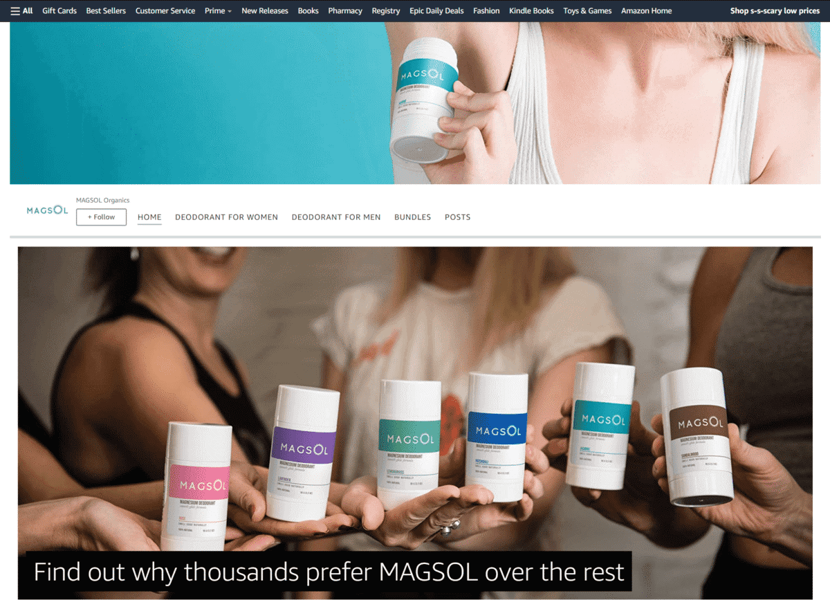
If you have it, flaunt it – that’s why this store’s Storefront proudly says how all their bodycare products have garnered more than 10,000 5-star reviews from their loyal customers.
Wetcat
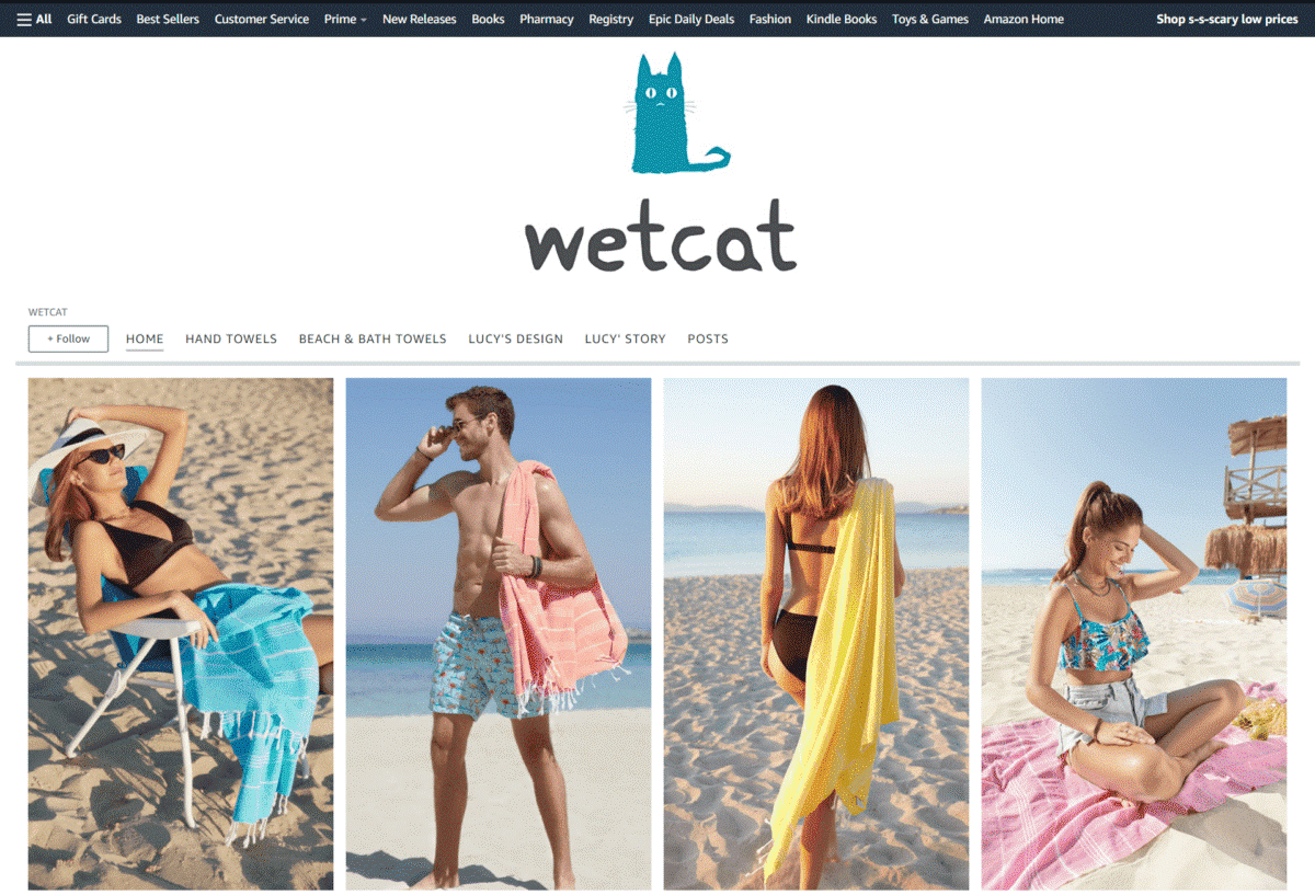
Featuring modern lifestyle images of their Turkish towels being used on the beach, you just can’t help but wish you were out there feeling the cool ocean breeze.
Poo-Pourri
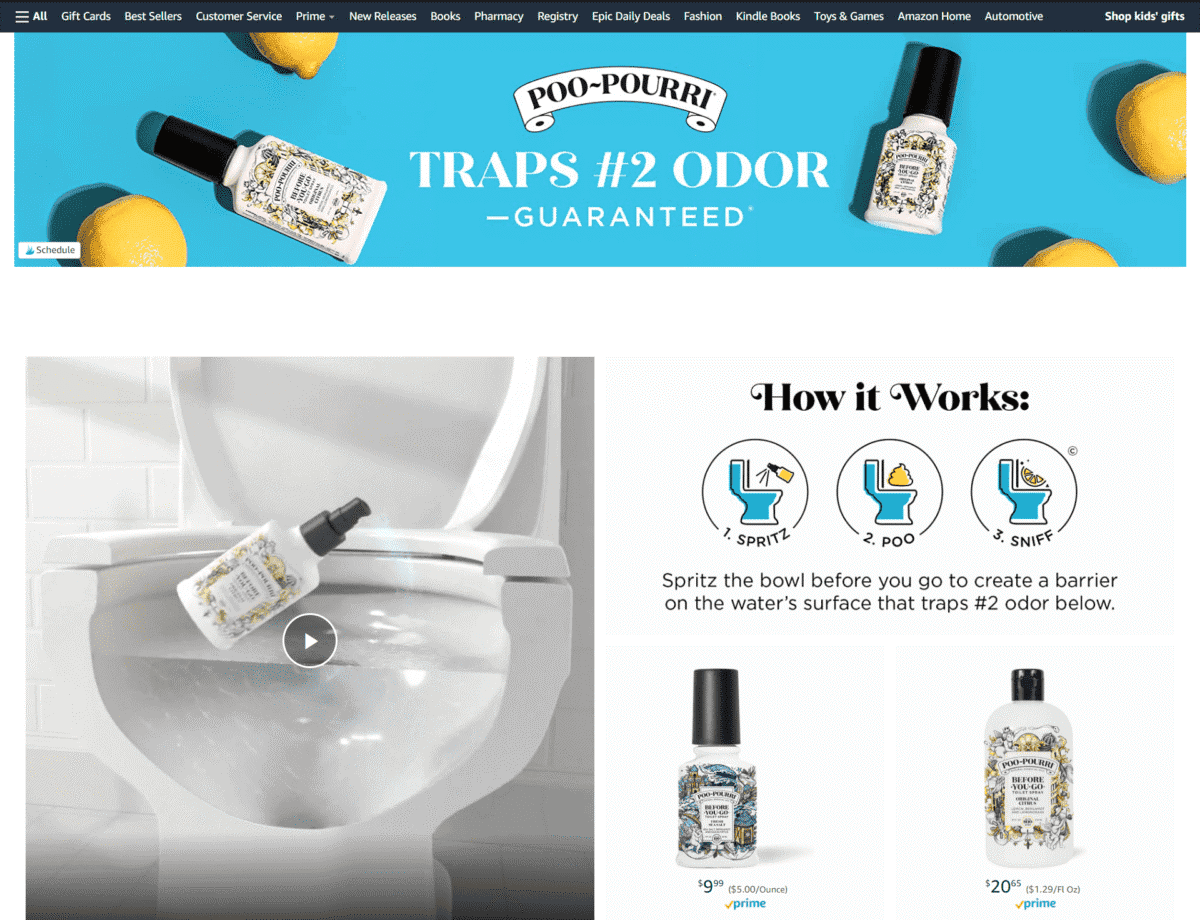
Aside from their whimsical tagline – Traps #2 Odor – Guaranteed – we also love how this brand presented a video showing how their deodorizing formula works in a light-hearted way.
Lagunamoon
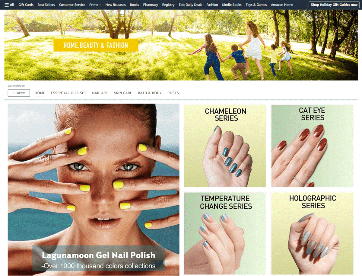
A simple layout featuring large image tiles with short text descriptions mentioning their benefits. The brand’s Storefront also features a “Recommended For You” section at the bottom of the page.
Maple Holistics
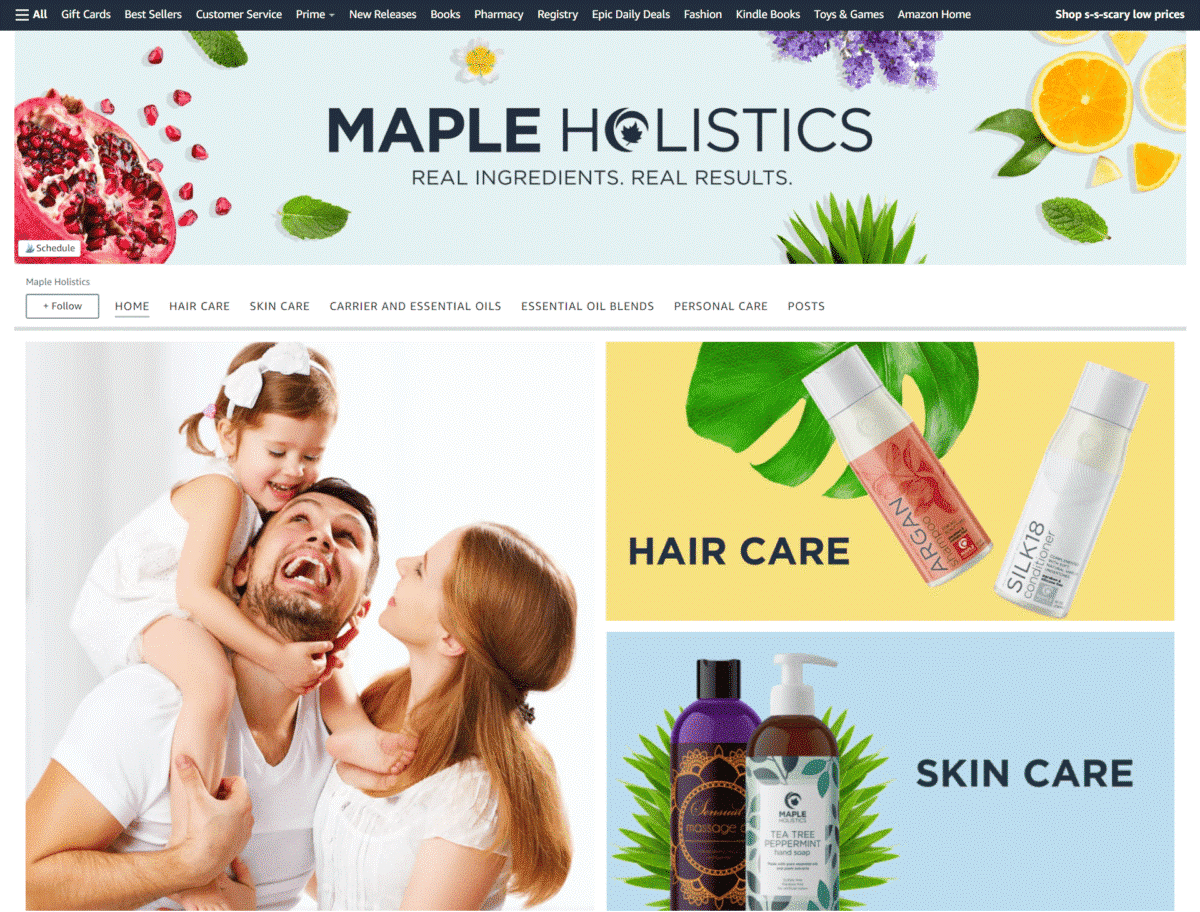
If your brand sells products that use natural ingredients, it’s always a good idea to feature images of plants, botanicals, or fruits – as shown by this personal care brand’s Storefront design.
Car
ThisWorx
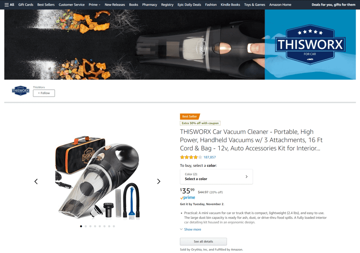
As soon as you check out this brand’s online store, you immediately see why it made it to our list of best Amazon Storefront examples. Its page uses bullet points enumerating the product features of their car vacuum cleaner. Tile images also show the different vacuum attachments included in the package.
Gooloo
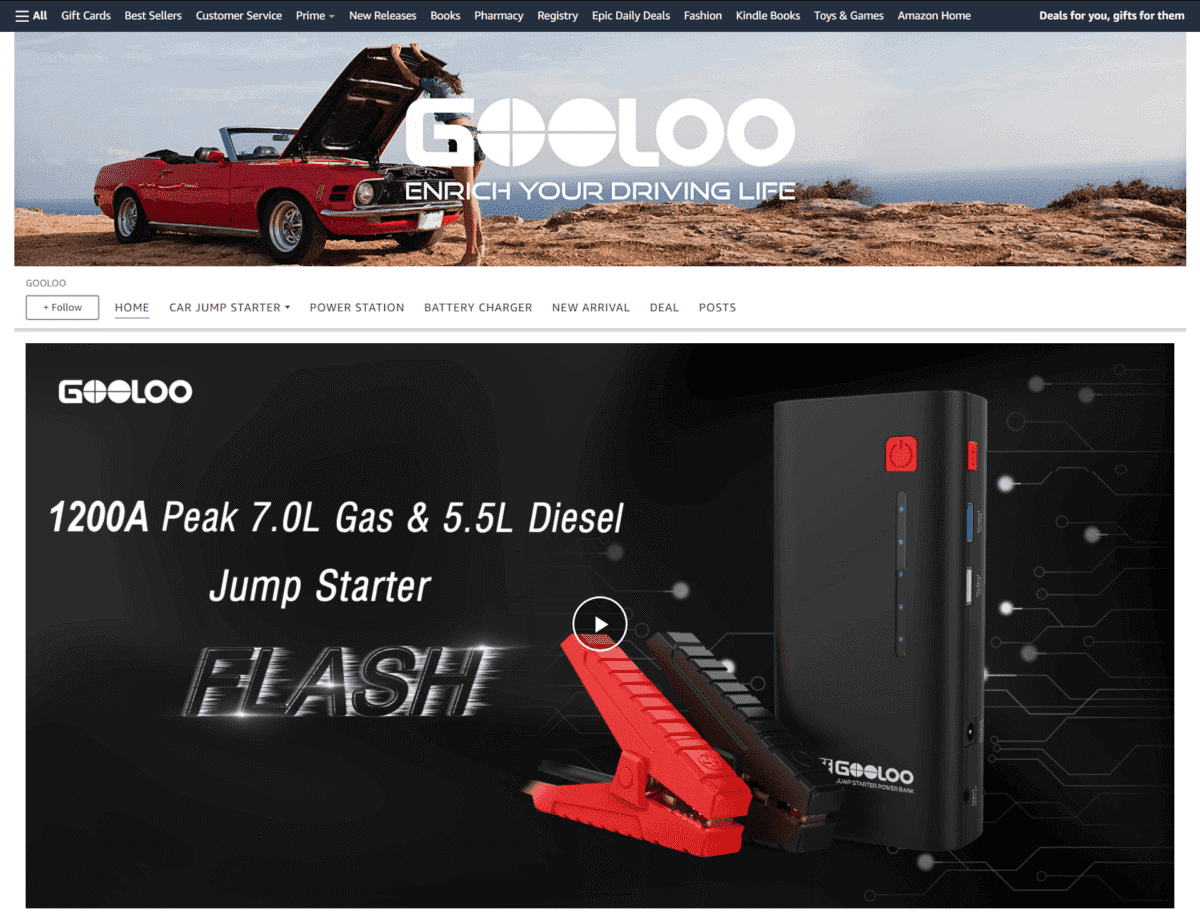
Placing a video that demonstrates how your product can save the day always works – as you can see by watching the one on this online store’s page.
EcoNour
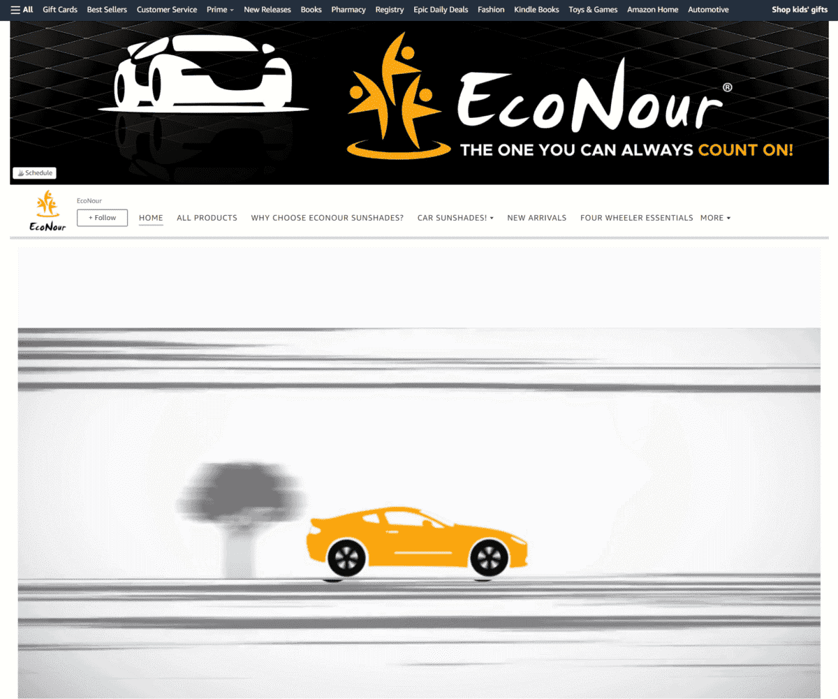
We can’t help but admire how this brand featured a top view cross-section image of a car, with shoppable modules to click on for each product that they offer.
Ainope
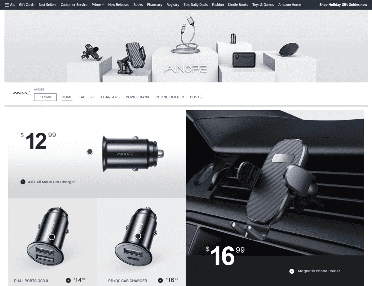
High-quality close-up images are always a welcome sight for Amazon stores. In this Storefront, you see large photos of their car chargers, also with shoppable modules.
Office
Everlasting Comfort
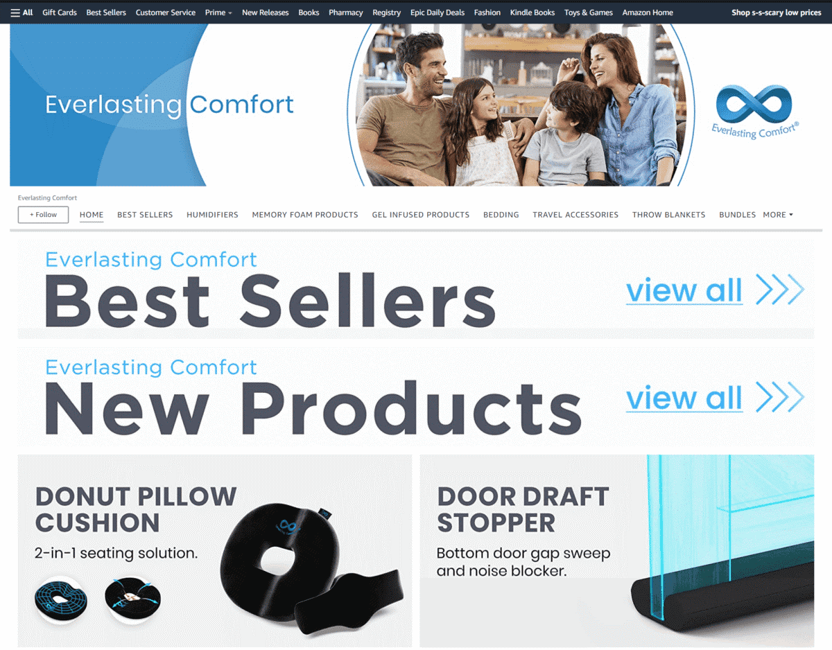
Placing large links to your “Best Sellers” and “New Products” upfront also looks good, as shown by the design of this online store’s Storefront.
Bandle B
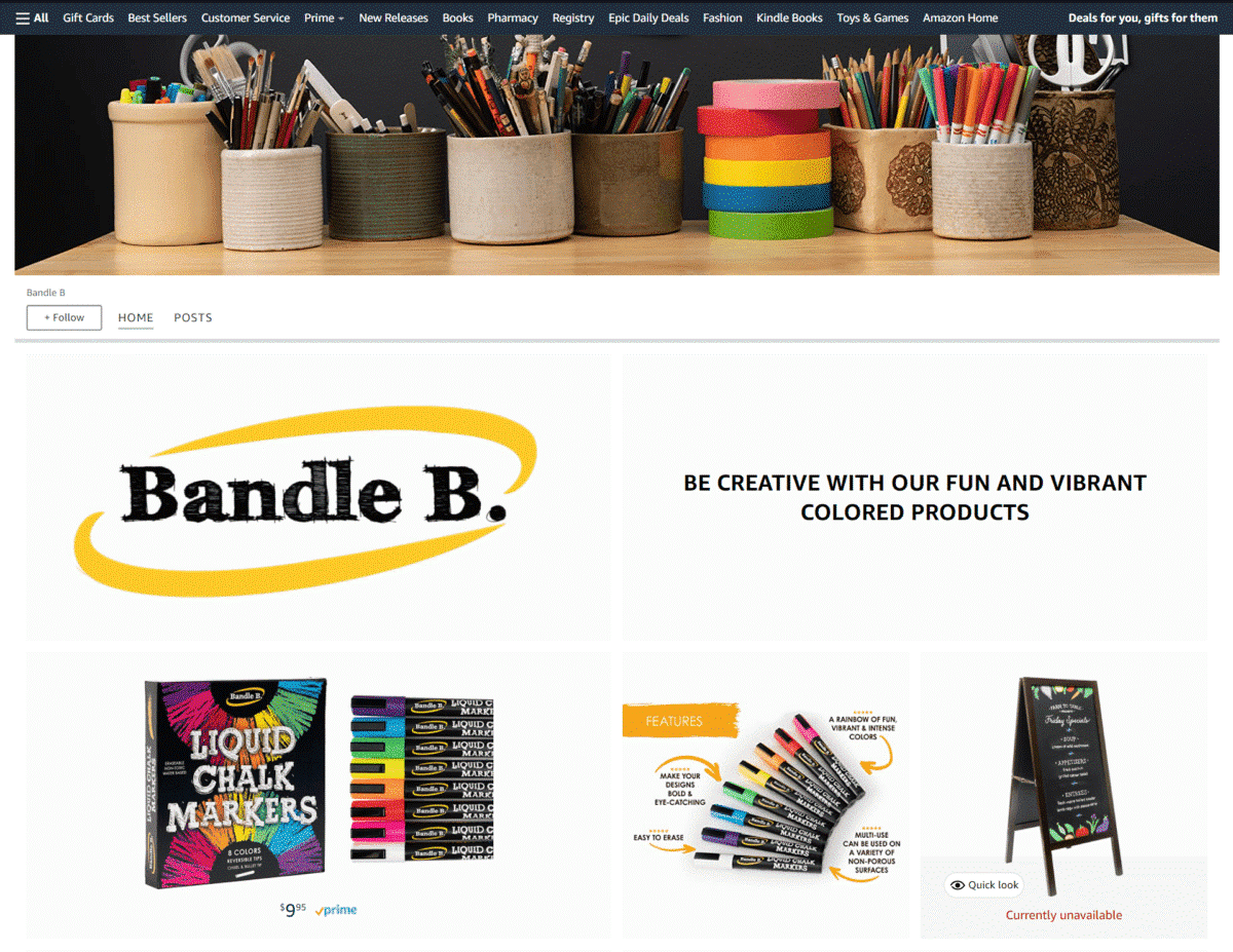
Using a plain white background for most of their images, this color of this brand’s chalk markers easily stand out to catch your attention. They also feature an image showing their 5-star customer reviews.
Health And Wellness
Curated By Nature
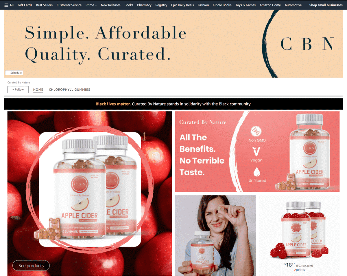
Large images of their supplements are paired with shoppable modules, plus smaller images highlighting how their products are made of natural ingredients. You can clearly see how this brand takes product research seriously.
Havasu Nutrition
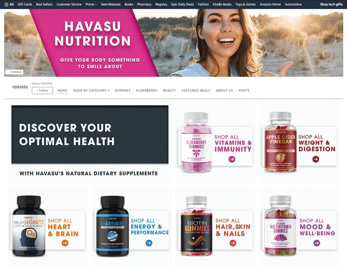
Since they offer a comprehensive lineup of supplements, this Amazon Storefront example did a good job of creating product category images to organize their page.
Nourish Life with Science
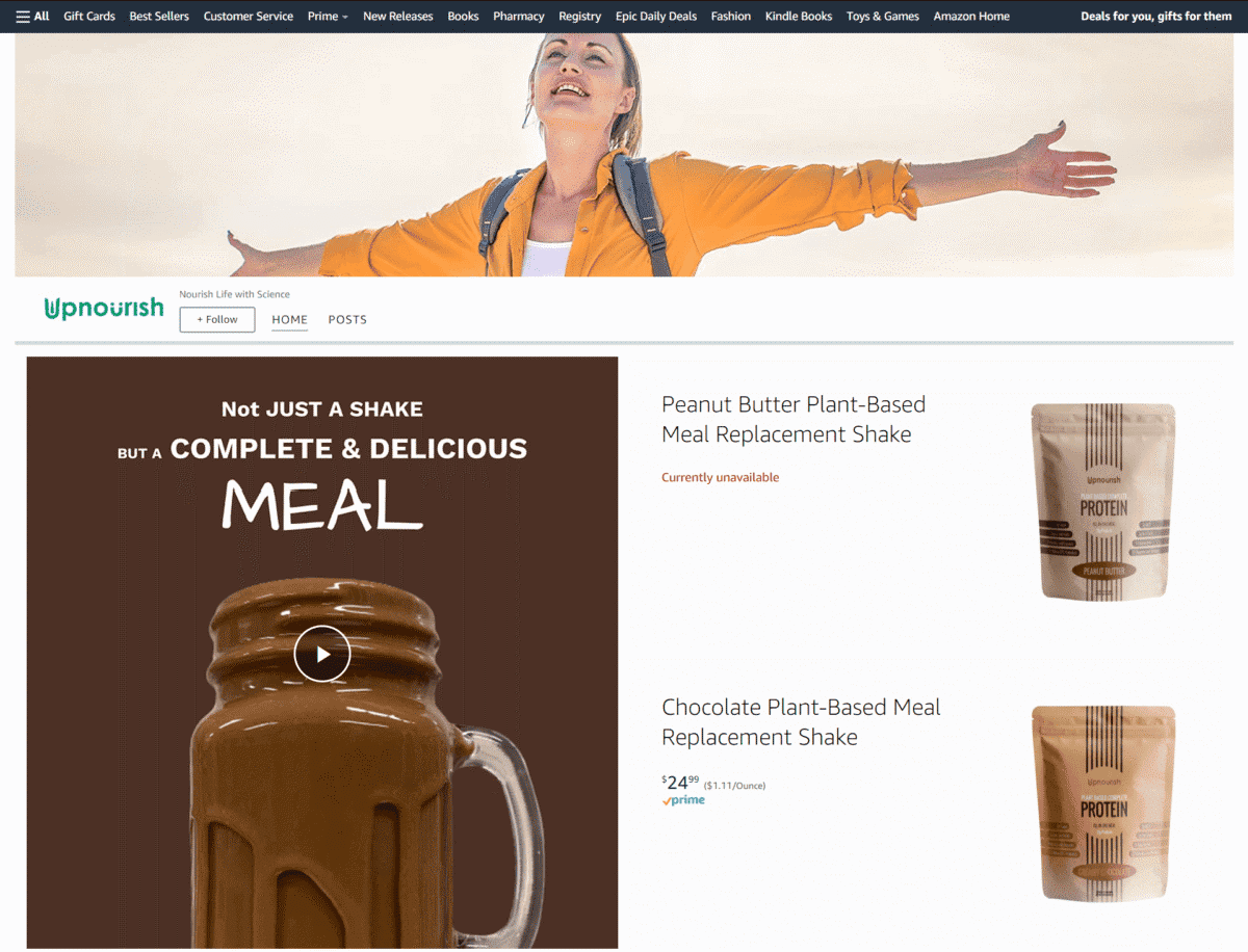
Each of their supplement images is paired with a short video presentation, giving a more in-depth look at the product.
Aspercreme
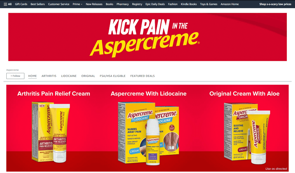
Here’s another one of our favorite Amazon Storefront examples. It simply doesn’t get any catchier than this – just have a look at this brand’s witty tagline and you’ll find it hard not to give out a small chuckle.
Biofreeze
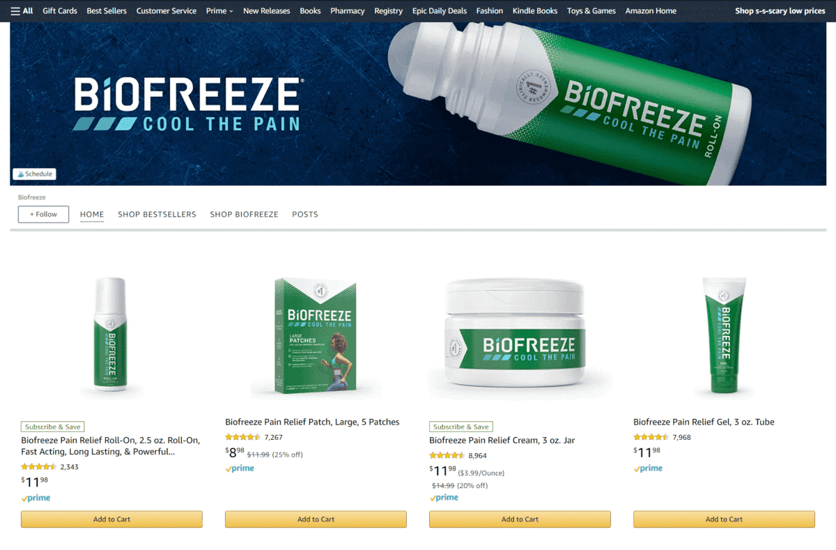
Sleek and simple always does the trick. For this Amazon Storefront example, it decides to lay out their product lineup right away – followed by product grid tile images and a short video.
Music
Wogod
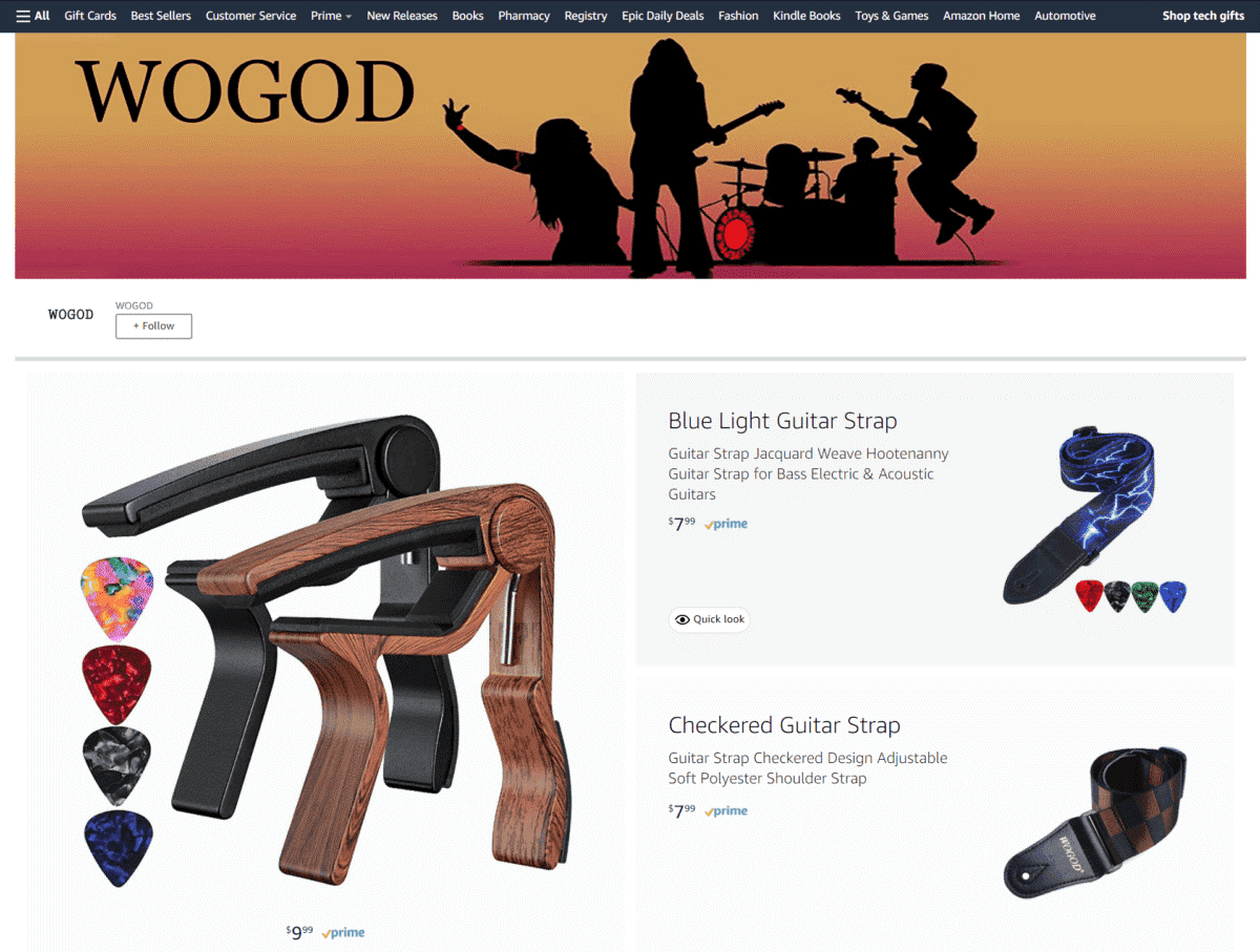
What better way to brand yourself as a music accessories brand than to use a banner image featuring a silhouette of the Red Hot Chilli Peppers?
Electronics
Motorola
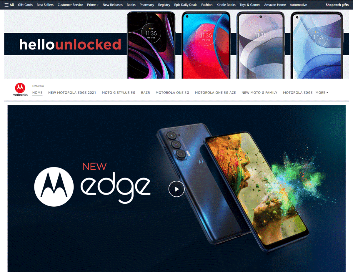
Well-made videos give you a closer look at the details and specs of their smartphones, as if you were holding them in your own hands.
Netgear
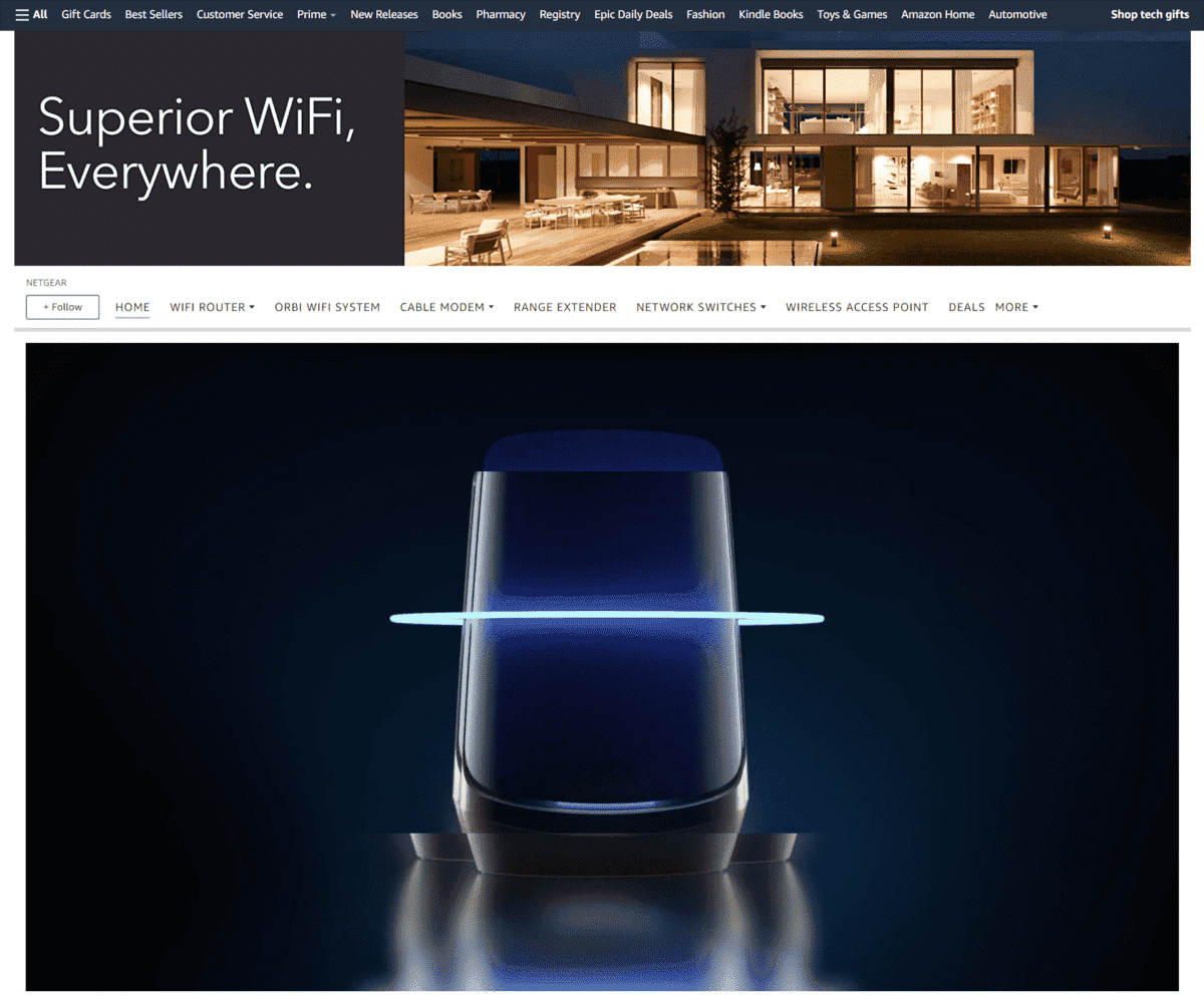
A picture of a happy family bonding and enjoying the use of their gadgets is something people recognize, right? Their product pages feature images with a quick description showing key details and specs of each router or extender.
Garden
Flexzilla
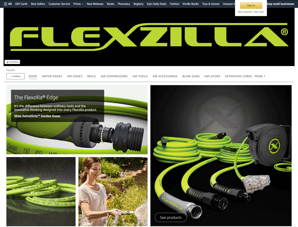
By marketing their gardening products as having the “Flexzilla Edge”, your curiosity gets aroused right away. Their catchy call to action is the phrase, “Join The Revolution”.
Miracle-Gro
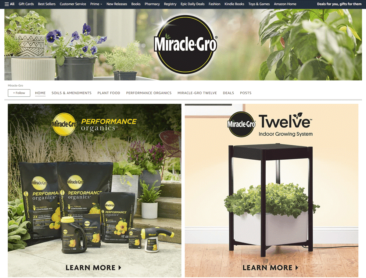
If you are offering plant food and potting mix, it’s always a good idea to use images of flowering plants in full bloom – as you can see on this Storefront example.
Vivosun
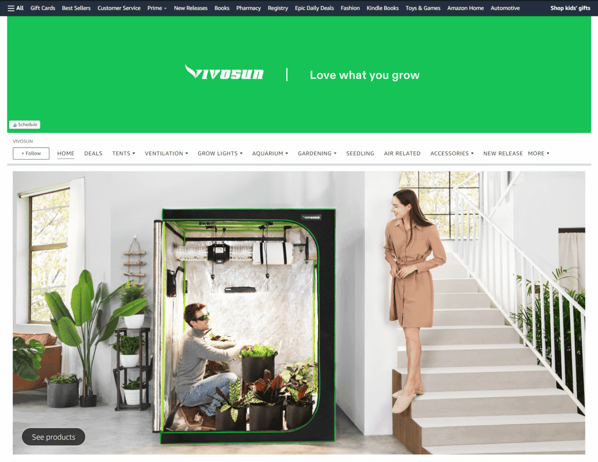
Since their brand is all about gardening accessories, it goes without saying that the green theme of their landing page perfectly works to their advantage.
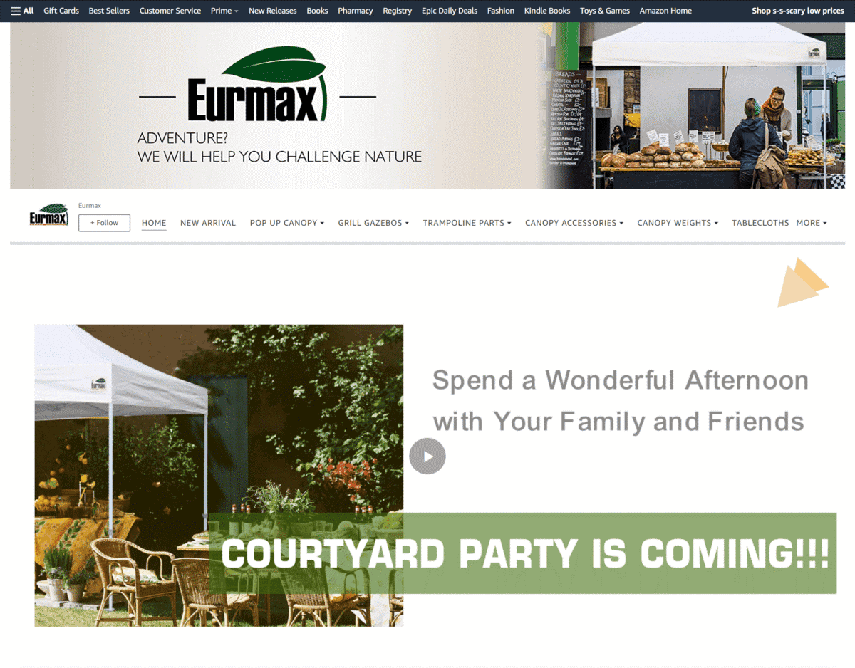
Eurmax
Showcasing how versatile their tents are is a great idea. Their Storefront also features logos of famous brands that have been their customers.
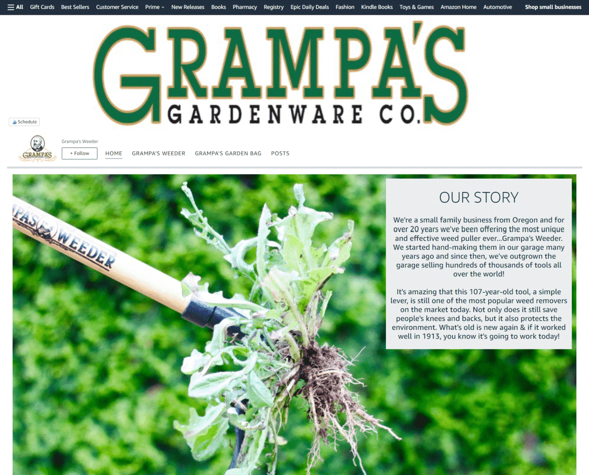
Grampa’s Weeder
This brand’s Amazon strategy is to starts off by sharing the story behind the creation of their weed-pulling tool. A product demo video also highlights how easy it is to get the job done with their weeder.
Handmade
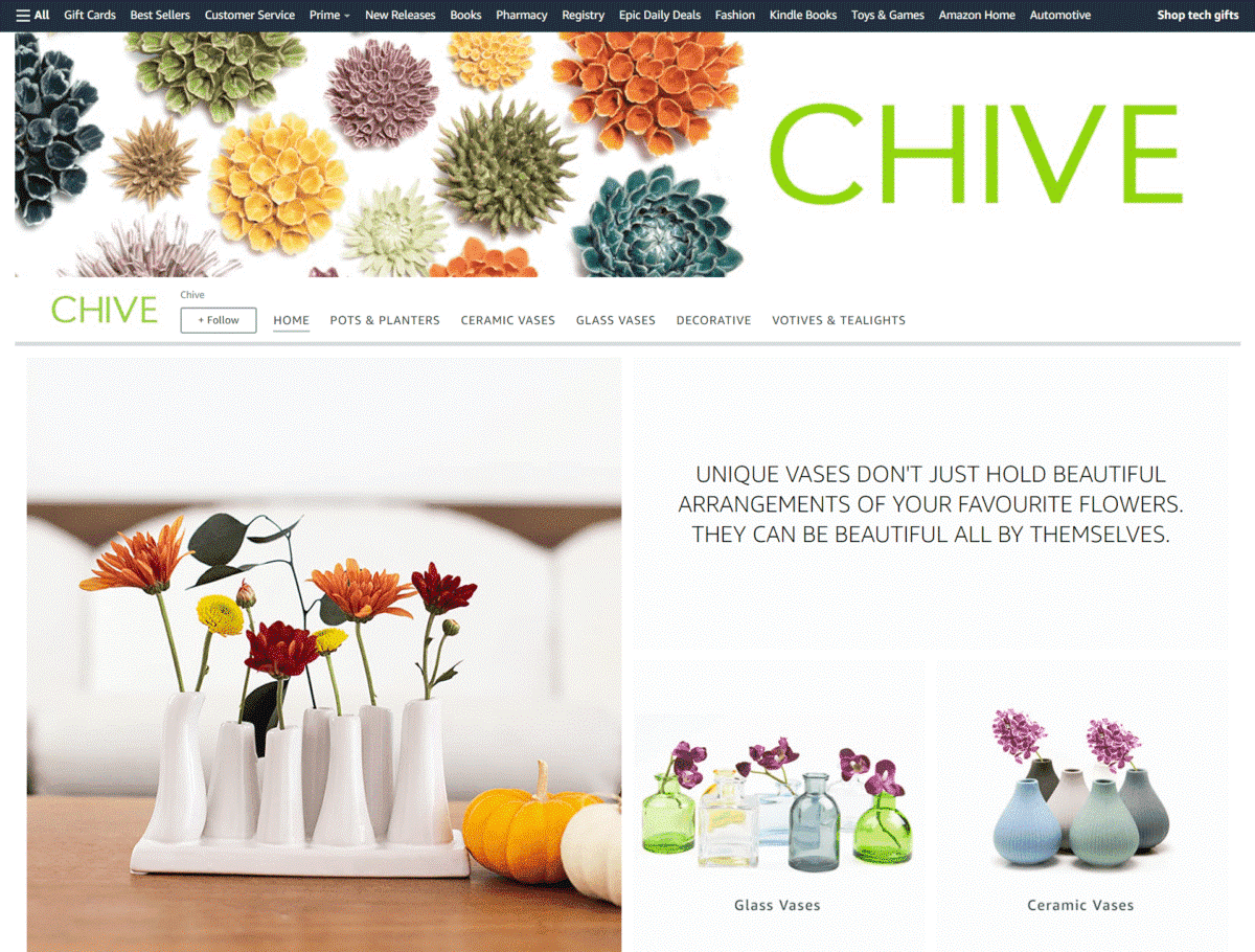
Chive
Each image used in their landing page features the simple and classic look of their vases, which are complemented by colorful flowers and modern indoor décor.
Home And Kitchen
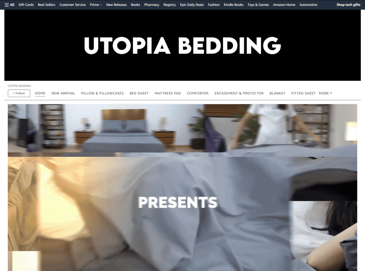
Utopia Bedding
This brand’s Storefront is another fine example of using shoppable image modules in their page to make way for fuss-free shopping.
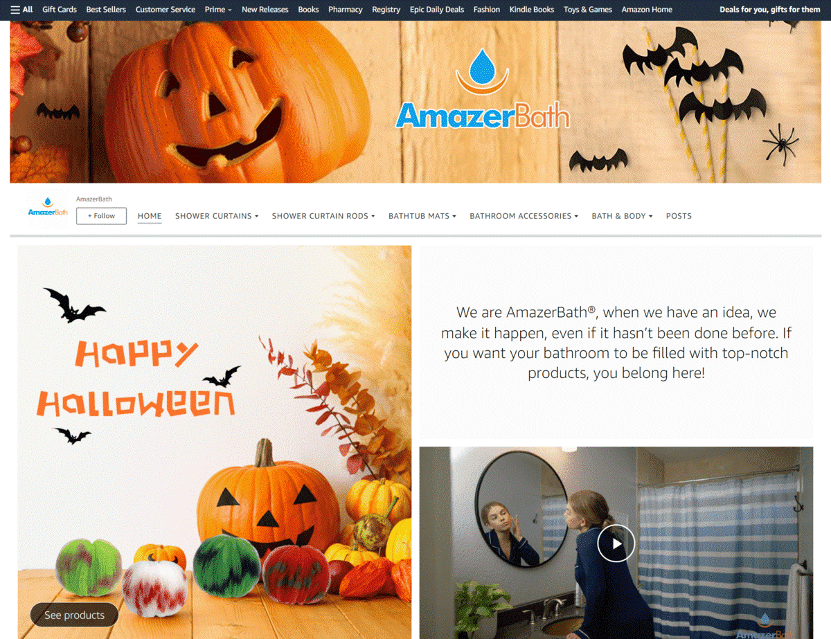
AmazerBath
It’s a good idea to incorporate upcoming holidays to images of your products, as shown by this Amazon storefront. This is also one of the brands that use modern lifestyle videos to breathe life to their page.
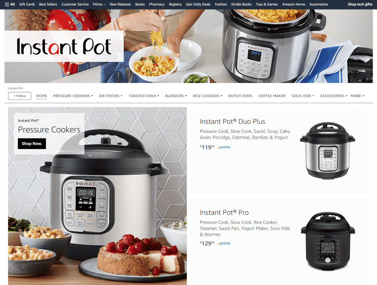
Instant Pot
If your brand features food preparation equipment or cookware, add a personal touch by using images of freshly cooked food beside your products is always a good step to take.
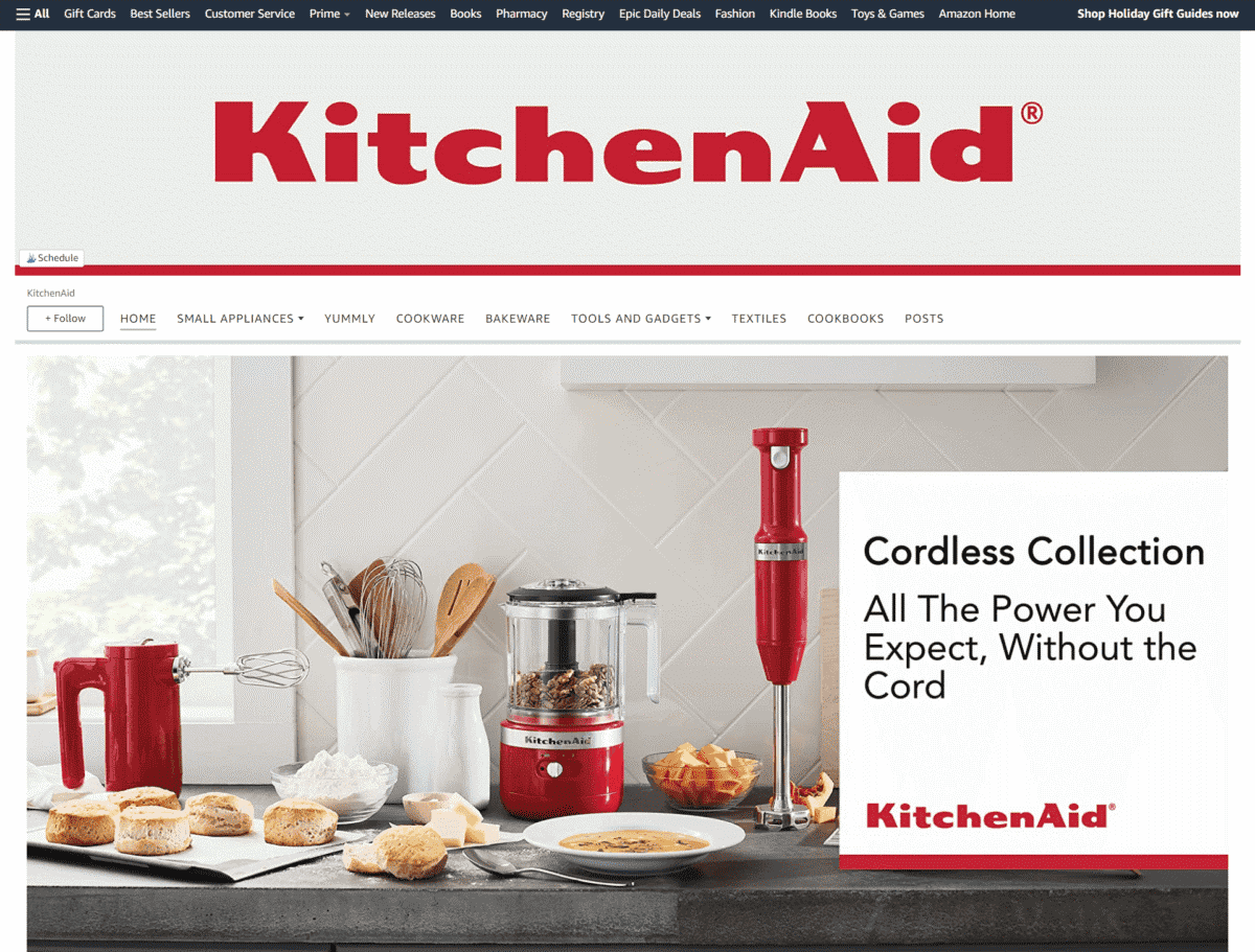
KitchenAid
Just looking at the pictures used for their Storefront makes you want to try your hand at making your own culinary masterpieces – while using their products, of course!
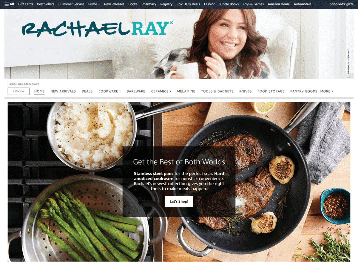
Rachael Ray Kitchenware
With a picture of a famous celebrity cook at the top of the page, plus mouth-watering images of cooked food, you just can’t help but browse through their brand’s collection of cookware.
Sango
The use of large, close-up images of their dinnerware magnifies their elegant details and textures. They also feature tile images of newly arrived products.

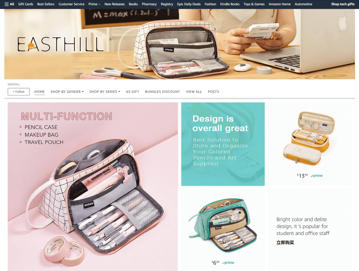
Easthill
This is one of the Amazon Store examples that use small, medium, and large images, which are paired with easy-to-read descriptions. We also love the light and casual color scheme they use for their page.
Arts, Crafts And Sewing
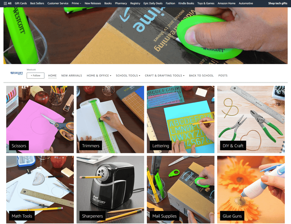
Westcott
With an exhaustive collection of arts and crafts supplies, this brand made a good move by creating category images for easier shopping and Storefront navigation.
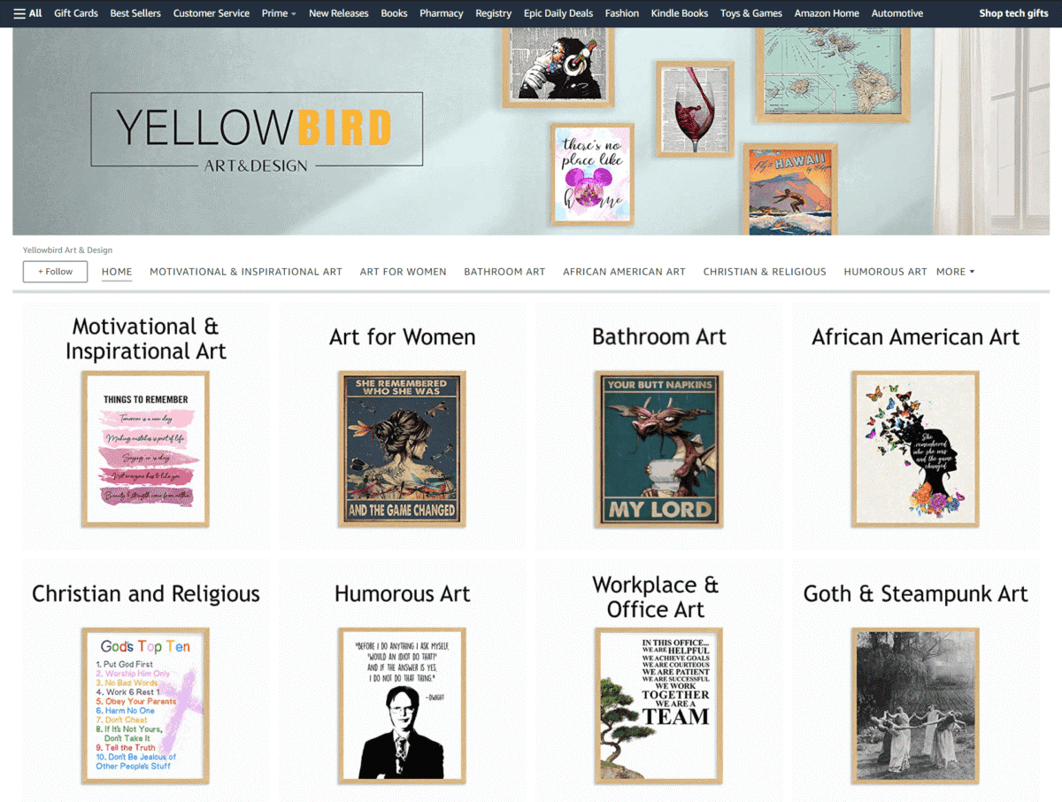
Yellowbird Art & Design
No need for flashy videos or photo shoots, this is one of those brands that take a simple approach to marketing their artwork. They feature their wall décor in separate product categories for fuss-free browsing.
Appliances
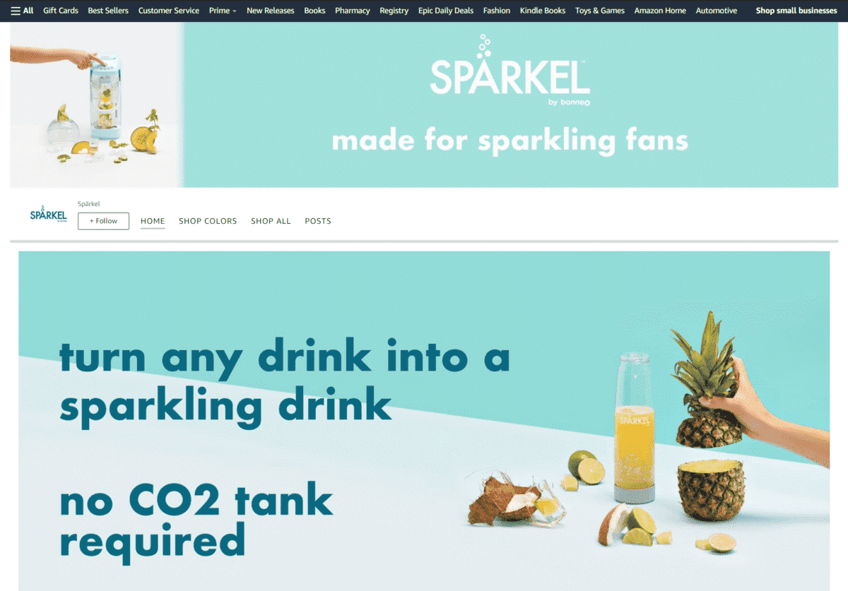
Spärkel
Bold and direct to the point, this brand lets customers know that their product can turn any drink into a sparkling drink by using a large image and equally large text.
Shoes
Musshoe
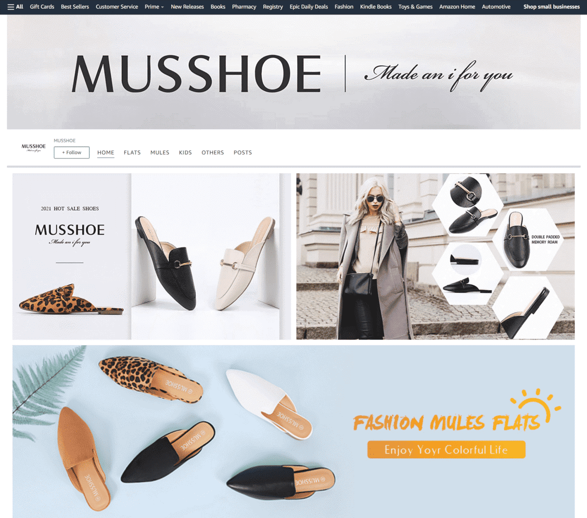
Shopping for shoes? This brand takes you through their collection by featuring attractive photos of their footwear – they also have a “Featured Deals” section for items on sale.
Toys
Growsland
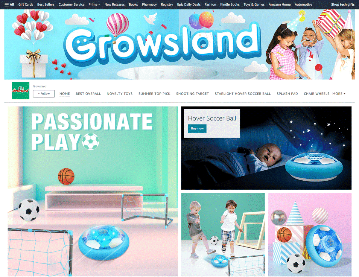
The good thing about this Storefront is that they used images of their toys being used or played with by children of appropriate ages – bath books being used by a baby, remote control cars played by a young boy, and splash pads with preschoolers having fun.
Clothing Organizer
Vipek
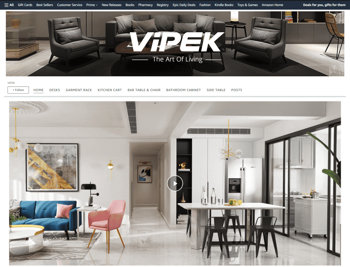
A short demo video shows how their organizers can easily give your home a spacious and tidy look in an instant. They also make use of large image tiles to showcase their other products.
Rubbermaid
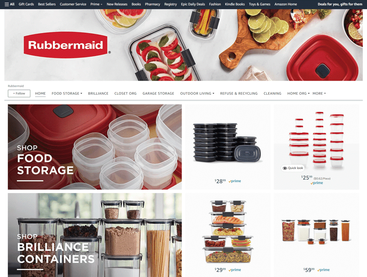
This is one of the Amazon Storefronts that push for brand recognition by taking on a simple and elegant design layout – large lifestyle images on the left side, while the products are shown on the right with their corresponding prices.
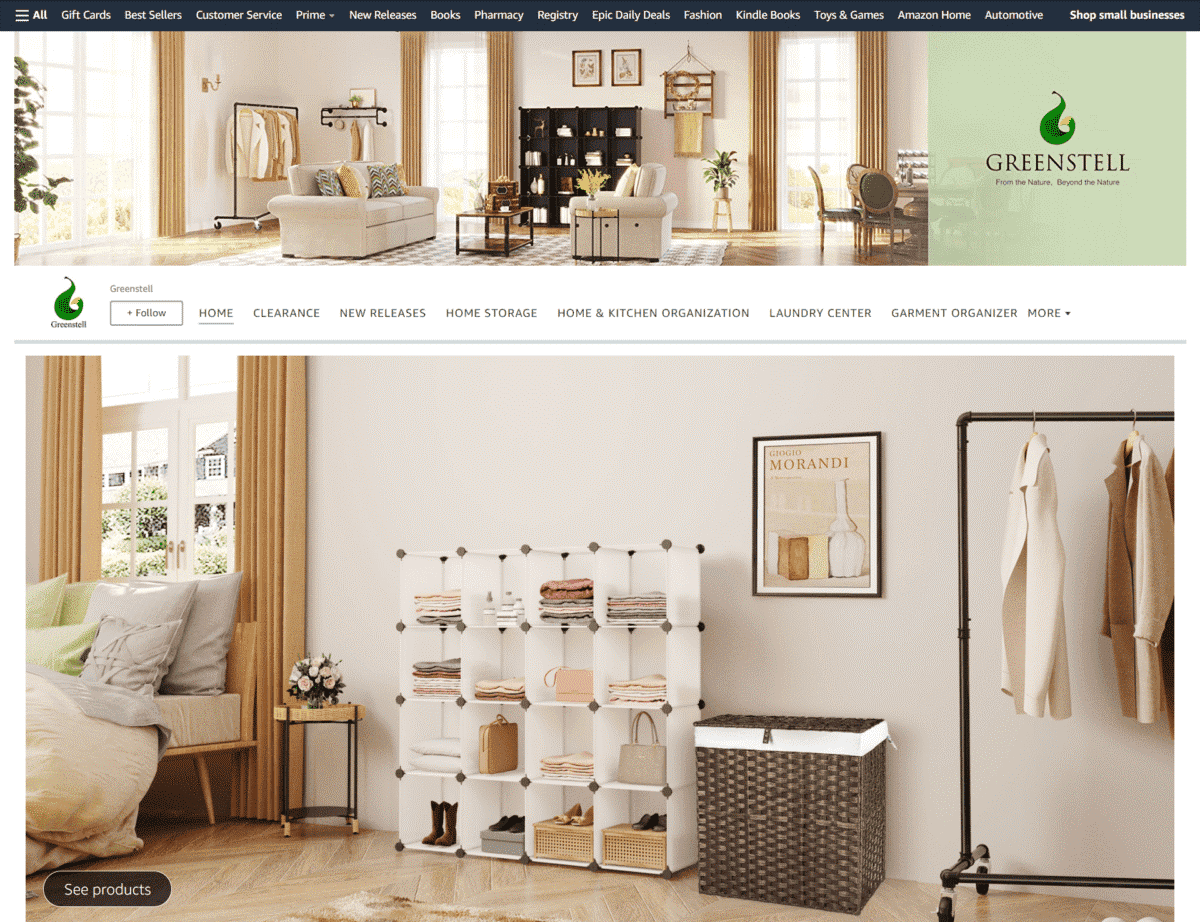
Greenstell
What we love about the photos used for their products is that they also included images of the mounting accessories included in each bundle.
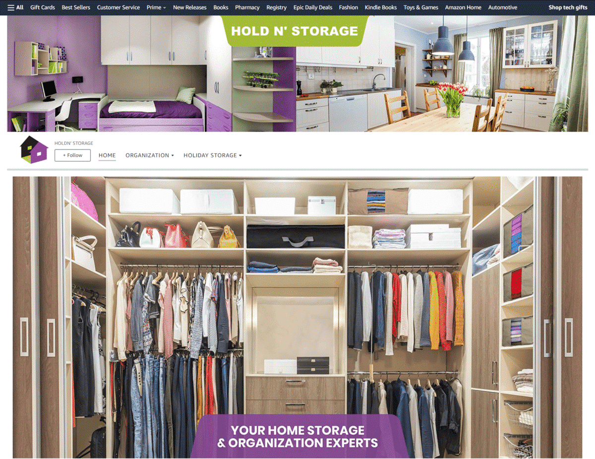
Holdn’ Storage
The first thing you see on this brand’s storefront is a large picture of an organized wardrobe. They also feature photos of their storage solutions being used all over the home.
Supplements
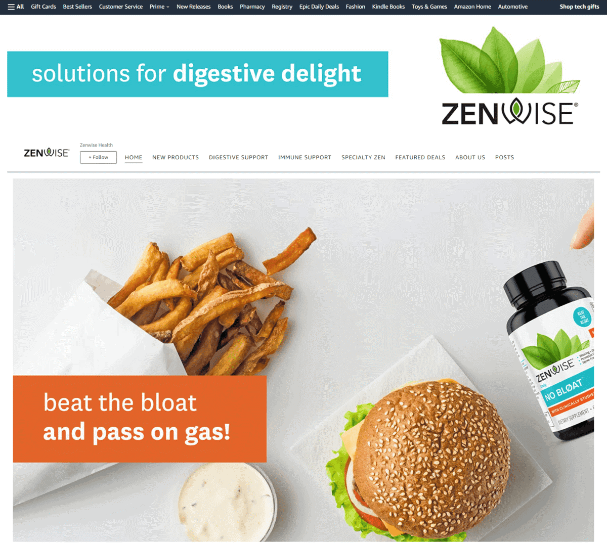
Zenwise Health
Struggling with indigestion? This brand lets you know right away that their supplements are the solution for bloating and gas – you see it right away on their banner!
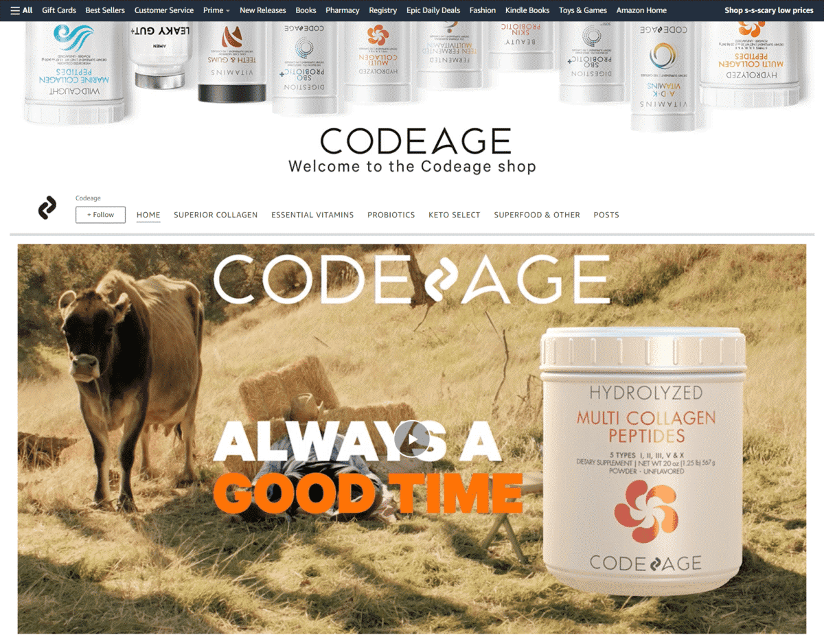
Codeage
This online store takes a different approach in marketing their products – they add a funny video on their page to make you smile and feel good!
Nature’s Bounty
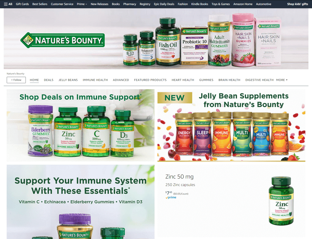
It’s always nice to know how a brand has been around for decades – and this supplement brand waves around a banner saying how they have been in business for 50 years!
New Chapter
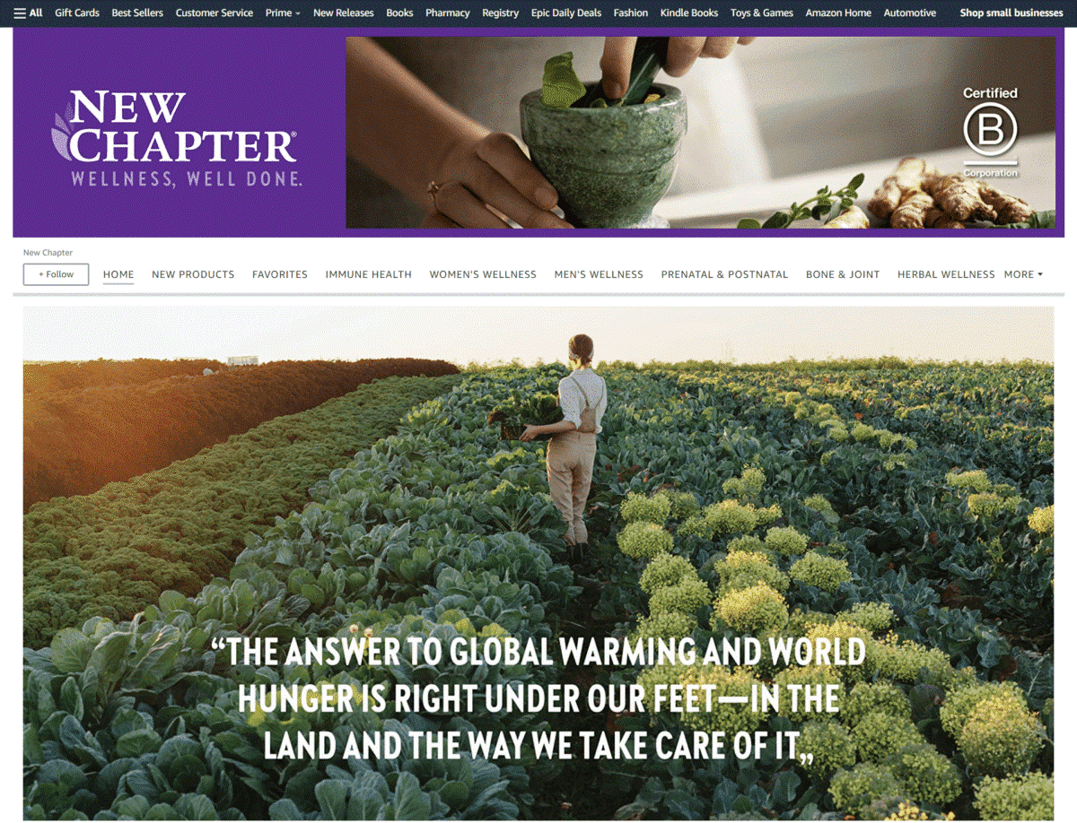
A large image of a woman harvesting crops is a great way of showing everyone how their brand promotes wellness through naturally sourced nutrition.
Automotive
Thalassa
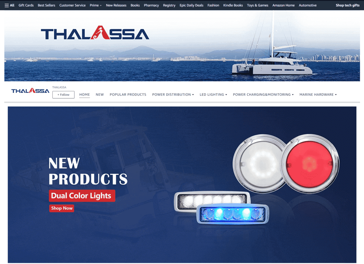
This brand’s Storefront takes on a blue-themed design, paired with images of boats sailing the open seas. They also feature their “New Products” section first on their page.
Frequently Asked Questions:
1 – What Is Amazon Storefront Design?
Amazon Storefront Design lets Amazon sellers use a variety of images, text, or videos to make their products stand out. Making an Amazon Storefront makes it easy for you to build brand recognition and boost Amazon stores sales at the same time.
2 – Can Anyone have an Amazon Storefront?
Sellers, vendors, and agencies may open their own Amazon Storefront. Before doing so, however, you have to enroll in Amazon Brand Registry, which requires you to have a registered and active text or image-based trademark.
3 – How many followers do you need for an Amazon Storefront?
You don’t need to have a specific number of followers to start an Amazon Storefront. As long as you have successfully enrolled in Amazon Brand Registry, you may open an Amazon Storefront right away.
4 – How do you find someone’s Storefront on Amazon?
Here are some steps you can take to find a specific Amazon Storefront:
- Visit www. Amazon.com
- Click on “Other Sellers” on the right
- Click on the store name of other sellers
- Check for the seller’s storefront under their name
- You may locate the vendor’s seller ID by looking at the HTML navigation bar after the merchant
- The letter combination is their seller ID
So What Do You Think?
Have you seen any Storefronts that deserve to be in our list of Best Amazon Brand Stores?
Comment them down below so we can add them to our list!

