Do your customers like excellent visuals, or are they more interested in checking out vital information?
Consider this question if you’re trying to reel more buyers on your Amazon store.
Infographics provide both attractive visuals and helpful information.
In this article, I discuss how you can maximize sales using Amazon infographics. I also provide the following information.
- The definition of an infographic
- How Amazon sellers use infographics on product listings
- How infographics on Amazon can make online selling more productive for you and more fun for your customers
- The importance of Amazon infographic images
- Tips and tricks on creating infographic images that increase sales and grow your Amazon business
- Examples of well-designed infographic images
Let’s begin!
What Are Amazon Infographics?
Most people find numbers and data boring.
Infographics enable potential buyers to quickly digest information with the help of engaging and exciting photos, drawings, shapes, and colors.
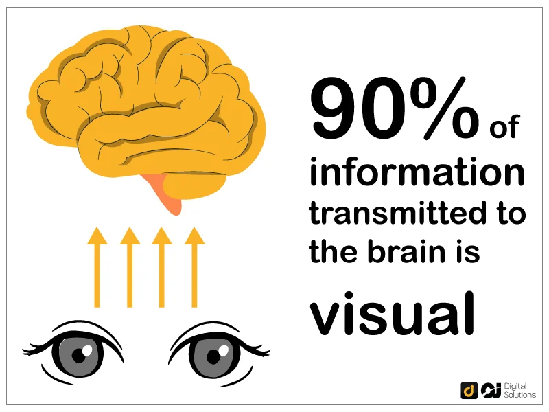
Amazon infographics promote product features and related information rather than general facts or research results.
An Amazon product infographic can grab a customer’s attention and encourage a purchase, making it a crucial element for many Amazon listings.
Here are some product infographic examples.
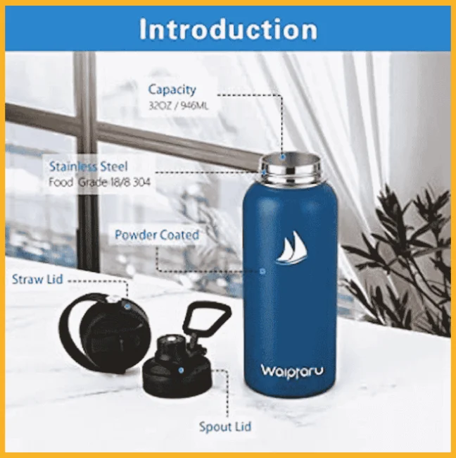
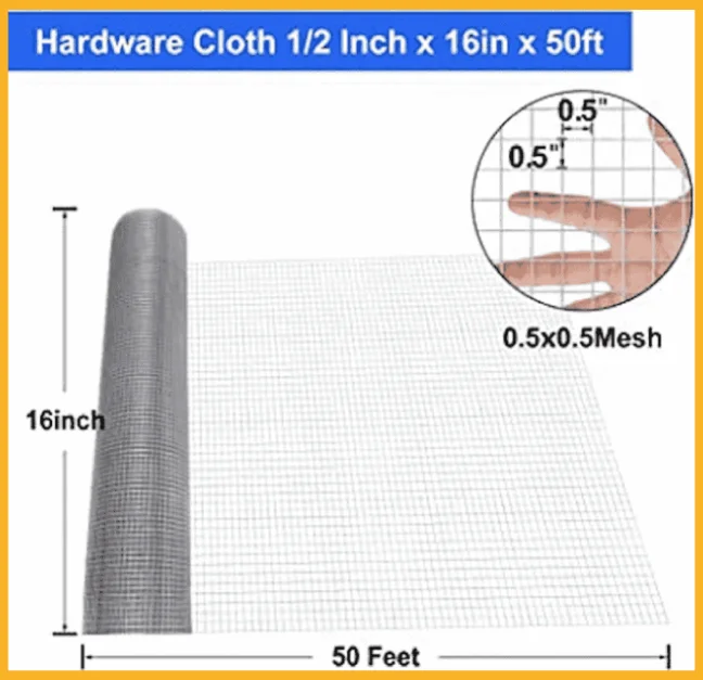
Infographics are essential parts of listing images.
Aside from photos, listings have other details you can tweak to boost sales. Learn how to optimize your product listings to increase your Amazon marketplace store sales.
Best Amazon Infographics Examples for Product Listings
Let’s look at some fantastic examples now that you can create infographics to supplement your product listings.
I’ve compiled the images below by product category for easier browsing. Hopefully, you’ll find inspiration in their clever layouts, attractive color schemes, and other strategies to give you a competitive advantage over other Amazon FBA sellers.
Apparel
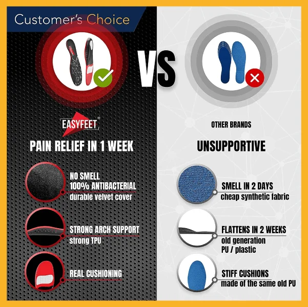
Easyfeet Insoles
Use visual elements to illustrate each feature of your product. You can also lay out the great points your product offers with a chart comparing it with other brands in the market.
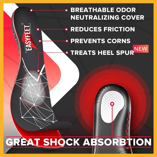
Here’s another way to draw shoppers’ attention — bold lines that connect the parts of your product to labels that showcase its unique properties!
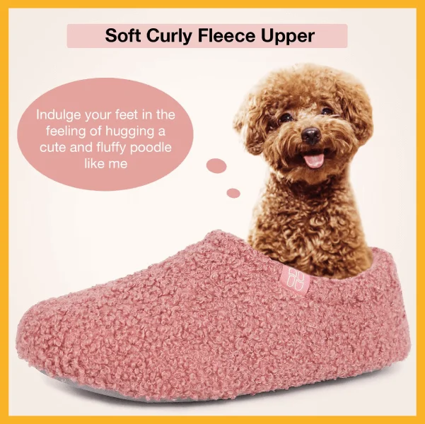
VeraCosy
Does your product have a remarkable quality? Why not match it with an example to make the consumer think about how it feels to try out your product? Bonus points if it’s as cute as this one!
Beauty
Absolute Collagen Maxerum Collagen Boosting Serum
Today’s beauty and skincare consumers are more meticulous than ever. Nowadays, they inspect every inch of a product before buying.
Cater to this target audience’s demand for detail by stating the relevant points to help them decide. Arrange the elements in an interesting pattern for even more visual appeal.

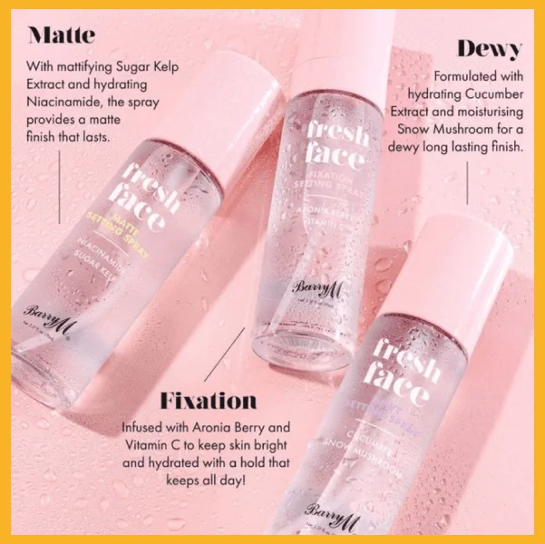
Barry M Fresh Face Setting Spray
If you’ve got multiple variants of one product, you can present them as an array. Pair each variant with a brief description of what it offers the user.
That way, consumers won’t have to scroll through many images to choose the one that’s best for them.
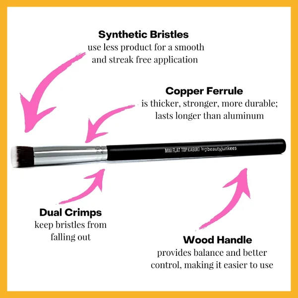
Beauty Junkees Mini Flat Top Kabuki Brush
Consumers like knowing what is in the products they buy, so it’s always a good idea to break down and label the parts of tools like this. Notice the infographic lays out the details of each component against a white background for better readability.
Electronics
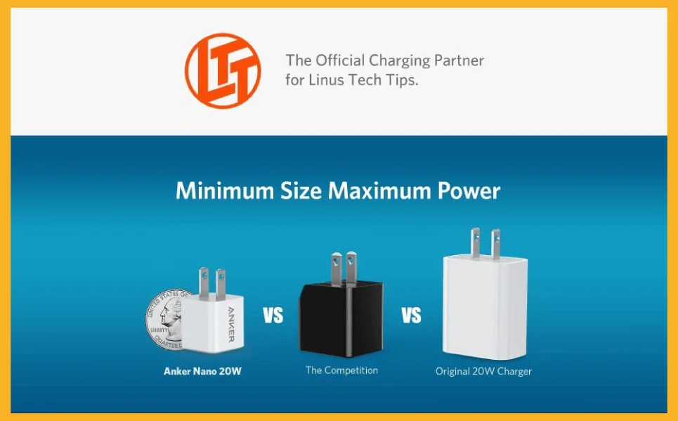
Anker Nano
This infographic brilliantly conveys what it wants to highlight to the consumer. The image below shows you how small the charger is by comparing it with other models.
Sometimes, this strategy is more effective than just putting in the product’s exact measurements, which can be more challenging for customers to visualize.
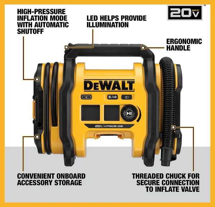
DeWalt 20V Max
Heavy-duty tools and gadgets with lots of details to consider can be too much for the average shopper. It can be intimidating to absorb so much information in one sitting, but not with this infographic style.
Breaking down the parts and highlighting what’s unique about each one helps shoppers think the product is easy to use.
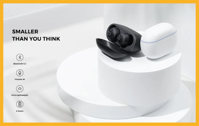
SoundPeats Mini Pro
If you have a minimalist-style product, your infographic should reflect that, too.
This brand wants to highlight the product’s miniature size in the infographic below. In keeping with this, the infographic also uses a simple black-and-white palette and small print.
Fitness and Outdoors
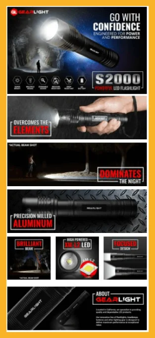
GearLight Flashlight
Do you have a lighting product to sell? There’s no better way to demonstrate its power than using it against a dark background. Users can see how it works in dark settings, primarily how the product distributes light.
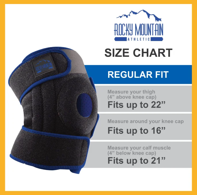
Rocky Mountain Athletic Knee Support
Listings of wearable products must include an infographic specifying their sizes. This infographic informs consumers where to take measurements, assuring them the product will fit.
Food and Drink
Bulletproof Coffee
Sometimes, brands capture their target audience by sharing their values. This infographic does precisely that by headlining sustainability as the brand’s mission to attract like-minded consumers easily!

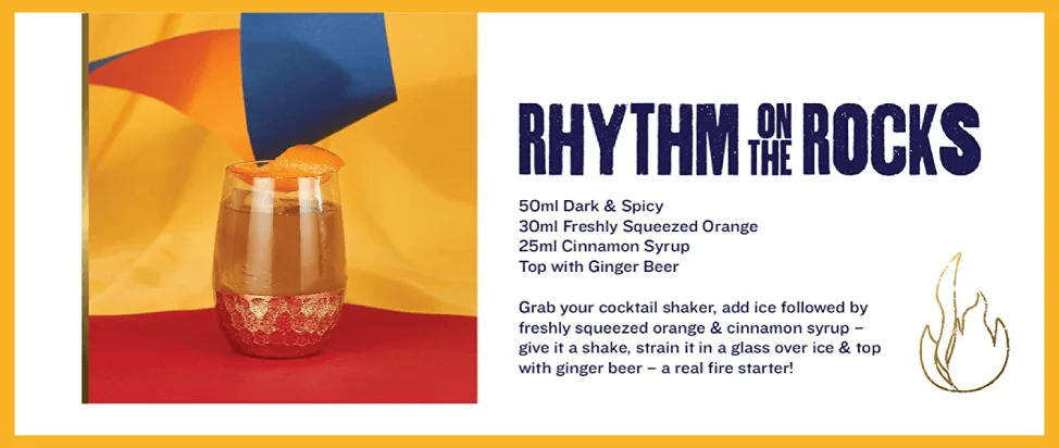
Caleño Dark & Spicy
Do you want to convey a fun party vibe? If your company specializes in alcoholic drinks, then you probably do!
Use bright and bold colors to amp up the excitement. Get a bit extra with a free recipe showing consumers how versatile your product is!
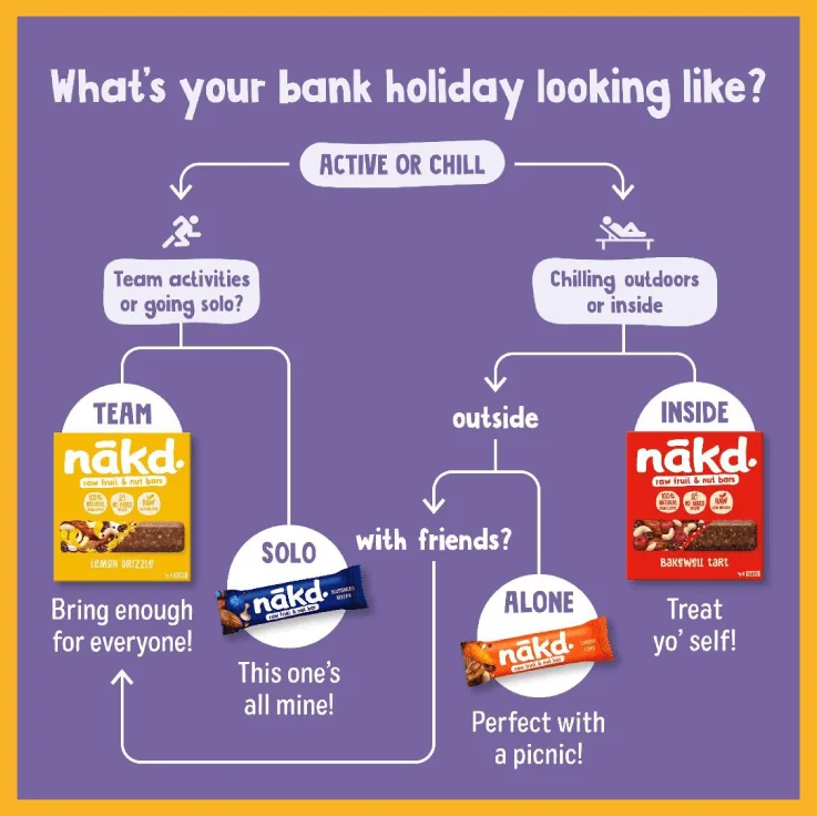
Nakd Raw Fruit & Nut Bars
Are you looking to break out of the typical bullet infographic mold? Create a fun modified yes/no flowchart.
The infographic below is more interactive than the usual infographic design. Each arrow ends with an image of a product. The overall message is that this brand has something for everyone!
Health and Wellness
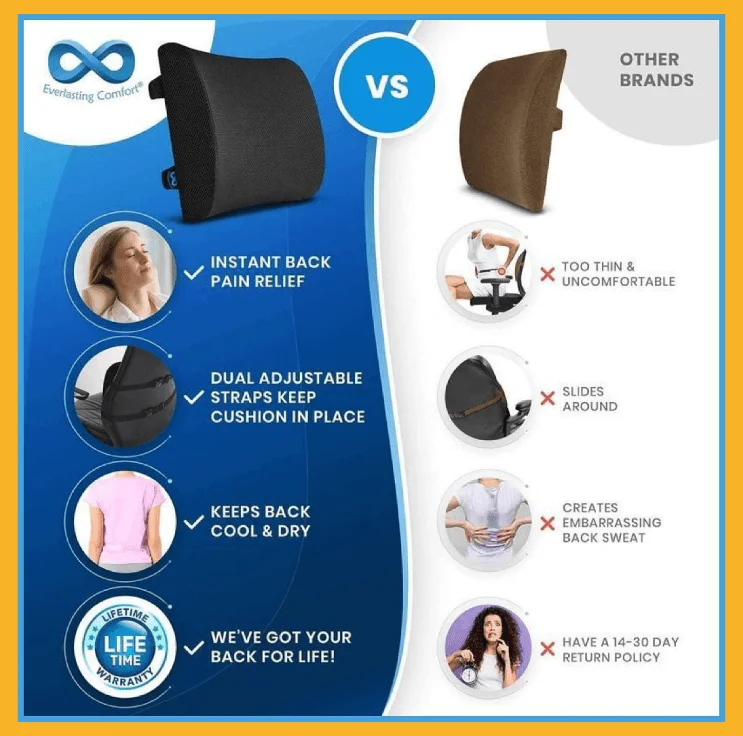
Everlasting Comfort Back Cushion
Here’s an example of a well-done comparison infographic. This brand uses bullet points with clear images to showcase how their product fares beside others.
It’s also interesting to note how they pull focus to their brand with a patterned and colored background instead of plain white.
The Gut Stuff High Fibre Bar
Cute images with short text often attract customers because they are easy on the eyes, and humans naturally like cute things.
When giving a serious message (in this case, stress and gut problems), it can sometimes help to deliver it lightheartedly. The infographic below tells consumers that no matter how severe the issue is, there’s a solution!

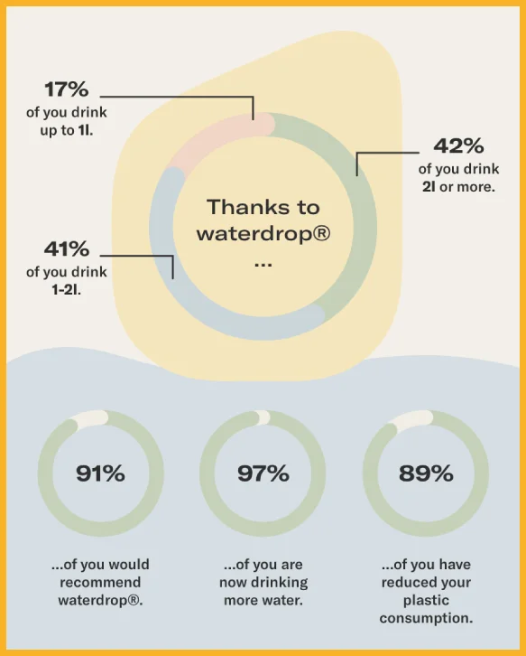
Waterdrop Microdrink
Do you want a quick way to impress your customers? Use facts to highlight why your product is essential!
Laying out stats helps consumers think about the effectiveness of the product’s purported benefits. It’s evidence of past performance, which is always worth a brag. Past performance is always a good indicator of future success!
Home
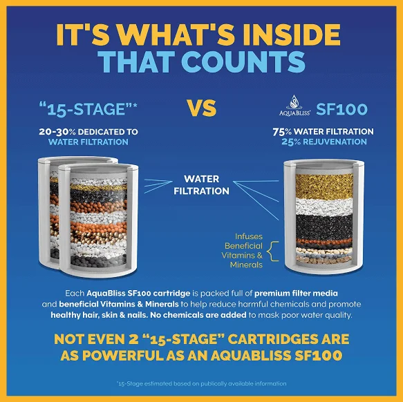
Aqua Bliss Water Filter
Advertise a complex product by simplifying the process for the average user to understand.
This brand doesn’t just compare its product with another brand. It also explains how their water filtration process works by peaking at what’s inside.
When consumers understand the essence of a complex product, it makes them more open to purchasing it!
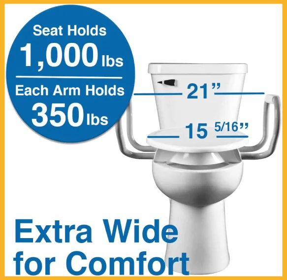
Bemis Toilet Seat
Although it boasts no fancy graphics or brilliant color schemes, this infographic pays attention to what’s important–the product’s design and capacity to handle heavy loads. It shows exact numbers, so the buyer doesn’t have to guess.
Brita Water Filter
This brand also knows the importance of explaining a complicated process. Using graphic illustrations and a clean color scheme makes it easy to understand.

Kids and Babies
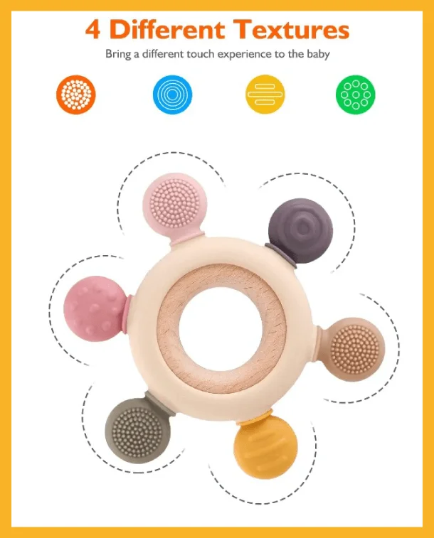
Akolik Silicone Teether
Putting your product’s strongest point in the headline is a definite attention-grabber.
For instance, this infographic from Akolik provides microscopic views of the different textures that the teether offers. The product stands out because the brand used a white background, making it easier to check out the details.
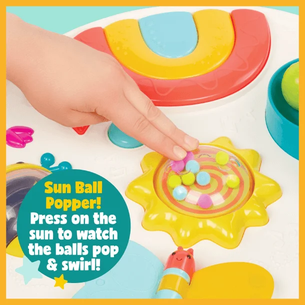
B. Toys
You can’t go wrong with bright colors if you’re selling children’s toys. After all, you’re trying to sell the idea of fun!
This brand also makes information more accessible by showcasing one feature of the entire toy at a time. Thus, customers can pay attention to each feature and see how children can play with them.

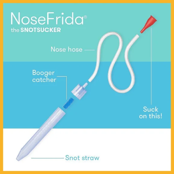
NoseFrida Snotsucker
This brand has a lighthearted approach.
The brand’s name pokes fun at an unpleasant task, and the infographic is just as amusing.
While it uses a straightforward color scheme and layout, the labels simplify the complicated process for users. Parents won’t have to think about which parts go where; the simple wording makes it all straightforward!
Pet Care
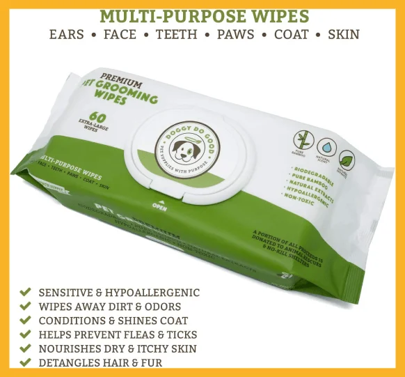
Doggy Do Good Pet Grooming Wipes
The combination of green and white always looks great for brands that want to highlight their environmental and health-focused values.
If a product is biodegradable, stress that in your infographic. Don’t forget to mention how your product uses natural ingredients for an irritation-free experience.
Earth Rated Poop Bags
You might think it’s difficult for people to take poop bags seriously, but not if you use statistic-packed infographics like this. This style shows you mean business, even if it’s something people often dismiss as insignificant.
Use the numbers to establish trustworthiness and share your company values. Help people see how your product benefits customers and the planet.

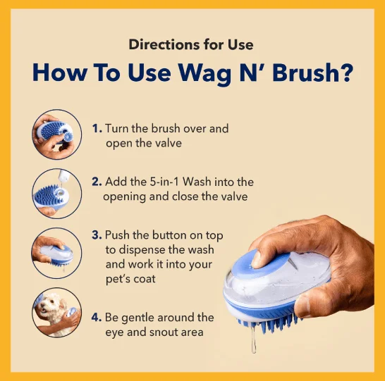
Honest Paws Wag N’ Brush
When you have a nifty product designed for convenience, let customers know how to use it.
A how-to approach or step-by-step guide helps customers understand how your product will make their lives easier!
Toiletries and Hygiene
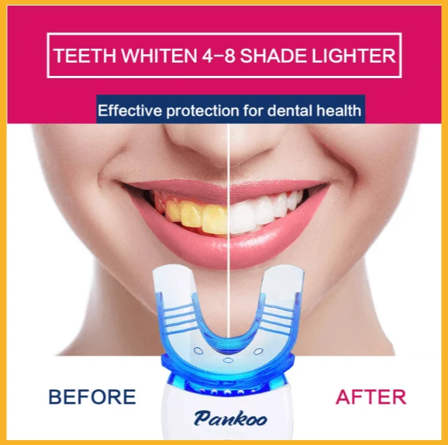
Pankoo Teeth Whitening Kit
For a product claiming to whiten teeth, this brand chose a before-and-after infographic.
After all, this is what customers need to see—the product’s effectiveness.
Snow Teeth Whitening Kit
Here’s another teeth whitening kit with a different focus.
The infographic wants to assure users of the product’s convenience and ease of use. What better way than an image of someone using it?
It’s also worth noting that the dark theme—from the background to the man’s shirt—contrasts the white product effectively.

Here’s the same kit but with more information to let users know what to expect.
The white background works to make the dark text highly readable.

Tools and Hobbies
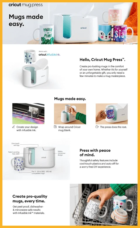
Cricut Mug Press
Do you want to tell a story with your infographic? Take a look at this infographic from Cricut. A step-by-step visual guide shows how the product works.
The storyboard-style infographic is an apt choice to show customers what to expect from the product.
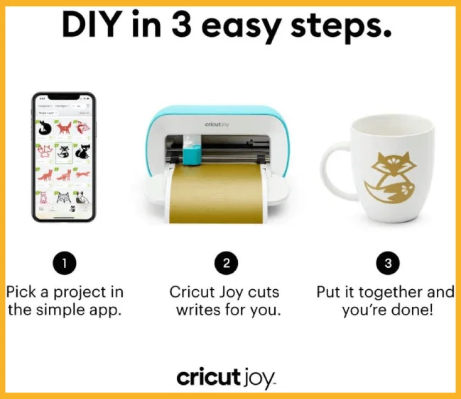
Cricut Joy
When selling tools, your priority should be to show customers how easy it is to use.
Cricut nails it again with this simple layout of steps. Customers won’t have any unpleasant surprises when they try the product themselves since they already know how it works!
Speks Adult Fidget Toys
If you have a range of products in one category, why not show them all in different sections?
The blocks of color in this brand’s infographic give off a fun vibe that matches the goal of their toys. But as bright and carefree as it looks, there’s also some serious proof of its effectiveness.
The brand intersperses product images with actual reviews to highlight that other customers have already approved.

How To Add Infographics on Amazon
You can add infographics like you upload new product images for Amazon if you’re setting up a new Amazon listing.
If you have an existing product listing page, follow these steps to add your infographic.
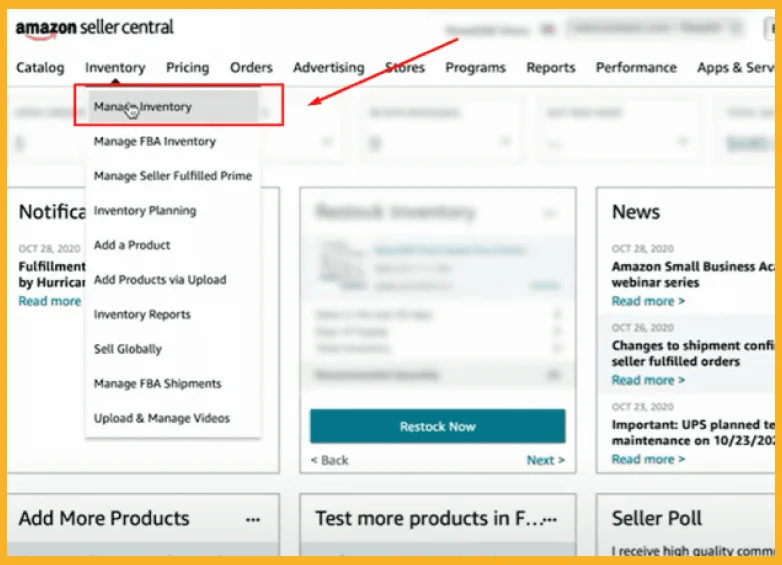
1. Go to the Manage Inventory page to edit the existing listing.
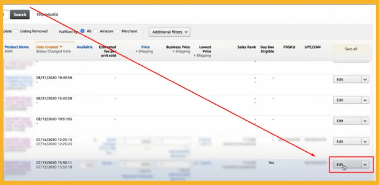
2. Find the particular product listing where you want to add Amazon product infographic images.
3. Click Edit on the right-most column of that listing.
4. Go to the Images tab to upload your infographic.
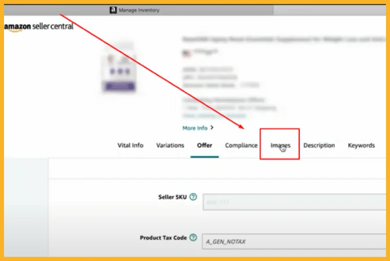
Don’t panic if you don’t see your new infographic after uploading. New Amazon listing images—including infographics—can take up to 24 hours to appear on your listings page.
How To Optimize Amazon Infographics for Mobile Devices
Mobile ecommerce has become popular, especially during and after the COVID-19 pandemic. Data shows that mobile ecommerce will grow to over 511 billion in 2023.
In short, it pays to optimize your Amazon infographics for mobile usage.
Here’s how.
1. Keep the text short.
Long blocks of text are difficult to read on mobile devices and don’t provide a good user experience.
Keep the text in your infographics short, sweet, and concise to make the infographics easier to mobile-optimize and more digestible to potential customers.
2. Replace text with icons and badges (when applicable).
Use icons and badges instead of text to highlight specific features.
For example, imagine you’re creating an infographic for wireless headphones that can connect to Bluetooth. Rather than adding a product description saying “Connects to Bluetooth easily,” you can add an icon with the Bluetooth logo.
3. Use a simple, easy-to-read layout.
Use a layout that’s easy to read, even on mobile devices. Look at the examples above, and you’ll notice that many have simple, two-column layouts that are easy to follow.
The positioning of text in the examples is also logical and natural, meaning your eyes don’t have to work hard to see the next bit of information.
4. Avoid clutter.
Avoid adding all your product’s features and benefits in an infographic, even if the product has 20 amazing features. Adding too much information creates clutter that can turn off potential buyers.
Choose and highlight only your product’s best features or unique selling propositions. A range of about four to five features per product is ideal.
5. Test your infographics on various mobile devices.
Upload your infographics and see how they look on various mobile devices, including iPhones, Android smartphones, and tablets.
Finalize your infographic designs based on what you learned in your testing, and then publish them.
Why Do Amazon Infographics Matter?
Here’s why infographics matter on Amazon.
Infographics Reduce Negative Reviews.
Amazon product infographic images provide vital details about your product. Thus, an ideal infographic helps your customers make informed purchasing decisions.
There is also a lesser chance they will leave negative reviews claiming you did not inform them of specific product details.
You should always aim to reduce negative reviews as an Amazon seller.
Infographics Improve Conversion Rates and Sales.
Studies show that online shoppers pay less attention to unfamiliar product catalogs.
Grabbing your customers’ attention increases the likelihood of buying your products, meaning infographics are ideal for increasing your sales.
Infographics make products more familiar and more sellable.
Infographics Speed Up Buyer Decision-Making.
Infographics can contribute to faster purchasing times, leading to increased growth for your Amazon business. Infographics can speed up the buying process further if they make your product stand out.
Here are several statistics that support the above claims:
- According to Xerox, infographics and other colorful visuals can increase sales by up to 80%.
- Another study revealed that around 52% of marketers agree that visual content is vital for promoting products or services.
- The mind processes visuals quicker than words, meaning infographics can help Amazon shoppers make easier decisions.
5 Best Practices To Create High-Quality Infographics
Here are the best tips for creating infographics for your Amazon listings. These best practices will significantly increase the likelihood that your Amazon product infographics will bring more sales to your business.
1. Optimize Your Infographics for Mobile.
Customers who use their mobile devices when shopping on Amazon must also see your infographics.

2018 statistics reveal only 24 percent of Amazon shoppers use mobile devices. However, 24 percent is still significant, considering there were approximately 100 million Amazon Prime Subscribers in 2018.
24 percent of 100 million is equal to 24 million mobile users you need to consider when optimizing your infographic images for mobile.
Follow these tips for mobile-friendly infographics.
- Keep the text as brief as possible.
- Use a simple layout.
- Include only five features per product.
- Test how the infographics appear on mobile before publishing them.
2. Be Clear and Concise.
Avoid cramming too much information in your infographics.
Include only the most critical information in your infographics, like notable product features and benefits.
Here is some information you can include in your infographics.
- Product dimensions
- Product warranty (if any)
- Unique value propositions
- Pricing packages
Writing clear and concise text prevents you from overwhelming shoppers with cluttered infographics.
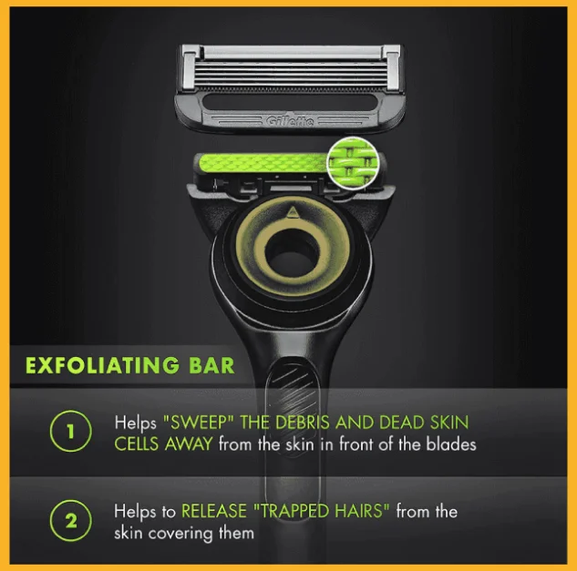
The ideal infographic shouldn’t contain more than 200 characters since you’re trying to grab attention through visual representation rather than text-based information.
Here’s an example of an infographic with only 200 characters.
3. Use Appropriate Images.
There are many image types you can use, depending on your product.
Here are some examples:
Lifestyle Image
Lifestyle images let potential customers see how to use your products in different work, recreational, or other social settings.
If you sell backpacks, you can add photos of models using the backpacks in schools or at work.
The Amazon product infographic image below is an example of using a lifestyle image as an infographic element.
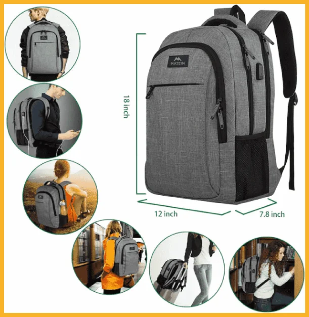
Lifestyle imagery also enables customers to connect with your product emotionally, which is crucial since most buyers make purchasing decisions based on emotion.
Package Image
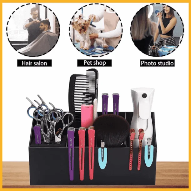
Package images containing multiple products or services in a single listing.
Check out the Amazon product infographic below that showcases an offering that includes scissors, combs, hair clips, and more.
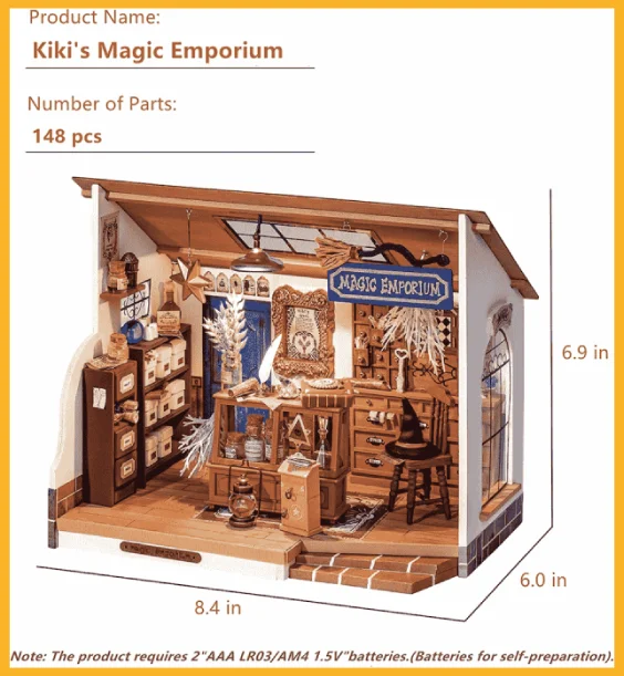
Dimension Image
A dimension image helps customers determine the actual size of your product.
Check out the sample image below.
4. Outsource When Necessary.
Feel free to create infographics yourself if you have the skills.
If you’re not a graphic designer, many companies and freelance graphic designers offer Amazon infographic services and Amazon image editing services.
5. Choose the Right Visual Elements.
Amazon product infographic images must have the right font and color schemes to match your listings.
Here’s a table that can help you determine which fonts suit which products.
| Font Type | How It Looks Like | Product Suitable for the Font |
|---|---|---|
| Brody, Allura, Sauber Script | Cursive Human Handwriting | Jewelry, makeup, or other products that have a luxurious or elegant air |
| Sans Serif | Generic Computer Text | Wooden trays or other products with minimalist designs |
Choose colors carefully when creating your Amazon infographic design. If your brand promotes eco-friendliness, choose colors with earthy tones like green, beige, or white.
The Amazon product infographic image below features an eco-friendly type of dental floss.

Use apps like Pinterest to create the right colors and visual elements. Create a mood board of images, colors, and fonts. You can also base your color scheme on your product’s brand logo, website design, or packaging.
Frequently Asked Questions (FAQs)
What Is the Ideal Size of Infographics on Amazon?
Amazon product infographics follow the same guidelines as ordinary product listing images, meaning an infographic should have a minimum height or width of 1,000 pixels.
Remember that a higher pixel density means a better zoom quality.
Regarding file size, Amazon infographic images can have a maximum size of 10 MB.
How Many Infographic Images Can I Upload Per Product Listing?
The first image (or main product image) should be the photo of your product on a white background. The other eight images in one listing can be additional photos of your product or infographics.
You can have the following set of photos per listing.
- One main image and eight infographics
- One main photo, six infographics, and two other product photos
- One main image, four infographics, and four other product photos
Should Amazon Infographics Be Have a White Background?
No. Not all your infographics should be white-background images. Only the main image should be a white-background image. The background of other images in your listing, including infographics, can be other colors.
The Bottom Line
Hopefully, reading my article has made you realize how Amazon infographics can help you grow your business.
Try the tips I mentioned in this article today and create beautiful infographics to attract your target audience.
However, infographics aren’t the only keys to success on Amazon. To boost your Amazon sales, you must also know how to write product descriptions that sell.

